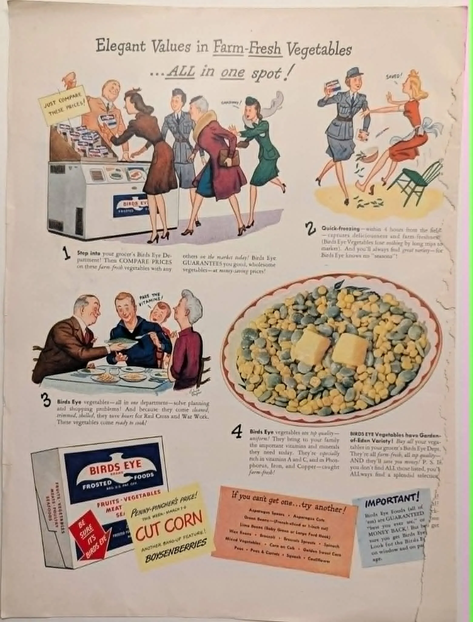
c. 1943 Birds Eye Frosted Foods "Farm-Fresh Vegetables" Vintage Advertisement
In the early 1940s, Clarence Birdseye’s revolutionary quick-freezing process was still a relatively novel concept for many American consumers. This meticulously crafted advertisement serves a dual purpose: demystifying the frozen food aisle and aligning the product with the urgent patriotic duties of the World War II home front. The campaign masterfully utilizes a sequential, comic-strip layout to guide the viewer through the modern shopping experience, addressing consumer hesitations step-by-step. The visual narrative is anchored by its explicit wartime context. The illustration features women in military uniform—likely representing the Women's Army Corps (WAC)—shopping alongside busy housewives. The copy in the third panel explicitly states that using these pre-cleaned, pre-shelled vegetables saves "hours for Red Cross and War Work," framing convenience as a patriotic contribution. Furthermore, callouts like "Penny-Pincher's Price!" directly appeal to families navigating the strict economic realities and food rationing of the era. The frozen food chest itself is depicted as a bustling hub of modern efficiency, contrasting sharply with the traditional, labor-intensive preparation of fresh produce. Aesthetically, the advertisement is a prime example of 1940s commercial offset lithography. It employs a distinctive flat illustration style characterized by crisp outlines, unshaded color blocks, and dynamic, exaggerated character posing. The artist utilizes a highly structured, static composition for the sequential panels, which grounds the frantic action of the characters and provides a clear hierarchy of information. This reliance on clean line work and a vibrant, period-accurate color palette was essential for printing on wartime magazine stock, ensuring the message remained legible and visually striking. Today, it stands as a critical document tracing the intersection of food technology, wartime domesticity, and mid-century graphic design.
Category: Food & Beverage
Year: 1946
Rarity Class: B
Paper & Print Condition
The artifact displays an authentic, aged paper texture typical of wartime mass-market periodicals, bearing minor edge wear and micro-tears that testify to its historical journey. Despite the fragility of the paper stock, the color offset lithography has aged gracefully. The period color palette remains highly legible, perfectly preserving the original flat illustration style, halftone dot patterns, and the sharp, static composition of the informational panels.
Provenance & Rarity
Sourced from an American domestic publication during the height of WWII. Like many periodicals of the era, the vast majority were surrendered to national paper scrap drives to aid the war effort. The survival of this intact page elevates it to Rarity Class B, offering a rare glimpse into the wartime consumer psyche.
Rarity & Condition Summary
Class B. This advertisement holds immense archival value due to its direct commentary on WWII food rationing and technological adoption. Furthermore, its meticulously preserved flat illustration style, static camera-like panel framing, and authentic aged paper texture make it an exceptional historical reference. It is an ideal baseline artifact for digital preservationists aiming to transform vintage print media into living 2D artwork while retaining strict period-accurate aesthetics.