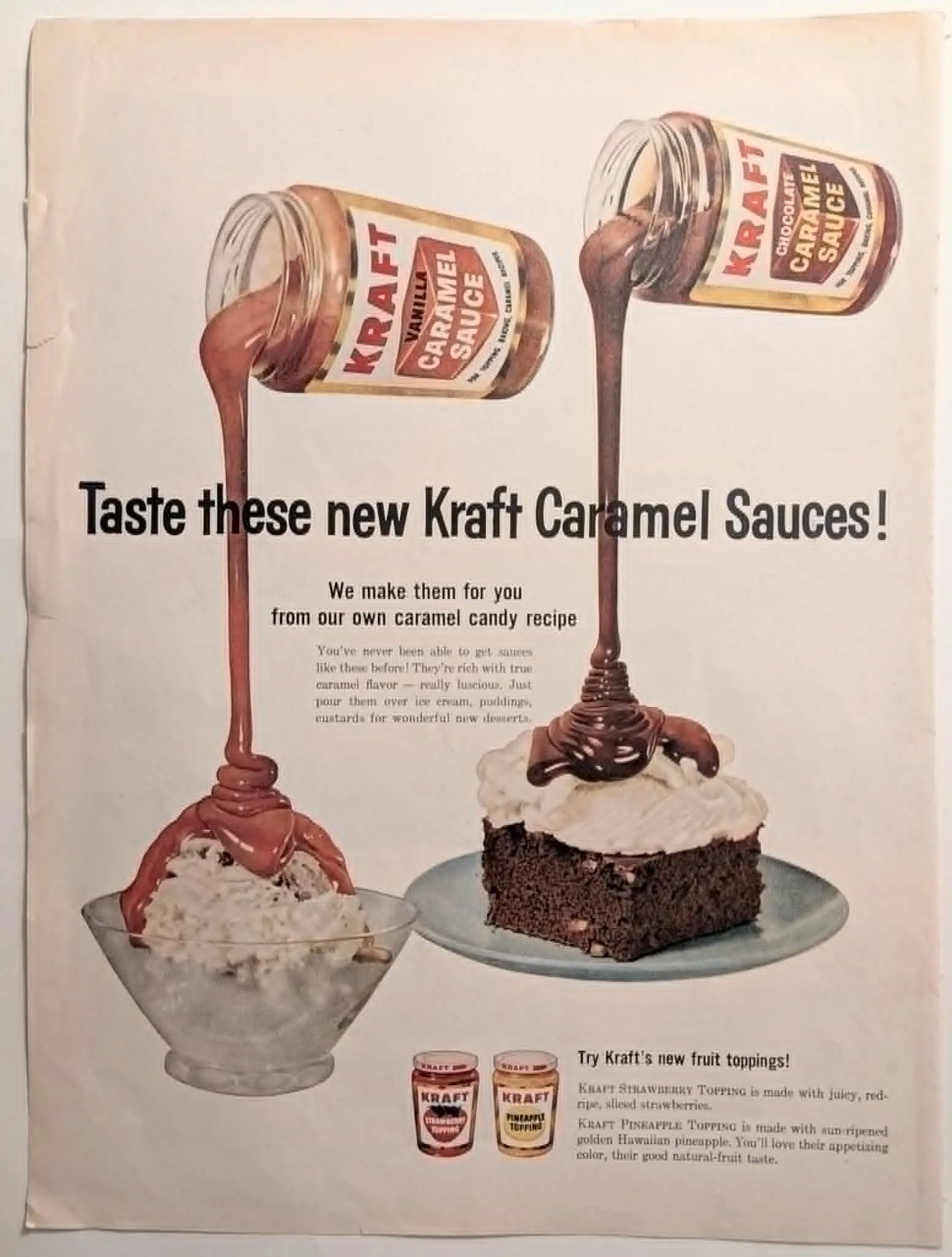
1960 Kraft Caramel Sauces Vintage Advertisement
The mid-twentieth century represented a golden age for food illustration in commercial art. Prior to the ubiquitous adoption of high-speed macro photography in food styling, advertising agencies relied on the meticulous skill of commercial illustrators to render products with an almost hyper-real, mouth-watering appeal. This circa 1960 advertisement for Kraft Caramel Sauces is a prime example of this methodology. The artwork perfectly captures a moment of suspended action—thick, luscious ribbons of vanilla and chocolate caramel caught mid-pour from their respective glass jars onto ice cream and cake. This technique of freezing motion within a completely static composition creates a compelling visual tension. The artist has utilized a warm, nostalgic period color palette, relying on rich siennas, deep umbers, and creamy whites to convey the richness of Kraft's proprietary caramel candy recipe. The original flat illustration style, while lacking the harsh, hyper-detailed shadows of modern digital photography, masterfully employs subtle gouache gradients to give weight and volume to the cascading sauces and the textured surfaces of the desserts. Furthermore, the composition is highly regimented, presenting the items almost as architectural pillars. The verticality of the pouring sauces anchors the viewer's eye, while the secondary products—the Kraft Strawberry and Pineapple Toppings—rest neatly at the foundational level of the layout. This strict, grid-like structural integrity, combined with the inherent sense of frozen time, makes this specific visual arrangement highly translatable to modern archival preservation efforts. When reimagined as a living 2D artwork, the perfectly static camera perspective demanded by the original layout allows the rich, viscous flow of the caramel to be isolated and continuously animated, creating a mesmerizing, synchronized loop that respects the original artistic intent without altering the spatial boundaries of the page. The typography pairs a bold, condensed sans-serif headline ("Taste these new Kraft Caramel Sauces!") with a highly legible, lighter serif body copy, a hallmark of mid-century informational advertising. The overall effect is one of inviting domesticity, designed to evoke the comforting, sweet atmosphere of a 1960s kitchen—a space where one might hear the distant, warm crackle of a vintage radio or the gentle, ambient sounds of a bustling neighborhood street drifting through an open window. This advertisement did not merely sell a topping; it sold a vision of effortless, modern hospitality.
Category: Food & Beverage
Year: 1960
Rarity Class: B
Paper & Print Condition
This document displays a beautiful, authentic aged paper texture that lends a tactile, historical depth to the piece. Minor edge wear and slight tearing are present along the left binding margin, typical of historical periodical extraction. The commercial print retains its original flat illustration style, with the period color palette remaining vibrantly preserved without significant UV degradation. The rich, warm tones of the caramel are exceptionally stable.
Provenance & Rarity
Sourced from a widely circulated American women's lifestyle magazine from the early 1960s. While Kraft was a ubiquitous household name, full-page, full-color illustrative advertisements capturing this specific product launch are becoming increasingly scarce as intact ephemera, due to the disposable nature of mid-century print media.
Rarity & Condition Summary
Class B. A beautifully preserved artifact exhibiting standard environmental aging. Its pristine, static compositional structure and clearly defined visual planes make it an ideal foundational asset for continuous, synchronized 2D animation within a fixed framework.