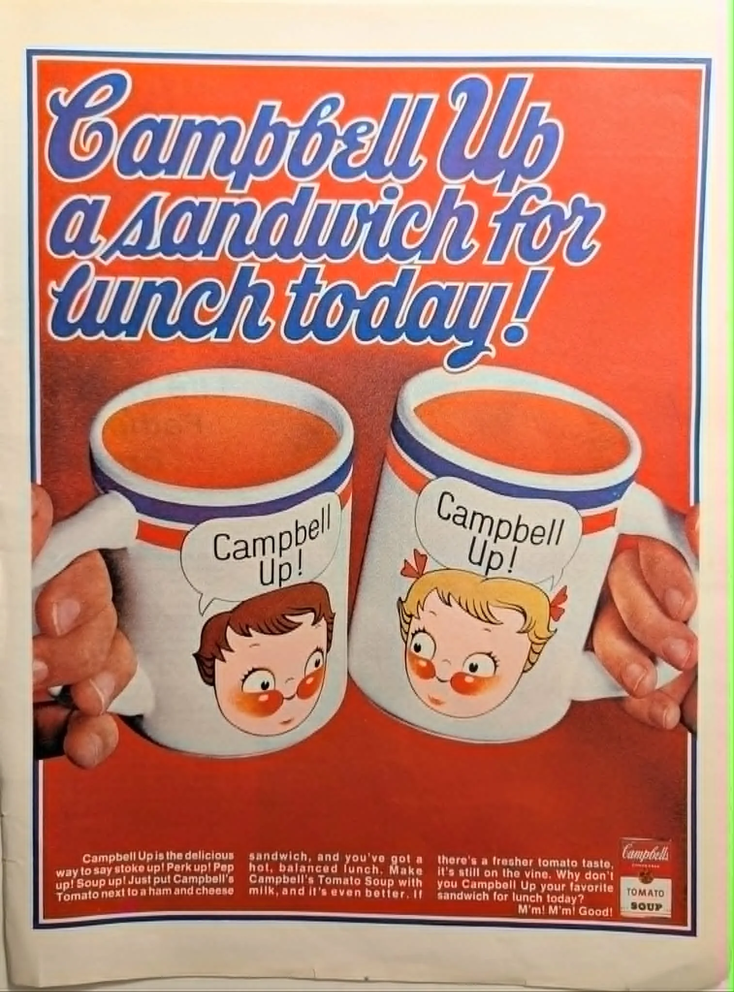
1970 Campbell's Tomato Soup "Campbell Up" Vintage Advertisement
The late 1960s and early 1970s represented a transitional period in American advertising, where legacy brands sought to refresh their messaging while maintaining their comforting, established identities. Campbell Soup Company achieved this brilliantly with their "Campbell Up!" campaign. Designed to encourage consumers to pair their classic tomato soup with a lunchtime sandwich, the campaign injected a sense of upbeat energy—"stoke up! Perk up! Pep up! Soup up!"—into the daily routine of the American household. Visually, this advertisement is a striking study in contrasts and symmetrical framing. It utilizes a bold, deeply saturated period color palette, dominated by the quintessential "Campbell Red" background. Against this vibrant backdrop, a pair of hands symmetrically holds two promotio
Category: Food & Beverage
Year: 1970
Rarity Class: B
Paper & Print Condition
This specimen exhibits an authentic aged paper texture that adds tactile depth to the vibrant period color palette. The striking Campbell red background and the original flat illustration style of the character mugs are preserved with remarkable high-fidelity halftone clarity. The strict, symmetrical composition provides an exceptionally stable visual plane, making this print an ideal candidate for translation into a living 2D artwork using fixed, static camera perspectives.
Provenance & Rarity
Originating from a mass-market American periodical circa 1970, this piece represents a highly specific and beloved era of culinary marketing. While Campbell's is a ubiquitous brand, finding intact ephemera featuring the "Campbell Up!" promotional mugs in such unblemished condition is increasingly rare. Surviving examples that so flawlessly support the potential for animated, synchronized lip movement within the printed speech bubbles are highly prized by contemporary digital archivists.
Rarity & Condition Summary
Class B. A beautifully preserved artifact exhibiting standard environmental aging. Its pristine compositional structure and the stark, appealing contrast between the photographic hands and illustrated mugs make it an exceptional foundational asset. The inherent visual stability of the layout allows the era's unique blend of domestic nostalgia to be meticulously brought to life, perhaps best paired with the crackling warmth of a vintage radio broadcast.