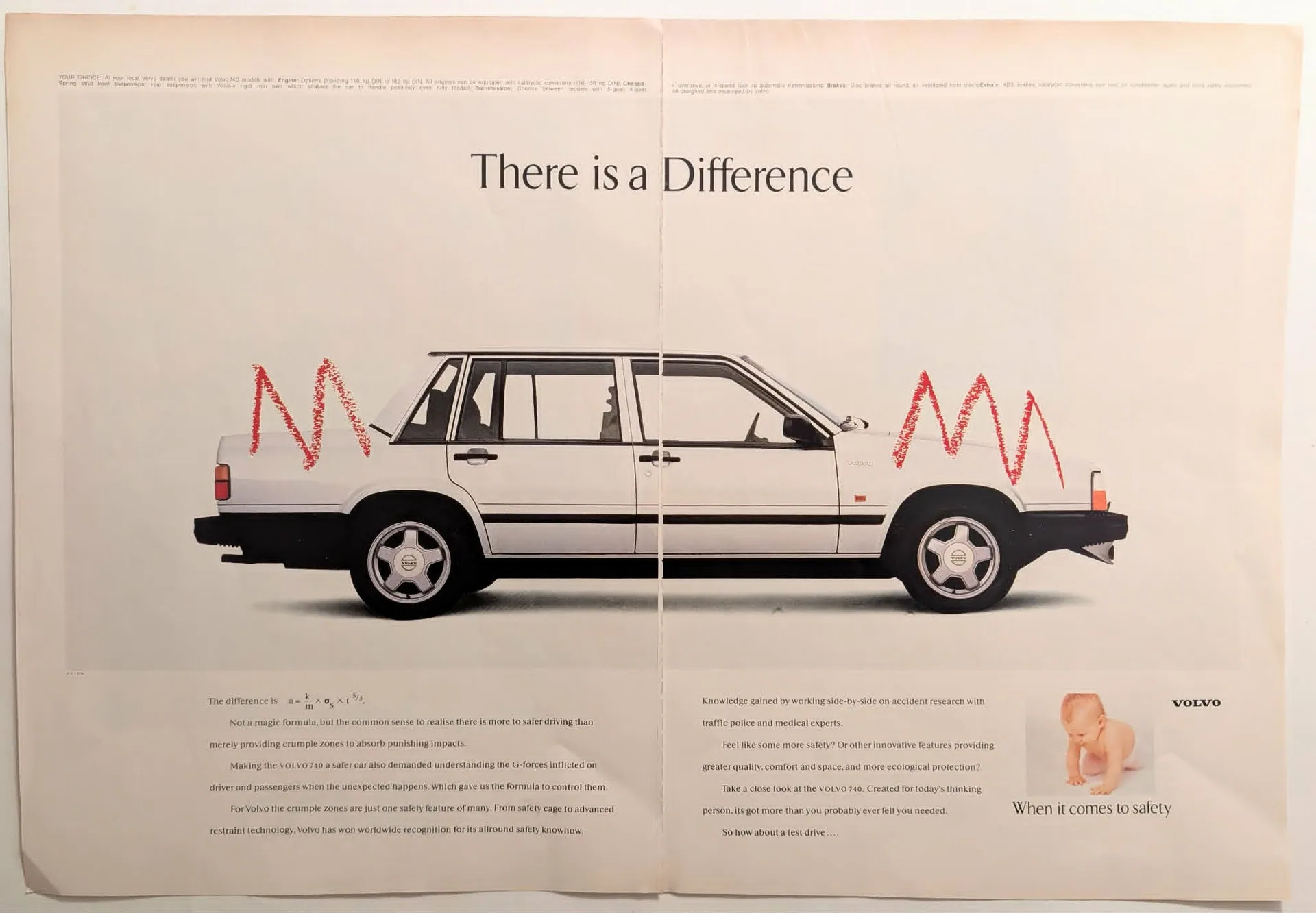
1985 Volvo 740 "There is a Difference" Vintage Safety Advertisement
During the mid-1980s, automotive marketing often focused on performance metrics like horsepower, top speed, and aggressive styling. Volvo, however, took a radically different, highly rationalized approach. This specific campaign, headlined "There is a Difference," is a masterclass in intellectual advertising. It strips away the superficial glamour of the automobile to focus entirely on survivability. The visual composition is stark and clinical. A brilliant white Volvo 740 sits prominently in the center of a two-page spread, overlaid with hand-drawn, jagged red lines indicating the precise locations of the vehicle's front and rear crumple zones. The advertisement boldly asserts that safety is "not a magic formula, but the common sense to realise there is more to safer driving than merely p
Category: Cars
Year: 1985
Rarity Class: A
Paper & Print Condition
Printed on standard commercial magazine stock of the era, which now exhibits a subtle, authentic aged paper texture. The typography remains remarkably crisp alongside the flat illustration style of the hand-drawn red stroke graphics, which retain their original vibrancy without bleeding. Minor edge wear is present, indicative of its historical age and typical magazine binding removal.
Provenance & Rarity
Sourced from a premier mid-1980s international publication. This artifact holds a distinct provenance within the lineage of automotive marketing. Advertisements of this era rarely featured complex kinematic physics equations intended for the general consumer. The deliberate inclusion of structural deformation formulas alongside emotive imagery makes this an exceptionally rare, highly sought-after archival piece for automotive historians and corporate archivists studying the evolution of vehicle
Rarity & Condition Summary
Classified as a Class A artifact, this well-preserved print is in Excellent condition. It serves as a cornerstone example of 1980s rationalist advertising, perfectly encapsulating Volvo's uncompromising safety-first brand identity. The minor structural wear around the edges is completely offset by the exceptional preservation of its original ink vibrancy and crisp typography.