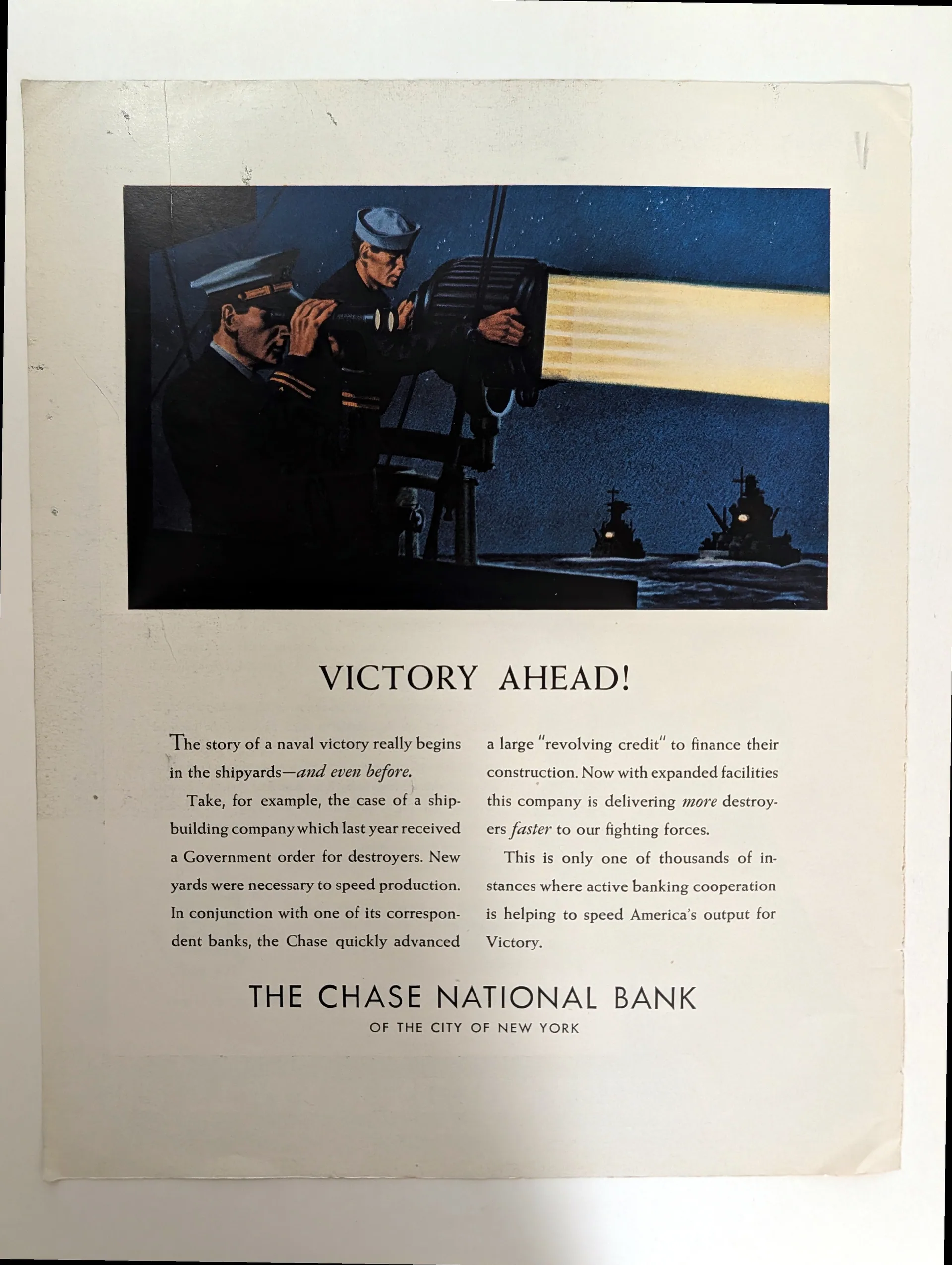
c. 1942–43 (visual estimate) Chase National Bank "Victory Ahead!"
Paragraph 1 — Object and layout description The object is a full-page magazine advertisement for the Chase National Bank, photographed in three views: a full page, a body-copy and bank-name detail, and a headline detail. The supplied full-page photograph shows the sheet rotated ninety degrees from its reading orientation; in reading orientation the layout runs from top to foot as follows: a painted night scene occupying the upper portion, the headline "VICTORY AHEAD!" in large serif capitals beneath it, two columns of body copy, and the bank's name at the foot. The illustration depicts two sailors in dark uniforms and caps on the deck of a warship at night, operating a large searchlight whose beam cuts diagonally upward through a deep blue sky; in the distance, the dark silhouette of a second vessel carries a few small lit points, and the sea is rendered in dark blue tones. The painting is naturalistic, with attention to the figures' hands, faces, and the metal housing of the searchlight. The paper is off-white with slight toning toward the edges. Paragraph 2 — Printed text, credits, and marks Printed text, credits, and marks. The headline reads "VICTORY AHEAD!" The body copy, transcribed from the detail photographs, reads in full: "The story of a naval victory really begins in the shipyards — and even before. Take, for example, the case of a shipbuilding company which last year received a Government order for destroyers. New yards were necessary to speed production. In conjunction with one of its correspondent banks, the Chase quickly advanced a large 'revolving credit' to finance their construction. Now with expanded facilities this company is delivering more destroyers faster to our fighting forces. This is only one of thousands of instances where active banking cooperation is helping to speed America's output for Victory." The foot of the advertisement reads "THE CHASE NATIONAL BANK / OF THE CITY OF NEW YORK," the bank name in widely spaced capitals above the smaller city line. Imprint (observed): the bank name as advertiser, as printed above. Publisher, copyright holder, illustrator credit, and advertising agency credit: none legible in the supplied photographs; no masthead, folio, issue date, or page furniture is visible. No signature is resolvable on the illustration in the photographed areas. Paragraph 3 — Maker and attribution context Maker and attribution context. The illustration is unsigned in the areas photographed, and no illustrator, studio, or agency credit appears in the printed text; the advertisement's maker is unidentified. The painting's naturalistic handling — the modelling of the figures, the tonal rendering of the night sky and the searchlight beam — is consistent with American commercial illustration practice of the early 1940s, but the medium of the original (oil, gouache, or another medium) cannot be determined from the digital proxy. The Chase National Bank appears solely as the advertiser; the bank is the client of the advertisement, not its maker. Attribution status for the artwork is therefore Unidentified, and this ceiling governs the title, metadata, and summaries. Paragraph 4 — Geographic, industrial, and audience context Geographic, industrial, and audience context. The printed credits name New York City and invoke "America's output" and "our fighting forces"; the country of publication is inferred as the United States from these credits and is not printed on the object. The object is a magazine advertisement; the publication, issue, and date are not visible in the supplied photographs. The copy belongs to the genre of wartime institutional advertising, in which corporations presented their contribution to the war effort rather than selling a product: the "revolving credit" extended to a shipbuilding company is offered as one of "thousands of instances" of banking cooperation with war production. The intended audience is the general-interest magazine reader — addressed simultaneously as citizen, potential depositor, and business client — during the Second World War. The date estimate of c. 1942–1943 rests on the wartime messaging and the destroyer-production subject matter, taken together as contextual evidence. Paragraph 5 — Visual language and design The design's visual language pairs a naturalistic painted illustration with a restrained typographic page. The night scene is built on tonal contrast: the near-black deck and uniforms against the deep blue sky, cut by the pale diagonal of the searchlight beam, with the small lit points of the distant vessel giving the composition its depth. The figures are rendered at a human scale that keeps the machinery — the searchlight housing, the ship's fittings — subordinate to the men's work. Below the picture, the page turns typographic and spare: a single exclamatory headline in classical serif capitals, two even columns of text, and the bank's name in widely spaced capitals as a formal sign-off. This combination is consistent with the Social Realism / WPA idiom in its earnest, civic-minded naturalism and its use of labor — here naval labor — as the pictorial subject, and it carries a possible formal resonance with Streamline Moderne in the geometric spacing of the bank imprint and the sleek diagonal of the beam; the resemblance is formal, not a claim of derivation. Paragraph 6 — Function, circulation, and archival significance Function, circulation, and archival significance. The object functioned as institutional magazine advertising: a paid insertion whose purpose was not to sell a banking product but to associate the Chase National Bank with the national war effort, using a documented-sounding case history — the destroyer order, the revolving credit, the expanded yards — as evidence of the bank's usefulness. It would have been encountered in the course of ordinary magazine reading, where the painted night scene served as the pictorial interruption that drew the eye before the copy made its argument. As an archival document, the advertisement preserves a characteristic wartime corporate communication strategy: the translation of financial services into the language of production and patriotism, with the bank positioned as an instrument of "America's output for Victory." The full transcription of the body copy records the period's institutional rhetoric verbatim — the correspondent-bank mechanism, the "thousands of instances" claim — in a form that printed ephemera alone preserves. The publication, issue, illustrator, and agency remain unrecorded and are listed as verification tasks.
Category: Financial Services
Year: 1942
Rarity Class: B
Paper & Print Condition
Observed printing characteristics. The illustration reproduces as continuous tone with smooth gradations in the night sky and the searchlight beam; deep blues, near-blacks, and the pale beam read as dense, with warm flesh tones in the figures' faces and hands. The serif body text and the spaced capitals of the bank name appear visually crisp at the supplied resolution. The paper is off-white with slight toning toward the sheet edges, most noticeable in the full-page view; a few small dark specks are visible in the left margin area. No tears, folds, foxing clusters, or abrasion are visible in the photographed areas. Likely process: probable offset lithography reproducing a painted illustration through halftone screens; physical examination is required for confirmation. Confidence: Probable. An alternative, letterpress printing from halftone plates, is consistent with period magazine advertising practice and cannot be excluded from a digital proxy; the smooth tonal transitions favor the offset reading, stated as comparative likelihood rather than exclusion. Minimum distinguishable colour separations resolvable in the supplied image: 4. This is a floor, not a count. No statement is made about storage history or handling beyond the visible marks.
Provenance & Rarity
[AWAITING CURATORIAL ASSIGNMENT]
Rarity & Condition Summary
Condition: the sheet shows slight toning toward the edges, most noticeable in the full-page view, and a few small dark specks in the left margin area; no tears, folds, foxing clusters, or abrasion are visible in the photographed areas. The illustration's tonal range — the deep blues of the night sky, the near-black deck, the pale searchlight beam — reads as dense and continuous as photographed, and the serif body text and spaced capitals of the bank name remain legible throughout. These observations cover the photographed face of the sheet only: the verso was not photographed and is unassessed, and no handling or storage history is inferred from the visible marks. Rarity: [AWAITING CURATORIAL ASSIGNMENT].