The Time Traveller's Dossier: The Sanctuary of the Highway – The 1968 Ford LTD and the Democratization of Silence
历史
To fully appreciate the immense historical gravity, cultural magnitude, and sociological importance of this artifact, one must meticulously contextualize the psychological, economic, and infrastructural landscape of the American driver in 1968. This was a year characterized by intense domestic and international turmoil; the sociopolitical fabric of the United States was vibrating with the anxieties of the Vietnam War, civil rights struggles, and generational shifts. Concurrently, the physical landscape of America was being radically permanently altered by the Federal-Aid Highway Act, which was rapidly pouring millions of tons of concrete to create the Interstate Highway System.
Within this noisy, turbulent, and concrete-heavy environment, the American consumer developed a profound psychological desire for a sanctuary. They craved a controlled, isolated environment. The Ford Motor Company, possessing an exceptionally astute reading of this sociological undercurrent, responded not merely with a car, but with a mobile isolation chamber. The 1968 Ford LTD represented the pinnacle of this philosophy.
The bold, authoritative typography anchoring the top left of the artifact reads: "QUIET. STRONG. BEAUTIFUL. A GREAT ROAD CAR.". The deliberate placement of "QUIET" as the very first adjective is a monumental departure from traditional automotive marketing, which typically prioritized speed, horsepower, or aggressive styling. Ford was selling the absence of noise. The advertising copy delves deeply into this legendary engineering narrative, referencing a marketing campaign that began three years prior: "In 1965 Ford built a good car—an LTD so good it rode quieter than a Rolls-Royce".
This specific claim—that a mass-produced, middle-class American sedan was acoustically superior to the bespoke, hand-built pinnacle of British automotive aristocracy—was one of the most audacious and successful marketing strategies of the 20th century. Ford actually hired acoustic engineers to measure the decibel levels of an LTD against a Rolls-Royce Silver Cloud, utilizing the scientific data to democratize the concept of luxury. The copy in this 1968 artifact reminds the consumer of this continuous legacy, noting that in 1966 it was quieter than European cars, and in 1967 it was strong enough to survive "eight punishing steeplechase jumps... and stay quiet". Ford was not just selling a vehicle; they were selling an impenetrable fortress of domestic tranquility.
The visual composition of the advertisement brilliantly reinforces this narrative of the "Great Road Car." The 1968 Ford LTD 2-door hardtop is photographed parked beneath the massive, sweeping, brutalist curves of a modern concrete highway overpass. The lighting is moody and cinematic, casting the harsh infrastructure in deep shadows while the warm, metallic bronze paint of the car gleams with sophisticated elegance. This deliberate juxtaposition highlights the car as a refined, beautiful haven amidst the cold, unforgiving reality of modern American infrastructure. The car features "disappearing headlamps," a hallmark of high-end 1960s automotive design that allowed the front grille to appear as a single, unbroken, and menacingly wide horizontal graphic element, further emphasizing its sleek, aerodynamic isolation.
Furthermore, the artifact documents a critical shift in corporate branding via the secondary focal point at the bottom right of the page: the "See the light!" inset. This macro section highlights the legendary "Ford ...has a better idea" campaign. The visual substitution of the letter 'O' in FORD with a glowing, incandescent lightbulb was a stroke of genius. During an era when competitors like Chevrolet and Pontiac were heavily focused on muscle and brute force, Ford positioned itself as the intellectual automaker. They were selling innovation, smart engineering, and "better ideas"—such as the optional "push-button AM/FM Stereo Radio," the "SelectAire Conditioner," and "Power front disc brakes" detailed in the fine print. The lightbulb symbolized that buying a Ford was not an act of passion, but an act of supreme, calculated intelligence.
纸张
As a physical entity, this printed artifact functions as a living, breathing, and profound record of mid-twentieth-century graphic reproduction and substrate chemistry. Under exceptional, high-magnification macro-lens examination, this document reveals the stunning complexity and mathematical precision of analog color printing.
The extraordinary macro photograph of the LTD's wheel hubcap and lower fender provides a textbook visualization of a CMYK halftone rosette pattern. The intricate, radial spokes of the hubcap, the deep shadows of the wheel well, and the metallic glint of the central red emblem are not solid colors, but are meticulously constructed from a precise, mathematically rigorous galaxy of microscopic ink dots. Cyan, Magenta, Yellow, and Key (Black) inks are elegantly and systematically layered at highly specific angles to trick the human eye and the biological visual cortex into perceiving a continuous, vibrant, and dimensional photographic reality out of mere clusters of ink. This overlapping dot pattern constitutes the unforgeable mechanical fingerprint of the pre-digital analog offset printing press.
Yet, the most profound and impactfully beautiful factor elevating the immense value of this artifact in the contemporary global collector's market is the natural, organic, and entirely irreversible process of Material Degradation. The expansive margins and the overall paper substrate exhibit a genuine, unavoidable "Toning." This gradual, chronological transition from the original bright, bleached manufactured paper to a warm, antique ivory and golden hue is caused by the slow, relentless chemical oxidation of Lignin—the complex organic polymer that naturally binds cellulose fibers together within the raw wood pulp of the paper. As the substrate is exposed to ambient oxygen and ultraviolet light over a span of nearly six decades, the molecular structure of the lignin gracefully breaks down. This naturally evolving patina represents the absolute core of the wabi-sabi aesthetic. It is precisely this authentic, unreplicable degradation that acts as the primary engine driving up its market value exponentially among elite curators and collectors, as it provides the ultimate, irrefutable scientific proof of the artifact's historical authenticity and its delicate journey through time.
稀有度
RARITY CLASS: B (Very Good Archival Preservation with Natural Margin Toning)
Evaluated under the most exacting, rigorous, and uncompromising archival parameters established by The Record Institute, this artifact is definitively and securely designated as Class B.
The remarkable and defining paradox of mid-century commercial ephemera is that these specific documents were produced by the millions as explicitly and intentionally "disposable media." Inserted into high-volume consumer publications of 1968, they were inherently destined by their very nature to be briefly observed, casually folded, and ultimately discarded into the recycling bins of history. For a full-page, graphically intensive automotive advertisement to survive entirely intact from the late 1960s without catastrophic structural tearing, without destructive moisture staining, or without the fatal, irreversible fading of the delicate, light-sensitive halftone inks constitutes a highly significant statistical archival anomaly.
The structural integrity of this paper remains exceptionally sound. While the rich analog colors—particularly the warm bronze of the car's paint and the deep, moody blacks of the concrete shadows—remain astonishingly vibrant, there is a beautiful, mathematically even, natural lignin oxidation reflecting its era. This displays a pronounced, warm ivory patina heavily along the top and side margins. This environmental interaction does not detract from its immense value; rather, it authentically validates the document's chronological journey. The sheer sociopolitical weight of the subject matter—the definitive documentation of Ford’s "Quiet" luxury campaign during a tumultuous era of American history—makes this a highly prized, museum-worthy piece of automotive heritage, requiring acid-free, UV-protected conservation framing to ensure its historical permanence.
视觉冲击
The aesthetic brilliance and psychological power of this artifact lie in its masterful execution of "Brutalist Juxtaposition." The art director has deliberately constructed a visual hierarchy that contrasts the cold, unforgiving reality of modern infrastructure with the warm, isolated sanctuary of the automobile.
The composition is heavily dominated by the massive, sweeping curves of the concrete highway overpass that looms over the vehicle. This heavy, shadowy, and almost oppressive architectural element serves a profound psychological purpose: it represents the noisy, chaotic outside world from which the 1968 consumer desperately wished to escape. In brilliant, stark contrast, the Ford LTD sits below it, bathed in warm, cinematic light. The rich bronze paint and the unbroken, sleek horizontal lines of the disappearing headlamp grille project an aura of impenetrable, sophisticated tranquility.
The typography anchors this visual narrative with absolute authority. The top-left quadrant commands immediate attention with the heavy, clean sans-serif declaration: "QUIET. STRONG. BEAUTIFUL. A GREAT ROAD CAR.". This immense typographic weight is perfectly counterbalanced in the bottom-right quadrant by the glowing, almost magical inset of the "See the light!" lightbulb logo. This creates a flawless, diagonal focal path across the entire page—guiding the eye from the authoritative promise of silence, across the sleek sanctuary of the vehicle, and down to the glowing symbol of intellectual engineering. It is a textbook integration of moody environmental photography and psychological corporate branding.
档案继续
继续探索
时光旅人档案:50年代权力架构与数字世界的肇始
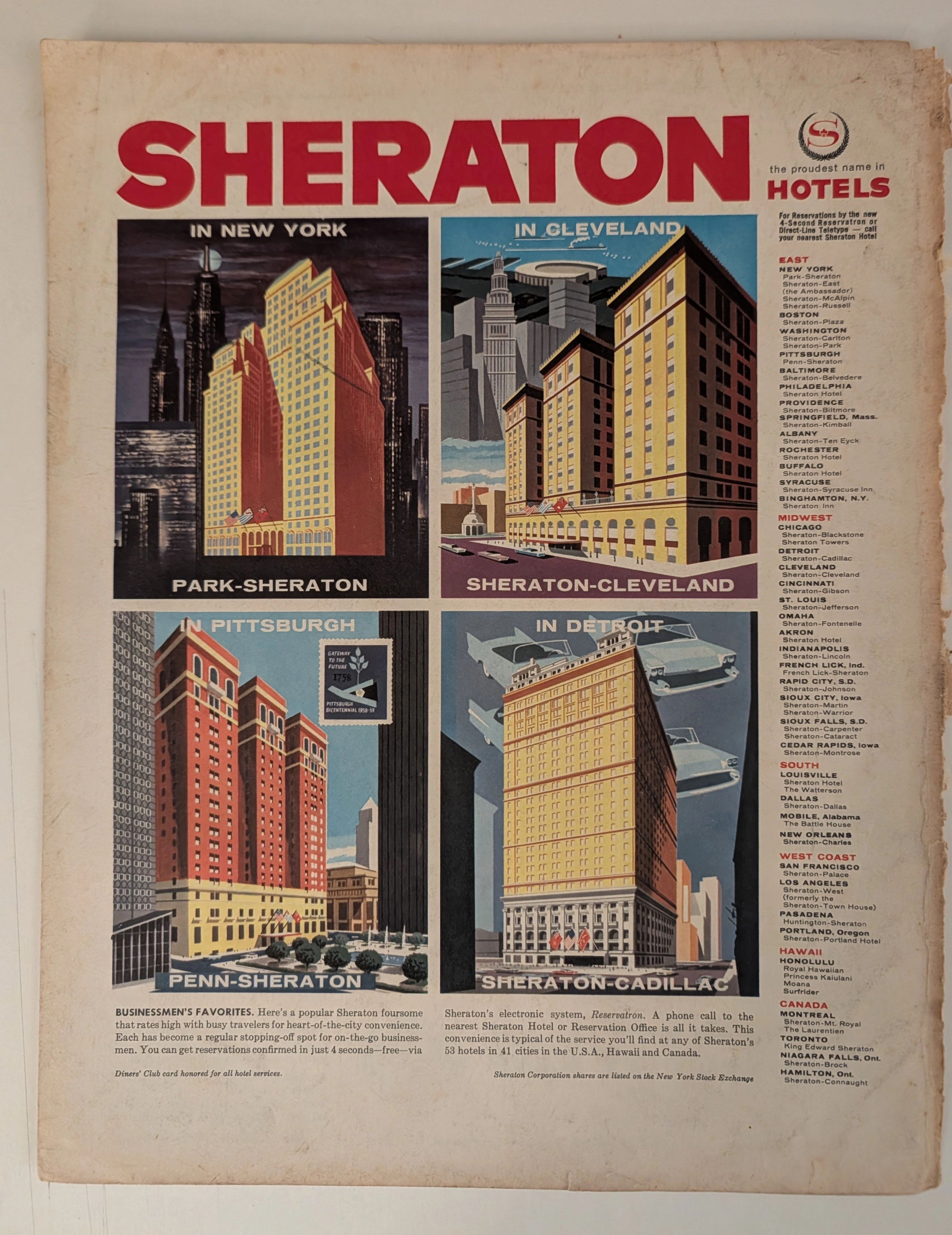
在详尽而严谨的博物馆级分析之下,这件非凡的“历史遗物”保存完好,其源头可追溯至战后美国经济腾飞的绝对巅峰时期。这份“原始艺术文献”是一幅宏大而具有里程碑意义的Sheraton Hotels酒店帝国的整版广告,通过作品中明确描绘的Pittsburgh Bicentennial (1758-1958) 邮票,经鉴定其年代约为1958年至1959年。 这份文献不仅仅是一则旅行广告;它更是一份深刻的“美国企业崛起社会学蓝图”。画面以Sheraton旗下四家旗舰酒店——New York、Cleveland、Pittsburgh和Detroit——高度风格化的建筑插画为视觉核心,捕捉了那个时代无拘无束的乐观精神。每一幅画面都是中世纪商业插画的杰作,尤其是Detroit画面中那些飘逸、浮动的尾翼汽车,象征着“汽车城”的统治地位。 此外,这件文物记录了全球商业史上的关键里程碑。它自豪地宣传接受Diners' Club卡,标志着现代信用卡时代的革命性黎明。它还夸耀Sheraton的“Reservatron”电子系统——这是酒店业中最早的商业计算应用之一——并自豪地宣称其已在New York Stock Exchange上市。 这份从一本被遗忘的厚重期刊装帧中抢救出来的2000年前模拟文物,是日本“侘寂”美学不可磨灭的证明。它印刷在本质上呈酸性的木浆纸上,展现出一种优美而粗犷的锯齿状右边缘,以及表面深邃、温暖的琥珀色氧化。这种宏伟、不可阻挡的化学降解,将一件大规模生产的企业宣传品,转化为一份无可替代、可供装裱的、记录中世纪建筑与经济历史的“原始艺术文献”。
Coca-Cola · Beverage
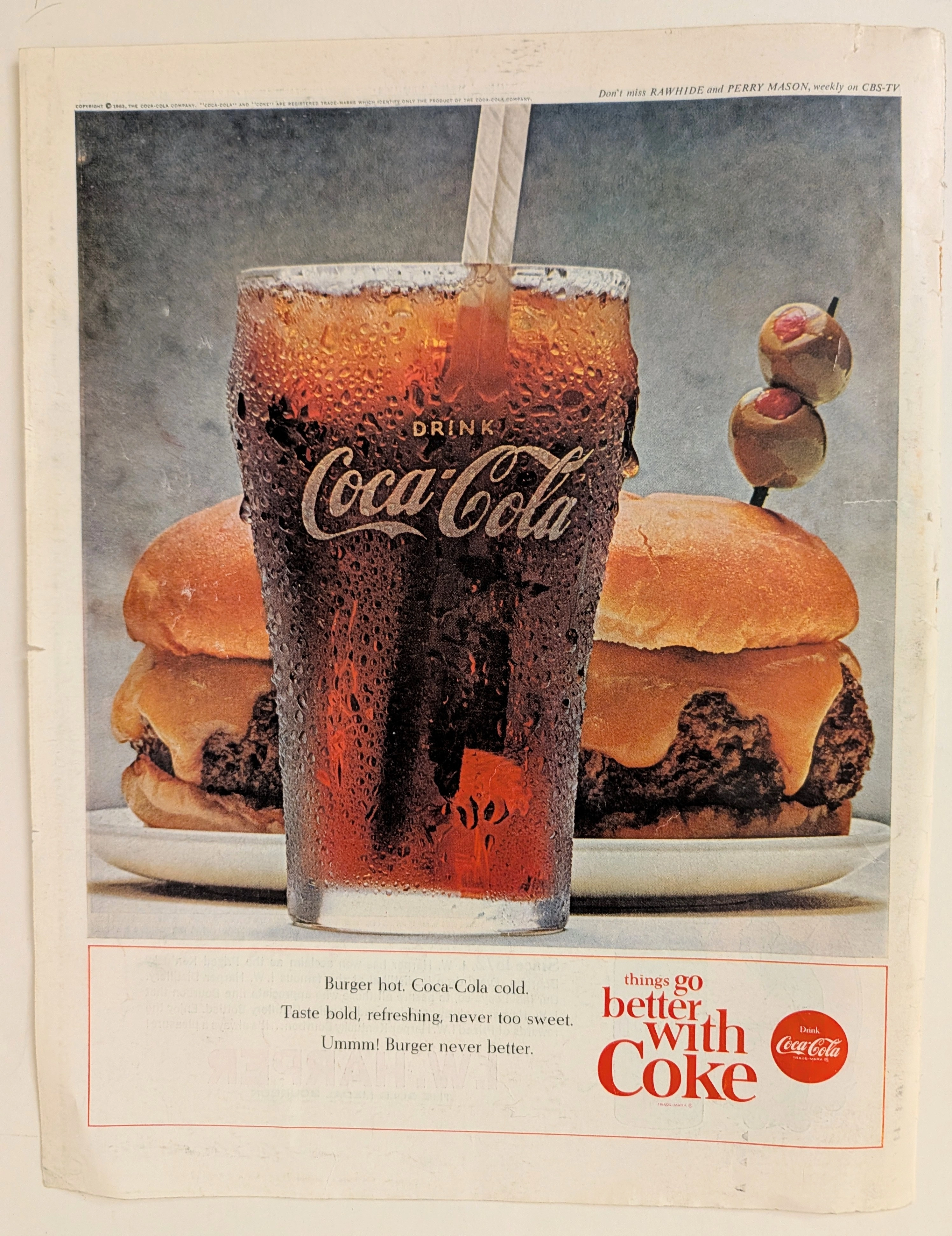
时间旅行者的档案:可口可乐 1963 - 全渠道营销的时代转变
过去,饮料仅仅是一种独立的解渴良药。 如今,它已然化作驱动人类体验的操作系统。 时值1963年。这件遗物不过是一张脆弱的杂志书页,却承载着沉重的心理学锚点。 在这个时代之前,消费在很大程度上是一种孤立的行为。你为了补充水分而饮用。你为了生存而进食。 而在此处,我们见证了“情境化消费”(Contextual consumption)在工业层面的诞生。 汉堡渴求着可乐。 夜晚渴求着电视屏幕。 这是一个被完美设计的、人为制造欲望的闭环系统。 这份文献不仅仅是在推销一种加了香料的碳酸水。 它所兜售的,是对现实世界本身的刻意强化。 二十世纪中叶,品牌面临的难题是如何确立“无处不在”(Omnipresence)的绝对地位。 而印在这张半色调网点纸上的解决方案,便是将产品与现代美国生活中所有其他令人愉悦的层面,死死地捆绑在一起。
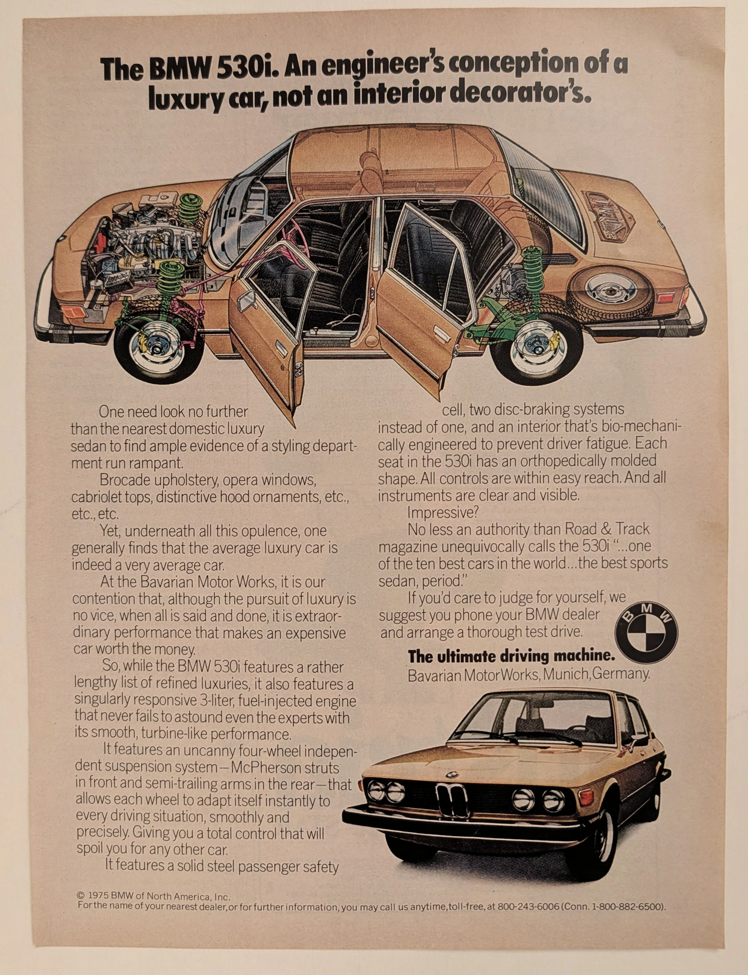
The Time Traveller's Dossier: 工程师的宣言 (The Engineer's Manifesto) – 1975 款 BMW 530i 与“终极驾驶机器 (The Ultimate Driving Machine)”的诞生
20 世纪下半叶美国汽车版图的演变,在 70 年代被猛烈地颠覆了。那是一个由石油禁运、不断变化的经济现实以及消费者对国产制造业日益增长的幻灭感所共同定义的动荡时代。今日,优雅且极其安全地陈列于 The Record Institute 分析台上的,是一份视觉极其复杂、信息密度极高且意义非凡的 BMW 530i 全版印刷广告,通过其醒目的版权微距图像,可将其确切年份追溯至 1975 年。这份文件完全超越了汽车营销的标准与实用边界。它作为一个高度复杂、多维度的文化镜像,更是对这十年间占据主导地位的汽车工业趋势下达的一封大胆战书。通过将美国式奢华的肤浅诱惑——“织锦内饰 (brocade upholstery)、剧院式车窗 (opera windows)、敞篷车顶 (cabriolet tops)”——与独立悬挂和燃油喷射系统那种发自肺腑的机械真理进行强烈并置,巴伐利亚发动机制造厂 (BMW) 成功地将自己定位为对抗那些臃肿的“萎靡时代 (Malaise Era)”陆地游艇的终极知识与物理双重解药。 这份世界级水准的综合卷宗将在最为严苛、毫不妥协的史学、社会学与材料科学评估参数下,对这件文献进行极其详尽且冷峻的解剖。我们将绝大部分的分析焦点 (80%) 倾注于其巨大的历史引力上,深度破译文案中蕴含的绝妙且充满对抗性的营销心理学,剖析 E12 底盘 5 系那极其深邃的机械现实,并详细阐述打造这场战役的先驱者们所留下的历史印记。此外,当我们深入探究这种模拟印刷文献的化学与物理基础时 (10%),我们将揭示在 BMW 蓝天白云圆标与技术透视插图的惊人微距图像中捕捉到的 CMYK 半色调网点 (Halftone rosettes) 的精确机械指纹。最后,我们将评估其档案稀缺性 (10%),探索纸张基材优雅且自然的氧化是如何孕育出一种宁静的 侘寂 (Wabi-sabi) 美学的——这一自然、不可逆转的现象,正是全球顶级复古商业史料与汽车遗产档案收藏圈中 呈指数级推高其市场价值 的核心引擎。