The Time Traveller's Dossier : 1935 Japan Trade Map - The Economics of Empire
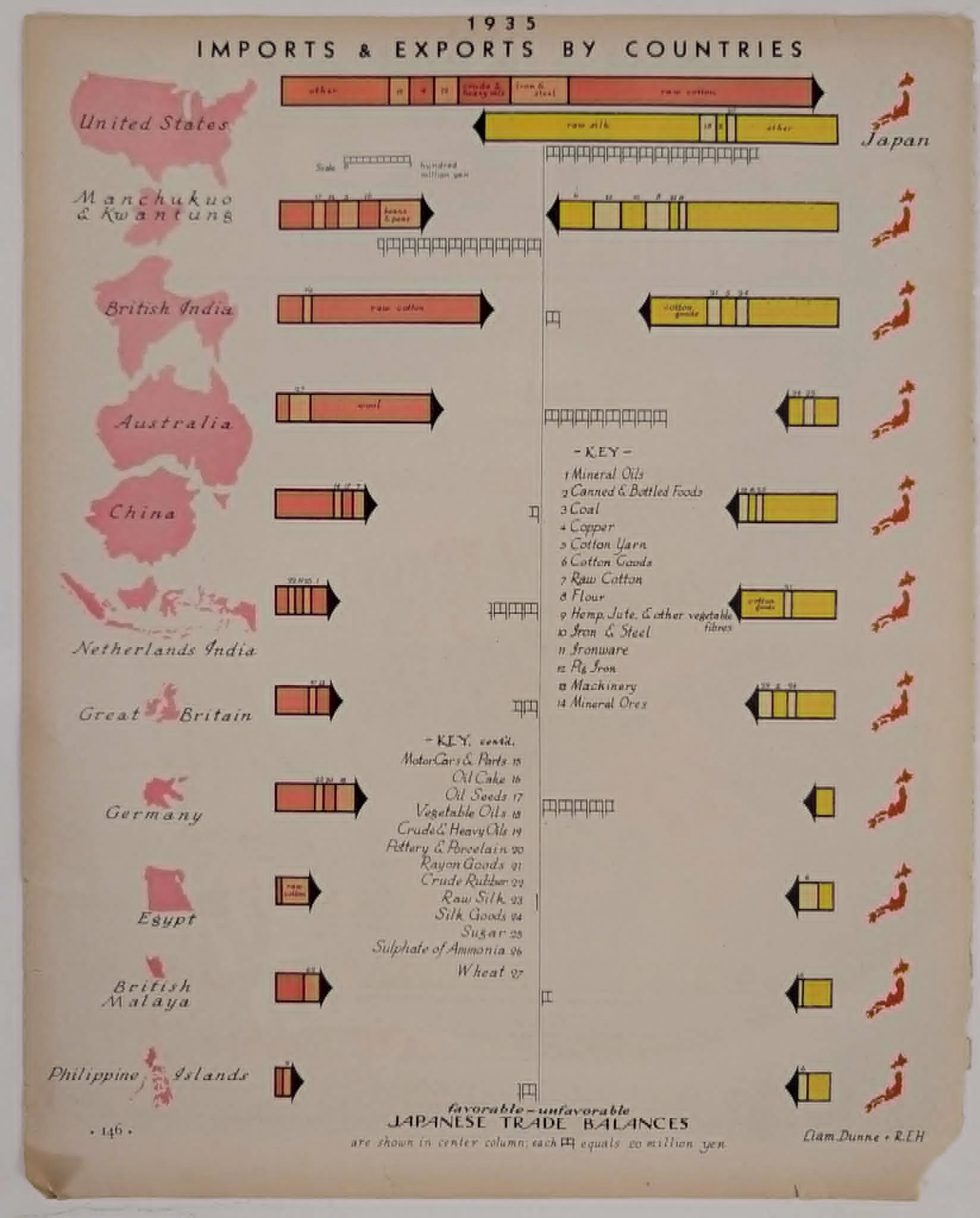
The year is 1935. The world is fracturing. The illusion of post-war stability has shattered. Global trade is no longer a system of mutual benefit. It is a zero-sum game of survival. Then, maps depicted geography. They showed the rigid borders of nation-states. They displayed mountain ranges, rivers, and the political lines drawn by diplomats in quiet rooms. They mapped the earth, but they did not map the pulse of the nations that occupied it. Now, in the context of this artifact, a profound shift in cartography and communication is realized. This is not a map of land. It is a map of blood. It is the vascular system of an industrializing empire. It visualizes the raw dependencies of the Japanese war machine and the civilian economy. It charts the inward flow of crude oil, scrap iron, and raw cotton. It charts the outward hemorrhage of raw silk and cheap textiles. This artifact captures the exact moment data visualization became a geopolitical autopsy. It proves that the impending global conflict was not born of sudden ideology. It was a mathematical inevitability, written in the ledgers of imports and exports.
Category: Other
The History
The Anatomy of Isolation To understand this document, one must stand in the year 1935. The Great Depression has laid waste to the global economy. The gold standard is collapsing. Nations are retreating behind massive tariff walls. Protectionism is the new global doctrine. The British Empire has enacted the Ottawa Agreements, prioritizing trade within its own colonies and dominions. The United States has passed the Smoot-Hawley Tariff. Japan finds itself geographically isolated and economically besieged. It is an island nation devoid of the raw materials required for modern heavy industry. It has no significant domestic reserves of oil. It lacks iron ore. It lacks rubber. It lacks the vast acreage needed to grow cotton. Yet, it possesses a rapidly expanding, highly disciplined workforce and a military apparatus nursing boundless imperial ambitions. This chart, published in an era of elite business journalism, strips away political rhetoric. It presents the raw, terrifying mathematics of dependency. It shows a nation that must export to survive, and must import to arm itself. It is a visual representation of a trapped tiger, pacing the confines of its resource limitations. The American Chokehold Examine the uppermost bar. The United States. The visual weight of this specific data point is staggering. The arrows are massive, dominating the page. This is the central narrative of the coming Pacific War, rendered in red and yellow ink six years before the attack on Pearl Harbor. Observe the flow. From the United States to Japan: A massive, uninterrupted block of red. The key details the lifeblood. "Raw cotton." "Crude & heavy oils." "Iron & steel." These are not luxury goods. These are the fundamental building blocks of an industrialized military state. The cotton feeds the textile mills of Osaka. The oil fuels the Imperial Japanese Navy. The scrap iron is melted down to forge the armor of zero fighters and battleships. Japan's military expansion on the Asian mainland is entirely underwritten by American raw materials. Now, observe the return flow. From Japan to the United States: A long, slender yellow arrow. What pays for the steel and the oil? "Raw silk." The Japanese economy is precariously balanced on the backs of rural silk farmers. It is a fragile, asymmetrical relationship. Japan is exchanging luxury textiles for the hard currency required to buy weapons-grade resources. The historical shift is laid bare. The United States holds the leash. This chart visualizes the precise mechanism that will trigger World War II in the Pacific. When the United States eventually imposes an embargo on oil and scrap iron in 1941, the massive red arrow at the top of this page will be severed. Japan, facing industrial and military starvation, will calculate that war is the only mathematical solution to a blocked artery. The Architecture of the Co-Prosperity Sphere Look below the United States. Look at the architecture of the rising empire. Manchukuo & Kwantung. This is the puppet state established by Japan in 1932 after the invasion of Manchuria. It was condemned by the League of Nations, leading to Japan's withdrawal. Why did they invade? The chart answers with clinical precision. The imports from Manchukuo: "Beans & peas." "Coal." This is the classic colonial extraction model. Japan needed agricultural land to feed its growing population and coal to fire its blast furnaces. Manchukuo was not a political liberation; it was a resource acquisition, clearly accounted for in this ledger. Move further down the page. British India. Australia. Netherlands India (modern-day Indonesia). From India: Raw cotton. From Australia: Wool. From Netherlands India: Mineral oils and rubber. These arrows point to the future targets of the Imperial Japanese Armed Forces. This chart is a blueprint for the "Greater East Asia Co-Prosperity Sphere." It demonstrates the strategic necessity of conquering Southeast Asia. To sever the reliance on the United States, Japan must secure the rubber of Malaya, the oil of the Dutch East Indies, and the resources of the British imperial holdings. The military campaigns of 1941 and 1942 were simply an attempt to redraw these very arrows, changing the suppliers from trading partners to conquered territories. The Friction of Textiles The chart also maps economic friction, particularly with Great Britain and its colonies. Look at the exports to British India and Great Britain. The yellow arrows pointing away from Japan denote "Cotton goods," "Rayon goods," and "Silk goods." Throughout the 1930s, Japan's highly efficient textile industry was flooding global markets with cheap, high-quality fabrics. They were systematically undercutting the textile mills of Lancashire, England. This caused immense diplomatic tension. Britain and its colonies responded with quotas and tariffs against Japanese goods. The chart visualizes this tension. Japan imports raw cotton from India, processes it with cheap labor, and exports finished cotton goods back, destroying local industries. It is an aggressive, mercantilist cycle. The "favorable-unfavorable" balance line in the center of the page is a seismograph of these trade wars. The Engineering of Information Beyond the geopolitical horror, this artifact represents a monumental shift in the engineering of information. In 1935, data visualization was in its infancy. Complex macroeconomic data was typically buried in impenetrable government white papers, rows of sterile numbers that obscured the larger truth. The artists here, Liam Dunne and R.E.H., applied architectural principles to economics. They utilized a system heavily influenced by the Isotype movement (International System of Typographic Picture Education) pioneered by Otto Neurath. The goal was universal comprehension. They discarded traditional bar graphs. Instead, they used the geography of the page. The countries are reduced to stark, red silhouettes. They are geographically dislocated, arranged purely by trade volume. The United States is at the top, towering over the others, establishing the hierarchy of dependency. The central spine is the balance. The "Yen" symbol anchors the center. The arrows are dynamic. They do not just show volume; they show velocity. They penetrate the central line. They resemble military chevron formations. This is the weaponization of data. It forces the viewer to confront the precarious, unbalanced nature of the Japanese economy without reading a single paragraph of text.
The Paper
The physical medium is a heavy, uncoated matte paper, characteristic of premium editorial inserts from the mid-1930s. It was designed to absorb and hold solid blocks of ink without bleeding, ensuring the razor-sharp edges of the graphic design remained pristine. The printing method is a high-fidelity lithographic process. Observe the colors. This is not a modern CMYK composite. The reds and yellows are distinct spot colors, mixed specifically for this run. The red is deep, almost the color of dried clay, evoking both the rising sun and a sense of warning. The yellow is muted, industrial. The ink sits heavily on the surface, creating a subtle tactile ridge. Decades of exposure have introduced mild oxidation, warming the white background into a soft parchment tone, turning the data into an undeniable historical relic.
The Rarity
Classification: Class S. Contextual Value: Supreme. Vintage maps are common. Vintage economic charts are rare. But a beautifully preserved, masterfully designed data visualization that perfectly predicts and explains the macroeconomic causes of the Pacific War is an archival treasure. Its value lies in its chilling objectivity. It is not propaganda. It is an accounting sheet from the eve of destruction. Finding pre-war artifacts that visualize the structural dependencies of the Axis powers with such elegant clarity is exceptionally difficult.
Cite this article
- MLA
- Naodhinsuk, Ronin. “The Time Traveller's Dossier : 1935 Japan Trade Map - The Economics of Empire.” The Record Institute, 26 May 2026, https://therecord.institute/journal/the-time-travellers-dossier-1935-japan-trade-map-the-economics-of-empire.
- APA
- Naodhinsuk, R. (2026, May 26). The Time Traveller's Dossier : 1935 Japan Trade Map - The Economics of Empire. The Record Institute. https://therecord.institute/journal/the-time-travellers-dossier-1935-japan-trade-map-the-economics-of-empire
- CHICAGO
- Naodhinsuk, Ronin. 2026. “The Time Traveller's Dossier : 1935 Japan Trade Map - The Economics of Empire.” The Record Institute, May 26, 2026. https://therecord.institute/journal/the-time-travellers-dossier-1935-japan-trade-map-the-economics-of-empire.