The Time Traveller's Dossier : Apollo Decals - The Branding of Orbit
Before this artifact existed, space was a mathematical abstract. It was a domain of invisible telemetry. It was a theater of Cold War paranoia, understood only by elite physicists and military strategists. Then, the paradigm shifted. Space exploration required a visual identity. It needed to be consumed, understood, and championed by the masses. These Apollo Flight Decals are not mere stickers. They are the modern heraldry of the 20th century. They mark the exact historical moment when humanity commodified the cosmos, turning orbital mechanics into consumer iconography.
Category: Technology
Brand: NASA
The History
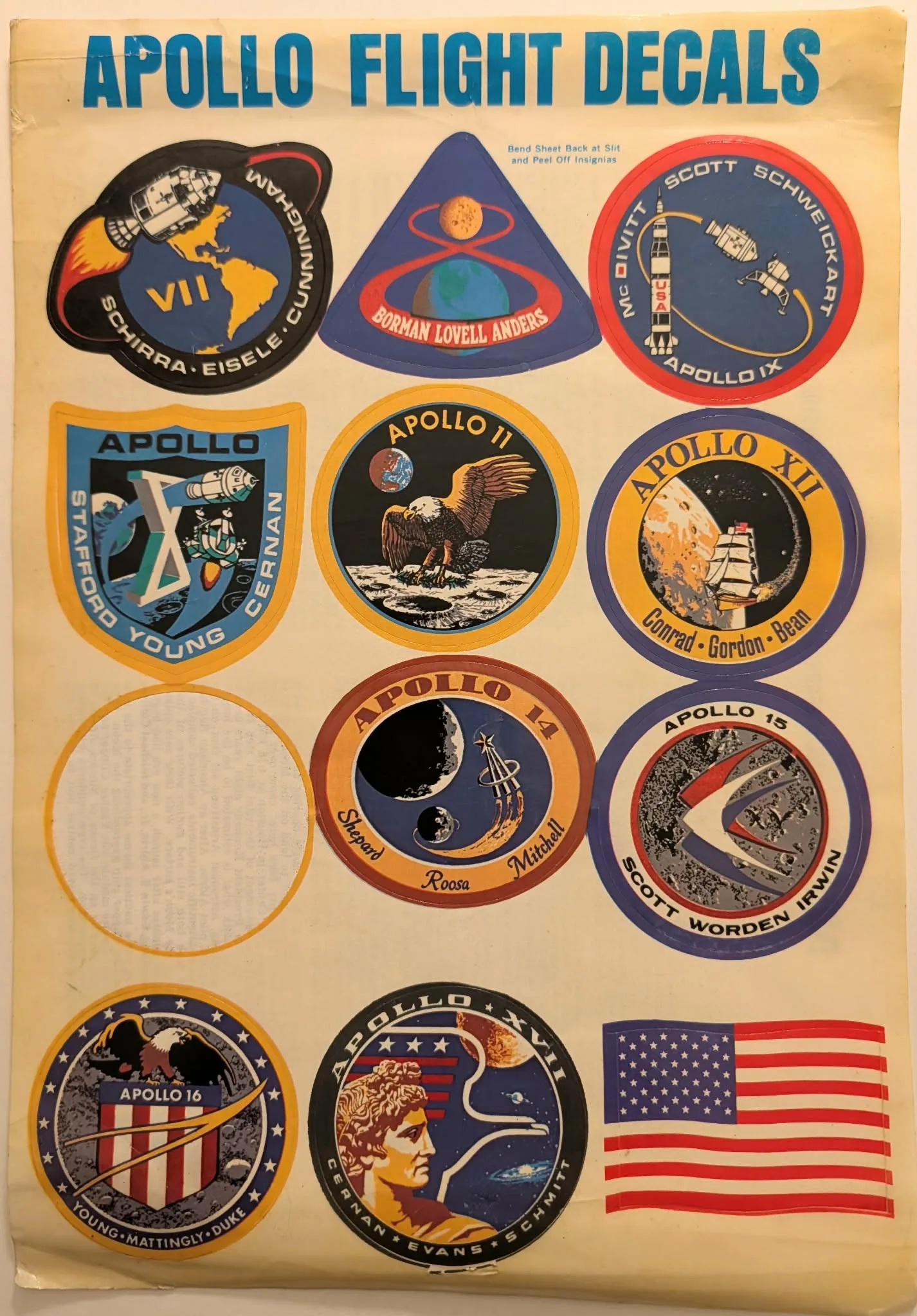
The Context of the Cosmos: The Ideological Battleground To understand the profound weight of this printed sheet, one must first isolate the precise temporal and geopolitical coordinates of its creation. The mid-20th century was defined by an ideological struggle that threatened the total annihilation of the species. The Cold War was fundamentally a war of perception. The Soviet Union and the United States were locked in a desperate race to prove the superiority of their respective socioeconomic systems. Space was the ultimate high ground. It was the absolute zenith of human capability. Whichever nation could conquer the void would inherently command the future. However, launching monolithic rockets into the abyss was an endeavor that required unprecedented, staggering amounts of capital. The National Aeronautics and Space Administration (NASA) was draining a massive percentage of the federal budget. To sustain this astronomical expenditure, NASA needed the unwavering support of the American taxpayer. They could not simply rely on cold data, delta-v calculations, and sterile engineering reports. They needed a narrative. They needed to translate the terrifying, lethal reality of spaceflight into an accessible, heroic, and distinctly American mythology. This artifact is the physical manifestation of that translation. It represents the shift from military secrecy to public relations. It is the brilliant realization that to win the space race, one must first win the branding war. The Heraldry of the Void: Modern Crests Historically, heraldry was used to identify knights on the battlefield. Coats of arms communicated allegiance, history, and purpose through a strict visual language of symbols and colors. NASA adopted this ancient psychological tool and applied it to the most advanced technology in human history. The "mission patch" became the coat of arms for the orbital age. This sheet of Apollo Flight Decals is a complete catalog of this new heraldry. It was designed for the public. It was designed for children to apply to their school binders, for mechanics to stick on their toolboxes, and for citizens to proudly display on their car bumpers. By transforming the missions into consumable, adhesive graphics, NASA democratized the cosmos. They allowed the average citizen to claim a tiny, physical piece of the lunar landing. The decals bridged the impossible gap between the suburban living room and the Sea of Tranquility. The Anatomy of the Patches: Apollo 7 through 12 The reverse side of this artifact provides a staggering amount of textual context, acting as a Rosetta Stone for the visual symbols on the front. It begins with Apollo 7, noting that the patch shows the command and service module passing over the Western Hemisphere. This was a critical mission, the first manned Apollo flight, which performed flawlessly through more than 780 hours in orbit. The Apollo 8 patch is a masterpiece of graphic brevity, symbolizing the flight's unique feature with a figure "8" encompassing both the Earth and the Moon. The text reminds us of the profound historical weight of this mission: men flew to another body in the solar system, accomplishing ten lunar orbits. Apollo 9 exemplifies the major objectives of testing the lunar module in space, showcasing the complete Saturn V/Apollo complex. Following this, Apollo 10 served as the ultimate dress rehearsal, with its patch showing the lunar module sweeping low over the lunar surface while the command module monitors from above. Then, the pinnacle of the era: Apollo 11. The text on the back explicitly states that the eagle bearing an olive branch is the universal symbol of peace, about to land on the Moon's surface. It recounts the exact moment at 4:18 PM (EDT) on July 20, 1969, when the phrase "Houston, Tranquility Base here" signaled the achievement of the national goal set by President Kennedy. The Apollo 12 patch follows, carrying a nautical theme with a Yankee Clipper ship approaching the Moon, an appropriate nod to the all-Navy crew. The Missing Thirteen: A Poetic Void Perhaps the most philosophically profound aspect of this specific physical artifact is what is absent from it. On the front sheet, in the third row on the left side, there is a blank, white, circular void. The decal for Apollo 13 has been peeled away and removed by a previous owner. Yet, the ghost of the mission remains entirely documented on the reverse side. The text describes how the Apollo 13 patch design derives from the myth of Apollo, featuring three horses pulling the Sun chariot from Earth to the Moon. It translates the Latin phrase "Ex Luna, Scientia" as "From the Moon, Knowledge". The text coldly outlines the near-fatal disaster: a service module oxygen tank ruptured, forcing an abort of the mission. It then details the brilliant improvisation by the crew and the Houston support team, which enabled the use of the lunar module as a lifeboat. The physical absence of this decal on the front transforms this mass-produced consumer item into a poignant historical metaphor. The mission that failed to land on the moon is the very emblem that is missing from this collection. The Culmination of an Era: Apollo 14 through 17 The narrative continues, chronicling the final stages of the lunar program. Apollo 14 features an astronaut lapel pin approaching the Moon, symbolizing the flight path from Earth toward a touchdown in the Fra Mauro area. Apollo 15 breaks tradition; its patch does not depict flight hardware, but instead utilizes three symbols of flight over a concept of the Hadley-Apennine landing site. The Flight Emblem for Apollo 16 shows a lunar surface surrounded by a circular array of 16 stars, with a symbolic American Eagle perched atop a red, white, and blue striped shield. Finally, the text describes the Apollo 17 emblem, dominated by the image of Apollo, the Greek sun god, suspended behind an American eagle, with three stars symbolizing the three astronauts against a background of deep blue space, the planet Saturn, and a spiral galaxy. This final description reads like an epitaph for the golden age of human exploration. It was the last time humans would travel beyond low Earth orbit. The Societal Shift: Normalizing the Impossible The ultimate historical shift represented by these decals is the absolute normalization of the impossible. In less than a decade, humanity went from gazing at the moon in untouchable wonder, to landing upon it, and finally, to printing its commemorative graphics on peel-and-stick paper. This sheet of decals is evidence that spaceflight had successfully transitioned from the realm of science fiction into the everyday reality of American consumer culture. The public had bought the narrative. The branding exercise was an unmitigated, spectacular success.
The Paper
The physical substrate of this artifact is a fascinating testament to mid-20th-century commercial printing capabilities. It consists of a standard coated paper stock fused to a waxy release liner, engineered specifically for mass-produced, peel-away decals. The printing process relies on standard offset lithography utilizing a CMYK halftone separation. You can observe the mechanical precision of the era in the tight registration of the solid ink fields, despite the slight bleeding typical of vintage commercial presses. Time has interacted chemically with this document. The backing paper exhibits a distinct aged paper texture, characterized by a warm, oxidized yellowing. The physical interaction with the artifact—the peeling away of the Apollo 13 and Apollo 10 decals—leaves behind stark, tactile circular impressions on the substrate. Today, the distinct, tactile quality of this aged paper texture and the specific mechanical limitations of the vintage printing process are meticulously studied. These physical characteristics serve as vital, authentic references for 2D animation techniques that seek to perfectly emulate mid-20th-century aesthetics, grounding digital recreations in a tangible, historical reality.
The Rarity
Classification: Class B. While millions of Apollo-themed decals and consumer goods were printed during the height of the space race in the late 1960s and early 1970s, intact sheets that retain both their original layout and the extensive textual context on the reverse side are becoming increasingly scarce. The true rarity of this artifact does not lie in its monetary auction-house value, but rather in its immense contextual value. The specific combination of the missing Apollo 13 decal on the front, contrasted with its surviving harrowing narrative on the back, elevates this from a piece of vintage ephemera to a poignant, interactive historical document.
Cite this article
- MLA
- Naodhinsuk, Ronin. “The Time Traveller's Dossier : Apollo Decals - The Branding of Orbit.” The Record Institute, 4 August 2026, https://therecord.institute/journal/the-time-travellers-dossier-apollo-decals-the-branding-of-orbit.
- APA
- Naodhinsuk, R. (2026, August 4). The Time Traveller's Dossier : Apollo Decals - The Branding of Orbit. The Record Institute. https://therecord.institute/journal/the-time-travellers-dossier-apollo-decals-the-branding-of-orbit
- CHICAGO
- Naodhinsuk, Ronin. 2026. “The Time Traveller's Dossier : Apollo Decals - The Branding of Orbit.” The Record Institute, August 4, 2026. https://therecord.institute/journal/the-time-travellers-dossier-apollo-decals-the-branding-of-orbit.