The Time Traveller's Dossier: Coca-Cola & The "Sprite Boy" - The Carbonated Utopia of Post-War America
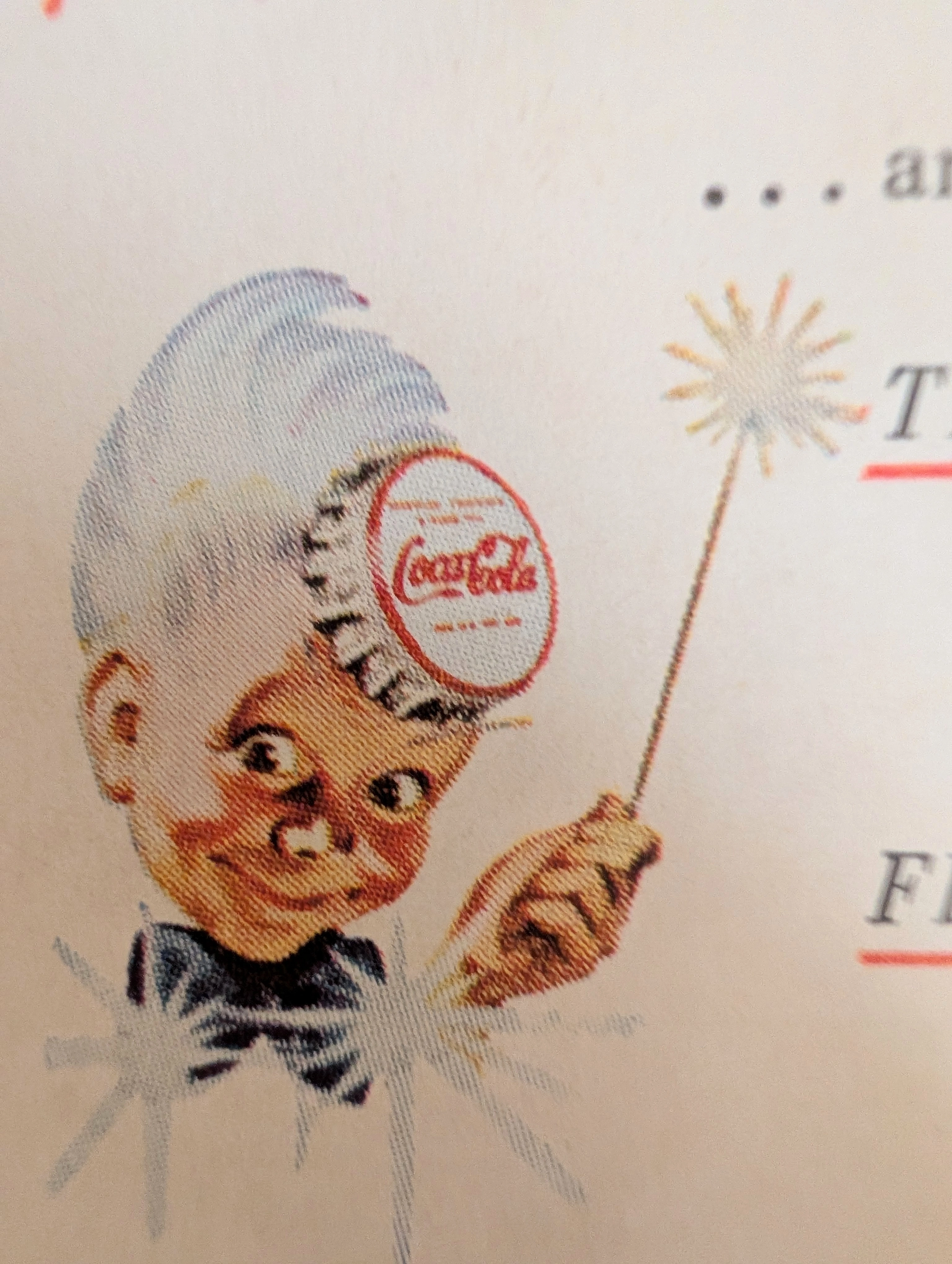
Then, a beverage was simply a flavored liquid used to quench thirst. In 1950s America, it was packaged as a scientifically formulated "lift," a socially sanctioned psychological "pause" in the roaring machinery of the post-war economy. This artifact is a portal. It transports us back to the mid-1950s, an era defined by blind optimism, explosive mass consumerism, and the absolute dawn of television media. Here, we encounter a now-forgotten phantom of pop culture: the Coca-Cola "Sprite Boy." It is a vintage print advertisement, yes. But deeper than that, it is an early blueprint for cross-media corporate synergy. It perfectly captures how Coca-Cola weaponized the sensory metaphors of print (sparks, energy, tang) to herd consumers toward a nascent media format: the corporately sponsored television program. It documents how a carbonated syrup inextricably bound itself to the leisure time of the American middle class.
Category: Beverage
Brand: Coca-Cola
The History
The Forgotten Phantom: The Truth of the "Sprite Boy" The most striking visual element of this artifact is the silver-haired elf wearing a Coca-Cola bottle cap as a hat. To a modern reader, this causes immediate cognitive dissonance. This character was officially known as the "Sprite Boy," yet he has absolutely nothing to do with the lemon-lime soda "Sprite," which the Coca-Cola Company would not introduce until 1961. The Sprite Boy was created in the early 1940s by the legendary illustrator Haddon Sundblom—the exact same artist who painted the modern, jolly, red-and-white version of Santa Claus for Coca-Cola. The Sprite Boy was conceived as a physical personification of the drink's effervescence—a literal "sprite" or elf of carbonation. Furthermore, his primary mission in the 1940s was to give a friendly face to the nickname "Coke," a moniker the company had fiercely resisted for decades before finally capitulating to the public's slang. By the time this ad was printed in the mid-1950s, his mischievous, slightly uncanny face was a familiar staple of American grocery store aisles. The Lexicon of Engineered Energy Examine the meticulously crafted copywriting next to the sparkler. The text demands that the consumer TASTE and FEEL the product, underlining these sensory verbs in aggressive red ink. It promises an "extra-bright tang" and a "fresh little lift that comes through in seconds." This is not the language of mere refreshment; this is the lexicon of engineered, chemical energy. In the booming post-war economy, American workers and homemakers were expected to operate at peak efficiency. Coca-Cola positioned its product—a potent delivery system for sugar and caffeine—as a necessary, almost medicinal boost. It wasn't just a treat; it was a "lift" required to sustain the relentless pace of 1950s domestic and industrial productivity. The Ultimate Mantra: "The Pause That Refreshes" Sitting quietly below the energetic copy is perhaps one of the most successful psychological slogans in advertising history: "The Pause That Refreshes." Coined much earlier in 1929, it found its ultimate cultural resonance in the 1950s. The phrase cleverly reframed the act of drinking a soda. It wasn't an indulgence or a waste of time; it was a sanctioned, restorative "pause." It suggested that to be productive, one must briefly stop, consume the product, and return to the capitalist machine revitalized. It branded the very concept of free time. The Dawn of Media Synergy: "Coke Time" The sentence at the very bottom of the artifact is perhaps its most historically significant element: "See Eddie Fisher on 'Coke Time' — NBC Television twice each week." This is a masterclass in cross-media pollination. Coke Time with Eddie Fisher was a highly popular musical variety show that ran on NBC from 1953 to 1957. Coca-Cola wasn't just buying ad space during the show; they owned the show. This print artifact demonstrates how corporations used traditional media (magazines) to command audiences to engage with new media (television), creating a closed-loop ecosystem of brand loyalty. The consumer was told to buy the drink at the store, read about the drink in their magazine, and drink the drink while watching the drink's television show. It was total cultural saturation.
The Paper
This artifact is a classic example of mid-century mass-market magazine stock. The paper is likely a lightweight, uncoated or lightly machine-coated offset sheet. Due to its age, the cellulose fibers have begun to oxidize, resulting in a warm, creamy off-white patina. The printing technique is high-volume offset lithography. When viewed under magnification, the rosy flush of the Sprite Boy’s cheeks and the gradient of his silver hair dissolve into a distinct, overlapping pattern of microscopic CMYK halftone dots (the rosette pattern). The registration—the alignment of these colored ink plates—is remarkably precise for the era, a testament to the high production values demanded by a corporate titan like Coca-Cola.
The Rarity
Classification: Class C (Cultural Ephemera - High Contextual Value) Print advertisements for Coca-Cola from the 1950s were produced by the millions, making them relatively common in the grand scheme of physical archives. However, discovering a clean, unblemished macro-crop that so perfectly encapsulates the intersection of the defunct "Sprite Boy" mascot and the promotion of early sponsored television ("Coke Time") elevates its contextual value. It serves as an excellent, highly legible primary source document for historians studying the evolution of multimedia marketing and mid-century consumer psychology.
Cite this article
- MLA
- Naodhinsuk, Ronin. “The Time Traveller's Dossier: Coca-Cola & The "Sprite Boy" - The Carbonated Utopia of Post-War America.” The Record Institute, 20 April 2026, https://therecord.institute/journal/the-time-travellers-dossier-coca-cola-the-sprite-boy-the-carbonated-utopia-of-post-war-america.
- APA
- Naodhinsuk, R. (2026, April 20). The Time Traveller's Dossier: Coca-Cola & The "Sprite Boy" - The Carbonated Utopia of Post-War America. The Record Institute. https://therecord.institute/journal/the-time-travellers-dossier-coca-cola-the-sprite-boy-the-carbonated-utopia-of-post-war-america
- CHICAGO
- Naodhinsuk, Ronin. 2026. “The Time Traveller's Dossier: Coca-Cola & The "Sprite Boy" - The Carbonated Utopia of Post-War America.” The Record Institute, April 20, 2026. https://therecord.institute/journal/the-time-travellers-dossier-coca-cola-the-sprite-boy-the-carbonated-utopia-of-post-war-america.