Tichnor Brothers and the Linen Postcard: America's Colour Postcard Empire
In a Boston Public Library file sit some 25,000 postcards that were never mailed. They are the office proofs of Tichnor Brothers, Inc., the Boston printing firm whose colour "linen" cards pictured nearly every vacation place in America between about 1930 and 1945 — large-letter greetings filled with landmarks, waterfalls and canyon rims in painted circles, and the motels and diners of the new highways, each card an advertisement its sender paid a cent to deliver. The file, kept by the firm itself and stamped OFFICE FILE, is the linen postcard's own portrait of its empire.
The History
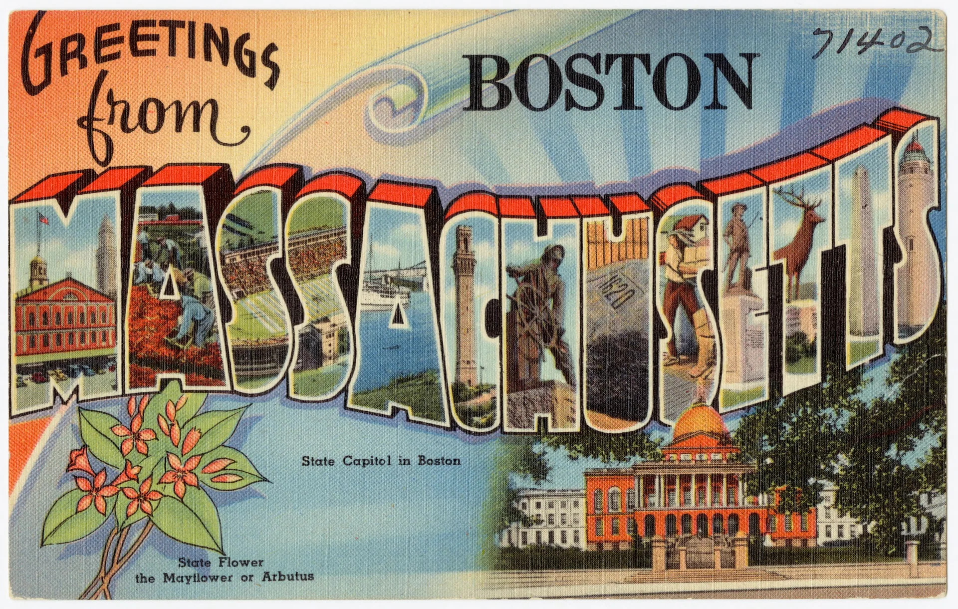
### An empire filed in a drawer The most complete portrait of America's linen postcard was never sold in a rack or dropped in a mailbox. It sits in Boston, in the keeping of the Boston Public Library: some 25,000 office proofs of the postcards published by Tichnor Brothers, Inc., the firm's own file copies of its work, kept flat and unhandled while their twins were being thumbed in drugstores from Maine to Arizona [S1]. Turn over the Boston card in this set and the reason for its perfect condition is stamped across the back in violet ink: OFFICE FILE. Down the spine of the same back runs the imprint the firm put on its era: "'Tichnor Quality Views' — Made only by Tichnor Bros., Inc., Boston, Mass." [S2] The Library dates the file's contents, as a whole, to about 1930–1945, and describes their concentration in a phrase that doubles as the firm's business plan: American vacation places [S1]. What Tichnor sold, town by town and highway by highway, was colour — and for fifteen years the standard American souvenir of anywhere was a small rectangle of it, three and a half by five and a half inches, printed in Boston. ### What "linen" means A linen postcard contains no linen. The word names the paper: a stock with a high rag content, embossed before printing with a fine crosshatch that imitates woven cloth, and then printed in colour by offset [S1][S2]. Hold any proof in this set up to the light of its scan and the weave is there, a fabric grain running through sky, water and brickwork alike. The texture was not nostalgia; it was engineering. The photographs behind most views were cheap black-and-white prints, and the embossed stock forgave them: it softened grain, hid retouching, and let flat, saturated colour do the persuading. A linen card could make a two-pump crossroads look like the capital of summer. It was also cheap to make and hard to wear out — a card built, like a good suitcase, for the road. ### The Boston firm and its Chicago rival Tichnor Brothers was founded by two brothers, Harry N. and Louis Tichnor, and the firm outlived them both in trade: it remained in business until 1987, and its archive — the office file itself — came to rest at the Boston Public Library [S4]. Even the firm's beginning refuses to settle: institutional sources give its founding variously as 1897, 1907, 1908 and 1912, and no founding document has been produced to decide between them, so the firm is dated here only by what its own cards can prove. From Boston it worked nationally, issuing its views under its own "Quality Views" imprint and picturing, state by state, a country that was learning to travel by car. Its great competitor stood in Chicago: Curt Teich & Co., the firm whose name defined the American linen era, and the standard against which Tichnor's cards were judged. The two firms watched each other the way rivals do; the historian Jeffrey Meikle, in his study of the Teich firm, records an occasion on which Teich's own managers wanted to copy a view from a Tichnor card [S3]. Between Boston and Chicago, the linen postcard became a national industry — and the surviving office file in Boston is the fullest single record of what that industry thought America looked like. ### Greetings from everywhere The file's most famous citizen is the large-letter card. In the Boston example — the card the Library itself uses as the collection's face — MASSACHUSETTS is spelled in letters a thumb high, and every letter is a window: Faneuil Hall, a cranberry bog at harvest, the Pilgrim Monument, Plymouth Rock, a minuteman, a lighthouse, each scene shrunk to fit its letterform, the State Capitol standing below like a signature [S2]. The large-letter format, which the firm produced from the later 1930s into the early 1950s [S4], compressed a whole state's sightseeing into a single glance — an advertisement for a place, readable across a rack. Other designs multiplied the view instead. The Niagara Falls and Grand Canyon cards set three circular scenes apiece — a general view, a sunset, a tower above the rim — like portholes onto wonders too large for one frame. And at the file's humblest end sits a Jersey Shore card of five beach vignettes that names no town at all: a stock design, printed with the firm's number 69431, ready to be sold to any resort that wanted its summer pictured [S2]. Every proof carries its job number, pencilled or printed at the edge — the empire keeping its own accounts. ### The roadside bought the advertising If the greetings cards advertised places, the file's second half advertised businesses, and here the economics of the linen card stand bare. A motel or diner commissioned its portrait from Boston; the portrait travelled home in a traveller's pocket and was mailed onward — by the customer, at the customer's expense. The Boston card's stamp box states the postage without embarrassment: "Place one cent stamp here" [S2]. For a cent, the travelling public distributed a business's advertising, with a personal message handwritten on the back to guarantee it was read. So the Frontier Motel, outside Omaha, prints its whole sales pitch on the picture's face: the AAA emblem, the highways to take ("#30A and #275"), the sign promising air conditioning and telephones, and a reservations line — "call collect Elkhorn #5771" [S2]. The Athens Motel in Alabama buys the standard dream instead: a red-brick court, a tall yellow sign, and more sky than Alabama strictly has. The Virginia Diner at Wakefield fits three businesses — diner, hotel, cottages — onto one card; Knoxville's Twin Diner is drawn as a streamline machine for lunch, its forecourt swept clean of every car and customer. None of these places needed the picture to be true. They needed it to be believed at a distance, in colour, for a cent. ### What the file remembers The mailed survivors of the linen era are legion, but they come home creased, cancelled and written over. The office file is the era as its maker filed it: unwritten, unposted, every view at its most persuasive, the whole national catalogue of longing preserved because a Boston firm kept one clean copy of everything it printed [S1]. After the war the linen texture gave way to the glossy photochrome — Tichnor's own later cards went out under the trade name Lusterchrome [S5] — and the crosshatched little rectangles became, almost overnight, antiques. They are antiques with an unusual afterlife. Because the Library catalogued the file item by item, each of these proofs can be read, and used, on its own record's terms [S2] — twenty-five thousand small arguments that the cheapest colour printing in America was also, for a while, its most widely travelled art. ### References / Sources [S1] Boston Public Library, "Tichnor Brothers Postcard Collection", collection description on Digital Commonwealth (collection record commonwealth:0p096w19r) — approximately 25,000 office proofs; Boston firm Tichnor Brothers Inc.; colour postcards with a linen texture, ca. 1930–1945; concentration on American vacation places. [S2] Digital Commonwealth item records for commonwealth:wh246s552, 6w924c650, 8g84n215x, xs55mj59t, 0p097559j, pr76ff35s, bz60cz997, kh04ds33j (catalogue data and rights fields), and the card images and versos read directly — including the "'Tichnor Quality Views' … Made only by Tichnor Bros., Inc., Boston, Mass." imprint, the OFFICE FILE stamp, and the one-cent stamp box on the Boston card. [S3] Meikle, Jeffrey L., *Postcard America: Curt Teich and the Imaging of a Nation, 1931–1950* (University of Texas Press, 2016) — the Teich–Tichnor rivalry, incl. p. 249. [S4] "Tichnor Brothers", reference summary drawing on Geographicus Rare Antique Maps ("Tichnor Brothers, Inc. (1908–1987)"), the Boston Globe obituary of Louis Tichnor (6 November 1974), and "Tichnor Bros. Large Letter Linens 1936–1952" — founding brothers; firm in business until 1987; large-letter date range. (Founding-year claims in these sources conflict and are not used; see the package's FACTS file.) [S5] Postcard Origins, "Tichnor Brothers: dating & marks" — Lusterchrome trade name for the firm's photochrome cards.
Cite this article
- MLA
- Naodhinsuk, Ronin. “Tichnor Brothers and the Linen Postcard: America's Colour Postcard Empire.” The Record Institute, 11 November 2026, https://therecord.institute/journal/tichnor-brothers-and-the-linen-postcard-americas-colour-postcard-empire.
- APA
- Naodhinsuk, R. (2026, November 11). Tichnor Brothers and the Linen Postcard: America's Colour Postcard Empire. The Record Institute. https://therecord.institute/journal/tichnor-brothers-and-the-linen-postcard-americas-colour-postcard-empire
- CHICAGO
- Naodhinsuk, Ronin. 2026. “Tichnor Brothers and the Linen Postcard: America's Colour Postcard Empire.” The Record Institute, November 11, 2026. https://therecord.institute/journal/tichnor-brothers-and-the-linen-postcard-americas-colour-postcard-empire.