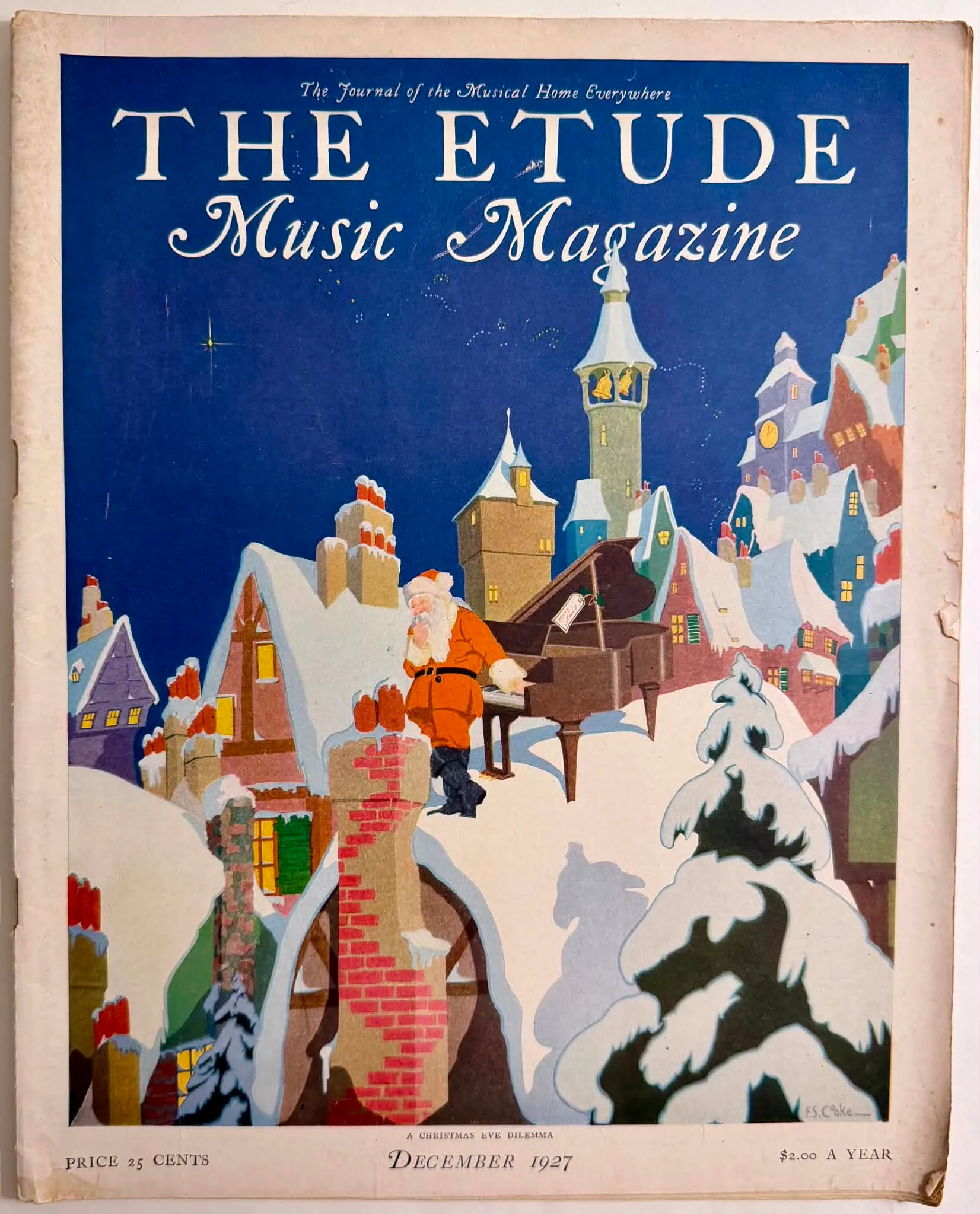
1927 F.S. Cooke A Christmas Eve Dilemma Etude Magazine Cover Art
The primary artifact under examination is a printed magazine cover presenting a stylized nighttime winter scene. At the center foreground, a figure universally identifiable as Santa Claus—clad in a traditional red suit with white trim and a black belt—stands atop a snow-laden rooftop. He adopts a posture of contemplative perplexity, his left hand resting on the keys of a grand piano positioned incongruously on the sloped roof, while his right hand rubs his chin. The grand piano features a visible tag reading "Merry Xmas." The background details a dense, steeply pitched European-style village or town, with warm yellow light emanating from various windows, all set against a deep, vibrant blue night sky dotted with faint, stylized stars. The typographic hierarchy is dominated by the masthead "THE ETUDE" in a large, serif, classical Roman typeface, subtitled "Music Magazine" in an elegant, flowing script. Above the masthead, a smaller italicized tagline reads, "The Journal of the Musical Home Everywhere." The lower margin contains the publication date, "DECEMBER 1927," prominently centered, preceded by the narrative title of the illustration, "A CHRISTMAS EVE DILEMMA." Pricing information flanks the bottom edge, indicating "PRICE 25 CENTS" on the left and "$2.00 A YEAR" on the right. A distinct signature, "F.S. Cooke —", is situated in the lower right quadrant of the composition, integrated into the snowdrift. The artifact is a product of the Theodore Presser Company, the established publisher of The Etude, which operated as a cornerstone of American musical pedagogy and appreciation from its inception in 1883 until 1957. The visual execution is credited via signature to F.S. Cooke. The precise biographical details of Cooke within the broader pantheon of early 20th-century commercial illustrators remain obscured in this immediate proxy, yet the execution demonstrates a sophisticated understanding of commercial graphic design prevalent in the late 1920s. The publisher's intent is clearly telegraphed: to unify the celebratory nature of the holiday season with the domestic musicality that the magazine championed. Geographically and culturally, this artifact is rooted in the United States during the late 1920s, a period marked by both economic prosperity (pre-Depression) and a robust middle-class domestic culture. The target audience is explicitly defined by the masthead's claim—the "Musical Home." This cover appealed directly to middle-to-upper-middle-class households where the piano served not only as a musical instrument but as a central fixture of familial entertainment and social status. The December publication strategically targets the holiday season, a time of peak sheet music sales and domestic gatherings centered around parlor music. The visual language operates within the transitional space between the Golden Age of Illustration and the emerging Art Deco movement. The composition relies heavily on flat, graphic shapes rather than deep chiaroscuro, utilizing a controlled, period-specific color palette. The stark contrast between the warm, saturated oranges of the central figure's coat and the illuminated windows against the expansive, cool, deep blue of the sky creates a striking visual dichotomy. The stylized, almost geometric rendering of the snow-capped roofs and the sharp verticality of the chimneys reflect early modernist sensibilities applied to commercial publishing. In its contemporary context, this cover functioned as a vital point-of-sale marketing asset, designed to capture attention on crowded newsstands and assert its presence in domestic parlors. Today, its archival significance is manifold. Beyond its documentation of 1920s musical culture, the material artifact itself—evidenced by the visible halftone dot structure and organic paper toning—stands as a prime subject for technical study. The strict preservation of its flat illustration styles, aged paper textures, and period color palettes provides a highly accurate, critical reference point for digital archivists and artists engaging in the translation of vintage ephemera into 2D motion graphics, ensuring historical fidelity in modern animated interpretations.
Category: Music & Entertainment
Year: 1927
Rarity Class: A
Paper & Print Condition
Visual analysis of the high-resolution proxy reveals standard mechanical aging expected of late-1920s commercial paper stock. There is distinct edge toning (foxing/yellowing) visible along the extreme right and top margins, indicating the oxidation of wood pulp over an extended period. The print process is unambiguously identifiable as commercial offset halftone printing. Macro details in the provided supplemental files demonstrate a distinct, classic rosette pattern in the ink application, particularly visible in the cyan and magenta layers making up the deeper blues and purples. Ink saturation remains notably dense, suggesting limited prolonged exposure to direct ultraviolet light, allowing the bold flat colors to maintain their original intended contrast.
Provenance & Rarity
Source media: The Etude Music Magazine. The origin of this artifact is verified by its own structural typography as the December 1927 issue of The Etude, published by the Theodore Presser Company out of Philadelphia, Pennsylvania. Historically, the provenance of such ephemera traces from newsstand or subscription delivery directly into the American parlor room, often kept temporarily for the sheet music contained within before eventual disposal. The rarity is inherently tied to the physical vulnerability of paper from this decade. While millions of copies were printed across the publication's lifespan, survival rates of specific holiday covers in presentable, archival condition diminish each decade. Consequently, its historical rarity is assessed not by initial production volume, but by its attrition rate, rendering an intact 1927 cover an uncommon and culturally valuable document of early 20th-century consumer illustration. Class A. Historical Rarity: While The Etude was a widely circulated, mass-produced periodical with substantial national distribution throughout the 1920s, intact covers—particularly those featuring specific, highly illustrative holiday themes unmarred by severe foundational damage—possess moderate historical scarcity. Magazines of this era were fundamentally ephemeral, prone to high disposal rates or aggressive physical wear in domestic environments. The survival of this cover with legible, vibrant ink integrity firmly anchors it in Class A.
Rarity & Condition Summary
Class A rarity; visually striking commercial preservation featuring moderate, expected marginal toning but maintaining excellent structural integrity and highly vibrant halftone ink retention.