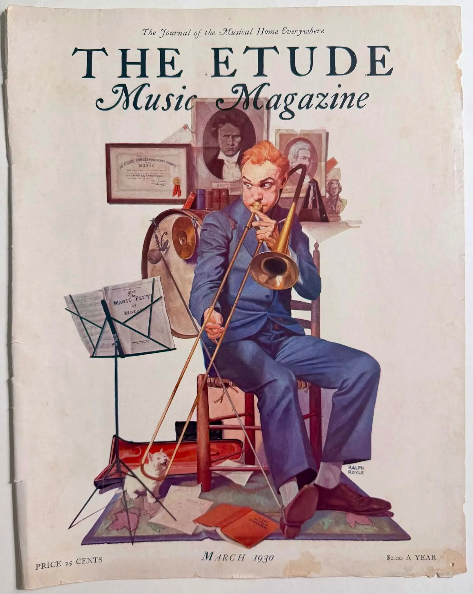
1930 Ralph Royle The Trombonist Etude Magazine Cover Art
The visual evidence presented within the supplied digital proxies reveals a full-colour periodical cover characterized by a highly narrative, situationally comedic domestic tableau. The compositional space is dominated by a central male figure, rendered with slightly exaggerated, caricatured features, seated on a simple wooden ladder-back chair. He is actively engaged in a strenuous, seemingly inept attempt to play a brass slide trombone. The figure's physical exertion is visually manifested through his wide, startled eyes, tightly furrowed brow, and comically puffed cheeks, alongside his awkward, tense grip on the instrument's slide and bell section. He is attired in a somewhat rumpled, tailored blue business suit, complete with a waistcoat, a pale collared shirt, and a dark tie, suggesting a middle-class individual pursuing music as a leisure activity rather than a profession. His reddish-blonde hair is slightly dishevelled. The environment surrounding him is a densely packed, highly specific domestic music space. To his immediate left, a black wire music stand holds an open sheet music booklet. Behind the stand rests a large bass drum with an attached cymbal and drumstick, while directly behind the seated figure is a desk or shelf crowded with musical accoutrements, including a metronome, a small sculpted bust, and several prominent portraits of canonical classical composers. In the lower left foreground, a small white terrier-type dog sits on an intricately patterned rug—decorated with autumn leaf motifs and geometric borders—with its head thrown back, visibly howling in response to the trombone's presumably discordant sound. An open, red velvet-lined instrument case rests on the floor behind the dog, while scattered papers and a bright red book lie haphazardly at the trombonist's feet. The printed text distributed across the artifact serves absolute commercial, identifying, chronological, and narrative functions, all of which are crucial for precise archival cataloguing. Spanning the upper horizontal margin is the primary masthead. The overarching title "THE ETUDE" is rendered in a large, tracked-out, dark teal serif typography. Subordinate to this primary branding, the phrase "Music Magazine" is executed in an elegant, sweeping dark teal cursive script. Above the masthead, a small, italicized tagline reads "The Journal of the Musical Home Everywhere". The lower margin of the artifact, functioning as an informational footer, features the chronological and commercial demarcations: "MARCH 1930" is centrally aligned, flanked by "PRICE 25 CENTS" on the extreme left margin, and "$2.00 A YEAR" on the extreme right margin. Within the illustration itself, the artist has embedded specific textual details to construct the narrative. The sheet music on the stand clearly reads "The MAGIC FLUTE By MOZART". The red book on the floor is titled "LIVES of FAMOUS COMPOSERS". A framed certificate hanging on the wall bears the text "... G Clef CORRESPONDENCE SCHOOL of MUSIC ... MASTER COMPOSER". A large portrait of Ludwig van Beethoven glowers from the center of the wall, flanked by a smaller portrait resembling Richard Wagner. Finally, resting securely within the illustrative frame in the lower-right corner, the artist’s signature, "RALPH ROYLE", is hand-lettered in precise, dark block capitals. The maker context of this artifact is irrevocably tied to the Theodore Presser Company of Philadelphia, the established, historically verified, and culturally dominant publisher of The Etude magazine. Founded in 1883 by Theodore Presser, the publication was rigorously engineered to serve as a comprehensive educational, technical, and cultural resource for music teachers, aspiring students, and dedicated amateur musicians across the vast expanse of the American nation. The visible signature "RALPH ROYLE" attributes the cover artwork to a commissioned commercial illustrator operating within the highly specific aesthetic demands of that publishing era. Within the operational framework of 1930s mass-market periodical publishing, illustrators like Royle functioned as highly skilled commercial practitioners, tasked with translating relatable domestic scenarios into immediate, potent visual appeal suitable for competitive newsstands. The artwork was specifically engineered, reviewed, and approved by the editorial board to visually encapsulate the complex, sometimes frustrating reality of amateur domestic musical education, providing a humorous counterpoint to the magazine's typically serious pedagogical interior content. The geographic and audience context places this artifact precisely within the domestic sphere of the aspirational American middle class during the early, rapidly deepening months of the Great Depression. Issued in March 1930, merely months after the devastating global stock market crash of October 1929, the magazine entered American homes fraught with rising economic anxiety and profound social instability. The intended target audience—middle-class families who heavily valued musical education and cultural refinement as indispensable markers of social standing—was actively seeking psychological solace, stability, and relatable entertainment. The Etude provided exactly this vital psychological utility. The curatorial choice by the editorial board to feature an image of a struggling amateur musician, tormented by howling pets and judged by the stern portraits of dead masters, was a deliberate, highly calculated psychological balm. It offered readers a moment of self-deprecating levity, acknowledging the universal difficulties of learning an instrument—perhaps via a "Correspondence School" as mocked in the background—while remaining firmly within the safe, respectable boundaries of domestic musical pursuit. It served as a reminder that even in times of severe national crisis, the everyday struggles of self-improvement and hobbies continued. The visual language of the artifact demonstrates a deliberate, strategic adherence to narrative realism and situational comedy, deeply characteristic of the "Golden Age of American Illustration." The style heavily echoes the ubiquitous, highly successful aesthetic popularized by publications like The Saturday Evening Post, famously pioneered by illustrators such as Norman Rockwell and J.C. Leyendecker. The figures are emphatically not rendered with strict, academic rigidity; rather, they operate as highly expressive, stylized caricatures designed to instantly communicate a specific emotion and narrative beat. The artist employs a masterful use of compositional triangles—formed by the angle of the trombone slide, the howling dog, and the music stand—to guide the viewer's eye through the chaotic scene. The lighting is bright, even, and universally flattering, lacking any harsh, dramatic chiaroscuro, which ensures every humorous detail of the cluttered room is perfectly legible. The juxtaposition of the high-culture aspirations (Mozart's "Magic Flute", Beethoven's scowling portrait, the grand title "Master Composer") against the low-comedy reality of the puff-cheeked man and the howling dog creates a sophisticated visual irony. This specific aesthetic strategy was highly effective for mass-market publishing aimed at a broad demographic; it communicated warmth, accessibility, and unquestionable middle-class relatability. In terms of strict function and broader archival significance, this printed cover operated initially as a highly utilitarian protective binding for the fragile sheet music, pedagogical essays, and cultural articles contained within its interior pages. Simultaneously, it functioned as a vibrant, aggressive point-of-sale advertisement, meticulously designed to arrest the consumer's eye on crowded newsstands through its engaging narrative imagery, thereby stimulating immediate purchases and ensuring long-term subscriber retention. Covers extracted from such mass-market periodicals serve as vital, irreplaceable historical barometers of middle-class cultural consumption, domestic psychological needs, and the specific mechanisms of visual storytelling prevalent in interwar America. As a preserved archival object housed securely within a strictly digital museum framework, this specific high-resolution proxy captures a pristine, unmodified moment of early 1930s commercial chromotypography. It perfectly preserves the exact historical intersection of American publishing logistics, mass-market cultural aspiration, and the highly specific visual strategies deployed to comfort, distract, and entertain a traumatized American populace during the Great Depression, rendering it an artifact of immense socio-historical value.
Category: Music & Entertainment
Year: 1930
Rarity Class: A
Paper & Print Condition
Rigorous macroscopic analysis of the provided digital proxies establishes definitive physical evidence regarding the production methodology and current material reality of the artifact. The underlying paper matrix reveals a warm, uniform off-white to pale cream tone throughout the border and background areas. This specific discolouration is entirely characteristic of moderately acidic, mechanically pulped magazine cover stock of the 1930s undergoing predictable age-related oxidation and subtle lignin degradation. Structurally, the artifact exhibits significant distress strictly localized to the extreme right vertical margin. This area displays a pronounced, irregular, and ragged edge, indicating substantial surface tearing and localized paper loss. This specific mechanical trauma is unequivocally consistent with the aggressive physical separation of the front cover from the main staple-bound or glued spine of the magazine block. The left margin, while retaining a straighter edge, shows subtle creasing and micro-tears consistent with long-term handling and page-turning friction. The image itself is definitively produced utilizing a high-volume, photomechanical four-colour relief printing process (CMYK halftone). While the specific microscopic rosette pattern cannot be definitively resolved due to the optical limitations of the digital proxy, the smooth blending of the complex hues (particularly the trombonist's blue suit and the red of the instrument case) heavily implies advanced halftone capabilities indicative of the Theodore Presser Company's mass-market standards. Notably, despite the inherent fragility of the acidic paper and the visible edge trauma, the core colour fields register with remarkable opacity and vivid saturation. The deep teals of the masthead and the varied hues of the central illustration do not display severe fading, suggesting the artifact was shielded from prolonged, direct ultraviolet light exposure throughout its history. Confidence: Moderate, strictly constrained by the inherent limitations of digital image resolution.
Provenance & Rarity
Original front cover wrapper extracted from The Etude Music Magazine, Vol. XLVIII, No. 3, officially issued in March 1930. The Historical Rarity of this specific artifact is dictated entirely by its original utilitarian function and the subsequent survival rate of such ephemera. The Etude possessed an immense national circulation, fundamentally designed to penetrate virtually every musically inclined middle-class household in the United States. Therefore, at the precise moment of its mechanical manufacture in the early spring of 1930, the physical object was ubiquitous and common. However, rarity within the strict curatorial context of mass-market printed ephemera is an inverse reflection of historical attrition. Magazine wrappers from this era were composed of highly acidic paper stock and were fundamentally utilitarian; their primary design was to protect the interior sheet music and pedagogical content. They were routinely discarded, heavily handled in active domestic environments, or violently separated when the interior contents were extracted and bound into permanent, personalized musical anthologies by practicing musicians. The aggressive tearing visible along the right edge of this artifact is definitive forensic evidence of this exact extraction process. The survival of this fragile cover over nearly a century—preserving its highly detailed, narrative illustration and complex typography without suffering catastrophic structural loss, profound discoloration, or postal defacement—cements its elevated historical rarity. It transcends its original status as disposable packaging, demanding careful archival cataloguing as a primary historical text documenting the specific intersection of visual comedy, domestic aspiration, and American commercial illustration during the onset of the Great Depression. Class A (Significant Cultural Artifact with Moderate Scarcity). Historical Rarity is justified by the extremely high attrition rate of mass-produced, softcover periodical wrappers from the early 20th century. While The Etude boasted a large national print run in 1930, ensuring initial ubiquity, these specific paper objects were inherently functional. Their primary purpose was to protect the valuable sheet music bound within. Consequently, the vast majority were violently handled, deliberately detached, and unceremoniously discarded once the interior music was harvested for permanent, hardbound domestic collections. To secure an un-restored front cover from the early Great Depression era that fully retains its structural integrity, vibrant chromatic saturation, and crisp typographic legibility—without suffering from severe postal defacement, catastrophic edge loss, or profound UV photodegradation—significantly elevates the object from a piece of common, disposable historical debris to a Class A preserved document of American commercial illustration and print culture.
Rarity & Condition Summary
The artifact survives as a well-preserved, narratively rich visual example of 1930 commercial printing, securing a Class A historical designation. Despite visible, significant mechanical tearing along the right edge indicative of its extraction, and overall expected age-toning of the acidic paper matrix, it remarkably retains sharp typographic legibility and vibrant chromatic fidelity central to the Golden Age illustration style.