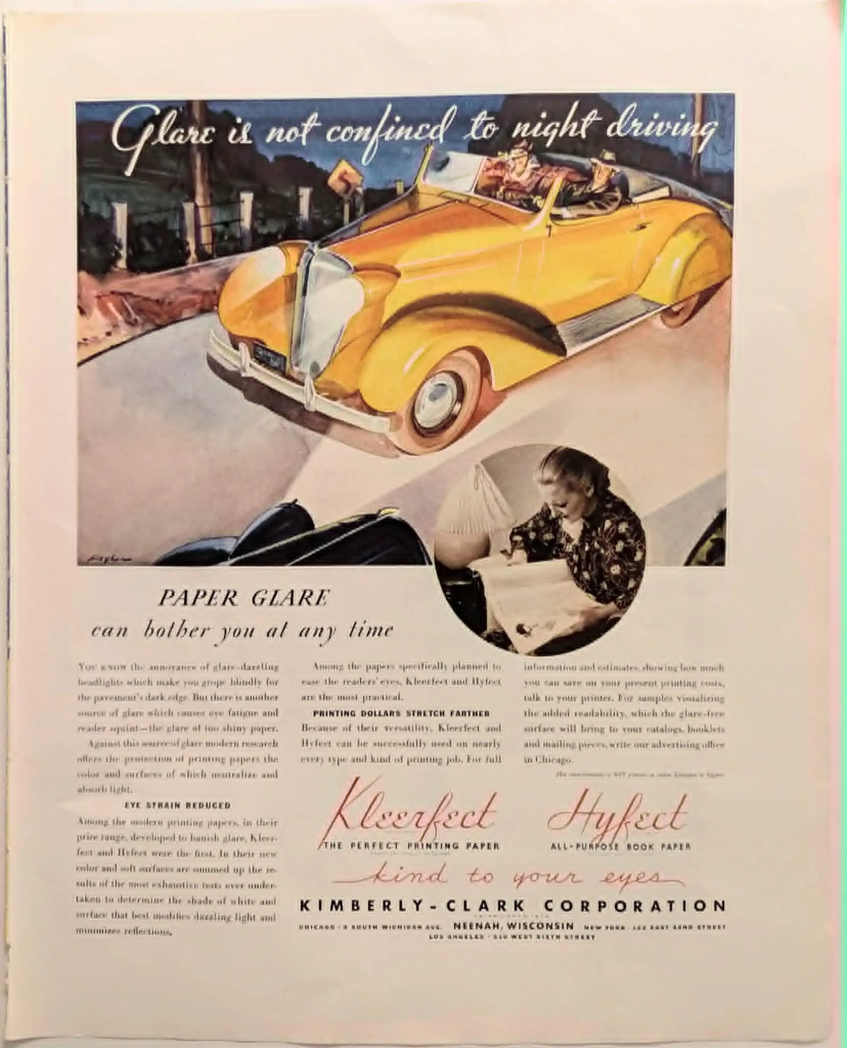
1937 Kimberly-Clark Kleerfect & Hyfect Vintage Advertisement
During the 1930s, the printing and publishing industries experienced rapid advancements in mass-production techniques, leading to an abundance of heavily coated, high-gloss papers. While these glossy surfaces allowed for sharper photographic reproductions, they also introduced a new, distinctly modern annoyance: paper glare. The Kimberly-Clark Corporation, established in 1872 and already a titan of the American paper industry, identified this pain point and developed a sophisticated marketing strategy centered entirely around reading ergonomics. This advertisement ingeniously parallels two very different modern experiences: the blinding glare of oncoming headlights during night driving, and the eye strain caused by reading under artificial light on overly shiny paper. The top illustration features a beautifully rendered, streamlined yellow roadster—typical of mid-1930s automotive styling—navigating a dark road. This imagery instantly establishes a sense of visual discomfort and hazard, leading directly into the core message: "PAPER GLARE can bother you at any time." Kimberly-Clark positions its two flagship products, Kleerfect and Hyfect, as the antidote to this modern fatigue. Marketed under the elegant tagline "kind to your eyes," these papers were engineered to neutralize and absorb light rather than reflect it. The copy emphasizes that a "soft surface" and a specific shade of white were determined by "exhaustive tests" to minimize reflections. This approach represents an early form of user-experience (UX) marketing, focusing not merely on the industrial durability of the paper, but on the physiological comfort of the end-user. Visually, the piece is a striking example of 1930s commercial art, blending bold, hand-lettered cursive typography for the product names with realistic, watercolor-style illustration. Notably, the archival artifact contains a highly transparent footnote at the bottom: "This advertisement is NOT printed on either Kleerfect or Hyfect." This disclaimer was practically necessary; because the magazine in which this ad appeared used standard glossy stock, the page itself inadvertently proved Kimberly-Clark's point about glare to the reader, making the persuasive argument all the more effective.
Category: Home & Household
Year: 1937
Rarity Class: B
Paper & Print Condition
The artifact displays the standard, high-quality characteristics of late-1930s commercial magazine paper stock. The color registration is exceptionally well-preserved, particularly the vibrant yellow and deep blue pigments within the primary automotive illustration, which show minimal fading. The typographic elements—most notably the striking red cursive script for 'Kleerfect' and 'Hyfect'—remain remarkably sharp, bright, and fully legible against the off-white background. The sepia-toned circular vignette of the woman reading also retains its detailed halftone contrast. There is minor, expected edge toning (yellowing) consistent with the natural aging process of mid-century paper, but the structural integrity of the page remains excellent.
Provenance & Rarity
This original archival print was retrieved from a mass-circulation American national periodical published circa 1937. While the Kimberly-Clark Corporation consistently maintained a heavy advertising presence during the late Interwar period, this specific ergonomic-focused campaign remains an uncommon find. The piece is highly regarded for its brilliant visual cross-promotion, using a stylized luxury automotive motif to articulate industrial paper specifications. Because high-volume commercial magazines of the late 1930s utilized highly acidic wood-pulp paper stock, surviving specimens frequently suffer from extreme brittleness, severe ink transfer, or heavy foxing. Intact examples with such vibrant yellow and blue pigment preservation are increasingly scarce, elevating this document to an attractive acquisition for industrial design archivists, automotive historians, and ephemera collectors specializing in early ergonomics.
Rarity & Condition Summary
Rarity Class: Class B (Uncommon) Condition Report: This artifact is a beautifully preserved, highly specialized industrial advertisement that successfully bridges the gap between mid-century automotive styling and early ergonomics. While Kimberly-Clark print campaigns from the late 1930s are historically documented, specimens displaying this exact level of vivid yellow and deep blue pigment retention are uncommon. The structural integrity of the page is excellent, showing only minor, expected edge toning that does not compromise the text or the central watercolor illustration, making it a highly desirable acquisition for institutional printing archives and vintage ephemera collectors.