The Time Traveller's Dossier : 1980 Vespa - The Urban Mobility Paradox
The History
The Tyranny of the Z-Pattern and the Intrusive Hand
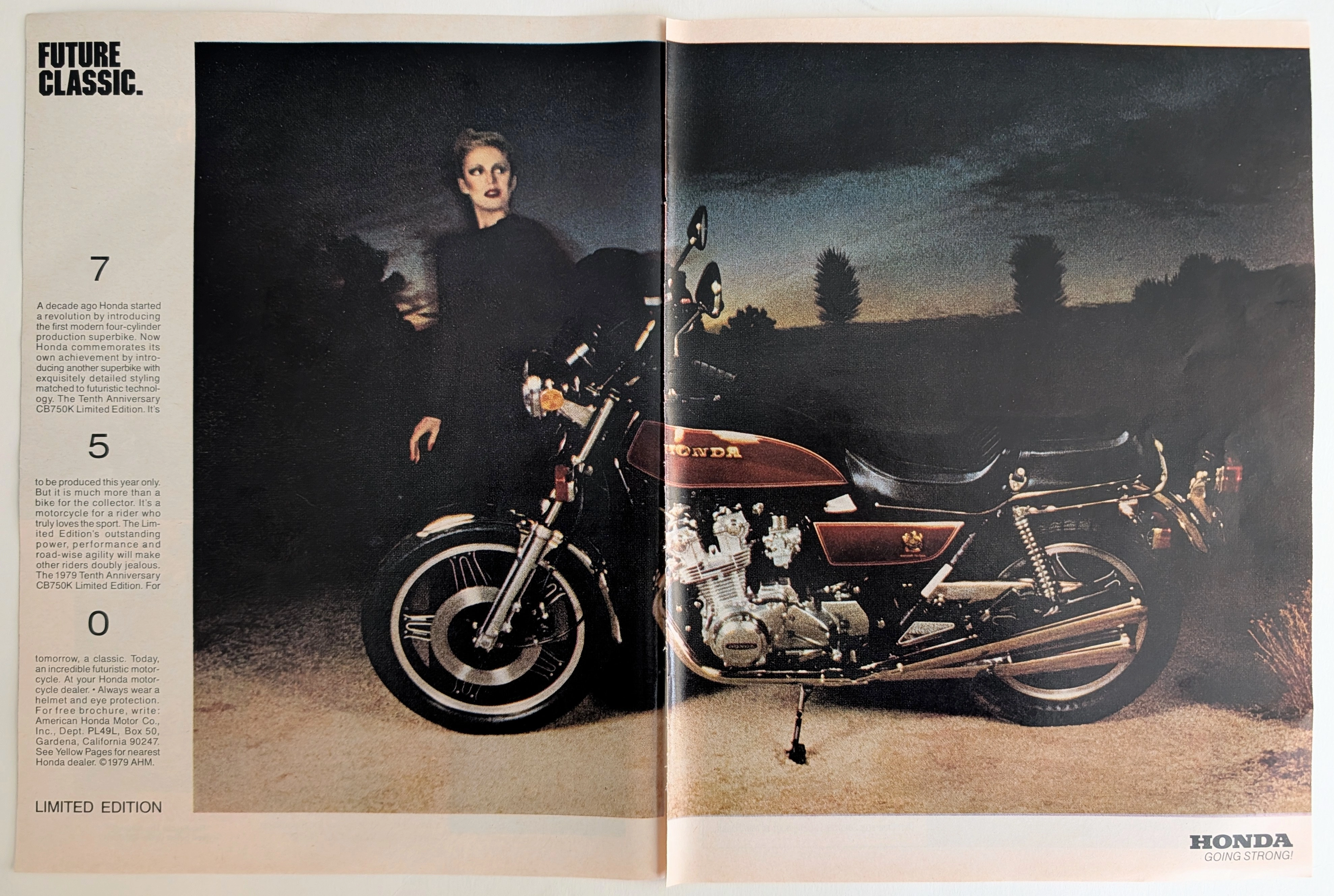
To understand the profound psychological strategy of this document, one must first analyze its most jarring element: the giant, out-of-focus hand dominating the foreground. In traditional advertising, visual composition relies on the "Z-pattern." The eye is guided seamlessly from a headline, across an aspirational image, down to the product, and finally to the logo.
This advertisement violently disrupts that comfortable cognitive flow.
The hand is an aggressive visual blockade. It commands the reader to halt. It acts as a physical manifestation of the American consumer's inherent prejudice against scooters. The marketing agency understood that if they simply showed a picture of a Vespa, the American reader would instantly categorize it as a "toy" or a "cheap motorcycle" and turn the page.
The hand forces a pause. It creates a visual riddle. "Quick. What's a Vespa?"
By obscuring the product, Piaggio demands active intellectual engagement. They are forcing the reader to dismantle their preconceived notions before they are even allowed to view the machine clearly. It is a highly defensive posture, born from the frustration of selling a fundamentally rational vehicle to a highly irrational, image-obsessed consumer base.
The Aeronautical Ghost of Corradino D'Ascanio
The text insists, with almost legal precision, that the Vespa is "protected by a welded, unitized body." To grasp the significance of this, one must look back to 1946 and the ruins of post-war Italy.
The Vespa was not designed by a motorcycle engineer. It was designed by an aeronautical engineer named Corradino D'Ascanio. He despised traditional motorcycles. He hated the exposed greasy chains, the straddle-seating position that ruined clothing, and the flimsy tubular frames.
D'Ascanio applied aircraft manufacturing principles to create the Vespa. He gave it a stressed-skin, monocoque steel chassis—the "unitized body" mentioned in the text. He placed the engine directly over the rear wheel to eliminate the drive chain. He created a step-through design so priests in cassocks and women in skirts could ride it with dignity. He put a shield in front to protect the rider from urban grime.
Therefore, when the 1980 advertisement claims "You ride inside—cleanly and quietly," it is invoking D'Ascanio’s original 1946 aeronautical manifesto. They are not selling a bike; they are selling a tiny, two-wheeled, open-air fuselage. The insistence that it is a "two-wheeled car" is mathematically and structurally accurate to its engineering lineage, even if it sounded like marketing hyperbole to the American ear.
The 1980 Energy Crisis and the Metrics of Survival
The economic backdrop of this artifact is crucial. In 1980, the United States was transitioning from the Carter administration to the Reagan era. The Iranian Revolution had triggered the second major oil shock. Fuel efficiency was suddenly not just a matter of economics, but of national anxiety.
The text quietly deploys its most devastating logical weapon in the lower paragraphs: "Vespa scooters deliver between 70 and 140 mpg."
In a rational market, this single metric should have instantly converted millions of American commuters. Piaggio coupled this extreme economy with features designed to mimic automobile reliability: electronic ignition, hydraulic suspension, and the brilliant inclusion of a hidden spare tire. They were attempting to disarm every logistical argument the American driver had against two-wheeled transport.
Yet, the messaging remains deeply conflicted. While offering extreme economic utility, the copy insists on framing the machine as "sensible, sophisticated street machines" delivered by "super Italian designers." They were trying to sell a vehicle of absolute necessity as an object of high-end desire. They wanted to appeal to the wallet of the commuter, but the ego of the yuppie.
The Infrastructure Disconnect
The historical tragedy of the 1980 Vespa in America, as evidenced by this document, was a failure of scale. The text notes that "More than 6 million Vespa scooters and 2 million Vespa mopeds have been produced and sold so far."
In Rome, Paris, or London, the Vespa was the undisputed king of mobility. Cities built on ancient, narrow, congested street grids favored the agility and tiny footprint of the scooter.
America, however, was built on the Interstate Highway System. It was a nation of sprawling suburbs, vast parking lots, and long-distance commutes. The Vespa, with its tiny wheels and low top speed, was fundamentally terrified of the American freeway. The text defensively claims the top models have an engine "powerful enough for freeway driving," but this was a stretch of mechanical truth. Riding a 200cc scooter on a Los Angeles interstate in 1980 was a harrowing, dangerous endeavor.
The machine was a perfect solution for an environment that did not exist in the United States.
The Historical Shift: From Utility to Subculture
The artifact marks a definitive shift in the sociology of transportation. Piaggio failed to replace the American car. They failed to make the scooter a ubiquitous appliance of daily commuting in the United States.
However, they succeeded in something far more enduring. By marketing the Vespa as "The Uncommon Carrier," they birthed a subculture.
Because it was entirely impractical for the American highway, the Vespa became a deliberate lifestyle choice. It became the vehicle of urban creatives, college students, and European-centric bohemians. It transformed from a post-war tool of survival into a pre-internet badge of alternative identity.
This advertisement is the exact focal point of that transition. It is the moment the Vespa stopped trying to be a cheap motorcycle and started demanding to be recognized as a sophisticated cultural icon. It represents the realization that if you cannot win the war of mass utility, you must win the war of niche exclusivity.
The Paper
A physical analysis of the artifact reveals the standardized practices of high-circulation American print media at the dawn of the 1980s. The substrate is a standard commercial magazine stock, possessing a lightweight density of approximately 65 to 75 GSM (Grams per Square Meter). The paper has undergone a calendering process, yielding the slight surface gloss necessary to carry the ink load of a full-page photographic reproduction without excessive saturation.
The degradation of the material is absolute and irreversible. The inherent acidic composition of the cheap wood pulp used in consumer periodicals has caused a uniform, deep oxidation. The margins, once a clinical white, have shifted into a warm, archival yellow.
The printing is executed via high-speed web offset lithography in standard CMYK. Under magnification, the rosette halftone patterns are clearly visible, particularly in the flesh tones of the giant hand and the saturated crimson of the Vespa's steel bodywork. The registration remains tight, a necessity for the crisp legibility of the dense, serif typography detailing the engineering specifications. The paper is entirely mundane; its historical weight is derived solely from the psychological battle it records upon its surface.
The Rarity
Classification: Class B (Culturally Significant Ephemera)
In the realm of physical scarcity, this document is common. As a full-page advertisement running in major national US magazines in 1980, hundreds of thousands of copies were printed and distributed. It is readily obtainable through vintage print dealers and archival collections.
However, it achieves a firm Class B rating due to its profound cultural and contextual significance. Artifacts that perfectly encapsulate the marketing friction between European utility and American consumer psychology are vital. The specific use of the "blocking hand" visual motif elevates this from a standard product catalog to a primary text on consumer behavioral defense mechanisms. It is a highly calculated piece of corporate rhetoric attempting to navigate the geopolitical anxieties of the 1979 oil crisis.
Visual Impact
The visual composition is a masterclass in calculated disruption. The hierarchy of information is deliberately inverted.
The dominant element is the massive, out-of-focus hand. It creates an immediate, almost claustrophobic sense of depth of field. The hand acts as a psychological barrier, literally pushing the viewer away while simultaneously demanding their attention. It is a visual paradox.
Behind the hand, rendered in sharp focus, is the product. The color psychology is precise. The Vespa is a vibrant, aggressive red, symbolizing energy, passion, and Italian design heritage. The riders are impeccably dressed, projecting an aura of relaxed, middle-class sophistication. They are entirely unbothered by the grease and grime associated with traditional motorcycles.
The lower third of the page is anchored by heavy, authoritative typography. The bold, all-caps headline "QUICK. WHAT'S A VESPA?" utilizes a thick sans-serif font to demand an immediate mental response. The body copy is structured in dense, rational blocks of serif text, visually mimicking the layout of a serious journalistic article or an engineering dossier. The juxtaposition is clear: the image creates the emotional disruption, and the text provides the cold, rational justification. It is a visual trap designed to catch the eye and hold the mind.
The Archive Continues
Continue the Exploration
Marantz · Entertainment
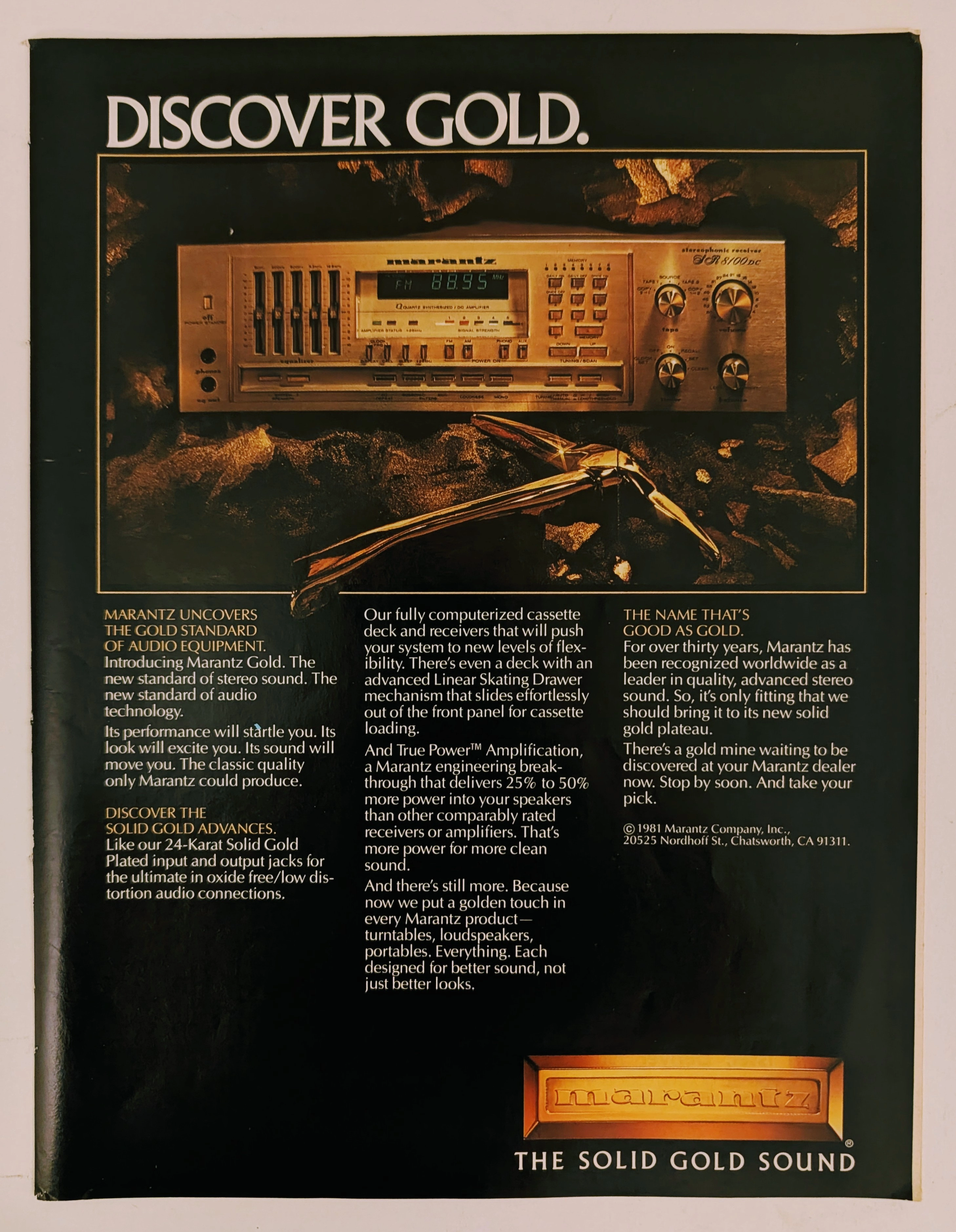
The Time Traveller's Dossier: The Alchemy of Acoustics – Marantz "Discover Gold" Advertisement (1981)
History is not an accidental sequence of events; it is a meticulously engineered illusion crafted by those who command the aesthetic and cultural narratives of their time. Long before digital algorithms could sterilely dictate consumer preferences, the ultimate manifestation of psychological manipulation and corporate alchemy was executed through the calculated precision of the offset printing press and the absolute mastery of analog darkroom photography. The historical artifact before us is not merely a disposable page torn from a vintage magazine. It is a perfectly weaponized blueprint of audio-exoticism, a visual declaration of extreme consumer luxury, and an unwavering testament to an era where electronic hardware was sold not merely as a functional utility, but as a precious, excavated commodity. This museum-grade, academic archival dossier presents an exhaustive, microscopic deconstruction of a 1981 print advertisement for the Marantz "Solid Gold" audio equipment line. Operating on a profound and ruthless binary structure, this document records a calculated paradigm shift within the global consumer electronics industry. It captures the precise historical fracture where silicon, copper, and plastic were conceptually transmuted into a literal, physical embodiment of a precious metal. Through the highly specialized lens of late-analog commercial artistry and stringent visual forensics, this document serves as a masterclass in psychological marketing. It established the foundational archetype for selling technology as a high-yield status symbol—an archetype that unconditionally dictates the visual and strategic totems of the modern high-end audiophile industry today.
GE · Technology
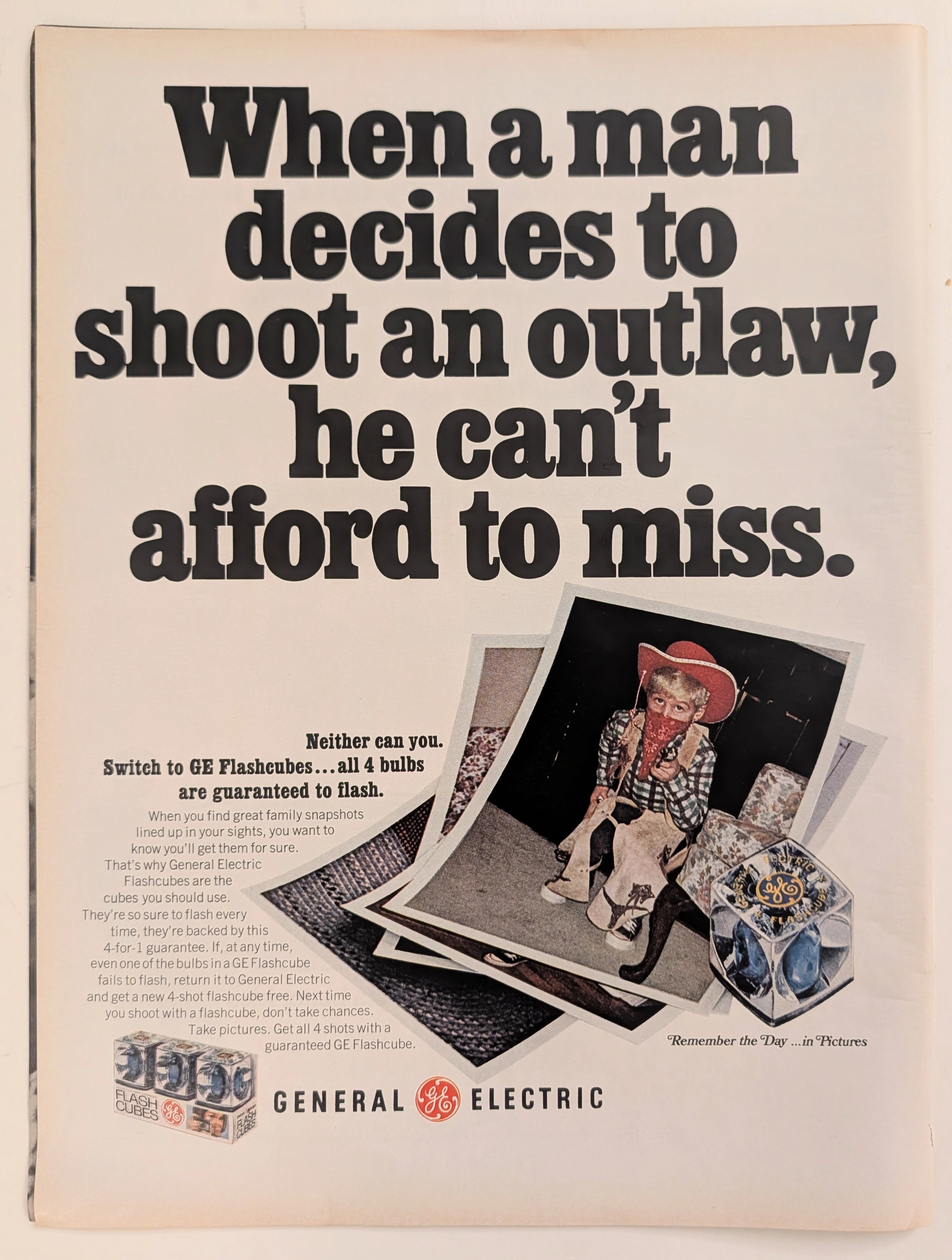
The Time Traveller's Dossier: Capturing the Outlaw – The General Electric Flashcube and the Democratization of Amateur Photography
The evolution of twentieth-century domestic life and the archiving of the American family unit was fundamentally defined by the rapid, uncompromising advancement of accessible consumer photography. The historical artifact elegantly and securely positioned upon the analytical table of The Record Institute today is a striking, narrative-driven full-page print advertisement for General Electric (GE) Flashcubes. This document completely transcends the standard, utilitarian boundaries of photographic equipment marketing. It operates as a highly sophisticated, multi-layered cultural mirror, reflecting a precise era in consumer psychology where the anxiety of "missing the moment" was aggressively addressed by industrial innovation. By utilizing the playful, universally recognizable motif of childhood dress-up—a young boy costumed as an Old West "outlaw"—GE sought to reassure the mid-century parent that their technological consistency would never fail the spontaneous archiving of family history. This world-class, comprehensive dossier conducts a meticulous, unyielding, and exceptionally exhaustive examination of the artifact, operating under the absolute most rigorous parameters of historical, sociological, and material science evaluation. Dedicating the overwhelming majority of our analytical focus to its immense historical gravity, we will decode the brilliant marketing psychology embedded within the "shoot an outlaw" double entendre, analyze the profound sociopolitical impact of the Flashcube's invention on consumer behavior, and dissect the economic realities of the "4-for-1 guarantee." Furthermore, as we venture deeply into the chemical and physical foundations of this analog printed ephemera, we will reveal the precise mechanical fingerprints of the CMYK halftone rosettes captured in the stunning macro imagery of the GE logo. Finally, we will assess its archival rarity, exploring how the graceful, natural oxidation of the paper substrate cultivates a serene wabi-sabi aesthetic—a natural, irreversible phenomenon that serves as the primary engine driving up its market value exponentially within the elite global spheres of Vintage Commercial Ephemera and Technology Archives.
Chrysler · Automotive
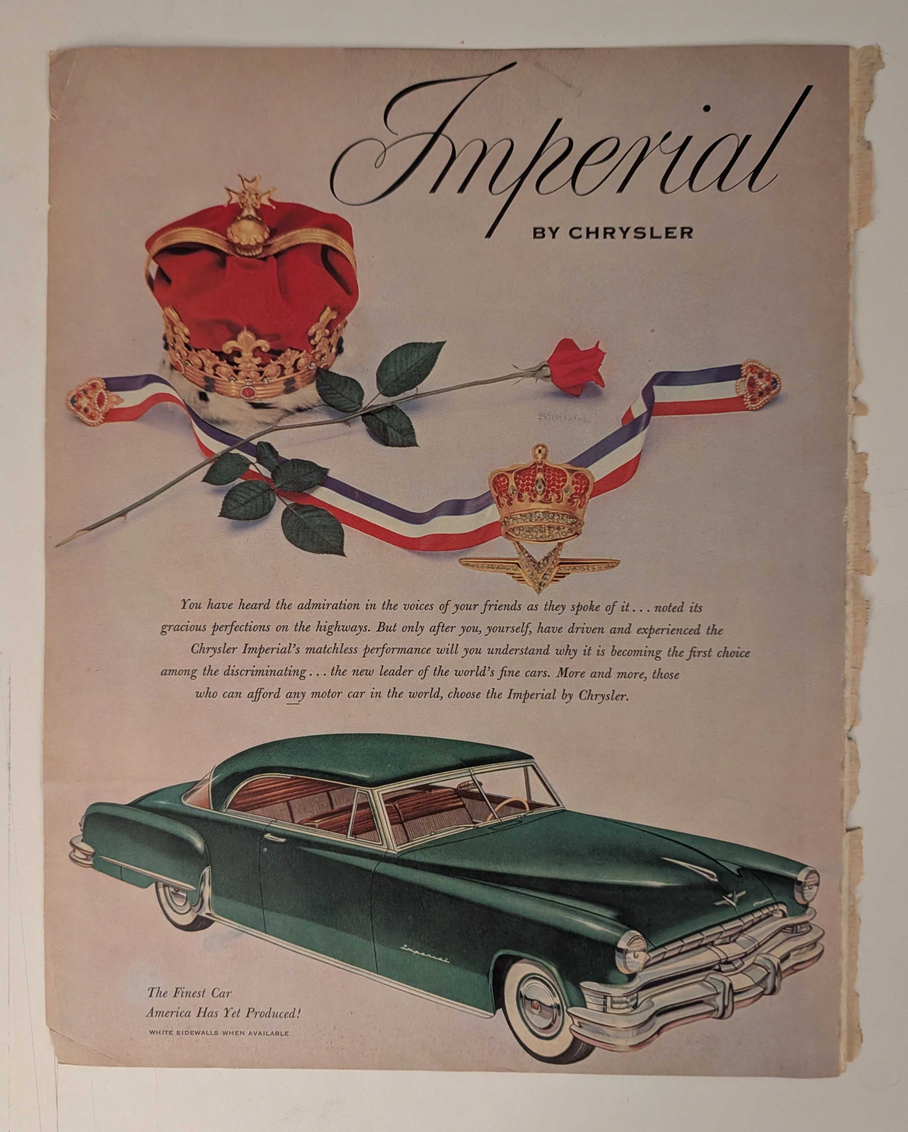
THE TIME TRAVELER'S DOSSIER: THE KOREAN WAR ANCHOR AND THE SCARCITY OF LUXURY
The artifact under our uncompromising, unprecedented museum-grade analysis is a profoundly preserved Historical Relic excavated from the golden age of post-WWII American opulence. This Primary Art Document is a monumental magazine advertisement for the Imperial by Chrysler, dating to the pivotal 1951-1952 era. This document is a "Forensic Blueprint of American Aristocracy and Geopolitical Crisis." It masterfully weaponizes regal European iconography to elevate Chrysler's flagship model above mere transportation, explicitly targeting "those who can afford any motor car in the world". Yet, its most significant historical anchor is hidden in the microscopic fine print: "WHITE SIDEWALLS WHEN AVAILABLE". This single sentence instantly transforms the advertisement into a wartime relic, reflecting the severe rubber shortages imposed during the Korean War. Grounded by the iconic jeweled emblem and its breathtaking wabi-sabi chemical degradation—highlighted by its violently torn binding edge—this artifact commands an irreplaceable status, cementing its Rarity Class A designation.