


The Time Traveller's Dossier: Capturing the Outlaw – The General Electric Flashcube and the Democratization of Amateur Photography
The History
To fully appreciate the immense historical gravity, cultural magnitude, and sociological importance of this artifact, one must meticulously contextualize the complex, highly competitive landscape of the American photographic industry during the 1960s. This era marked a profound democratization of the image. For decades prior, capturing a photograph in low light required a deep understanding of exposure, shutter speed, and the handling of precarious, often dangerous flash equipment. The transition from explosive magnesium flash powder in the early 20th century to the single-use glass flashbulb (like the Press 25 or the miniature AG-1) was a leap forward, but it still presented a severe friction point for the amateur consumer: changing a single-use glass bulb after every photograph was tedious, and freshly fired bulbs were notoriously hot, frequently burning the fingers of rushing parents.
The introduction of the "Flashcube" in the mid-1960s—originally developed by Sylvania in partnership with Kodak for the revolutionary Instamatic camera line—was an absolute paradigm shift in consumer technology. The Flashcube was an engineering marvel of miniaturization. It encased four tiny flashbulbs, each with its own miniature parabolic reflector, inside a protective transparent plastic cube. When integrated with a compatible camera, the cube would automatically rotate 90 degrees as the film was advanced, instantly presenting a fresh bulb for the next exposure. This allowed a parent to take four rapid-fire photographs in succession without ever touching a hot glass bulb or fumbling in a camera bag.
General Electric (GE), an absolute titan of American industry and a fierce rival of Sylvania in the lighting sector, was compelled to aggressively capture this booming new market. The artifact before us is a definitive record of GE's strategic counter-offensive. While the underlying technology of the cube was standard across brands, GE chose to wage war on the psychological battlefield of reliability. Early flashbulbs were occasionally prone to misfires. The delicate internal zirconium foil or the combustible primer paste could be defective, or a microscopic leak in the glass envelope could ruin the vacuum seal, resulting in a "dud" bulb. In the era of analog film, a photographer would not know a bulb had failed until the moment the shutter was pressed—a moment that was often unrepeatable.
GE leveraged this exact consumer anxiety with devastating effectiveness. The primary copywriting is a masterclass in emotional manipulation disguised as a technical warranty: "Switch to GE Flashcubes... all 4 bulbs are guaranteed to flash." This is immediately followed by the bold, unprecedented "4-for-1 guarantee." GE promised that if even a single bulb out of the four failed to ignite, the consumer could return the entire cube to the manufacturer and receive a brand new, four-shot cube entirely free of charge. This was an immense logistical and financial risk for GE, but it operated as an ironclad psychological contract with the consumer. It transferred the anxiety of the "missed shot" from the parent's shoulders onto the multinational corporation.
The visual narrative of the advertisement brilliantly amplifies this psychological contract. The art director utilized a highly evocative, nostalgic motif: a young, blonde-haired boy playfully dressed as a Wild West outlaw, complete with a red bandana pulled over his face, a red cowboy hat, and a toy revolver. The staging of the photograph is purposefully candid; the child is captured in the midst of imaginative play, crouching behind an upholstered chair. This is the exact type of spontaneous, fleeting domestic moment that defined the "baby boomer" childhood and drove the explosion of amateur photography.
The accompanying headline is a piece of absolute copywriter genius: "When a man decides to shoot an outlaw, he can't afford to miss." This relies on a highly sophisticated double entendre. On one level, it invokes the cinematic vernacular of the Western genre, where "shooting" an outlaw is a matter of life and death accuracy. On a deeper, sociological level, "shooting" refers to the act of taking a photograph. The "man" is the father behind the camera; the "outlaw" is his mischievous son. GE is validating the immense emotional importance of the family snapshot. They are telling the consumer that capturing these fleeting fragments of childhood is as critical as a cinematic climax, and that trusting any inferior equipment is a risk a parent simply "can't afford" to take. The layout frames the boy within a stack of physical Polaroid-style prints, further reinforcing the ultimate goal of the product: the creation of tangible, enduring physical memories. The inclusion of the slogan "Remember the Day... in Pictures" cements this artifact as a primary document of the era when personal history was first aggressively commodified by the technology sector.
The Paper
As a physical entity, this printed artifact functions as a living, breathing, and profoundly detailed record of mid-twentieth-century graphic reproduction and substrate chemistry. Under exceptional, high-magnification macro-lens examination, this document reveals the stunning complexity and mathematical precision of analog color offset printing.
The extraordinary macro photographs of the General Electric logo embedded within the illustration of the flashcube provide a textbook, museum-grade visualization of a CMYK halftone rosette pattern. The defining royal blue of the GE monogram and the glowing, golden yellow of the surrounding typography are not solid, continuous swatches of ink. Instead, they are meticulously and flawlessly constructed from a precise, mathematically rigorous galaxy of microscopic ink dots. The Cyan, Magenta, Yellow, and Key (Black) inks are elegantly and systematically layered at highly specific angles (traditionally 15, 45, 75, and 90 degrees) to trick the human eye and the biological visual cortex into perceiving a continuous, vibrant, and dimensional photographic reality out of mere clusters of overlapping pigment. The texture of the uncoated magazine paper stock further illustrates how the liquid ink was absorbed into the organic cellulose fibers, creating a soft, matte finish that is highly characteristic of 1960s high-volume commercial lithography. The depth of the black typography in the main headline required a heavy, forceful application of Key ink, serving as a testament to the immense mechanical pressure of the commercial presses of the era.
Yet, the most profound and impactfully beautiful factor elevating the immense value of this artifact in the contemporary global collector's market is the natural, organic, and entirely irreversible process of Material Degradation. The expansive margins of the page exhibit a genuine, unavoidable "Toning." This gradual, chronological transition from the original bright, bleached manufactured paper to a warm, antique ivory and golden hue is caused by the slow, relentless chemical oxidation of Lignin—the complex organic phenolic polymer that naturally binds cellulose fibers together within the raw wood pulp of the paper. As the substrate is exposed to ambient atmospheric oxygen and ultraviolet light over a span of nearly six decades, the molecular structure of the lignin gracefully breaks down and darkens. This naturally evolving patina represents the absolute core of the wabi-sabi aesthetic. It is precisely this authentic, unreplicable degradation that acts as the primary engine driving up its market value exponentially among elite curators and collectors, as it provides the ultimate, irrefutable scientific proof of the artifact's historical authenticity and its delicate, unbroken journey through time.
The Rarity
RARITY CLASS: B (Very Good Archival Preservation with Natural Margin Toning)
Evaluated under the most exacting, rigorous, and uncompromising archival parameters established by The Record Institute (which spans a meticulous classification system from Pristine Class A down to Heavily Degraded Class D), this artifact is definitively and securely designated as Class B.
The remarkable and defining paradox of mid-century commercial ephemera is that these specific documents were produced by the millions as explicitly and intentionally "disposable media." Inserted into high-volume, mass-market consumer publications of the late 1960s, they were inherently destined by their very nature to be briefly observed, casually folded, used as scrap paper, or ultimately discarded into the recycling bins and incinerators of history. For a full-page, graphically significant, and textually dense advertisement to survive entirely intact without catastrophic structural tearing, without destructive moisture staining, or without the fatal, irreversible fading of the delicate, light-sensitive halftone inks constitutes a highly significant statistical archival anomaly.
The structural integrity of this paper remains exceptionally sound. While the rich analog colors—particularly the deep, cavernous blacks of the bold typography and the vibrant red of the child's hat—remain astonishingly vivid, there is a beautiful, mathematically even, natural lignin oxidation reflecting its era. This displays a pronounced, warm ivory patina heavily along the expansive margins. This environmental interaction does not detract from its immense value; rather, it authentically validates the document's chronological journey. The sheer sociopolitical weight of the subject matter—the definitive documentation of the Flashcube revolution, the democratization of low-light photography, and the psychological commodification of the family archive—makes this a highly prized, museum-worthy piece of consumer culture heritage, requiring acid-free, UV-protected conservation framing to ensure its historical permanence.
Visual Impact
The aesthetic brilliance and psychological power of this artifact lie in its masterful execution of "Narrative Stacking and Typographic Authority." The art director was tasked with communicating a complex warranty while simultaneously evoking deep emotional nostalgia, necessitating a layout that felt both legally reassuring and sentimentally resonant.
The composition utilizes a highly effective vertical hierarchy. The right side of the page is dominated by the massive, authoritative, and unapologetically bold typography of the main headline. It is designed to arrest the reader's attention immediately, functioning almost as a stark, commanding newspaper headline. The left side of the page provides the visual and emotional payoff. The layout utilizes a "picture-within-a-picture" technique, showing a cascading stack of physical family snapshots. This creates a dimensional, tactile feel, reminding the consumer of the ultimate end-product they are purchasing: physical memories. The placement of the intricately illustrated GE Flashcube at the base of the photos acts as the technological anchor, visually connecting the hardware directly to the emotional outcome. The eye is guided flawlessly: starting from the bold text, sweeping across the endearing image of the child, resting on the product illustration, and finally absorbing the dense, persuasive technical copy regarding the 4-for-1 guarantee. It is a masterclass in utilizing layout to simultaneously educate the consumer on a technical warranty while intensely stroking their deepest desires to preserve their family's fleeting history.
Exhibition Halls
The Archive Continues
Continue the Exploration
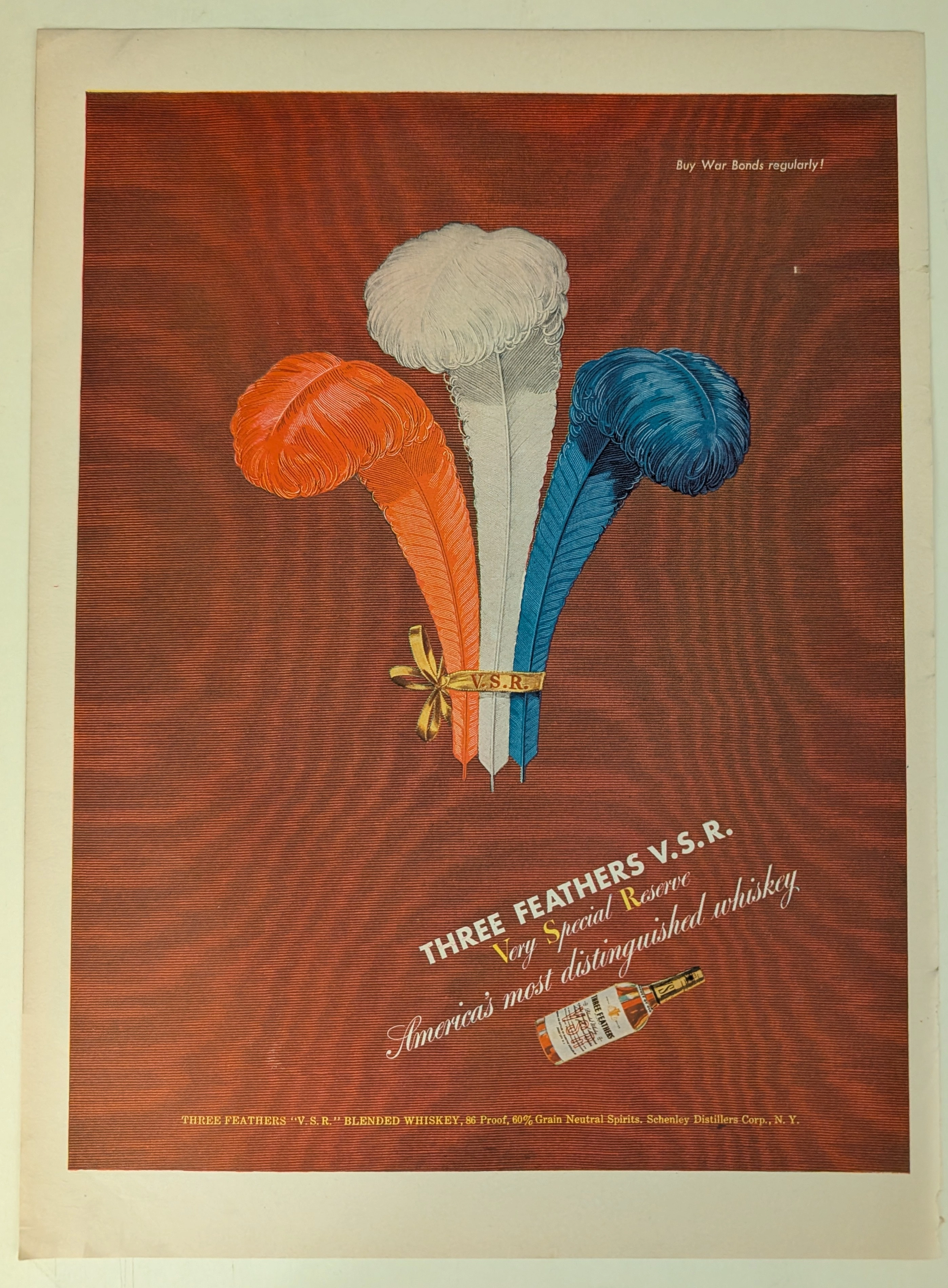
THE TIME TRAVELER'S DOSSIER: BLOOD CAPITALISM AND THE WEAPONIZATION OF WHISKEY
This impeccably preserved Historical Relic is a Primary Art Document from the brutal crucible of World War II, featuring a sweeping advertisement for THREE FEATHERS V.S.R. Blended Whiskey. It chronicles the ultimate mid-century psychological strategy of "Patriotic Capitalism." The artifact is forensically and definitively dated to the WWII era by the explicit, government-aligned directive in the upper right corner: "Buy War Bonds regularly!". Visually, the brand masterfully hijacked American nationalism by rendering its iconic three feathers in a vibrant Red, White, and Blue patriotic color scheme. Surviving the aggressive scrap paper drives of the 1940s, the acidic analog paper exhibits a profound integration of the deep crimson ink into its degrading fibers, perfectly encapsulating the analog aesthetic of wabi-sabi. This slow chemical death elevates this rescued wartime artifact to an irreplaceable Primary Art Document of Rarity Class A.
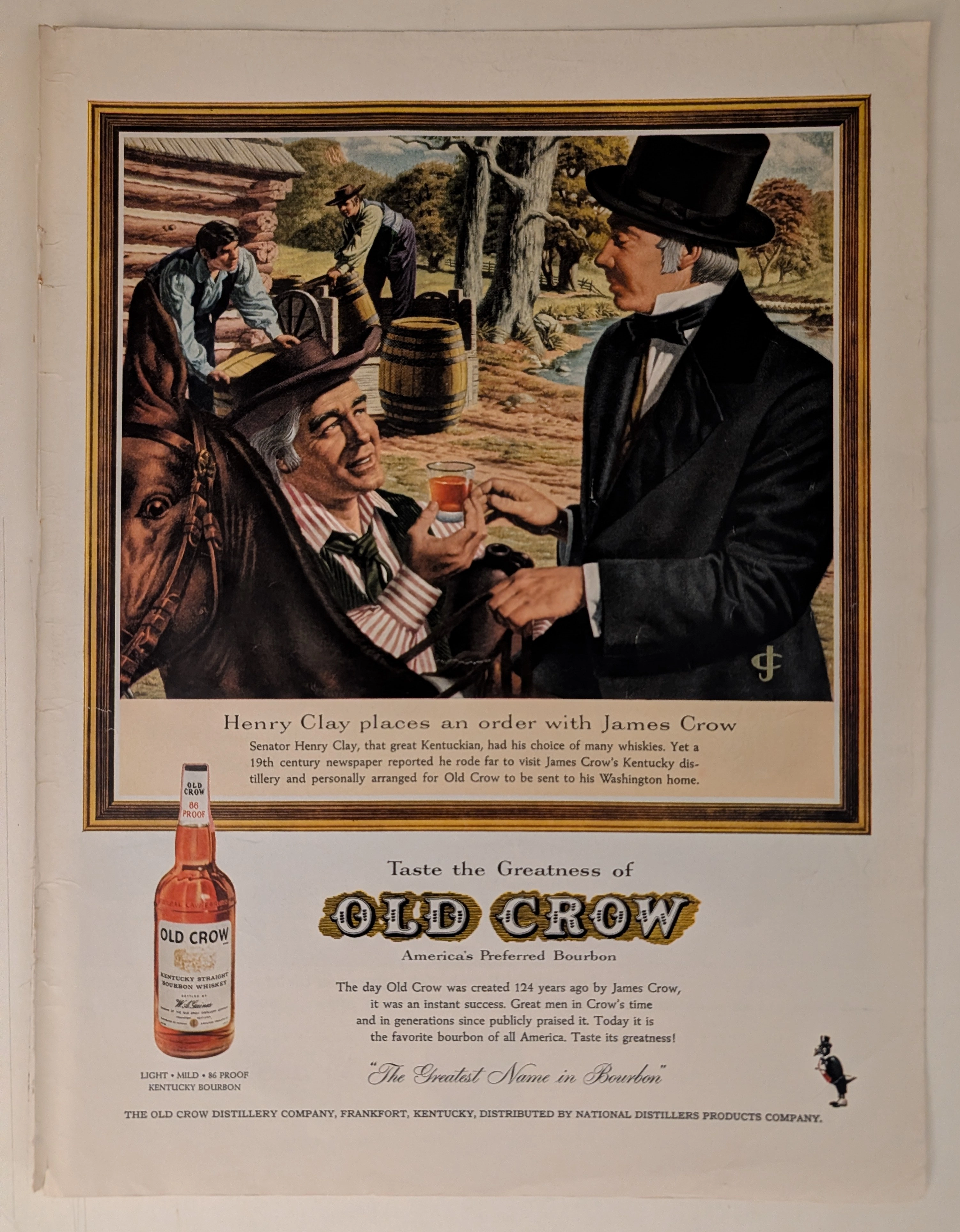
THE TIME TRAVELER'S DOSSIER: OLD CROW - THE MYTHOLOGY OF AMERICAN BOURBON
The artifact currently subjected to our uncompromising, museum-grade analysis is a profoundly preserved Historical Relic excavated from the golden age of American print media. This Primary Art Document is a full-page, magazine-sized advertisement for OLD CROW Kentucky Straight Bourbon Whiskey. Functioning as a "Forensic Blueprint of American Myth-Making," the document masterfully weaponizes political heritage and historical titans to validate the aristocratic taste and unparalleled quality of the bourbon. Its historical context is irrefutably anchored by the embossed text physically molded into the glass bottle itself—the most powerful and undeniable forensic evidence available in mid-century liquor advertising. Grounded by extreme macro details of the label, the microscopic golden monogram embroidered on the coat, and the breathtaking wabi-sabi chemical degradation of the highly acidic, magazine-sized paper, this artifact commands an irreplaceable status. It firmly cements its Rarity Class A designation as an absolute masterpiece of historical marketing engineering and analog preservation.
Pontiac · Automotive
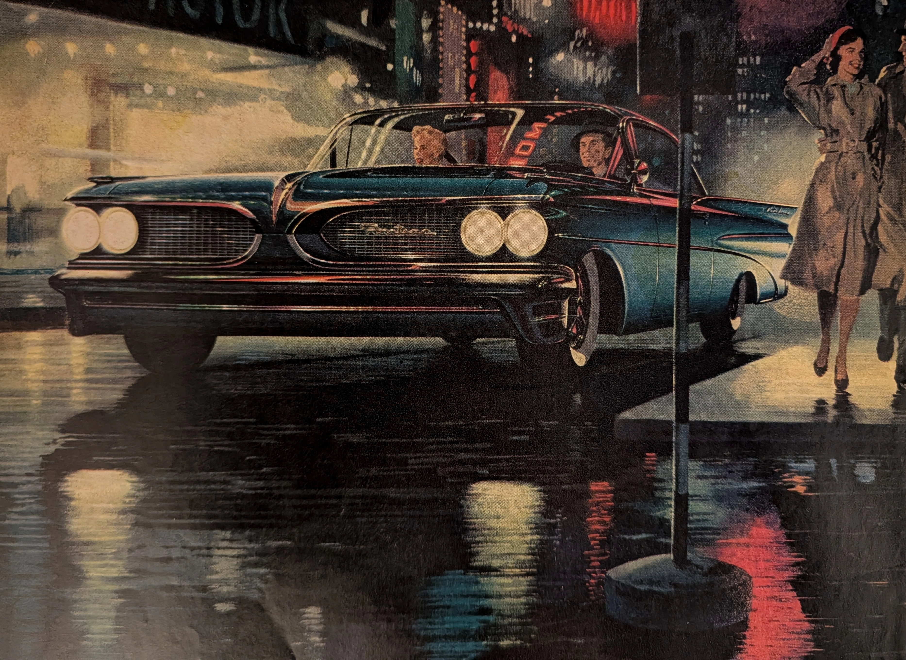
THE TIME TRAVELER'S DOSSIER :THE BIRTH OF THE WIDE-TRACK
The artifact currently subjected to our uncompromising, museum-grade analysis is a profoundly preserved Historical Relic excavated from the turning point of Detroit's "horsepower and handling" wars. This Primary Art Document is a full-page magazine advertisement for the 1959 Pontiac, explicitly introducing the brand's revolutionary "Wide-Track" engineering. Functioning as a "Forensic Blueprint of Automotive Rebranding," the document masterfully weaponizes the peerless artistic talents of Fitz and Van to transform Pontiac from a conservative, aging brand into America's most aggressive performance marque. Its historical context is irrefutably anchored by the extreme macro details of its proprietary engineering claims and the highly coveted "Body by Fisher" corporate hallmark. Grounded by these physical timestamps, the microscopic artist signature, and its breathtaking wabi-sabi chemical degradation, this artifact commands an irreplaceable status, cementing its Rarity Class A designation.