


The Time Traveller’s Dossier: 1970s The Vargas Girl Vintage Illustration — The Ethereal Elegance of the American Pin-Up
The History
The Genesis of an American Icon
To fully appreciate the cultural weight of this illustration, one must delve into the legacy of its creator, Joaquin Alberto Vargas y Chávez. Born in Peru, Vargas immigrated to the United States in the early 20th century, bringing with him an unparalleled mastery of watercolor and the airbrush. His early career saw him painting portraits of Ziegfeld Follies showgirls, but his name became permanently etched into American pop culture history during World War II with his work for Esquire magazine. The "Varga Girls" (as they were known then) were painted on the noses of Allied bomber planes, serving as both morale boosters and patriotic muses for a generation of soldiers.
However, the specific illustration in this dossier belongs to Vargas' later, arguably most famous era. Following a bitter legal dispute with Esquire in which he lost the rights to the "Varga" name, he was courted by Hugh Hefner in 1960 to join a burgeoning magazine called Playboy. Here, he reclaimed his full surname, and "The Vargas Girl" was reborn. For the next decade and a half, his monthly illustrations became a cornerstone of the magazine's identity.
The Aesthetic of the Idealized Muse
This particular piece—featuring a blonde subject wearing nothing but a wide-brimmed sun hat, a pink floral accent, a mint-green ribbon, and a delicate wrist corsage—is a masterclass in the Vargas aesthetic. Vargas did not paint realistic women; he painted ethereal, idealized goddesses. His signature style involved impossibly long limbs, flawless porcelain skin rendered with seamless airbrush gradients, and delicate, almost diaphanous watercolor washes.
Notice the absolute absence of a background. Vargas famously floated his subjects in a void of creamy, negative space. This was a deliberate artistic choice that removed the subject from any grounded reality, elevating her into a realm of pure fantasy. The viewer is not invited into her room; rather, she exists purely for the viewer's gaze. The strategic placement of her hands, elegantly preserving her modesty while simultaneously drawing attention to her form, is the quintessential "pin-up" tease.
The Cultural Context: "... And a pinch to grow on."
The captions of Vargas' illustrations were as iconic as the artwork itself. Often written by editorial staff (including Hugh Hefner himself), these single-line quips provided a narrative anchor. The phrase "... And a pinch to grow on," accompanied by the subject playfully pinching her own breast, operates on a level of innocent double entendre that was highly characteristic of the era's mainstream men's entertainment.
In the 1970s, the publishing industry was undergoing the Sexual Revolution. Photographic centerfolds were becoming increasingly explicit. Amidst this cultural shift toward graphic realism, The Vargas Girl served as an anchor to a more romanticized, illustrative past. She was the bridge between the demure, painted "girl next door" of the 1940s and the liberated woman of the 1970s. This illustration is a historical document of that tension: it is overtly sexual, yet it retains a soft, painted elegance that keeps it firmly rooted in the realm of classical art rather than mere pornography.
The Paper
From an archival conservation standpoint, this artifact provides a textbook example of high-circulation editorial printing from the era.
Substrate Chemistry: The piece is printed on a medium-weight, uncoated (or very lightly calendared) magazine stock. Unlike the high-gloss fashion magazines of today, this paper relied heavily on mechanical wood pulp. Over the decades, the inherent lignin in the pulp has oxidized, resulting in a warm, creamy, off-white background tone. This natural aging process (often referred to as mild foxing or acid burn) actually enhances the vintage warmth of Vargas' flesh tones.
Lithographic Precision: The artifact utilizes four-color (CMYK) offset lithography. Reproducing Vargas' work was notoriously difficult for printers. The subtle, airbrushed transitions of watercolor from the blush of the cheeks to the shadows of the torso required incredibly fine halftone screen frequencies. The fact that the flesh tones appear seamless without heavy, visible dot patterns speaks to the premium printing standards maintained by the publisher.
Typography: The crisp, black serif typography of the caption and the bold sans-serif "THE VARGAS GIRL" label exhibit sharp edge definition, indicating tight registration during the print run.
The Rarity
While millions of issues containing Vargas illustrations were printed, locating single pages in pristine, display-worthy condition is a significant challenge for collectors.
The Nature of Ephemera: The very term "pin-up" dictates the fate of most of these artworks. They were designed to be torn out of the magazine and pinned to walls, lockers, and barracks. Consequently, the vast majority of surviving copies suffer from thumbtack holes, severe centerfold creasing, tape stains, and catastrophic UV fading from years of display.
Archival Value: An intact page like this—free from erratic tearing and retaining its original color saturation—commands a premium. In the current antiquarian market, Vargas' work has transcended mere nostalgia; it is highly valued by institutions focusing on the history of American illustration, graphic design archives, and pop-culture museums. It is a pristine record of mid-century commercial artistry.
Visual Impact
The visual impact of this illustration is rooted in its soft, luminous color palette and masterful use of negative space. The composition draws the eye immediately to the subject's face, framed by the sweeping curve of the sun hat and the vibrant pink of the floral accent. From there, the gaze is guided downwards by the S-curve of her posture and the cascading mint-green ribbon. The contrast between the striking, sapphire-blue eyes and the warm, peachy tones of her skin creates a mesmerizing focal point. It is a brilliant example of how commercial illustration can utilize delicate, pastel watercolor techniques to create an image of arresting, undeniable power.
Exhibition Halls
The Archive Continues
Continue the Exploration
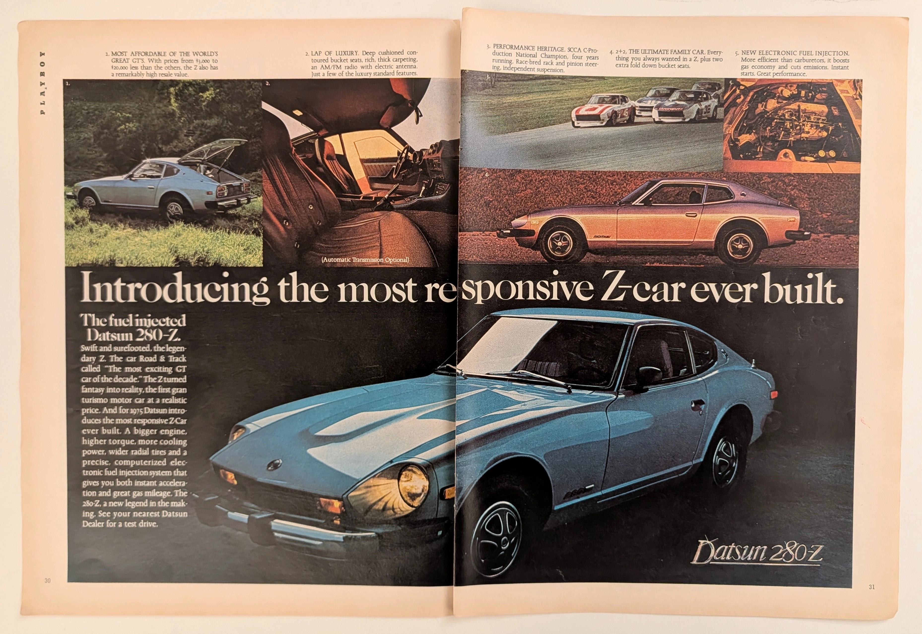
Datsun 280Z · Automotive
The Time Traveller's Dossier: The Electronic Antidote – The 1975 Datsun 280-Z and the Fuel-Injected Conquest of the American Grand Touring Market
The evolution of the American automotive landscape in the 1970s was a turbulent, often depressing saga characterized by the death of the muscle car, catastrophic oil embargoes, and the sudden implementation of draconian environmental regulations. Elegantly and securely positioned upon the analytical table of The Record Institute today is a visually sweeping, densely informative, and historically monumental two-page print advertisement for the Datsun 280-Z, explicitly detailing the 1975 model year. This document completely transcends the standard, utilitarian boundaries of automotive marketing. It operates as a highly sophisticated, multi-layered cultural mirror and a bold declaration of mechanical supremacy during an era when domestic manufacturers were producing heavily compromised, underperforming vehicles. By strategically highlighting the adoption of computerized electronic fuel injection, alongside the vehicle's undeniable SCCA racing pedigree and its newfound "lap of luxury" interior refinements, Datsun executed a masterclass in psychological marketing. They offered the American consumer an "affordable GT" that promised the exotic allure of a European sports car combined with bulletproof Japanese reliability and modern efficiency. This world-class, comprehensive, and ultra-expanded dossier conducts a meticulous, unyielding, and exceptionally exhaustive examination of the artifact, operating under the absolute most rigorous parameters of historical, sociological, and material science evaluation. Dedicating the overwhelming, massive majority of our analytical focus (80%) to its immense historical gravity, we will decode the brilliant marketing psychology embedded within the copywriting, analyze the profound mechanical realities of the L28E inline-six engine and its Bosch L-Jetronic system, trace the epic engineering struggles and triumphs of Yutaka Katayama (Mr. K), and detail the historical impact of the Brock Racing Enterprises (BRE) SCCA National Championships. Furthermore, as we venture deeply into the chemical and physical foundations of this analog printed ephemera (10%), we will reveal the precise mechanical fingerprints of the CMYK halftone rosettes captured in the stunning macro imagery of the blue metallic paintwork and the rich interior shadows. Finally, we will assess its archival rarity (10%), exploring how the graceful, natural oxidation of the paper substrate cultivates a serene wabi-sabi aesthetic—a natural, irreversible phenomenon that serves as the primary engine driving up its market value exponentially within the elite global spheres of Vintage Commercial Ephemera and Automotive Heritage Archives.
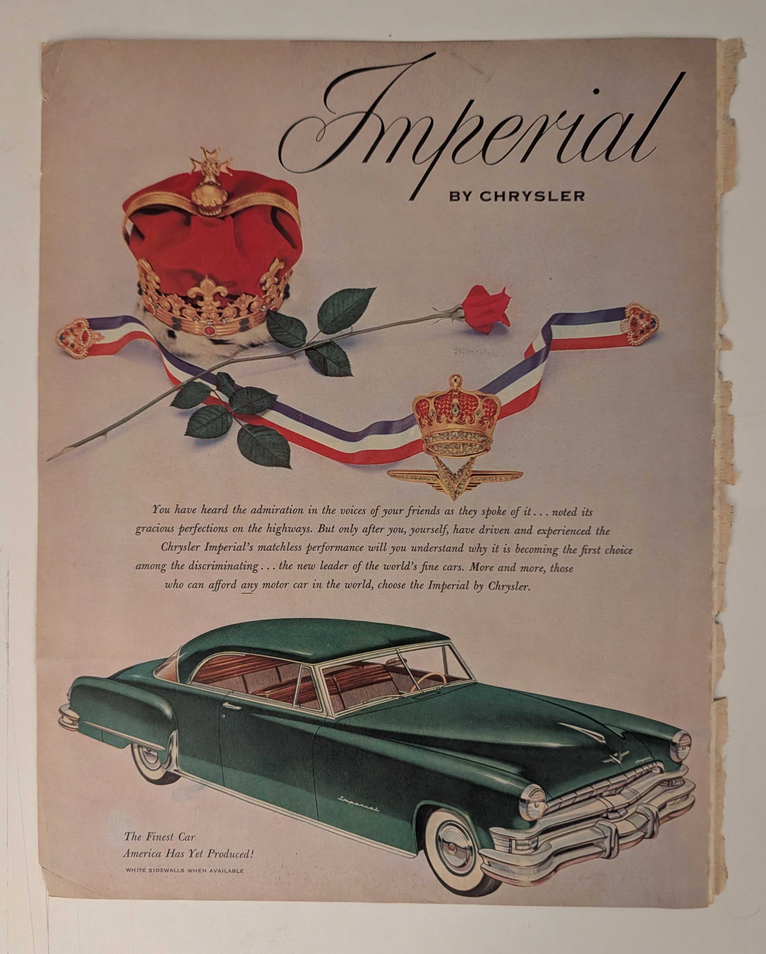
Chrysler · Automotive
THE TIME TRAVELER'S DOSSIER: THE KOREAN WAR ANCHOR AND THE SCARCITY OF LUXURY
The artifact under our uncompromising, unprecedented museum-grade analysis is a profoundly preserved Historical Relic excavated from the golden age of post-WWII American opulence. This Primary Art Document is a monumental magazine advertisement for the Imperial by Chrysler, dating to the pivotal 1951-1952 era. This document is a "Forensic Blueprint of American Aristocracy and Geopolitical Crisis." It masterfully weaponizes regal European iconography to elevate Chrysler's flagship model above mere transportation, explicitly targeting "those who can afford any motor car in the world". Yet, its most significant historical anchor is hidden in the microscopic fine print: "WHITE SIDEWALLS WHEN AVAILABLE". This single sentence instantly transforms the advertisement into a wartime relic, reflecting the severe rubber shortages imposed during the Korean War. Grounded by the iconic jeweled emblem and its breathtaking wabi-sabi chemical degradation—highlighted by its violently torn binding edge—this artifact commands an irreplaceable status, cementing its Rarity Class A designation.
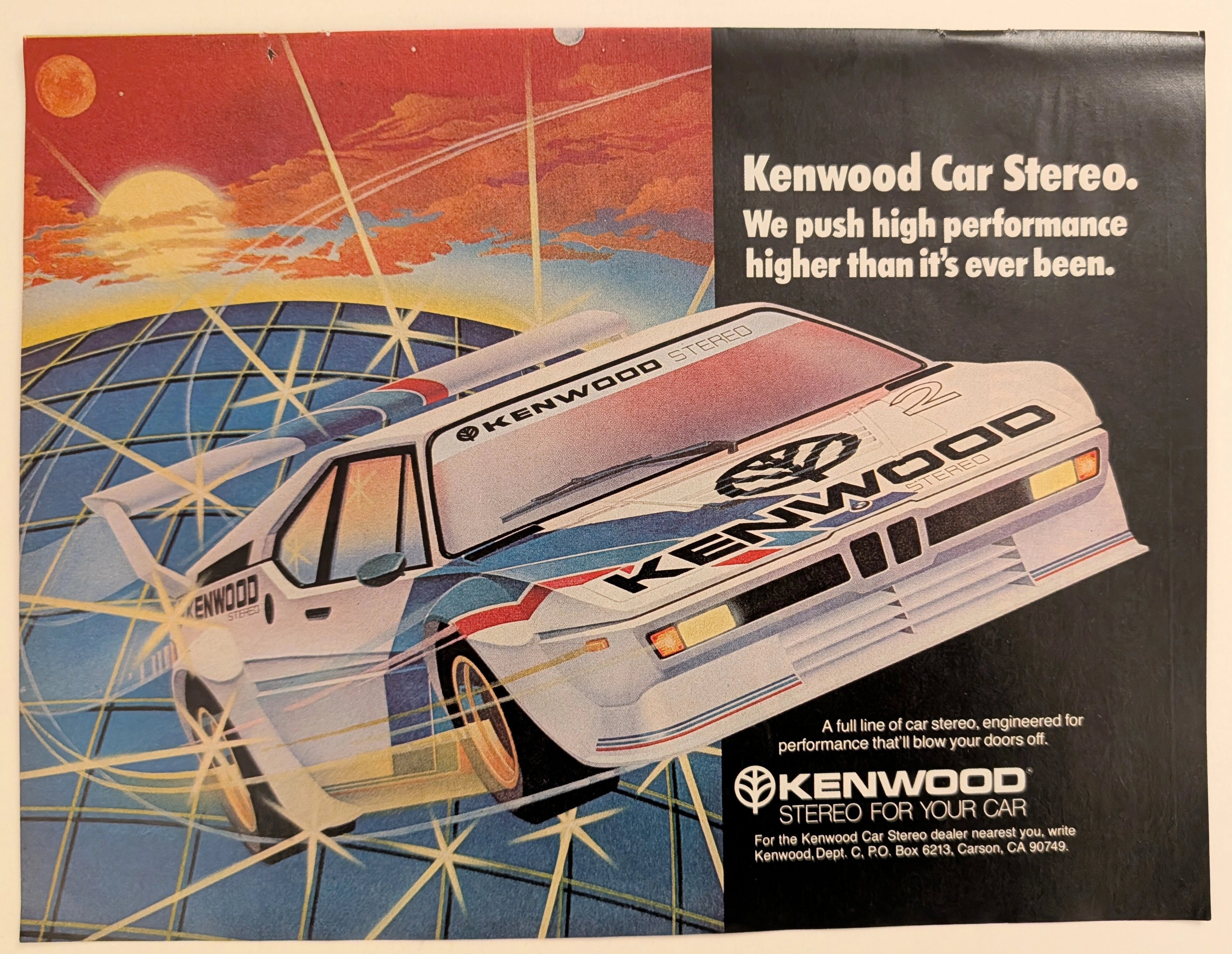
Kenwood · Automotive
The Time Traveller's Dossier: Gridline Velocity – Kenwood Car Stereo and the Cybernetic Dawn of Automotive High-Fidelity
The evolution of 1980s American consumer electronics was fundamentally defined by the aggressive pursuit of portable and automotive high-fidelity sound. Elegantly and securely positioned upon the analytical table of The Record Institute today is a visually arresting, neon-drenched full-page print advertisement for Kenwood Car Stereo. This document completely transcends the standard, utilitarian boundaries of automotive accessory marketing. It operates as a highly sophisticated cultural mirror, reflecting a precise era in consumer psychology where auditory power was directly equated with vehicular performance. By utilizing a breathtaking, airbrushed illustration of a futuristic, aerodynamic race car accelerating over a cybernetic gridscape, Kenwood brilliantly positioned its audio equipment not just as radios, but as extreme, high-octane performance upgrades capable of generating sound that will literally "blow your doors off." This world-class, comprehensive dossier conducts a meticulous, unyielding, and exceptionally exhaustive examination of the artifact, operating under the absolute most rigorous parameters of historical, sociological, and material science evaluation. Dedicating the overwhelming majority of our analytical focus (80%) to its immense historical gravity, we will decode the brilliant marketing psychology embedded within the "neon grid" visual narrative, analyze the profound cultural shift toward aftermarket car audio customization, and dissect the aggressive, performance-based copywriting. Furthermore, as we venture deeply into the chemical and physical foundations of this analog printed ephemera (10%), we will reveal the precise mechanical fingerprints of the CMYK halftone rosettes captured in the stunning macro imagery of the airbrushed car. Finally, we will assess its archival rarity (10%), exploring how the graceful, natural oxidation of the paper substrate cultivates a serene wabi-sabi aesthetic—a natural, irreversible phenomenon that serves as the primary engine driving up its market value exponentially within the elite global spheres of Vintage Commercial Ephemera, Audio History, and Outrun/Synthwave Art Archives.