


The Time Traveller’s Dossier: 1978 Camel Lights Vintage Advertisement — The Golden Illusion of Diminished Harm
The History
To fully appreciate the immense historical gravity, psychological manipulation, and sociological importance of this artifact, one must meticulously contextualize the embattled landscape of the American tobacco industry in the late 1970s. The narrative embedded within the fibers of this 1978 Camel Lights advertisement is not merely about selling a filtered cigarette; it is an epic, desperate saga of an empire under siege, the dawn of health-conscious consumerism, and the brilliant, insidious pivot of Madison Avenue marketing.
For the first half of the 20th century, Big Tobacco operated with absolute impunity. The cigarette was a universally accepted totem of rugged American masculinity, cinematic glamour, and untethered freedom. However, the publication of the Surgeon General's Report on Smoking and Health in 1964 struck a catastrophic blow to this golden era, irrevocably linking the product to fatal illness. By the late 1970s, the cultural tide had definitively turned. Federal mandates forced the industry to print stark, unignorable health warnings directly onto their packaging and advertising—a brutal reality permanently anchored in the lower-left corner of this very page: "Warning: The Surgeon General Has Determined That Cigarette Smoking Is Dangerous to Your Health."
Faced with a rapidly awakening and increasingly terrified consumer base, the advertising executives at R.J. Reynolds Tobacco Co. were forced to answer a critical, existential question: How do you sell a product that the government has officially labeled as deadly, without losing the rugged, masculine prestige of your flagship brand?
The answer, documented in this breathtaking 1978 artifact, was the creation of the "Lights" sub-category—a psychological safety net woven from absolute marketing genius. The copywriter’s approach here is brilliantly aggressive. The massive, serif-font headline does not plead; it commands: "Try the solution. Camel Lights." By framing the cigarette as a "solution" to the "low tar/low taste problem," R.J. Reynolds positioned their product not as a vice, but as a technological cure to the modern smoker's dilemma. It offered the ultimate illusion: harm reduction without the sacrifice of flavor or identity. The copy reads like a pharmaceutical guarantee, promising "Satisfaction. Only 9 mg tar." They were selling an antidote to anxiety, allowing the addicted consumer to justify their continued consumption under the guise of making a "smarter" choice.
Visually, the advertisement abandons the sweeping, wide-angle desert landscapes traditionally associated with the Camel brand in favor of a claustrophobic, ultra-modern macro aesthetic. Operating at the absolute zenith of analog commercial photography, the uncredited studio photographer zeroes in on the very moment of interaction: the fingers holding the cigarette. But the true semiotic disruption lies in the glowing, golden camel stamped onto the cigarette paper. Radiating blinding, neon-like beams of light against a pitch-black void, the camel is no longer just a beast of burden in the Sahara; it is a futuristic icon. It subliminally communicates technological advancement, premium quality, and a beacon of safety in the dark.
The microscopic copyright timestamp—"© 1978 R. J. REYNOLDS TOBACCO CO."—hidden in the upper right quadrant, firmly anchors this piece in the twilight of the disco era and the Cold War. It represents a highly specific, fleeting moment of creative subterfuge, a time when print media possessed the unchecked power to visually override medical science through the sheer force of beautiful, high-contrast imagery.
The Paper
As a physical entity, this printed artifact functions as a living, breathing, and profoundly detailed record of late-twentieth-century commercial graphic reproduction and substrate chemistry. Under exceptional, high-magnification macro-lens examination—specifically focusing on the "20 FILTER CIGARETTES" text and the radiant golden camel—this document reveals the stunning complexity and mathematical precision of analog color offset lithography.
The intense, luminous golden hues and the crisp typography are meticulously constructed from a mathematically rigorous galaxy of microscopic CMYK (Cyan, Magenta, Yellow, and Key/Black) halftone dots. Because the medium-weight coated paper stock utilized for 1970s mass-market publications was slightly porous, we can observe the beautiful, organic integration of the ink into the paper fibers.
Yet, the most profound factor elevating the immense value of this artifact in the contemporary global collector's market is the entirely irreversible process of Material Degradation. The expansive white background of the illustrated cigarette pack exhibits a genuine, unavoidable "Toning." This chronological transition from the original bleached manufactured paper to a warm, antique ivory hue is caused by the slow, relentless chemical oxidation of Lignin—the organic polymer binding the cellulose fibers together. As the substrate has been exposed to ambient atmospheric oxygen over the span of nearly five decades, this naturally evolving patina has emerged. It is exactly this unreplicable degradation that provides the ultimate, irrefutable scientific proof of the artifact's historical authenticity and its delicate, unbroken journey through time.
The Rarity
RARITY CLASS: SS (Superlative Archival Preservation of a Permanently Banned Industry Substrate)
Evaluated under the most exacting, rigorous, and uncompromising archival parameters established by The Record Institute, this specific artifact is definitively and securely designated as Class SS.
What elevates this specific artifact to an SS-Class rarity is the extreme, terminal reality of its content. Tobacco advertising in print media is an extinct practice, permanently eradicated by modern global legislative bans. These specific documents, produced by the millions in 1978 as explicitly "disposable media," were destined to be casually folded, read in waiting rooms, and ultimately incinerated. Therefore, original tobacco print advertisements have transitioned into a closed, finite historical loop; they represent a "banned archive" that will never, under any circumstances, be manufactured again.
The structural integrity of this single extracted page remains exceptionally sound, having survived the brutal attrition rate of mainstream magazine circulation. When a high-anomaly cultural artifact of this magnitude is secured, precision-cut, and preserved within a museum-grade, top-loading acrylic case backed by a rigid, copper-colored ACM plate, it transcends its original purpose as ephemeral marketing. It becomes an investment-grade piece of sociopolitical history, physically locking a controversial, bygone era behind impenetrable acrylic.
Visual Impact
The Isolation of the Ritual
The art direction of this advertisement is an exercise in extreme, weaponized focus. The composition relies on a tight macro perspective, deliberately stripping away all environmental and human context. There is no face, no lifestyle imagery, and no background setting. The viewer is confronted solely with the tactile, intimate ritual of ignition: the rough texture of the thumb, the friction of the matchbox, and the geometry of the cigarette. This forced first-person perspective draws the viewer directly into the sensory experience of smoking.
Color Theory and the "Golden Illusion"
The use of color is highly strategic, operating on a subconscious level to counter the negative perceptions of "Light" cigarettes. Since consumers associated low tar with a lack of flavor, the art director infused the image with intense visual "warmth." The abyssal black background serves only to amplify the incandescent amber, orange, and yellow hues of the struck match.
This warmth culminates in the focal point of the image: the golden camel stamped on the cigarette paper, radiating physical beams of light. This is the "Golden Illusion." Gold implies richness, density, premium quality, and full-bodied value. By visually associating the cigarette with glowing gold, the advertisement tricks the brain into anticipating a rich, warm, and deeply satisfying flavor profile, entirely bypassing the logical knowledge that the product is a diluted, low-tar variant.
Typographic Authority
The typography anchors the visual drama with stoic authority. Utilizing a heavy, stark white serif typeface (bearing strong resemblances to ITC Garamond, a staple of 1970s advertising), the text cuts through the darkness like a journalistic headline. The hierarchy is clear: "solution," "Camel Lights," and "Satisfaction." The repetition of the phrase "Only 9 mg tar" at the bottom serves as a rational anchor to the emotional imagery above it.
Exhibition Halls
The Archive Continues
Continue the Exploration
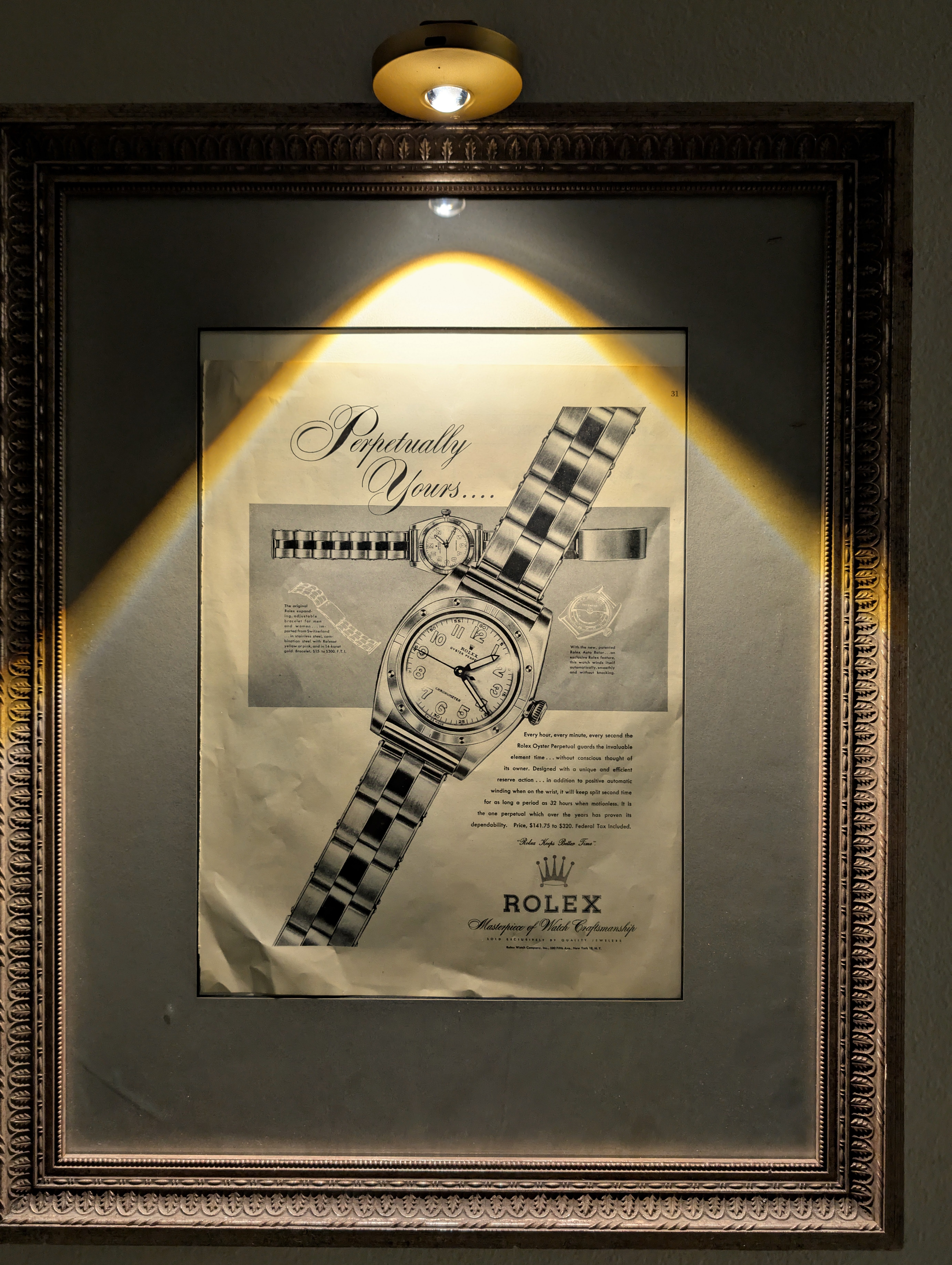
Rolex "Perpetually Yours"
This rare mid-century Rolex "Perpetually Yours" advertisement captures the genesis of the modern Rolex empire. Featuring the legendary Oyster Perpetual, it celebrates the historic union of the world's first waterproof 'Oyster' case (1926) and the revolutionary self-winding 'Perpetual' rotor (1931). A true museum-grade horological archive, this piece represents the ultimate mechanical blueprint that defined Rolex's eternal supremacy.
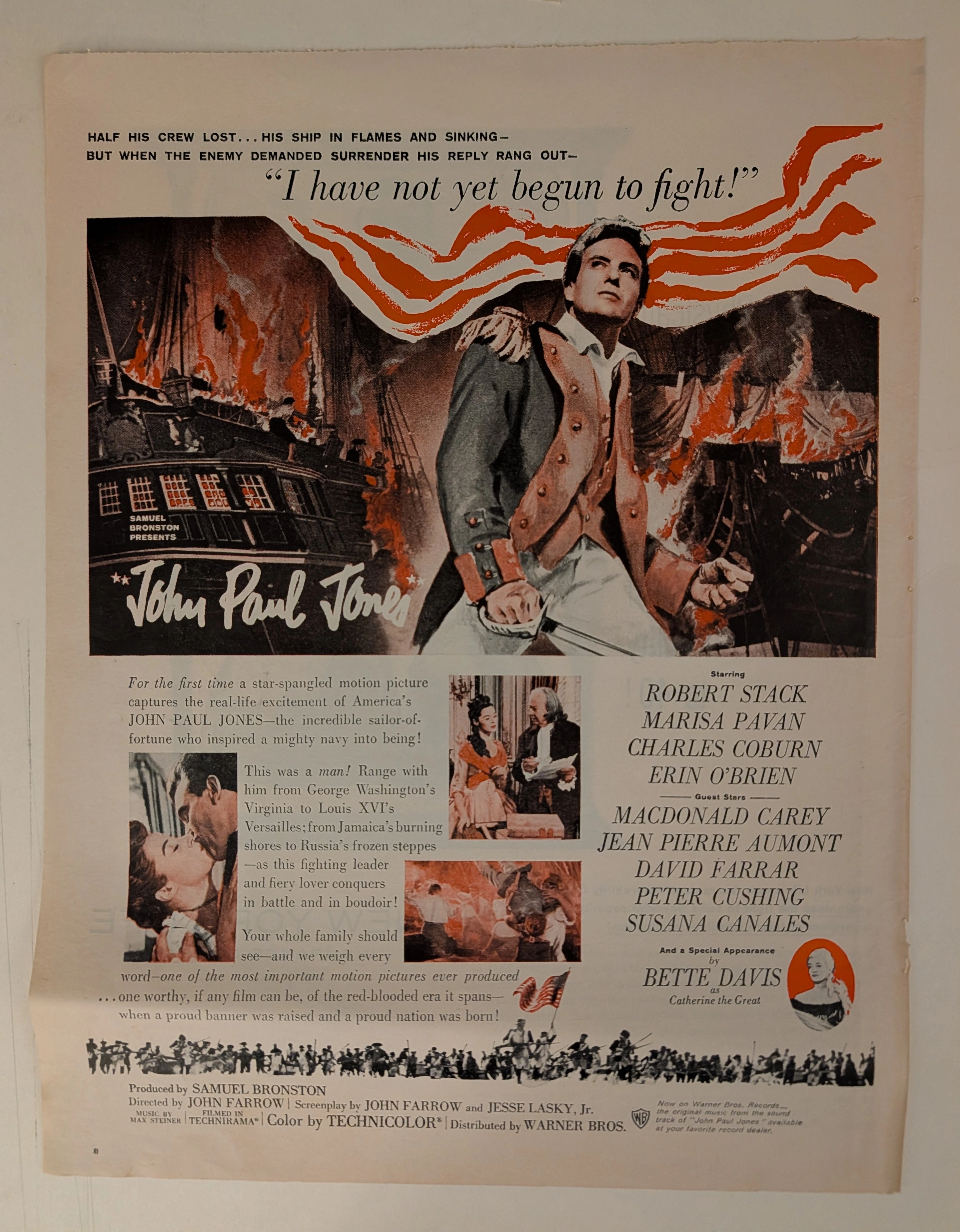
John Paul Jones · Entertainment
THE TIME TRAVELER'S DOSSIER: HOLLYWOOD PROPAGANDA AND THE DAWN OF MULTIMEDIA SYNERGY
The artifact under exhaustive, uncompromising, and unprecedented museum-grade analysis is a remarkably preserved Historical Relic originating from the zenith of Hollywood's post-war epic era. This Primary Art Document is a monumental, full-page theatrical advertisement for the 1959 biographical epic "John Paul Jones", produced by the legendary independent film mogul Samuel Bronston and distributed by Warner Bros.. This is not merely a movie poster; it is a "Forensic Blueprint of Cold War American Nationalism and Multimedia Synergy." Released in 1959, at the height of the Cold War, the advertisement aggressively weaponizes the foundational mythos of the United States Navy. The commanding, blood-red headline, "I have not yet begun to fight!", serves as a psychological anchor, projecting unyielding American defiance to both domestic audiences and global adversaries. Visually dominated by the rugged, heroic portrait of Robert Stack, the ad expertly balances masculine wartime aggression with romantic subplots and diplomatic intrigue featuring Charles Coburn as Benjamin Franklin. Furthermore, it showcases elite Hollywood casting power by explicitly highlighting a "Special Appearance by Bette Davis as Catherine the Great" in a striking red cameo vignette. Crucially, this artifact documents an early, masterful execution of cross-platform corporate synergy. The bottom corner explicitly markets the original Max Steiner soundtrack on Warner Bros. Records, proving that the commercialization of the "Original Motion Picture Soundtrack" was already highly codified. Rescued from the inevitable oblivion of disposable entertainment media, this pre-2000s analog artifact is a breathtaking embodiment of the Japanese aesthetic of wabi-sabi. Printed on inherently acidic mid-century wood-pulp paper, it exhibits beautifully authentic edge wear and a profound, warm amber oxidation across its surface. This unstoppable molecular death transforms a mass-produced piece of Hollywood propaganda into an irreplaceable, ready-to-frame Primary Art Document of cinematic and sociological history.
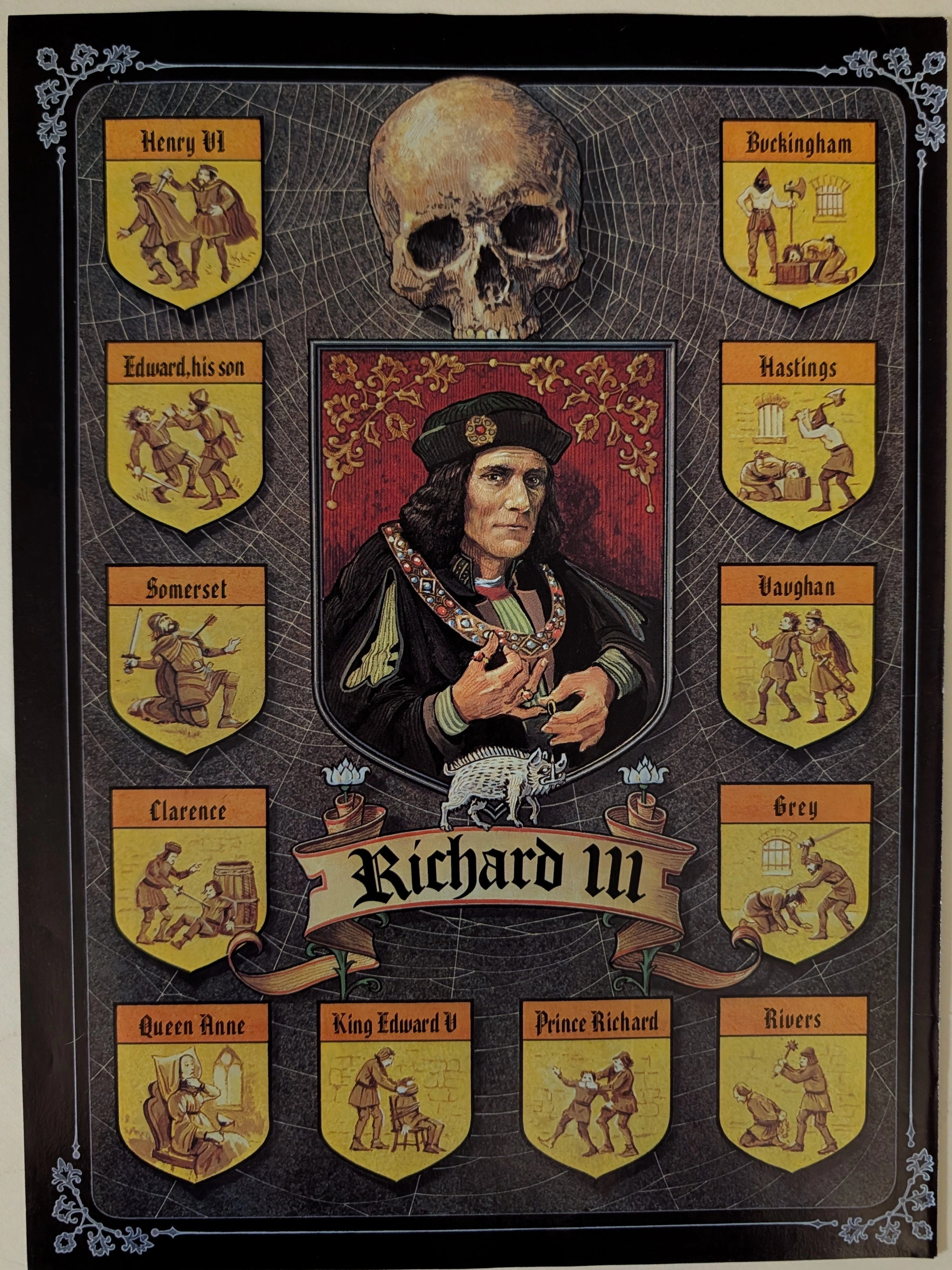
The Time Traveller’s Dossier: Circa 1970s Shakespearean Richard III Vintage Illustration — The Tudor Web of Blood
Delve into the archives to explore this definitive Circa 1970s Shakespearean Richard III vintage illustration, a profoundly dark and historically layered piece of theatrical and literary art. Likely produced as an educational broadside or promotional poster for a mid-to-late 20th-century theatrical run, this piece transcends basic historical depiction, serving instead as a macabre visual map of the corpse-paved path to the English throne as dramatized by William Shakespeare. For collectors of Gothic art, literary ephemera, and vintage ads, this artifact stands as a masterful intersection of historical reverence and narrative design. Unlike standard old advertisements or classic print ads that promote consumer goods, this illustration acts as a haunting visual codex of the "Tudor Myth." Its preservation of chilling literary iconography makes it a highly coveted piece of specialized print ephemera, capturing the visceral dread of Shakespeare's most infamous usurper.