


The Time Traveller's Dossier: The Anatomy of a Commodity – Chiquita's "How to read a banana" and the Invention of Produce Branding
The History
To fully appreciate the immense historical gravity, cultural magnitude, and sociological importance of this artifact, one must meticulously contextualize the complex, highly dominant landscape of the United Fruit Company (UFC) during the mid-twentieth century. The United Fruit Company was a colossal American agro-industrial multinational corporation that traded in tropical fruit (primarily bananas) grown on Central and South American plantations. Their geopolitical influence was so vast and deeply entrenched that they essentially authored the concept of the "Banana Republic," wielding immense power over the economic and political trajectories of several Latin American nations. However, by the 1960s, UFC faced a domestic marketing challenge: despite their vast supply chain, a banana was still just a banana to the American consumer. It was a generic commodity.
To combat commoditization and justify a premium price point, UFC launched one of the most successful branding initiatives in the history of agriculture. In 1963, they introduced the iconic blue Chiquita oval sticker, featuring Miss Chiquita, placing it directly on the skin of the fruit. This artifact, produced shortly after that branding revolution, represents the next phase of their psychological marketing strategy: consumer education.
The audacious, purely typographic headline anchoring the top of the artifact—"How to read a banana."—is a masterstroke of mid-century advertising. It immediately reframes the consumption of fruit from a passive biological act into an intellectual, analytical process. By instructing the consumer to "read" the fruit, Chiquita elevates the banana to an object worthy of study and scrutiny. The advertisement utilizes a clinical, infographic layout with precise leader lines pointing to specific anatomical features of the banana, effectively transforming the grocery shopper into a deputized quality-control inspector.
The copywriting embedded within these callouts is a masterclass in psychological re-framing. Consider the section detailing "Sugar spots". Biologically, these are simply signs of natural enzymatic browning and over-ripening. Yet, the copy brilliant spins this potential visual defect into a hallmark of premium quality: "Like as not, they're not speckles at all. They're sugar spots. The mark of a sweet, ripe banana." By renaming a blemish as a "sugar spot," Chiquita effectively immunized their product against the superficial visual judgments of consumers, extending the shelf-life and desirability of older fruit.
Furthermore, the artifact aggressively pushes the narrative of exclusivity and rigorous corporate standardization. The callout for "The label" states: "It means it passed a 15-point inspection by some of the toughest inspectors in the business. Not once, but three separate times.". This is a profound statement for a piece of fruit grown on a tree. UFC was projecting the language of high-tech manufacturing, aerospace engineering, and rigorous industrial quality control onto an agricultural commodity. The blue sticker was transformed from a mere trademark into a certified seal of rigorous mechanical inspection.
The formal copyright line at the bottom right—"Chiquita Brand Bananas. Chiquita is a registered trademark of United Fruit Company."—serves as a stark historical anchor. In 1970, seeking to shed the heavy, controversial geopolitical baggage associated with its name, the United Fruit Company merged with AMK to become United Brands Company (and later, Chiquita Brands International). Therefore, this specific artifact, bearing the explicit "United Fruit Company" nomenclature alongside the modernized Chiquita sticker marketing, captures the precise, fleeting twilight of one of history's most powerful corporate empires just prior to its total corporate rebranding.
The Paper
As a physical entity, this printed artifact functions as a living, breathing, and profound record of mid-twentieth-century graphic reproduction and substrate chemistry. Under exceptional, high-magnification macro-lens examination, this document reveals the stunning complexity and mathematical precision of analog color printing.
The extraordinary macro photographs of the blue Chiquita label and the intricate brown "sugar spots" provide a textbook visualization of a CMYK halftone rosette pattern. The seemingly solid blue of the oval sticker, the vibrant yellow of the banana peel, and the deep, organic brown of the ripening spots are not solid swatches of ink. Instead, they are meticulously constructed from a precise, mathematically rigorous galaxy of microscopic ink dots. Cyan, Magenta, Yellow, and Key (Black) inks are elegantly and systematically layered at highly specific angles to trick the human eye and the biological visual cortex into perceiving a continuous, vibrant, and dimensional photographic reality out of mere clusters of ink. The texture of the uncoated magazine paper stock further illustrates how the ink absorbed into the organic fibers, creating a soft, matte finish characteristic of 1960s high-volume offset printing.
Yet, the most profound and impactfully beautiful factor elevating the immense value of this artifact in the contemporary global collector's market is the natural, organic, and entirely irreversible process of Material Degradation. The expansive margins and the stark negative space surrounding the banana exhibit a genuine, unavoidable "Toning." This gradual, chronological transition from the original bright, bleached manufactured paper to a warm, antique ivory and golden hue is caused by the slow, relentless chemical oxidation of Lignin—the complex organic polymer that naturally binds cellulose fibers together within the raw wood pulp of the paper. As the substrate is exposed to ambient oxygen and ultraviolet light over a span of decades, the molecular structure of the lignin gracefully breaks down. This naturally evolving patina represents the absolute core of the wabi-sabi aesthetic. It is precisely this authentic, unreplicable degradation that acts as the primary engine driving up its market value exponentially among elite curators and collectors, as it provides the ultimate, irrefutable scientific proof of the artifact's historical authenticity and its delicate journey through time.
The Rarity
RARITY CLASS: B (Very Good Archival Preservation with Natural Margin Toning)
Evaluated under the most exacting, rigorous, and uncompromising archival parameters established by The Record Institute, this artifact is definitively and securely designated as Class B.
The remarkable and defining paradox of mid-century commercial ephemera is that these specific documents were produced by the millions as explicitly and intentionally "disposable media." Inserted into high-volume consumer publications of the late 1960s, they were inherently destined by their very nature to be briefly observed, casually folded, and ultimately discarded into the recycling bins of history. For a full-page, graphically significant advertisement to survive entirely intact without catastrophic structural tearing, without destructive moisture staining, or without the fatal, irreversible fading of the delicate, light-sensitive halftone inks constitutes a highly significant statistical archival anomaly.
The structural integrity of this paper remains exceptionally sound. While the rich analog colors—particularly the defining cyan and magenta layers of the Chiquita sticker and the warm yellows of the fruit—remain astonishingly vibrant, there is a beautiful, mathematically even, natural lignin oxidation reflecting its era. This displays a pronounced, warm ivory patina heavily along the expansive margins and negative space. This environmental interaction does not detract from its immense value; rather, it authentically validates the document's chronological journey. The sheer sociopolitical weight of the subject matter—the definitive documentation of the United Fruit Company's psychological transformation of a generic agricultural commodity into a branded luxury—makes this a highly prized, museum-worthy piece of advertising heritage, requiring acid-free, UV-protected conservation framing to ensure its historical permanence.
Visual Impact
The aesthetic brilliance and psychological power of this artifact lie in its masterful execution of "Clinical Minimalism." The art director has deliberately constructed a visual hierarchy that strips away all environmental context, isolating the subject to force intense, analytical observation.
The composition completely removes the banana from the supermarket aisle, the fruit bowl, or the jungle. Instead, it is suspended in a vast, stark, softly lit void of negative space. This heavy reliance on negative space serves a profound psychological purpose: it elevates a mundane piece of fruit into a scientific specimen. The use of sharp, rigid, black leader lines connecting the clinical typographic paragraphs directly to the organic curves of the fruit further reinforces this aesthetic of an anatomical textbook or an engineering schematic.
The visual layout guides the eye flawlessly. The massive, bold typography of the headline demands immediate attention, which then drops down to the top of the banana stem. The eye is then forced to follow the elegant, natural curve of the fruit downwards, pausing at each precisely placed callout—"Sugar spots," "The ridge," "The label," "The peel," and finally, "The tip." The vivid blue and yellow Chiquita sticker sits perfectly centered on the fruit's curve, acting as the ultimate visual anchor and the definitive seal of corporate authority amidst the organic yellow landscape of the peel.
Exhibition Halls
The Archive Continues
Continue the Exploration
Vintage 70s Crown Royal Ad: Vanishing Analog Art | The Record
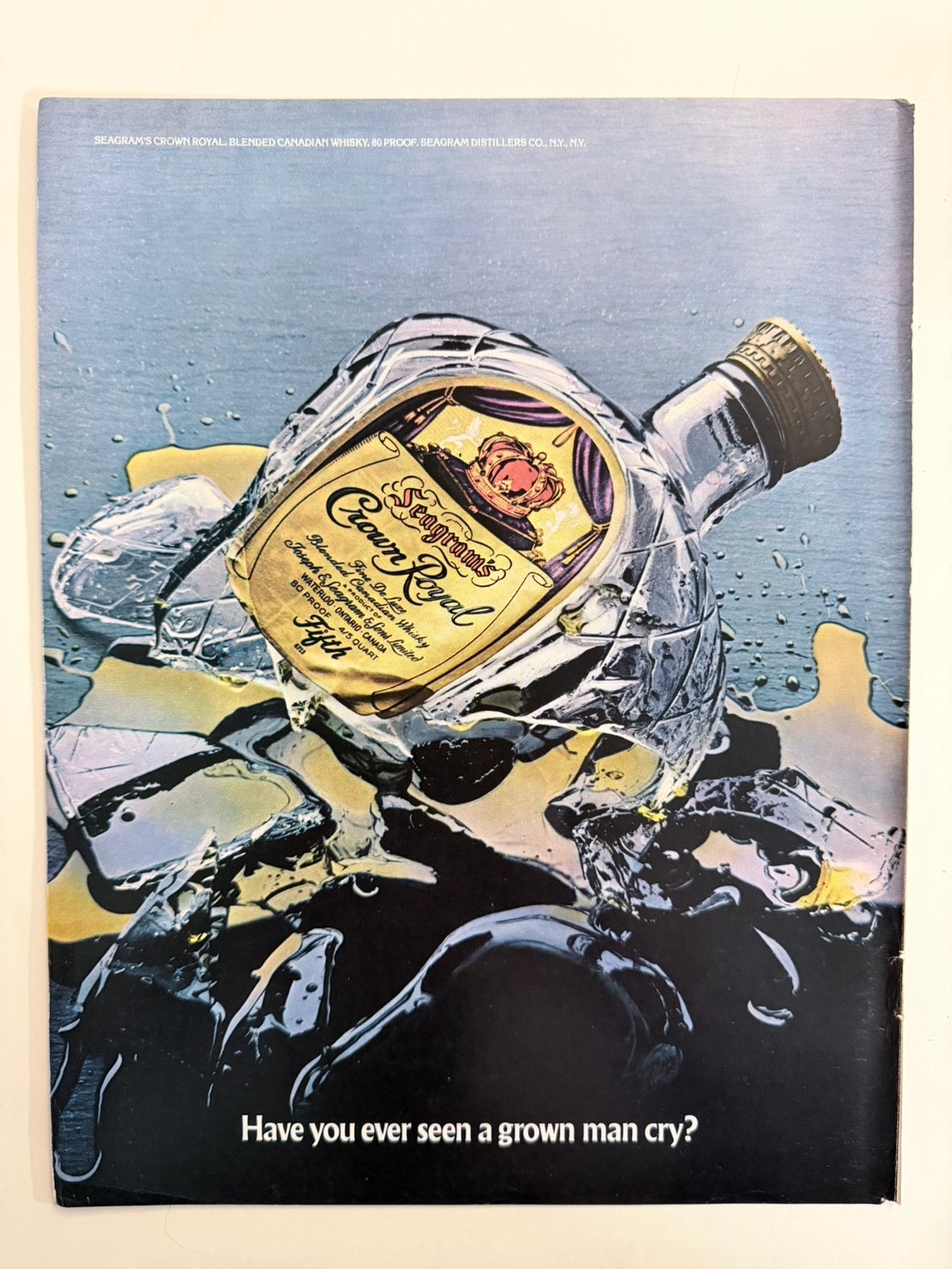
An in-depth look at the priceless 1970s Crown Royal "Have you ever seen a grown man cry?" advertisement. A masterpiece of authentic analog photography on degrading vintage paper, driving up the value of this original print as global supply inevitably shrinks.
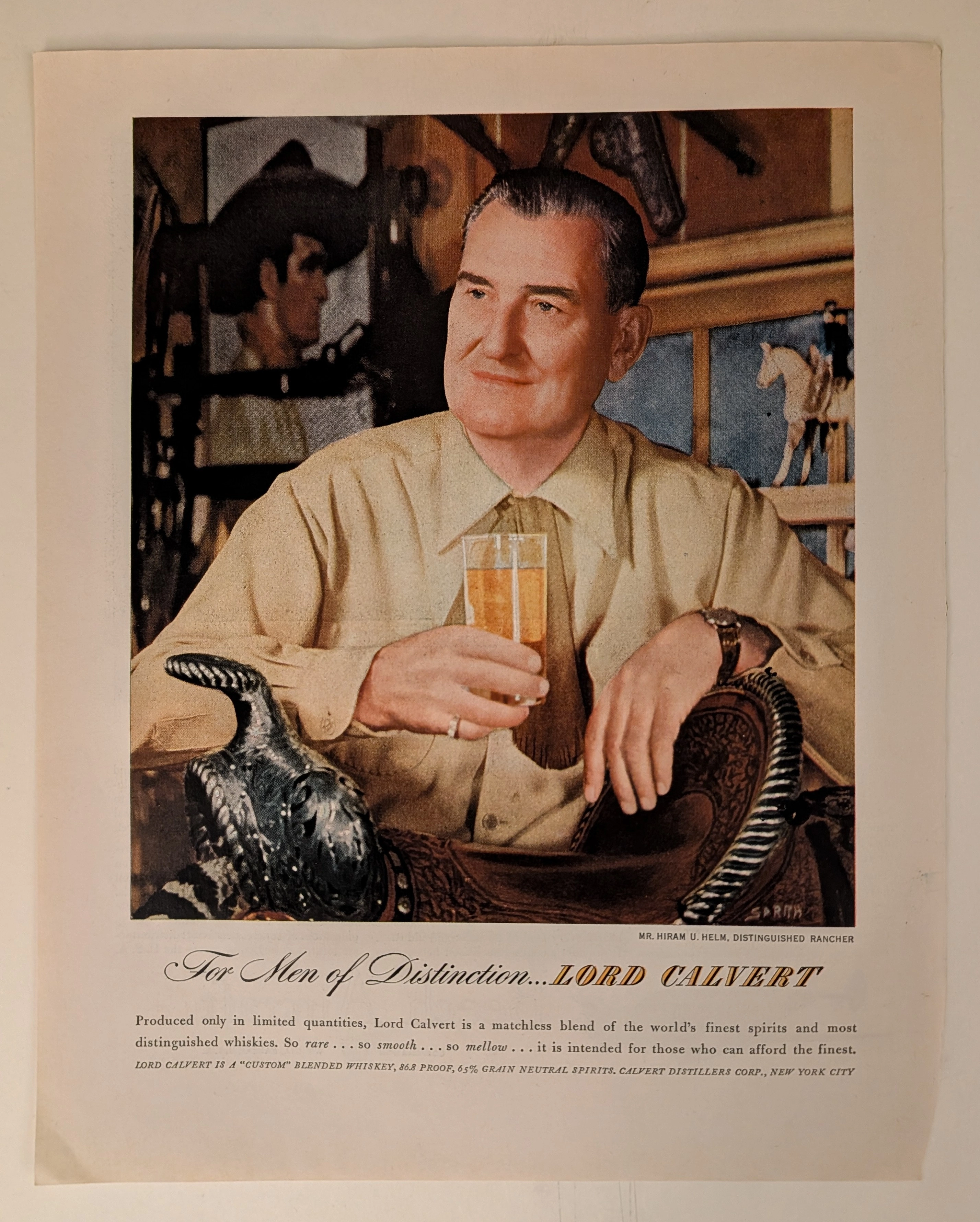
THE TIME TRAVELER'S DOSSIER: THE COMMODIFICATION OF STATUS AND THE ART OF THE ELEGANT ILLUSION
The artifact under exhaustive, uncompromising, and unprecedented museum-grade analysis is an exceptionally preserved Historical Relic originating from the absolute zenith of Madison Avenue's psychological marketing era (circa late 1940s to 1950s). This Primary Art Document is a monumental, full-page advertisement for LORD CALVERT, produced by the Calvert Distillers Corp., New York City. This piece represents the visual anchor for one of the most legendary, extensively studied, and phenomenally successful advertising campaigns in the history of American capitalism: "For Men of Distinction". It features a masterful, hyper-realistic portrait of Mr. Hiram U. Helm, Distinguished Rancher, deliberately painted/photographed to exude rugged sophistication, wealth, and aristocratic leisure. The artwork proudly bears the signature of SARRA (Valentino Sarra), a titan of mid-century commercial photography and illustration known for his cinematic lighting and profound character studies. This document is a profound "Sociological Blueprint of Aspirational Wealth." It masterfully utilized the psychology of exclusivity, marketing a blended whiskey composed of "65% Grain Neutral Spirits" as a "Custom" blend intended only "for those who can afford the finest". Rescued from the inevitable oblivion of disposable mass media, this mid-century analog artifact is a breathtaking embodiment of the Japanese aesthetic of wabi-sabi. Printed on inherently acidic wood-pulp paper, it exhibits a beautifully authentic, warm amber oxidation across its entire surface. This unstoppable molecular death transforms a piece of mass-produced corporate propaganda into an irreplaceable, ready-to-frame Primary Art Document of post-war sociological history.
Magnavox Star System 1981 Leonard Nimoy TV Advertisement | 'The Picture of Reliability' | Deep Analysis Rarity Class A-SS
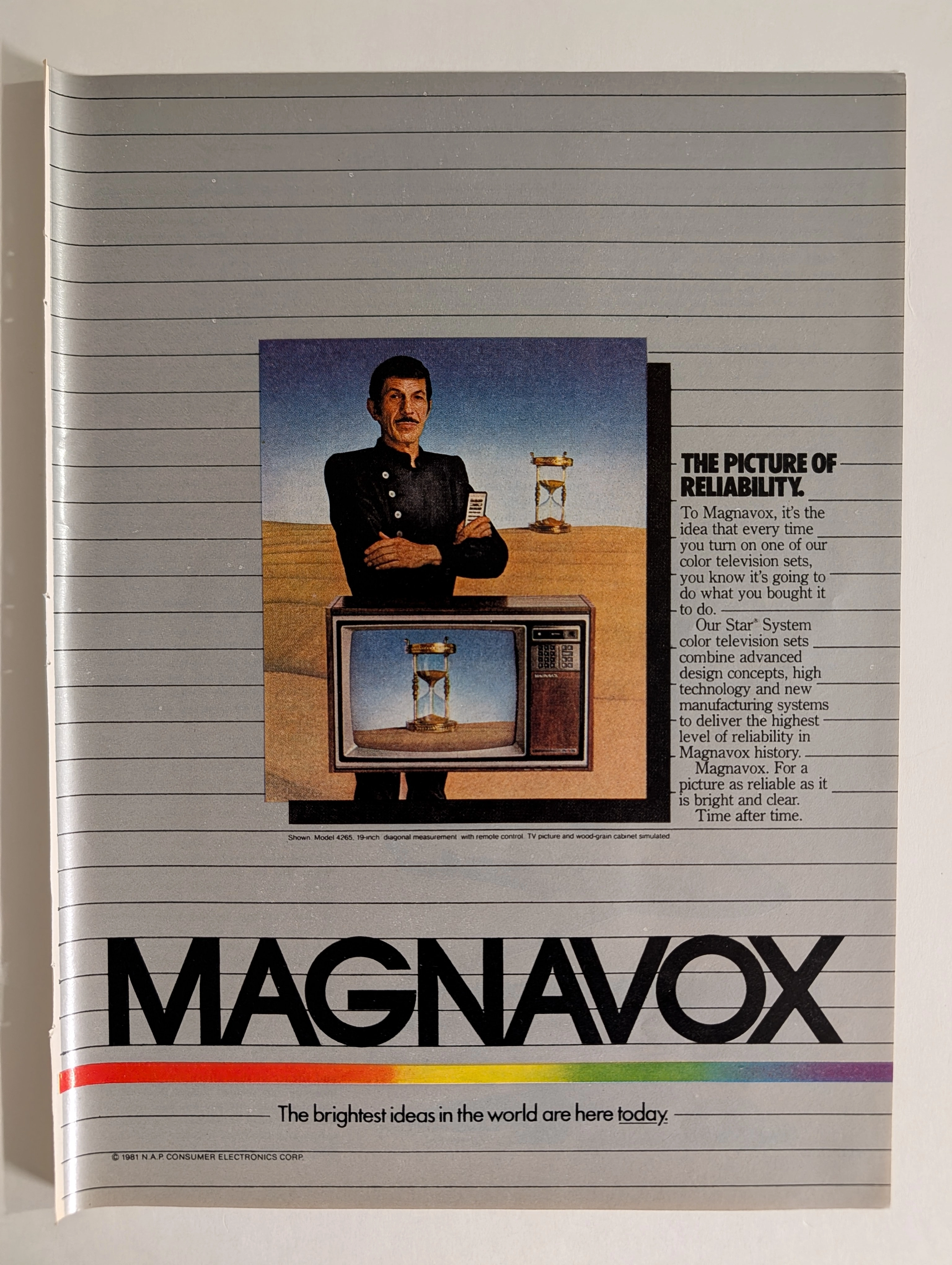
The advertisement analyzed here is a full-page full-color magazine promotion for Magnavox's Star® System color television sets, copyright © 1981 N.A.P. Consumer Electronics Corp. The ad features what is almost certainly Leonard Nimoy — iconic for his role as Mr. Spock in Star Trek — dressed in a black nehru-collar uniform against a surrealist desert landscape, standing above a Magnavox color TV set (Model 4265, 19-inch diagonal) that displays an hourglass on screen. A second hourglass appears behind him. The visual concept communicates timeless reliability. The headline 'The Picture of Reliability' and tagline 'The brightest ideas in the world are here today' frame Magnavox's Star System as the pinnacle of 1981 television technology. The rainbow spectrum stripe at the bottom is a distinctive brand element that ran across Magnavox advertising throughout the early 1980s. N.A.P. (North American Philips) Consumer Electronics Corp. was the American subsidiary of Philips that owned the Magnavox brand at this time, having acquired it in 1974.