


The Time Traveller's Dossier: The Anatomy of Autonomy – The 1966 Bulova Commander Collection and the American System of Watchmaking
The History
To fully appreciate the immense historical gravity, cultural magnitude, and sociological importance of this artifact, one must meticulously contextualize the complex, highly competitive landscape of the global watchmaking industry in the mid-1960s. During this era, the Bulova Watch Company was an absolute titan of global commerce. They were the largest marketer of jeweled-movement watches in the United States, possessing an advertising budget and a distribution network that eclipsed nearly all competitors. However, 1966 was also a period of profound technological transition. Bulova had recently revolutionized the world with the release of the electronic Accutron tuning-fork watch in 1960, a space-age marvel utilized by NASA. Yet, this specific artifact does not promote electronics; it champions the Bulova Commander, a traditional, 30-jewel, self-winding mechanical timepiece. This deliberate choice reveals a critical historical narrative: even as they conquered the future of electronic timekeeping, Bulova possessed a fierce, unwavering pride in their absolute mastery of traditional mechanical micro-engineering.
The audacious headline anchoring the bottom of the artifact—"If you want something done right, do it yourself."—is a masterstroke of mid-century psychological marketing. It taps directly into the foundational American ethos of the Protestant work ethic, self-reliance, and uncompromising personal responsibility. The advertising copy delves deeply into this philosophy, establishing a direct attack on the traditional Swiss établissage system. Historically, the Swiss watch industry was highly compartmentalized horizontally; a brand would often purchase movement blanks (ébauches) from one factory, dials from another, and cases from a third, merely acting as an assembler. Bulova, conversely, pioneered the "American System of Watchmaking" under its founder, Joseph Bulova. This system prioritized vertical integration—the mass production of highly standardized, perfectly interchangeable parts manufactured entirely under one corporate roof.
The copy proudly, almost defiantly, declares: "As far as we know, except for the jewels, we make more of our own parts than any other watch company in the world. It's not the easiest way, nor the cheapest, but it makes it very unlikely that anything will go wrong with a Bulova". In an era where consumers were increasingly skeptical of complex, mass-produced goods, Bulova was selling ultimate corporate accountability. They were explicitly telling the buyer that if a gear failed or a mainspring snapped, there was no labyrinth of subcontractors to blame—the responsibility rested solely and squarely on Bulova's shoulders.
The specific timepiece featured, the Commander Collection automatic, highlights the mechanical extravagance of the era. The prominently advertised "30 Jewels" indicates a highly sophisticated, premium movement (likely the robust Bulova caliber 10COAC). In mechanical horology, synthetic ruby jewels are utilized as bearings to radically reduce friction at the pivot points of the gear train. A standard manual-wind watch of the era functioned perfectly on 17 jewels; the inclusion of 30 jewels signifies an over-engineered, ultra-low-friction automatic movement designed for decades of relentless, accurate service. Paired with a solid "14K gold" case, this was a formidable instrument of status.
Furthermore, the copyright line at the absolute bottom of the page serves as a testament to the staggering global reach of the Bulova empire in 1966. It lists: "New York, Toronto, Bienne, Milan, London, Frankfurt, Hong Kong". Bulova was no longer just an American company operating out of Woodside, Queens; they were a sprawling, multinational conglomerate. Their massive factory in Bienne, Switzerland, successfully combined the mechanized efficiency of the American assembly line with the centuries-old pedigree of Swiss horological craftsmanship. This artifact is a definitive, museum-grade record capturing Bulova at the absolute, untouchable height of its mechanical empire, just a few short years before the "Quartz Crisis" of the 1970s would arrive to permanently decimate and restructure the global mechanical watch industry.
The Paper
As a physical entity, this printed artifact functions as a living, breathing, and profound record of mid-twentieth-century graphic reproduction and substrate chemistry. Under exceptional, high-magnification macro-lens examination, this document reveals the stunning complexity and mathematical precision of analog color printing.
The extraordinary macro photographs of the watch face and the textured, dark brown alligator leather strap provide a textbook visualization of a CMYK halftone rosette pattern. The intricate golden hour markers, the sweeping curves of the text "30 Jewels," and the deep, organic crevices of the leather are not solid swatches of color, but are meticulously constructed from a precise, mathematically rigorous galaxy of microscopic ink dots. Cyan, Magenta, Yellow, and Key (Black) inks are elegantly and systematically layered at highly specific angles to trick the human eye and the biological visual cortex into perceiving a continuous, vibrant, and dimensional photographic reality out of mere clusters of ink. Furthermore, the deep, void-like black background requires an incredibly dense application of Key ink, saturating the porous, fibrous texture of the uncoated magazine paper stock and illustrating the heavy mechanical pressures of 1960s high-volume offset printing.
Yet, the most profound and impactfully beautiful factor elevating the immense value of this artifact in the contemporary global collector's market is the natural, organic, and entirely irreversible process of Material Degradation. The expansive lower margin containing the primary typography exhibits a genuine, unavoidable "Toning." This gradual, chronological transition from the original bright, bleached manufactured paper to a warm, antique ivory and golden hue is caused by the slow, relentless chemical oxidation of Lignin—the complex organic polymer that naturally binds cellulose fibers together within the raw wood pulp of the paper. As the substrate is exposed to ambient oxygen and ultraviolet light over a span of nearly six decades, the molecular structure of the lignin gracefully breaks down. This naturally evolving patina represents the absolute core of the wabi-sabi aesthetic. It is precisely this authentic, unreplicable degradation that acts as the primary engine driving up its market value exponentially among elite curators and collectors, as it provides the ultimate, irrefutable scientific proof of the artifact's historical authenticity and its delicate journey through time.
The Rarity
RARITY CLASS: B (Very Good Archival Preservation with Natural Margin Toning)
Evaluated under the most exacting, rigorous, and uncompromising archival parameters established by The Record Institute, this artifact is definitively and securely designated as Class B.
The remarkable and defining paradox of mid-century commercial ephemera is that these specific documents were produced by the millions as explicitly and intentionally "disposable media." Inserted into high-volume consumer publications of 1966, they were inherently destined by their very nature to be briefly observed, casually folded, and ultimately discarded into the recycling bins of history. For a full-page, graphics-intensive advertisement featuring a heavily saturated, solid black background to survive entirely intact from the mid-1960s without catastrophic structural tearing, without destructive moisture staining, or without the fatal, irreversible fading of the delicate, light-sensitive halftone inks constitutes a highly significant statistical archival anomaly.
The structural integrity of this paper remains exceptionally sound. While the rich analog colors—particularly the gleaming 14K gold tones of the watch casing and internal gears—remain astonishingly vibrant against the stark black void, there is a beautiful, mathematically even, natural lignin oxidation reflecting its era. This displays a pronounced, warm ivory patina heavily along the lower text margin. This environmental interaction does not detract from its immense value; rather, it authentically validates the document's chronological journey. The sheer sociopolitical weight of the subject matter—the definitive documentation of Bulova's vertical integration and "do it yourself" philosophy at the peak of their mechanical power—makes this a highly prized, museum-worthy piece of horological heritage, requiring acid-free, UV-protected conservation framing to ensure its historical permanence.
Visual Impact
The aesthetic brilliance and psychological power of this artifact lie in its masterful execution of "Mechanical Deconstruction"—an early, highly sophisticated form of what contemporary designers refer to as knolling. The art director has deliberately constructed a visual hierarchy that elevates mass-produced micro-engineering into high art.
The composition deliberately shatters the pristine, 14K gold exterior of the Bulova Commander to lay its internal organs bare against a stark, high-contrast, void-like black background. This serves a profound dual purpose. First, it demystifies the magic of the self-winding watch, presenting it as a rational, understandable collection of meticulously engineered components. Second, the sweeping, elegant 'S' curve of the mainspring stretching across the center of the page creates a flawless leading line, guiding the viewer's eye downward through the constellation of gears, dials, and rotors.
However, the true psychological genius of the visual layout is the relentless, rhythmic repetition of the tiny typographic caption: "Bulova made." Placed deliberately next to exactly sixteen different dissected components, this phrase operates as a visual drumbeat. It pounds the message of total in-house manufacturing supremacy into the viewer's subconscious without the need to read a single word of the main body copy. It is a textbook integration of confident corporate branding, psychological reassurance, and mesmerizing still-life product photography.
Exhibition Halls
The Archive Continues
Continue the Exploration
Simmon · Other
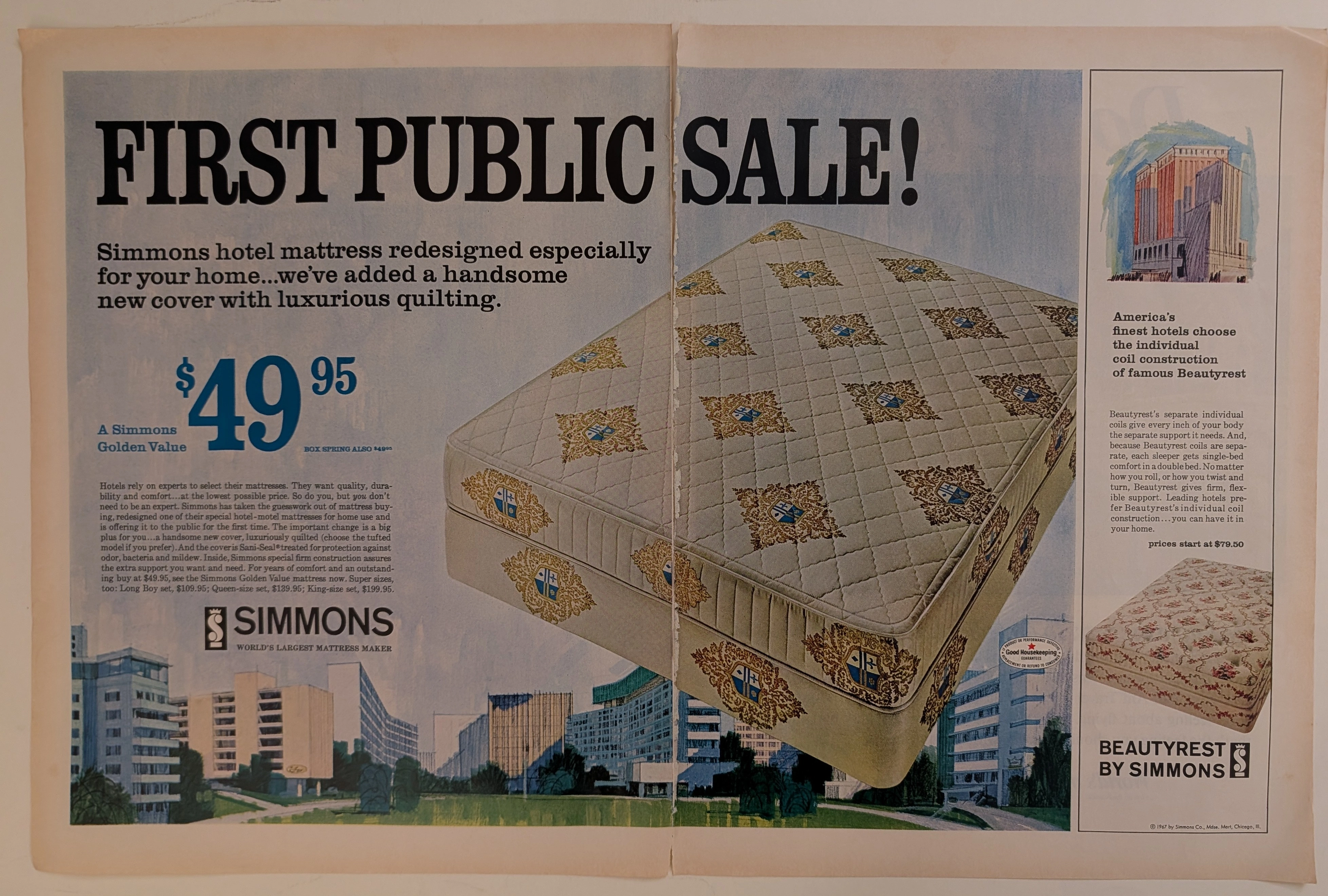
The Time Traveller's Dossier: The Architecture of Slumber – The 1967 Simmons Golden Value
The evolution of the American domestic interior during the mid-twentieth century was heavily influenced by the golden age of travel and the rapid expansion of the luxury hospitality industry. The historical artifact elegantly secured upon the analytical table of The Record Institute today is a large-format, two-page centerfold print advertisement for the Simmons Mattress Company, copyrighted in 1967. This document transcends standard consumer goods marketing; it operates as a sophisticated sociological mirror, reflecting a highly specific moment when industrial sleep engineering and the aspirational luxury of the modern hotel were explicitly packaged and sold to the suburban American household. This world-class, comprehensive dossier conducts a meticulous, profound, and historically objective examination of the artifact, operating under the absolute most rigorous parameters of sociological and material science evaluation. We will decode the brilliant marketing psychology embedded within the "First Public Sale" messaging, analyze the iconic "Good Housekeeping" endorsement, and dissect the rich semiotics of the heraldic quilt patterns alongside the modernist architectural illustrations. Furthermore, as we venture deeply into the chemical and physical foundations of this analog printed ephemera, we will reveal the precise mechanical fingerprints of the CMYK halftone rosettes and the graceful, natural oxidation of the paper substrate. This precise intersection of visual nostalgia, mid-century commercial artistry, and the immutable chemistry of time cultivates a serene wabi-sabi aesthetic—a natural, irreversible phenomenon that serves as the primary engine driving up its market value exponentially within the elite global spheres of Vintage Commercial Ephemera and Mid-Century Lifestyle Archives collecting.
Longines · Fashion
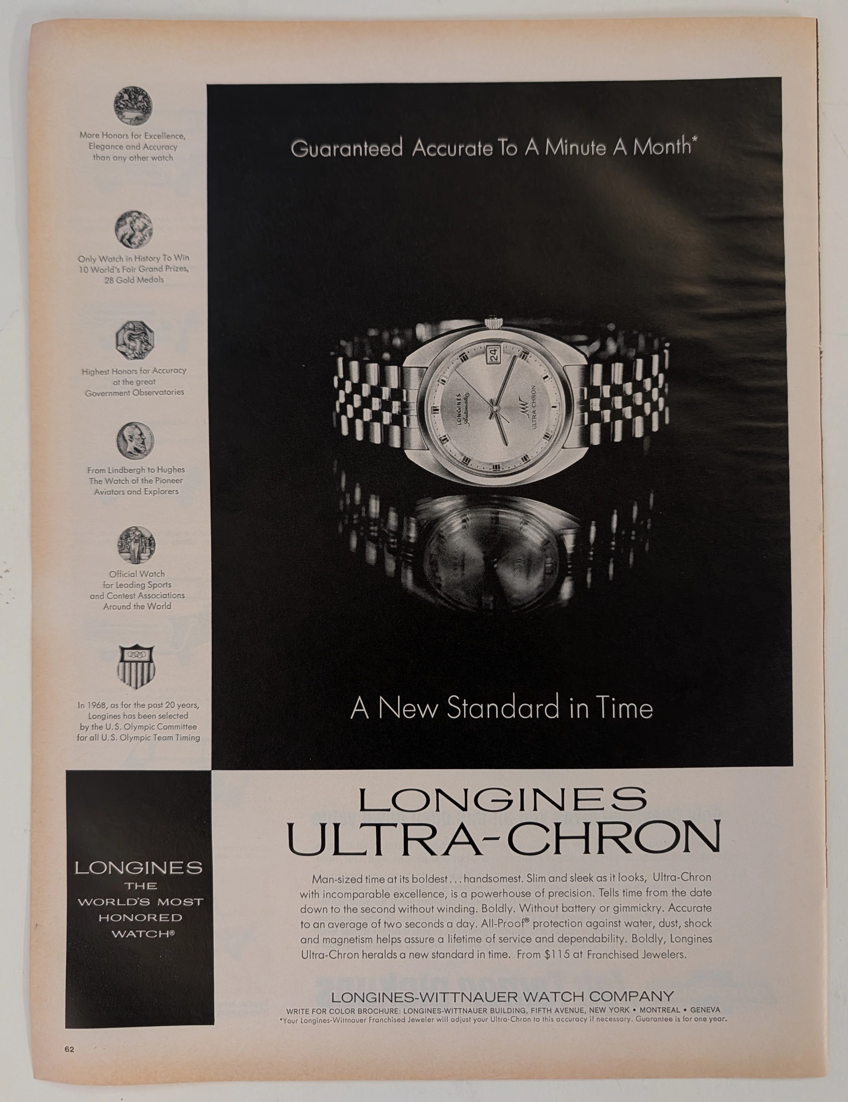
The Time Traveller's Dossier: The Ultimate Horological Supremacy – A Museum-Grade Forensic Deconstruction of the 1968 Longines Ultra-Chron
The evolution of human timekeeping is not merely a passive record of hands rotating in concentric circles; it is a brutal, centuries-long engineering war waged against the absolute, unforgiving laws of physics—specifically gravity, temperature fluctuation, and physical friction. The historical artifact placed upon The Record Institute’s forensic examination table today is a monumental full-page print advertisement for the 1968 Longines Ultra-Chron, extracted from a mid-twentieth-century publication. Released precisely on the precipice of the "Quartz Crisis"—a technological tsunami that would soon decimate the traditional Swiss watch industry—this document represents the absolute pinnacle, the zenith, and the glorious final, defiant stand of analog mechanical engineering. This exhaustive, world-class academic archival dossier will ruthlessly dissect the artifact with microscopic precision, operating under the most rigorous parameters of historical and physical evaluation. We will decode the arrogant yet mathematically backed copywriting that boldly claims "A Minute A Month" accuracy, the profound mechanical significance of the 36,000 vibrations per hour (vph) high-beat movement, and the five specific medallions of honor that permanently anchor the brand’s bloodline to legendary aviation pioneers such as Charles Lindbergh and Howard Hughes. Furthermore, we will subject the heavy, dark-field offset lithography to a rigorous material science analysis, exposing the mechanical fingerprints of the analog halftone rosettes and the inevitable, profoundly beautiful wabi-sabi oxidation of the paper substrate. It is this exact intersection of horological mastery and chemical degradation that acts as the primary engine driving the artifact's market value exponentially upward among serious global collectors.
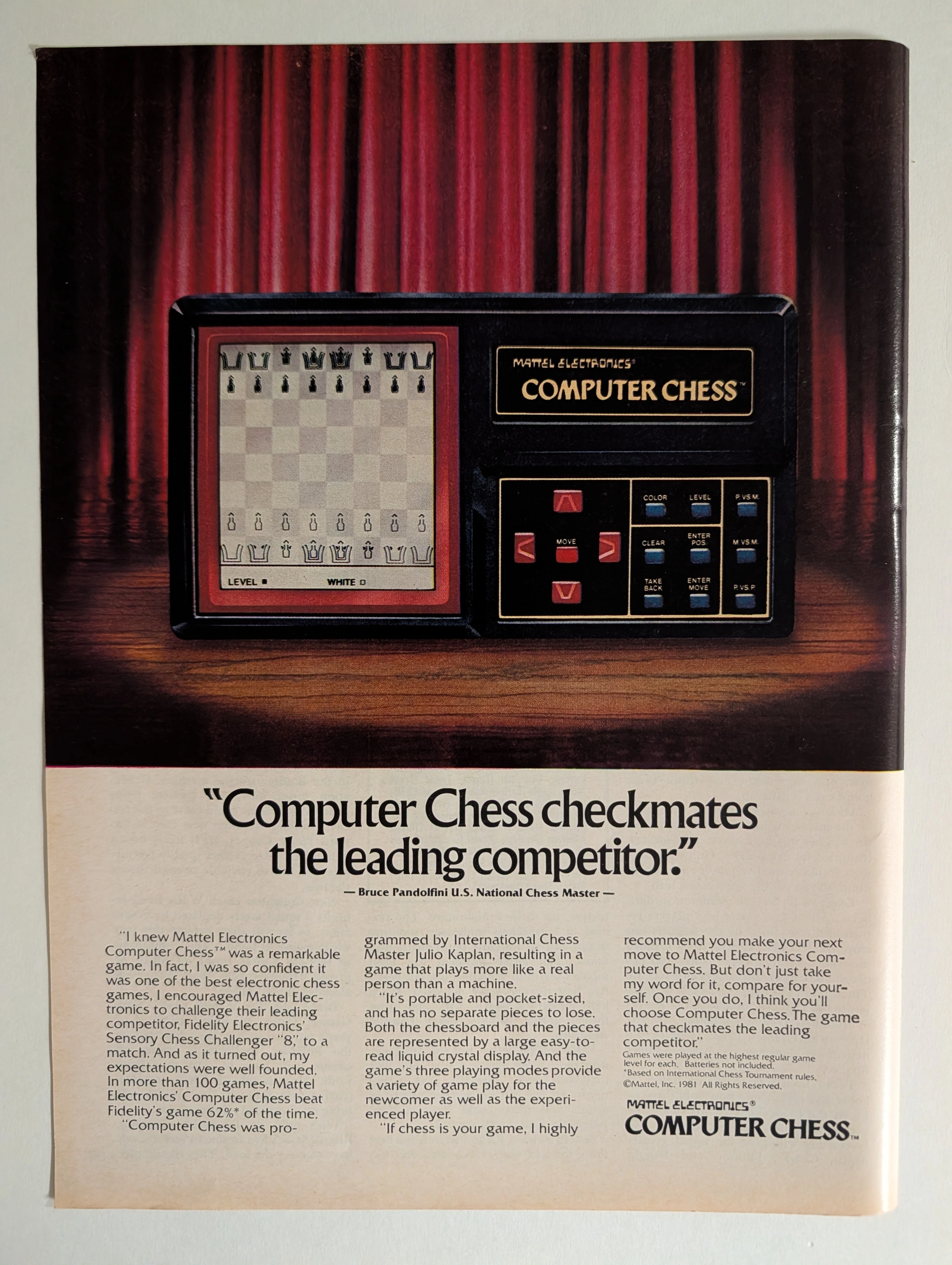
Mattel Electronics Computer Chess 1981 Full-Page Ad | Bruce Pandolfini | Julio Kaplan | Chess AI History | Deep Analysis Rarity Class A
The advertisement analyzed here is a full-page full-color magazine advertisement for the Mattel Electronics Computer Chess™ handheld/tabletop electronic game, copyright © Mattel, Inc. 1981. The ad ran in major American consumer magazines during 1981–1982 — the golden apex of the first electronic game boom. It features a dramatic theatrical photograph of the device spotlit against red velvet curtains on a wooden stage, with a bold competitive claim endorsed by U.S. National Chess Master Bruce Pandolfini: that Mattel's Computer Chess beat Fidelity Electronics' Sensory Chess Challenger '8' in more than 62% of over 100 head-to-head games. The ad also credits International Chess Master Julio Kaplan as programmer. This single page represents the intersection of early consumer AI history, 1980s toy advertising at its most theatrical, and a pivotal moment in the chess-computer arms race that prefigured Deep Blue.