


The Time Traveller's Dossier: The Electronic Antidote – The 1975 Datsun 280-Z and the Fuel-Injected Conquest of the American Grand Touring Market
The History
To fully appreciate the immense historical gravity, cultural magnitude, and sociological importance of this artifact, one must meticulously and exhaustively contextualize the complex, highly specific landscape of the global automotive industry leading up to the mid-1970s. The story embedded within the fibers of this two-page advertisement is not merely about selling a sports car; it is an epic saga of visionary corporate leadership, transatlantic engineering alliances, the brutal realities of government environmental mandates, and the absolute transformation of the American driving experience.
The narrative of the Z-car unequivocally begins with Yutaka Katayama, affectionately known in automotive lore as "Mr. K." As the president of Nissan Motor Corporation U.S.A. in the 1960s, Katayama was a rogue visionary who deeply understood the psyche of the American driver. At the time, Japanese imports were largely viewed as cheap, underpowered, and disposable economy cars. Nissan's early attempts at sports cars, the Fairlady roadsters, were charming but too small and primitive to capture the mass American market, which was dominated by heavy V8 muscle cars and expensive, fragile European imports like the Jaguar E-Type and the Porsche 911. Katayama relentlessly lobbied the conservative executives at Nissan headquarters in Tokyo to develop a bespoke sports car for America: a closed coupe with a long hood, a short deck, a reliable inline-six engine, four-wheel independent suspension, and a price tag that the middle class could actually afford. The result was the legendary Datsun 240Z, launched in late 1969. Designed by Yoshihiko Matsuo, the 240Z was an overnight, earth-shattering sensation. It looked like a million dollars, drove with the precision of a European exotic, rarely broke down, and cost just $3,526. It fundamentally destroyed the British sports car industry and put the world on notice.
However, the brilliant success of the early Z-car was soon threatened by geopolitical and environmental crises. By the early 1970s, the United States government enacted the Clean Air Act, mandating severe reductions in tailpipe emissions. Concurrently, the 1973 OPEC oil embargo made fuel efficiency a sudden national priority. Automotive engineers across the globe panicked. To meet the stringent new emissions standards, most manufacturers—including Nissan—resorted to crude, desperate measures. They lowered engine compression ratios, retarded ignition timing, and strapped restrictive, convoluted smog pumps and thermal reactors onto their carbureted engines. The transition model, the 1974 Datsun 260Z, suffered terribly from these band-aid fixes. Its complex, flat-top Hitachi carburetors were notoriously difficult to tune and suffered from severe vapor lock issues, causing the cars to stall in hot weather. The Z-car was losing its legendary responsiveness; it was being choked to death by bureaucracy.
It is within this exact climate of desperate, existential engineering panic that the hero of our artifact, the 1975 Datsun 280-Z, was born. Nissan realized that crude carburetors could no longer balance the conflicting demands of performance, fuel economy, and emissions. They needed a radical technological leap. The solution is proudly blazoned across the fifth vignette in the top right corner of the advertisement: "NEW ELECTRONIC FUEL INJECTION". Nissan abandoned carburetors entirely for the US market Z-car and adopted the highly advanced Bosch L-Jetronic fuel injection system (manufactured under license in Japan by JECS). Furthermore, to compensate for the weight of the newly mandated, heavy "5-mph impact bumpers" (clearly visible in the hero image with their thick black rubber overriders), Nissan engineers increased the displacement of the legendary L-series inline-six engine from 2.6 liters to 2.8 liters, creating the L28E.
The introduction of computerized electronic fuel injection (EFI) was an absolute game-changer, and it forms the central thesis of this advertisement. The copy explicitly celebrates this triumph: "A bigger engine, higher torque, more cooling power, wider radial tires and a precise, computerized electronic fuel injection system that gives you both instant acceleration and great gas mileage." EFI utilized an airflow meter and an electronic control unit (ECU) to precisely measure the air entering the engine and deliver the exact micro-second pulse of fuel required for optimal combustion. This completely eliminated the vapor lock issues, provided instant cold starts, smoothed out the power delivery, and, miraculously, allowed the 280-Z to pass strict emissions tests while actually regaining the horsepower that had been lost during the 260Z era. While American V8s were wheezing and stumbling with 140 horsepower, the 2.8-liter Datsun was producing a smooth, reliable 170 horsepower. It was the electronic antidote to the Malaise Era.
Beyond the engine technology, this artifact serves as a critical historical register of the Z-car's sociological evolution from a raw, purebred sports car into a refined Grand Tourer (GT). The advertisement's first vignette boldly claims it is the "MOST AFFORDABLE OF THE WORLD'S GREAT GT'S". By 1975, the original demographic of the Z-car was aging and becoming more affluent. They no longer wanted a Spartan interior; they demanded comfort. The second vignette, titled "LAP OF LUXURY," highlights the "Deep cushioned contoured bucket seats, rich, thick carpeting, an AM/FM radio with electric antenna". The macro imagery of the interior showcases a cabin that looks more akin to an executive jet than a track-day special. Furthermore, the fourth vignette highlights the "2+2, THE ULTIMATE FAMILY CAR". Introduced slightly earlier, the 2+2 variant featured a stretched wheelbase and a revised roofline to accommodate two small rear seats, drastically expanding the vehicle's market appeal to young executives with children. The Z was maturing.
However, Nissan knew they could not completely abandon the hardcore enthusiast. To legitimize the GT claims, the advertisement leans heavily on the brand's phenomenal, paradigm-shifting motorsport success. The third vignette, titled "PERFORMANCE HERITAGE," displays a thrilling, blurred action shot of Datsun Z-cars dominating a race track. The copy boasts: "SCCA C-Production National Champion, four years running." This is a direct, triumphant reference to Brock Racing Enterprises (BRE). Led by the legendary designer and team manager Peter Brock, and driven by the fiercely talented John Morton in the iconic red, white, and blue #46 Datsun 240Z, the BRE team absolutely annihilated the established European competition (like Triumph and Porsche) in the Sports Car Club of America (SCCA) C-Production class in the early 1970s. These consecutive national championships proved to the American public that Japanese cars were not just reliable commuters; they were fearsome, world-class performance machines capable of out-cornering and out-enduring the best Europe had to offer. Including this racing imagery in the 1975 ad was a psychological masterstroke, reassuring the buyer that beneath the new luxury carpets and heavy safety bumpers, the soul of a champion still beat furiously within the 280-Z.
The Paper
As a physical entity, this printed artifact functions as a living, breathing, and profoundly detailed record of mid-twentieth-century graphic reproduction, technical layout design, and substrate chemistry. Under exceptional, high-magnification macro-lens examination, this document reveals the stunning complexity and mathematical precision of analog color offset lithography, specifically adapted for a high-volume magazine centerfold spread.
The visual brilliance of this artifact is anchored by its capacity to render the sleek, aerodynamic curves and the icy, metallic reflections of the Datsun 280-Z's sheet metal using only microscopic deposits of liquid pigment. The macro photography of the primary vehicle and the inset images provides a textbook, museum-grade visualization of a CMYK halftone rosette pattern. The cool, ethereal metallic blue of the hero car, contrasting sharply with the warm, earthy tones of the background, is not a continuous, solid swatch of ink. Instead, these complex hues are meticulously and flawlessly constructed from a precise, mathematically rigorous galaxy of microscopic ink dots. The Cyan, Magenta, Yellow, and Key (Black) inks are elegantly and systematically layered at highly specific angles (traditionally 15, 75, 90, and 45 degrees respectively) to trick the human eye and the biological visual cortex into perceiving a continuous, dimensional reality out of mere clusters of overlapping pigment.
The physical construction of the two-page spread itself is an engineering marvel of the printing press. To create a seamless hero image that bridges across the central "gutter" (the fold where the two pages meet) required immaculate registration and binding precision. The texture of the magazine paper stock further illustrates how the liquid ink was absorbed into the organic cellulose fibers, creating a rich, slightly matte finish that defines the aesthetic of commercial printing in the mid-1970s. The typography, particularly the elegant serif font used for the headline "Introducing the most responsive Z-car ever built," interacts with the halftone backgrounds with razor-sharp clarity, a testament to the high-quality plate-making processes of the era.
Yet, the most profound and beautifully impactive factor elevating the immense value of this artifact in the contemporary global collector's market is the natural, organic, and entirely irreversible process of Material Degradation. The expansive margins of the pages exhibit a genuine, unavoidable "Toning." This gradual, chronological transition from the original bright, bleached manufactured paper to a warm, antique ivory hue is caused by the slow, relentless chemical oxidation of Lignin—the complex organic phenolic polymer that naturally binds cellulose fibers together within the raw wood pulp of the paper. As the substrate is exposed to ambient atmospheric oxygen and ultraviolet light over a span of nearly five decades, the molecular structure of the lignin gracefully breaks down, forming chromophores that darken the paper. This naturally evolving patina represents the absolute core of the wabi-sabi aesthetic. It is precisely this authentic, unreplicable degradation that acts as the primary engine driving up its market value exponentially among elite curators and collectors. It provides the ultimate, irrefutable scientific proof of the artifact's historical authenticity and its delicate, unbroken journey through time.
The Rarity
RARITY CLASS: B (Very Good Archival Preservation with Natural Margin Toning)
Evaluated under the most exacting, rigorous, and uncompromising archival parameters established by The Record Institute (which spans a meticulous classification system from Pristine Class A down to Heavily Degraded Class D), this specific two-page artifact is definitively and securely designated as Class B.
The remarkable and defining paradox of mid-century commercial ephemera is that these specific documents were produced by the millions as explicitly and intentionally "disposable media." Inserted into high-volume, mass-market consumer, automotive, or lifestyle publications (such as Playboy, as indicated by the vertical text on the far left margin) in 1975, they were inherently destined by their very nature to be briefly observed, casually folded, used as scrap paper, or ultimately discarded into the recycling bins and incinerators of history.
For a full two-page spread to survive entirely intact is an exceptionally rare occurrence. Magazine centerfolds are structurally vulnerable; they are held together merely by thin metal staples. When extracted, they are highly susceptible to catastrophic tearing down the central gutter, heavy creasing, or separation. For this expansive, graphically complex, and heavily ink-saturated advertisement to survive without structural dismemberment, without destructive moisture staining (foxing), or without the fatal, irreversible fading of the delicate analog inks constitutes a highly significant statistical archival anomaly.
The structural integrity of this paper remains exceptionally sound. While the rich analog colors—particularly the vibrant reds in the racing vignette and the cool metallic blue of the hero car—remain astonishingly vivid, there is a beautiful, mathematically even, natural lignin oxidation reflecting its 1970s origin. This displays a pronounced, warm ivory patina heavily along the margins. The sheer sociopolitical and engineering weight of the subject matter—the definitive documentation of Nissan's triumph over the emissions crisis, the integration of EFI, and the celebration of SCCA racing dominance—makes this a highly prized, museum-worthy piece of consumer culture heritage. It demands to be preserved via acid-free, UV-protected conservation framing, perfectly aligning with an aesthetic that appreciates the intersection of fine mechanics and curated history.
Visual Impact
The aesthetic brilliance and psychological power of this artifact lie in its masterful execution of a "Segmented Narrative Hierarchy." The art director was tasked with communicating a vast amount of technical, luxurious, and historical information to a consumer base that was looking for reassurance in a troubled economic climate. This required a layout that functioned as both an emotionally resonant poster and a highly detailed, didactic product catalog.
The composition utilizes a brilliant grid system. The bottom half of the two-page spread acts as the emotional anchor. A massive, beautiful photograph of a light blue metallic Datsun 280-Z coupe spans across the gutter, shot from a low, dramatic angle on a misty, atmospheric surface. This hero image establishes the car's undeniable physical presence and sleek, E-Type-inspired proportions. The bold headline, "Introducing the most responsive Z-car ever built," cuts directly across the middle, separating the emotion of the hero car from the logic of the upper section.
The top half of the spread is an exercise in organized, catalog-style persuasion. It features five distinct photographic vignettes, each numbered and accompanied by precise, authoritative text, addressing every possible consumer desire or anxiety. Box 1 appeals to fiscal logic ("Most Affordable"). Box 2 appeals to comfort ("Lap of Luxury"), showing the rich, inviting interior bathed in warm light. Box 3 appeals to the adrenaline-seeking enthusiast ("Performance Heritage"), showing the visceral blur of SCCA racing. Box 4 appeals to practicality ("The Ultimate Family Car"), showcasing the longer 2+2 model. Finally, Box 5 appeals to the technocrat ("New Electronic Fuel Injection"), showing a complex, overhead view of the sophisticated L28E engine bay. This layout is a psychological masterclass. It doesn't just sell a car; it systematically dismantled every single excuse a buyer might have for not purchasing a 280-Z. It is a symphony of persuasion, meticulously orchestrated across two pages of analog print.
Exhibition Halls
The Archive Continues
Continue the Exploration
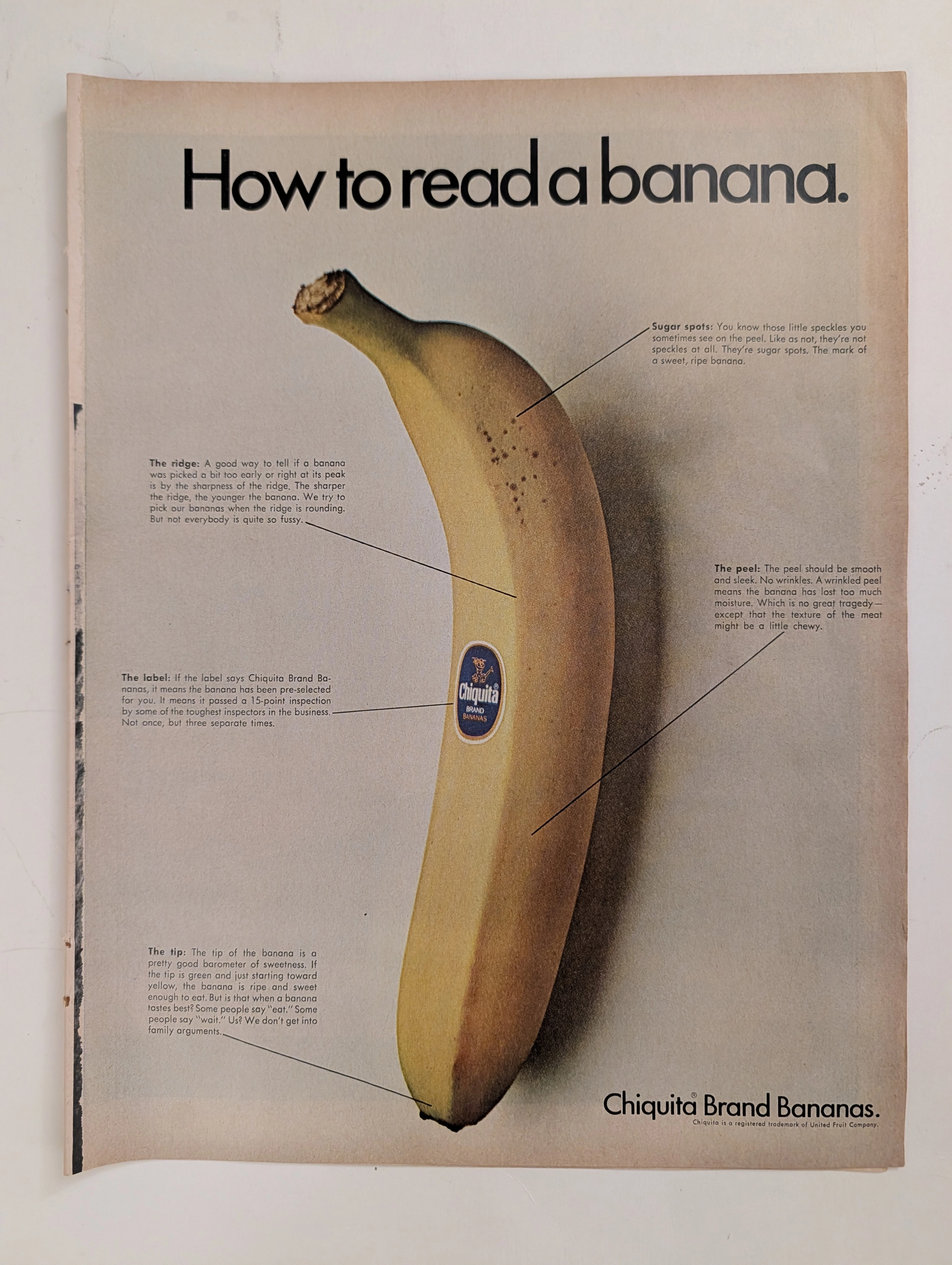
Chiquita · Food
The Time Traveller's Dossier: The Anatomy of a Commodity – Chiquita's "How to read a banana" and the Invention of Produce Branding
The evolution of the mid-twentieth-century American supermarket was defined by the rapid transition from bulk, unbranded agricultural goods to highly packaged, fiercely differentiated consumer brands. The historical artifact elegantly and securely positioned upon the analytical table of The Record Institute today is a striking, full-page print advertisement for Chiquita Brand Bananas, originating from the late 1960s. This document completely transcends the standard boundaries of grocery marketing. It operates as a highly sophisticated, multi-layered cultural mirror, reflecting the precise era when the United Fruit Company utilized educational infographics to train the American housewife to perceive natural biological traits as engineered markers of exclusive quality. This world-class, comprehensive dossier conducts a meticulous, unyielding, and exceptionally exhaustive examination of the artifact, operating under the absolute most rigorous parameters of historical, sociological, and material science evaluation. Dedicating the overwhelming majority of our analytical focus to its immense historical gravity, we will decode the brilliant marketing psychology embedded within the "How to read a banana" campaign, analyze the immense sociopolitical weight of the United Fruit Company, and dissect the profound visual semiotics of the blue Chiquita sticker. Furthermore, as we venture deeply into the chemical and physical foundations of this analog printed ephemera, we will reveal the precise mechanical fingerprints of the CMYK halftone rosettes captured in the macro imagery of the fruit's peel. Finally, we will assess its archival rarity, exploring how the graceful, natural oxidation of the paper substrate cultivates a serene wabi-sabi aesthetic—a natural, irreversible phenomenon that serves as the primary engine driving up its market value exponentially within the elite global spheres of Vintage Commercial Ephemera and Advertising Archives.

Ford · Automotive
The Time Traveller's Dossier: The Ten-Dollar Titan – The Autolite Ford Indianapolis 500 Exhibition
The synthesis of high-stakes motorsport engineering and everyday consumer accessibility represents a pinnacle achievement in mid-twentieth-century American commercial strategy. The historical artifact elegantly secured upon the analytical table of The Record Institute today is a majestic full-page print advertisement for Autolite Ford Ignition Coils, originating from the golden era of 1960s automobile racing. This document completely transcends the traditional boundaries of automotive parts marketing. It operates as a profound, sophisticated declaration of how cutting-edge technological innovation on the racetrack was democratized and delivered directly into the hands of the American middle class, transforming the daily commute into an extension of the Indianapolis 500. This world-class, comprehensive dossier conducts a meticulous and deep examination of the artifact, operating under the absolute most rigorous parameters of historical, sociological, and material science evaluation. We will decode the brilliant, kinetic pit-stop scene capturing an open-wheel race car, and analyze the dramatic visual juxtaposition of this high-speed chaos against the highly structured, calculated copywriting of the Ford Motor Company. Furthermore, as we venture into the chemical and physical foundations of this analog printed ephemera, we will reveal the mechanical fingerprints of the CMYK halftone rosettes and the graceful, natural oxidation of the paper substrate. This precise intersection of visual nostalgia, motorsport heritage, and the chemistry of time cultivates a serene wabi-sabi aesthetic—a natural, irreversible phenomenon that serves as the primary engine driving up its market value exponentially within the elite global spheres of Vintage Automotive Ephemera and Motorsports Archives collecting.
Chrysler · Automotive
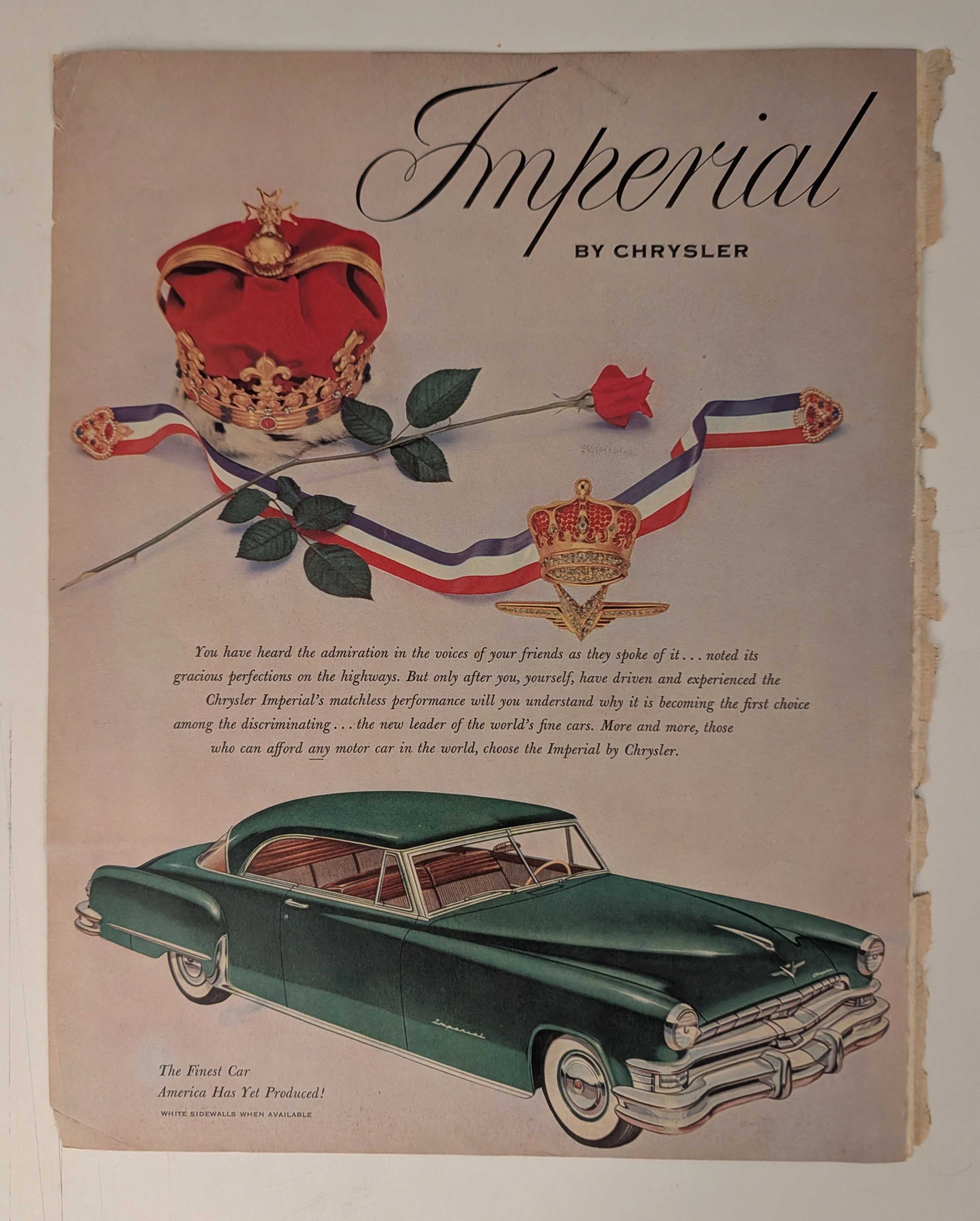
THE TIME TRAVELER'S DOSSIER: THE KOREAN WAR ANCHOR AND THE SCARCITY OF LUXURY
The artifact under our uncompromising, unprecedented museum-grade analysis is a profoundly preserved Historical Relic excavated from the golden age of post-WWII American opulence. This Primary Art Document is a monumental magazine advertisement for the Imperial by Chrysler, dating to the pivotal 1951-1952 era. This document is a "Forensic Blueprint of American Aristocracy and Geopolitical Crisis." It masterfully weaponizes regal European iconography to elevate Chrysler's flagship model above mere transportation, explicitly targeting "those who can afford any motor car in the world". Yet, its most significant historical anchor is hidden in the microscopic fine print: "WHITE SIDEWALLS WHEN AVAILABLE". This single sentence instantly transforms the advertisement into a wartime relic, reflecting the severe rubber shortages imposed during the Korean War. Grounded by the iconic jeweled emblem and its breathtaking wabi-sabi chemical degradation—highlighted by its violently torn binding edge—this artifact commands an irreplaceable status, cementing its Rarity Class A designation.