


The Time Traveller's Dossier: The Masquerade of Quality – Nabisco's 1968 Ritz "Can't Disguise" Campaign and the Golden Age of Snack Branding
The History
To fully appreciate the immense historical gravity, cultural magnitude, and sociological importance of this artifact, one must meticulously contextualize the complex, highly dominant landscape of the National Biscuit Company (Nabisco) and the broader history of the American processed food industry leading up to 1968.
The foundation of Nabisco’s monumental corporate supremacy began at the very end of the 19th century, marking the definitive transition of the American food supply from the localized "cracker barrel" era—where goods were sold in bulk, exposed to air, moisture, and pests—to the modern era of standardized, hygienically packaged, and nationally distributed commodities. The birth of the Ritz cracker in 1934, squarely in the devastating midst of the Great Depression, was a masterstroke of both economic engineering and consumer psychology. Sydney Stern, a legendary Nabisco employee, conceptualized the name "Ritz" to intentionally evoke the extreme luxury, glamour, and unattainable wealth associated with the Ritz-Carlton hotel chain. In an era of profound financial hardship, offering a cracker that felt "rich" and "buttery" for merely a few cents was the ultimate democratization of indulgence. It provided the American masses with an affordable luxury. By the time this specific artifact was printed in 1968, the Ritz cracker had already accumulated over three decades of cultural momentum, establishing itself as an unimpeachable icon of domestic comfort and social reliability.
As American society entered the late 1960s, it was undergoing a profound demographic and lifestyle metamorphosis. The post-World War II suburban boom had given rise to a new form of domestic socialization: the "cocktail party" and casual home entertaining. This cultural shift placed an immense, albeit unspoken, psychological pressure on the middle-class American housewife. She was expected to project an image of effortless sophistication, culinary creativity, and flawless hospitality. The 1968 "Can't Disguise" campaign featured in this artifact was ingeniously engineered to directly address and alleviate this specific social anxiety.
The visual presentation of 12 distinct crackers, meticulously and playfully decorated with olives, pimentos, cheese, and sliced vegetables to resemble a diverse cast of human faces—ranging from a clown and a blonde woman to a bespectacled gentleman and a pirate—is not merely whimsical food styling. It is a profound declaration of ultimate product "Versatility." Nabisco was communicating to the consumer that with a single, reliable box of Ritz crackers, she possessed an infinite culinary canvas. She could unleash her creativity, transforming a mundane, mass-produced snack into premium "hors d'oeuvres" and "canapés" fit for the most discerning guests. The cracker was no longer just food; it was a tool for social elevation and creative expression.
However, amidst this aggressive push for individual culinary customization, the advertisement remains fiercely anchored to the core principle of industrial consistency. The primary copywriting—"No matter how hard you try you just can’t disguise that beautiful buttery Ritz taste"—is a devastatingly powerful psychological reinforcement. It assures the anxious consumer that regardless of how radically the external appearance of the food is altered, "dressed up," or "masqueraded," the fundamental core of the product will never fail her. The familiar crispness, the perfect salinity, and the unmistakable rich mouthfeel will always be reliably present. Interestingly, from a food engineering perspective, Ritz crackers contain virtually no actual butter; they utilize meticulously processed vegetable oils and specific baking techniques to synthesize the perfect "illusion of buttery richness"—an illusion so potent it permanently rewired the taste memories of millions of consumers.
Furthermore, the prominent placement of the "YOU'LL FIND QUALITY IN OUR CORNER" slogan, accompanied by the iconic red triangular Nabisco logo in the upper-left quadrant, represents one of the most powerful national certifications of quality in mid-century commerce. In an era where modern supermarkets were rapidly expanding, flooding the aisles with an overwhelming array of new, fiercely competitive, and often untested products, this "Red Corner Seal" acted as a psychological lighthouse. It was an unspoken, ironclad contract between the multinational conglomerate and the individual shopper, guaranteeing that the product inside the box had survived the most rigorous, scientifically controlled industrial quality assurance protocols in the world. It promised an absolute absence of unpleasant surprises.
From the critical perspective of Packaging Engineering, this artifact also serves as a vital historical record of one of the most significant technological innovations in consumer goods history: the "Stack Pack," prominently featured in the lower-right corner. The textual callout boasting "3 MOISTURE-PROOF RECLOSABLE PACKS" is far more than mere marketing jargon; it represents a revolution in food preservation technology. By utilizing foldable wax paper sleeves to physically divide the crackers into three distinct, sealed rows, Nabisco effectively conquered the ancient enemies of baked goods: atmospheric moisture and staleness. This packaging innovation exponentially extended the product's shelf-life in the home pantry, drastically reduced food waste, and permanently altered the purchasing and consumption habits of the American family. This 1968 advertisement, therefore, is not merely a promotional flyer for a biscuit; it is a monumental historical tablet documenting the absolute zenith of the golden age of American grocery branding, capturing the market just before the health food movements and nutritional scrutiny of the 1970s would arrive to fundamentally challenge the aesthetics of "buttery" indulgence.
The Paper
As a physical entity, this printed artifact functions as a living record of mid-twentieth-century graphics reproduction. Under high-magnification macro-lens examination, the document reveals the stunning complexity of analog color printing. The extraordinary macro photographs of the Nabisco logo and the "clown" cracker faces provide a textbook visualization of the CMYK halftone rosette pattern.
The vibrant "Nabisco Red" and the "Ritz Yellow" are not solid swatches of ink; they are meticulously constructed from a precise, mathematically rigorous galaxy of microscopic ink dots. Cyan, Magenta, Yellow, and Key (Black) inks are layered at highly specific angles to trick the human eye into perceiving the vibrant, dimensional "golden" hue of the crackers. The texture of the uncoated magazine paper stock illustrates how the ink absorbed into the organic fibers, creating the soft, matte finish characteristic of late-1960s high-volume offset printing.
The most profound factor elevating the value of this artifact is the natural process of Material Degradation. The expansive margins exhibit a genuine "Toning"—a gradual transition to a warm, antique ivory hue caused by the chemical oxidation of Lignin within the wood-pulp paper. As the substrate is exposed to oxygen and UV light over nearly six decades, the molecular structure of the lignin gracefully breaks down. This naturally evolving patina represents the wabi-sabi aesthetic that elite curators seek. It is precisely this unreplicable degradation that acts as the engine driving up its market value exponentially, as it provides irrefutable scientific proof of the artifact's historical authenticity.
The Rarity
RARITY CLASS: B (Very Good Archival Preservation with Natural Margin Toning)
Under the exacting archival parameters of The Record Institute, this artifact is securely designated as Class B.
The defining paradox of 1960s commercial ephemera is that these documents were produced by the millions as "disposable media"—destined to be briefly observed and discarded. For a full-page, graphically saturated advertisement to survive without catastrophic structural tearing or destructive moisture staining is a statistical archival anomaly. The structural integrity of this paper remains exceptionally sound. While the rich analog colors—particularly the deep blacks of the wood-grain background—remain vibrant, there is a beautiful, mathematically even lignin oxidation. The sheer historical weight of the subject matter—documenting the peak of Nabisco's "Quality Corner" era—makes this a highly prized piece of consumer culture heritage, requiring acid-free, UV-protected conservation framing to ensure its historical permanence.
Visual Impact
The aesthetic brilliance of this artifact lies in its execution of "Anthropomorphic Whimsy." The art director deliberately constructed a visual hierarchy where the product is the art.
The composition utilizes a high-contrast, dark wood-grain background to force the golden, circular crackers to "pop" toward the viewer. This creates an immediate sensory connection. The visual layout guides the eye flawlessly from the playful faces down to the definitive "Nabisco Golden Jubilee" era box design. It is a masterclass in using "product personality" to build brand loyalty, ensuring that the consumer views the Ritz cracker not as a dry biscuit, but as a friendly, versatile participant in their domestic life.
Exhibition Halls
The Archive Continues
Continue the Exploration
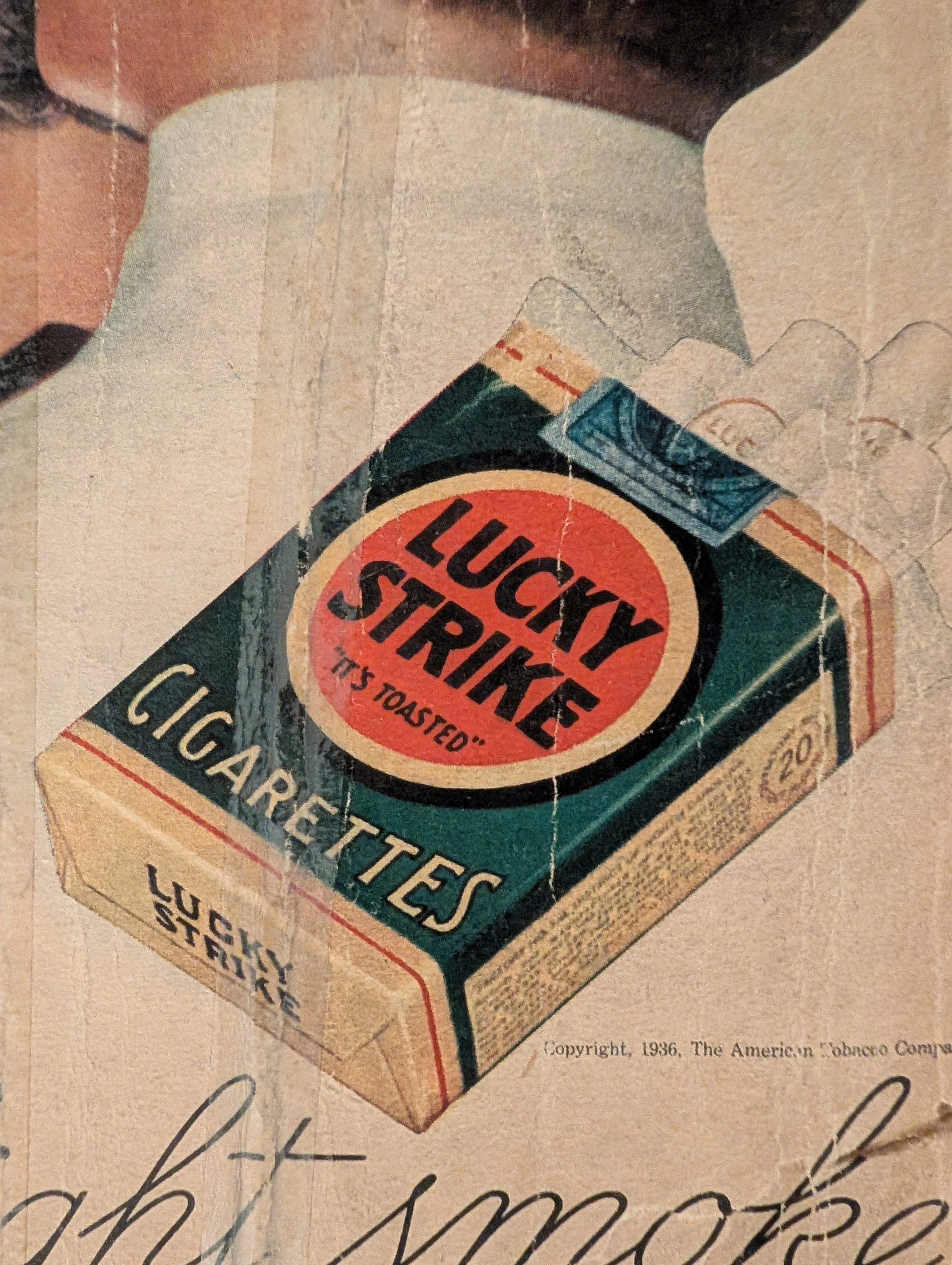
THE TIME TRAVELER'S DOSSIER: THE GOLDEN LIE AND THE PROPAGANDA OF 1936
The artifact under exhaustive, uncompromising, and unprecedented museum-grade analysis is an exceptionally rare, battle-scarred Historical Relic originating from the absolute zenith of the American tobacco empire. This Primary Art Document is a monumental, full-page advertisement for Lucky Strike Cigarettes, forensically and definitively dated to 1936 by the explicit copyright text: "Copyright, 1936, The American Tobacco Company". This is not merely a vintage tobacco ad; it is a profound "Sociological Blueprint of Corporate Propaganda" from the interwar period. Emerging in the heart of the Great Depression, this artifact captures the audacious peak of 1930s psychological marketing. The commanding headline, "Smoke to Your Throat's Content", represents the era's surreal, medically ironic strategy where tobacco conglomerates aggressively marketed deadly carcinogens as "smooth" and "non-irritating" to the throat. Furthermore, the legendary slogan "It's Toasted" serves as a masterclass in advertising spin, transforming a standard manufacturing process into an exclusive health benefit. Visually, the ad brilliantly normalizes and glamorizes female smoking—a direct continuation of the industry's sociological engineering to double their consumer base. Rescued from the inevitable oblivion of disposable mass media, this pre-2000s analog artifact is a breathtaking embodiment of the Japanese aesthetic of wabi-sabi. Printed on highly acidic wood-pulp paper, it exhibits severe, violent edge trauma, deep structural creasing, ancient tape residue, and a profound, burning amber oxidation across its entire surface. This unstoppable molecular death transforms a piece of mass-produced corporate propaganda into an irreplaceable, ready-to-frame Primary Art Document of American marketing history.
Chivas Regal · Beverage
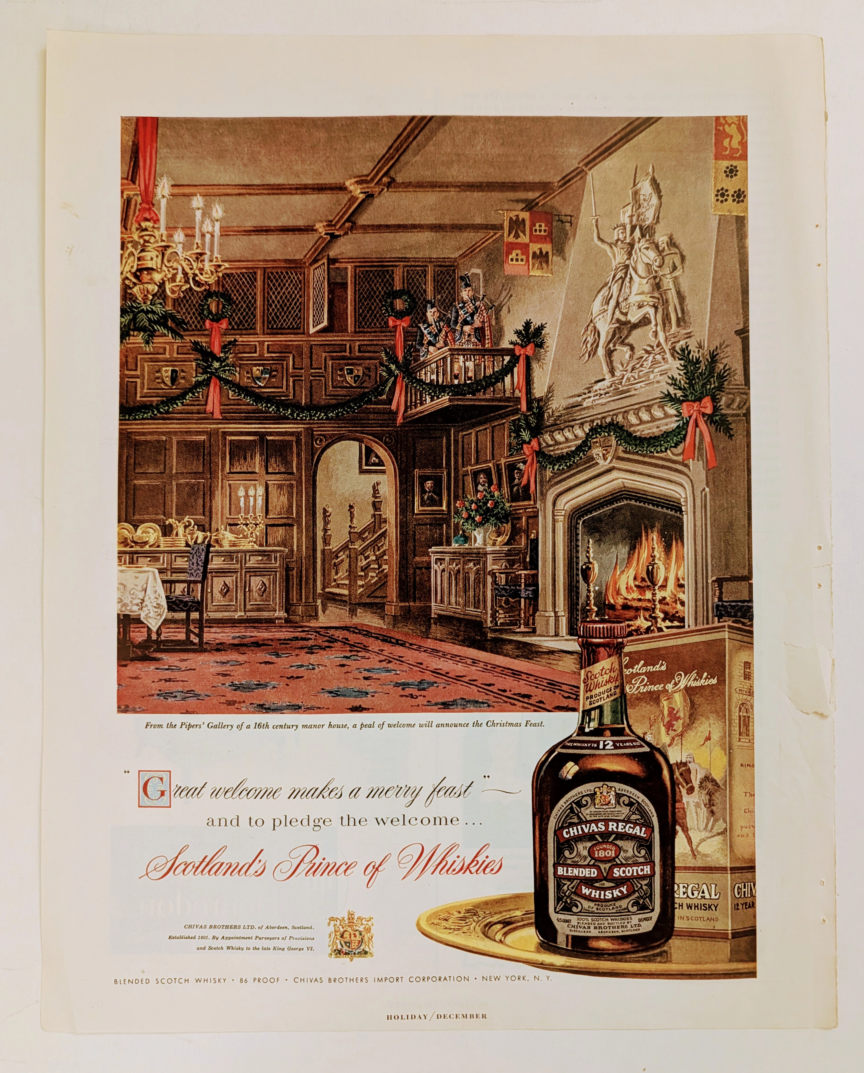
The Time Traveller's Dossier: The Architecture of Aristocracy – Chivas Regal "Prince of Whiskies" Advertisement (Circa Mid-1950s)
analysis is a meticulously preserved, single magazine tear sheet representing a pinnacle era of mid-20th-century commercial illustration and brand positioning. Far removed from the realm of disposable consumer advertising, this artifact operates as a sophisticated sociological document. It captures a precise historical epoch where the global spirits industry—specifically the Scotch whisky sector—transitioned from marketing regional agricultural products to curating internationally recognized symbols of aristocratic heritage and refined lineage. Operating with absolute curatorial precision, this dossier deconstructs a circa mid-1950s advertisement for Chivas Regal 12-Year-Old Blended Scotch Whisky. By analyzing the intersection of classical illustration, the strategic deployment of British royal iconography, and the meticulous visual forensics of the analog printing process, this document illuminates the foundational strategies of modern heritage branding. It demonstrates how a brand gracefully orchestrated a narrative of ancient nobility and warmth to captivate the post-war American consumer, establishing an enduring standard for the premium spirits market that remains profoundly influential today.
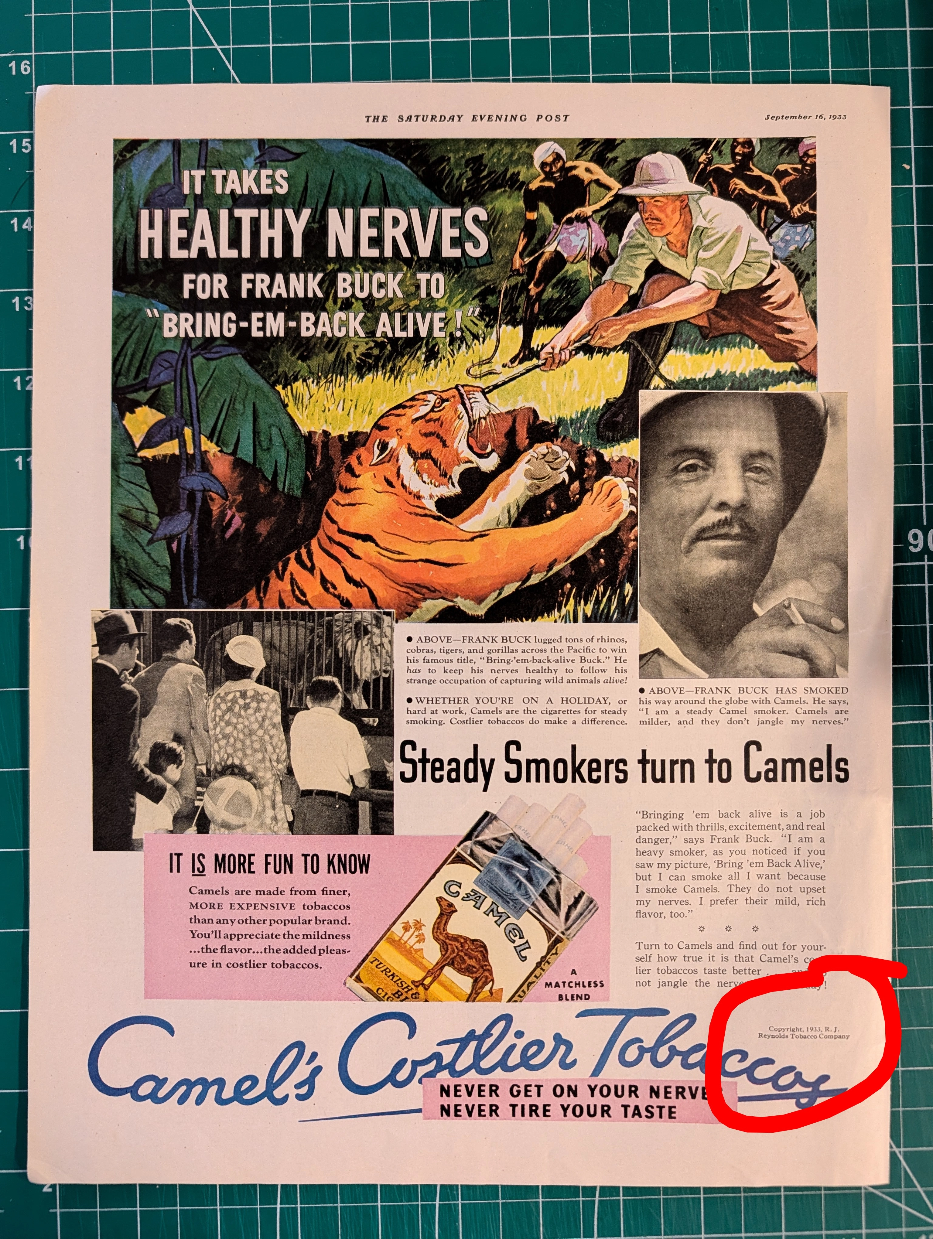
THE TINY TEXT THAT AUTHENTICATES HISTORY Why Fine Print in Magazine Advertisements Matters More Than You Think
Tiny copyright notices in magazine ads originated from mandatory US copyright law (1909 Act) and sector-specific regulations (BATF for alcohol). They function as layered authentication evidence: typographic era-consistency, regulatory language accuracy, ink/paper forensics, and contextual integrity — paralleling vintage band tee authentication methods. Collaboration credits (Pierre Cardin × Tiffany & Co.) and creative credits (photography, calligraphy, fashion) document commercial relationships lost to no other record.