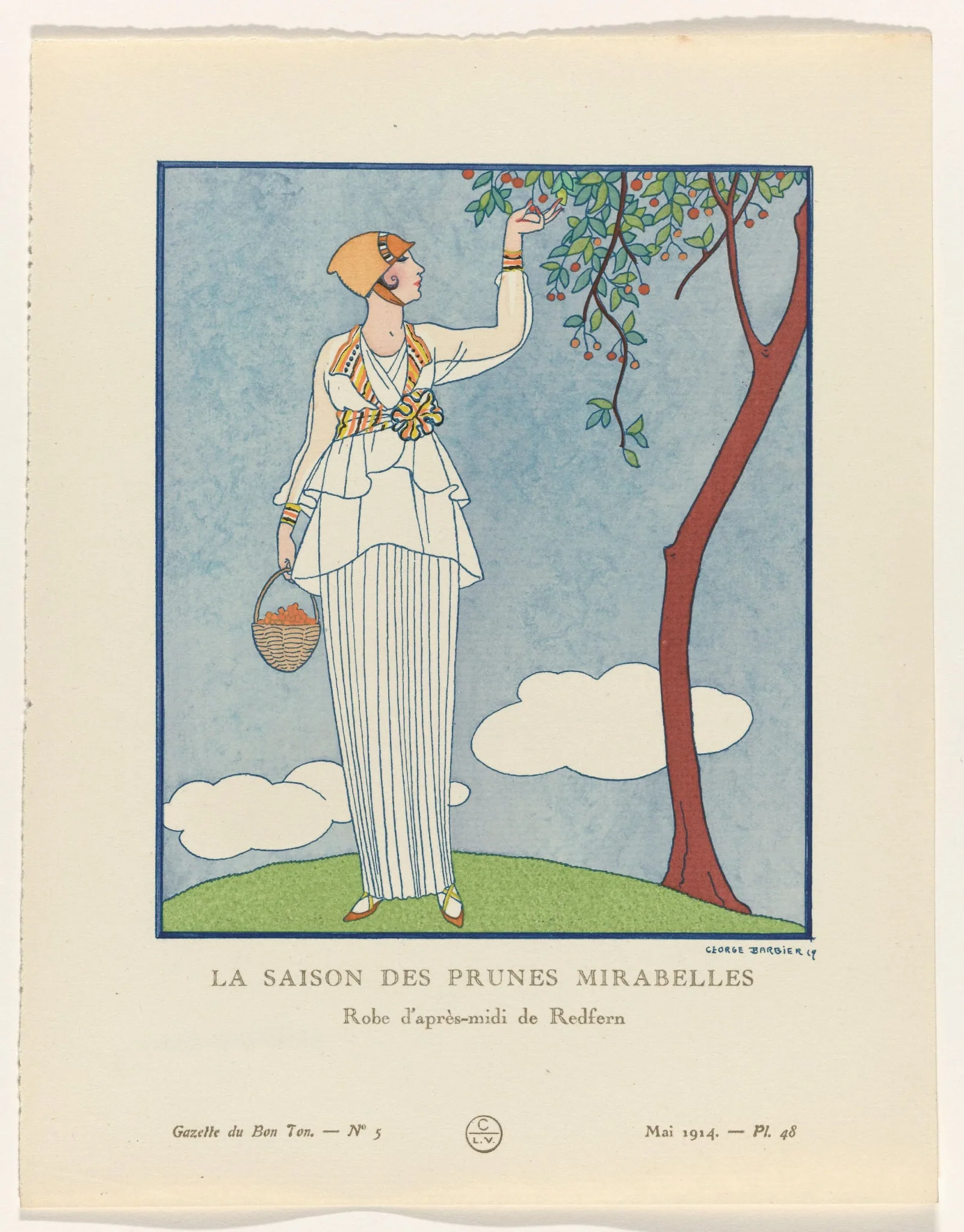
1914 George Barbier "La Saison des Prunes Mirabelles" Vintage Fashion Plate
The visual evidence presented in the supplied digital proxy reveals a vertical fashion illustration depicting a solitary female figure positioned in strict profile, facing the right edge of the composition. The figure stands upon a smoothly rendered, unmodelled green mound representing a stylized hill, extending her right arm upward to pluck a small, spherical yellow fruit from a highly stylized tree. The tree itself serves as a dominant architectural element within the frame, featuring a sinuous, organically curving brown trunk and branches heavily populated with flat, unshaded green leaves and small orange-red circular motifs. In her left hand, the figure holds a small, woven, basket-like receptacle containing several gathered yellow fruits. The figure is dressed in a stark white afternoon ensemble, fundamentally consisting of a layered, vertically pleated columnar skirt, which is topped with a draped tunic or peplum featuring angular, geometric layering that creates a tiered visual effect. A vibrant, multi-coloured patterned sash tightly encircles the waist, dominated by a large, prominent rosette positioned directly at the center, integrating striking yellow, orange, and dark linear accents. The figure's head is completely covered by a close-fitting orange headpiece that fully obscures the hair, extending downward over the ears to meet the jawline. The background is composed of a flat, unvariegated blue field representing the sky, interrupted solely by two distinct, hard-edged, flat white cloud formations located near the horizon line. The entire illustration is enclosed within a crisp, thin blue rectangular border, acting as a window-like frame, with all associated typography rigorously positioned externally within the lower margin of the page. The printed text occupying the lower margin of the artifact provides specific identification, structural designation, and vital dating cues essential for archival cataloguing. Centered directly beneath the blue illustration border is the primary title in a tracked-out serif typeface: "LA SAISON DES PRUNES MIRABELLES". Directly below this title, a secondary subtitle identifies the specific garment category and its creator: "Robe d'après-midi de Redfern". In the lower-left corner of the margin, the publication title and its structural issue are denoted as "Gazette du Bon Ton. — Nº 5". It is a critical curatorial distinction that this printed "Nº 5" identifies the specific issue number of the publication for that year, not a plate number or a sequence within the issue itself. In the mirrored lower-right corner, the date and individual plate number are recorded sequentially as "Mai 1914. — Pl. 48". Positioned centrally in the lower margin, resting symmetrically between the publication name and the date, is a circular monogram or roundel containing the specific letters "C" positioned above "L.V.". Finally, enclosed within the bounds of the illustration frame in the lower-right corner, a hand-lettered signature reads "GEORGE BARBIER 14". The maker context relies intrinsically on both the printed credits framing the illustration and the visible signature embedded within the artwork. The illustration is clearly signed "GEORGE BARBIER 14", indicating the year 1914 as a date notation directly associated with the execution of the signature; attribution to the prominent French illustrator George Barbier is highly probable based on stylistic comparison and the extensively documented history of his foundational contributions to this specific publication, though absolute confirmation requires downstream documentary verification. The featured garment itself is explicitly credited to the prestigious fashion house of Redfern, a prominent and highly influential maker documented during this era, representing the house's luxurious afternoon wear ("robe d'après-midi"). The central roundel containing the initials "L.V." is a probable candidate for Lucien Vogel, the documented founding director and visionary force behind the Gazette du Bon Ton, while the accompanying "C" likely denotes the overarching publisher, printer, or copyright syndicate responsible for the physical production. Every distinct glyph in this composite mark requires downstream verification to definitively resolve the production chain and copyright ownership. The geographic and audience context is firmly situated within the elite Parisian luxury publication industry immediately prior to the outbreak of the First World War. The explicitly printed date "Mai 1914" firmly places this printed artifact in the final, tension-filled months before the historically documented suspension of the Gazette du Bon Ton. The publication is understood to have been actively issued from November 1912 to the summer of 1915, before suspending operations due to the global conflict and eventually resuming in January 1920—a timeline treated as an independent historical fact requiring verification. The artifact's target audience was an exclusive, highly affluent readership that engaged with fashion not through standard utilitarian garment catalogues, but through highly stylized, narrative, and artistic tableaux. A notable curatorial discrepancy exists between the printed publication date and the depicted botanical subject: Mirabelle plums are a verifiable agricultural harvest of late August and September, not the month of May. This advance-season presentation was a standard and calculated practice in elite fashion periodicals, projecting upcoming late-summer or early-autumn styling rather than aligning strictly with the immediate month of publication, highlighting the forward-looking nature of the couture industry. The visual language of the artifact demonstrates specific and powerful aesthetic currents of the early 1910s, notably heavy Japonisme and Neoclassical revival influences. The entire composition relies on drastically flattened spatial depth, a complete absence of traditional chiaroscuro modelling, and a highly asymmetrical framing technique, all of which are thoroughly consistent with Japanese compositional strategies that had been enthusiastically assimilated into elite French illustration. The garment's defining silhouette—featuring a raised, empire-style waistline and a columnar, unrestrictive skirt—shares the direct visual language of the Directoire or Neoclassical revival, moving sharply and deliberately away from the heavily structured, corseted silhouettes that defined the previous decade. The close-fitting headpiece visually anticipates the cloche, whose dominant popular association is with the 1920s; the specific term is consciously avoided in the descriptive record to prevent an inaccurate, misdated reading by researchers. Furthermore, the stark, geometric reduction of the clouds and the highly stylized rendering of the fruit tree strongly anticipate the formal aesthetic later codified as Art Deco, though in 1914, this operates as a proto-Art Deco or anticipatory style moderne idiom. The rendering of the fruit on the tree as orange-red while the text names a yellow plum variety ("mirabelles") may reflect a stylised, deliberate colour decision by the illustrator to balance the composition's overall palette, or it may denote a technical limitation of the printing process itself; it should not be definitively attributed to a technical constraint without rigorous material analysis. In terms of function and archival significance, this printed plate operated as a sophisticated mechanism of taste-making and cultural projection rather than a mere commercial advertisement for Redfern. Plates extracted from this exclusive periodical were specifically designed as standalone, frameable artworks, intended for a discerning audience that valued the illustration as highly as the couture it depicted. The irregular, slightly torn left edge visible in the digital proxy is entirely consistent with later removal from a sewn, bound, or portfolio-held context, which was the standard distribution format for such luxury plates. The original assembly and exact distribution format of this specific physical copy require documentary or physical verification, and cannot be inferred strictly from the visible edge damage. As a preserved archival object housed within a digital museum framework, it captures the specific, fleeting intersection of elite couture, high-end commercial illustration, and the advanced luxury printing technologies deployed in Paris on the eve of a major global conflict that would permanently alter the landscape of the luxury publishing industry.
Category: Womenswear
Year: 1914
Rarity Class: S
Paper & Print Condition
The digital proxy reveals flat, uniform fields of opaque colour with incredibly sharp, unmodelled boundaries that do not bleed into the adjacent zones. The printed key lines appear visually crisp at the supplied resolution, accurately enclosing the solid colour zones without obvious registration errors. The likely process is probable pochoir (hand-stencil) applied meticulously over a printed key, a highly specialized and labour-intensive technique which is widely associated with this specific luxury publication; absolute confirmation for this individual sheet requires physical, microscopic examination. Confidence: Moderate. No distinct halftone dot or rosette structure is resolvable at the supplied image resolution. This is a technical limit of the digital reproduction, not definitive evidence of absence; high-quality chromolithography cannot be entirely excluded from a digital proxy and serves as a plausible, though less historically aligned, alternative. Minimum distinguishable colour separations resolvable in the supplied image: 6 (black/dark blue key, light blue, green, orange, yellow, brown). This is a floor, not an absolute count. The paper tone appears as a uniform cream or off-white, displaying an irregular left edge that is consistent with deliberate removal from a bound or folio context.
Provenance & Rarity
Source Media: Original printed fashion plate extracted from the May 1914 issue of Gazette du Bon Ton (digital proxy review). The historical rarity is highly significant due to the elite, low-volume subscription business model of the original publication, designed specifically for a restricted upper-class Parisian demographic. Its release mere months before the First World War forced a multi-year suspension of all printing operations adds immense historical weight. Unbound plates from this specific, fragile pre-war era are exceptionally scarce, as many were either discarded, improperly framed and light-damaged, or suffered severe edge damage following extraction from their original protective folios. Class S (Rare Pre-War Luxury Periodical Extract). The historical rarity of this piece is established by its verified status as an intact, surviving plate from the highly coveted pre-war segment (1912–1915) of a deeply exclusive, extremely limited-circulation Parisian luxury periodical. The attrition rate of such unbound or loosely bound individual plates over a century ensures a remarkably low survival rate in fine visual condition, elevating its archival importance.
Rarity & Condition Summary
The artifact survives as a well-preserved extract from a highly limited pre-war luxury publication, placing it firmly in a high tier of historical scarcity and curatorial interest. Visually, the print exhibits spectacularly flat, vibrant colour fields and crisp line work with an irregular left edge indicative of its original assembly, though physical examination remains necessary to confirm the exact printing process and intricate paper condition.