

The Time Traveler’s Dossier: The Silver Arrow in Ink – J. Crandall, the Mercedes-Benz 300 SL, and the Golden Age of Automotive Editorial Illustration
The History
To fully appreciate the immense historical gravity, cultural magnitude, and sociological importance of this artifact, one must meticulously and exhaustively contextualize both the machine it depicts and the highly specific, intellectual landscape of automotive print journalism in the mid-to-late twentieth century. The story embedded within the fibers of this editorial illustration is an epic saga of German industrial resurrection, relentless technological pursuit, transatlantic marketing genius, and the democratization of automotive passion through the printed word.
The narrative of the vehicle depicted—the Mercedes-Benz 300 SL—begins in the desolate, bombed-out ruins of post-World War II Stuttgart. In the early 1950s, the management of Daimler-Benz recognized that to restore the company's pre-war glory and rebuild international prestige, they needed to return to the absolute pinnacle of motorsport. Under the brilliant direction of their chief testing engineer, Rudolf Uhlenhaut, Mercedes developed the W194 sports racing car in 1952. Because the company was still financially constrained, Uhlenhaut had to utilize the relatively heavy, underpowered 3.0-liter inline-six engine from the luxurious 300 "Adenauer" touring car. To make the car competitive, Uhlenhaut realized he had to make it incredibly aerodynamic and exceptionally light. He designed an innovative, highly rigid tubular space frame chassis composed of a complex web of welded aluminum tubes. This frame was an engineering marvel, but it presented a significant problem: the tubes ran high along the sides of the chassis, making conventional doors completely impossible. Uhlenhaut's solution was to hinge the doors at the roof, creating the legendary, upward-opening "Gullwing" doors (Flügeltüren). The W194 was a devastating success, dominating the 1952 24 Hours of Le Mans, the Carrera Panamericana in Mexico, and the Eifelrennen at the Nürburgring.
However, Mercedes-Benz had absolutely no intention of putting this purpose-built race car into series production for the public. Enter Maximilian E. Hoffman. Max Hoffman was a wildly successful, Austrian-born importer of European luxury cars based in New York City. He was an absolute visionary, a man who single-handedly shaped the post-war American sports car market (he was also responsible for the Porsche 356 Speedster and the BMW 507). Hoffman intimately understood the deep pockets and the insatiable desire of the American post-war elite for exclusive, high-performance European exotica. At a 1953 director's meeting in Stuttgart, Hoffman made an audacious, almost dictatorial demand: Mercedes-Benz must build a street-legal version of the W194 race car, and he would personally commit to purchasing 1,000 units sight unseen. The Daimler-Benz executives, stunned by the sheer volume of the order and the promise of crucial American currency, agreed. The result was the W198, universally known as the 300 SL Gullwing, introduced at the 1954 New York Auto Show—a highly unusual debut location for a German manufacturer, underscoring the car's intended demographic.
While the artifact drawn by J. Crandall bears the "300 SL" moniker, a close, museum-grade visual inspection of the illustration reveals a crucial historical evolution. The vehicle depicted is not the original 1954 Gullwing coupe; it is the 300 SL Roadster, introduced in 1957. By 1956, sales of the Gullwing were declining. The enclosed cabin was notoriously hot and poorly ventilated, and the high sills made entry and exit an undignified chore for wealthy socialites. Furthermore, the Gullwing utilized a high-pivot rear swing axle suspension that, when pushed to the absolute limit by inexperienced drivers, could result in sudden, catastrophic oversteer. To address these issues, Mercedes engineers heavily redesigned the tubular space frame, lowering the side sills to accommodate conventional, front-hinged doors and a folding convertible top. Crucially, they also upgraded the rear suspension to a low-pivot swing axle with a compensating spring, drastically improving the car's high-speed stability and handling predictability. The Roadster, as beautifully captured in this illustration with its revised, vertical headlight clusters, became the ultimate expression of open-air grand touring.
Beneath the sleek, elongated hood drawn by Crandall lay one of the most significant milestones in automotive history: the M198 engine. The 300 SL was the very first four-stroke production passenger car in the world to be equipped with direct mechanical fuel injection. Mercedes-Benz adapted this incredibly complex technology from the Bosch systems utilized in the DB 601 V12 aero engines that powered the Messerschmitt Bf 109 fighter planes during the war. Instead of relying on carburetors, the Bosch injection pump shot fuel directly into the combustion chambers at highly precise intervals, drastically increasing power, improving throttle response, and maximizing efficiency. The engine had to be tilted at a severe 50-degree angle to fit beneath the impossibly low hood line, and it utilized a dry-sump lubrication system to ensure adequate oil pressure during high-G cornering. Producing a staggering 215 horsepower (and up to 240 hp with the sports camshaft), it propelled the 300 SL to a top speed of 163 mph, making it the fastest production car of its time. It was an engineering tour de force, a masterpiece of metallurgical orchestration.
It is precisely this rich, dense tapestry of engineering and motorsport mythology that makes the presence of this illustration in an automotive magazine so historically vital. In the mid-to-late twentieth century, before the advent of the internet, specialized print publications—such as Road & Track, Car and Driver, and Motor Trend—served as the absolute epicenters of automotive culture. They were not merely consumer guides; they were the intellectual town squares where a new, highly passionate demographic of driving enthusiasts gathered to absorb technical analyses, read romanticized dispatches from European Grands Prix, and engage in fierce, partisan debates.
The section heading partially visible in the artifact, "the Editor," points directly to the "Letters to the Editor" column—arguably the most intensely scrutinized and culturally significant pages in the entire publication. This was the arena where readers would challenge the technical editors on the merits of independent rear suspension, debate the aesthetic purity of Italian versus German design, and share their own triumphs and tragedies of ownership. It was a space of deep, engaged, analog community.
The role of the spot illustrator, such as J. Crandall, was critical to the editorial pacing of these magazines. Pages consisting solely of dense columns of 8-point text were visually exhausting. Art directors relied on highly skilled illustrators to provide "visual breathers"—small, evocative pieces of art that broke up the text and reinforced the romantic, passionate atmosphere of the publication. Crandall’s task was not to provide a sterile, photorealistic blueprint; it was to capture the essence, the soul, and the movement of the machine using only ink and paper. The illustration of the 300 SL Roadster is a masterclass in dynamic linework. Notice how Crandall utilizes jagged, high-contrast strokes to indicate the aggressive reflections of the sky and the environment on the curvature of the hood and the front fenders. The car is drawn from a low, slightly three-quarter angle, emphasizing its wide, predatory stance and the iconic three-pointed star dominating the grille. It is a highly stylized, almost impressionistic interpretation of engineering perfection. It tells the reader that the magazine they are holding is not just a technical manual, but a celebration of automotive art.
The Paper
As a physical entity, this printed artifact functions as a living, breathing, and profoundly detailed record of late-twentieth-century editorial illustration, graphic reproduction, and substrate chemistry. Under exceptional, high-magnification macro-lens examination, this document reveals the stunning complexity and mathematical precision of analog offset lithography utilized for high-volume magazine printing.
The visual brilliance of this artifact is anchored by its capacity to render the intricate, hand-drawn linework of J. Crandall using microscopic deposits of liquid pigment. The macro photography of the artist's signature and the lower bumper details provides a textbook, museum-grade visualization of a single-color or duotone halftone screen pattern. Unlike a continuous tone photograph or an original pen-and-ink drawing, the printing press cannot print shades of gray or varying opacities of a single ink. To create the illusion of depth, shading, and the varying thickness of Crandall's original brush or pen strokes, the image was photographed through a screen, breaking the artwork down into a precise, mathematically rigorous galaxy of microscopic ink dots of varying sizes. The eye blends these dots together to perceive continuous lines and shading. Interestingly, the ink utilized here is not a pure, stark black. It possesses a distinct, deep burgundy or sepia-toned hue, a deliberate editorial choice likely used to distinguish the "Letters to the Editor" section from the rest of the magazine, lending the column an air of classical, archival prestige.
Yet, the most profound and beautifully impactive factor elevating the immense value of this artifact in the contemporary global collector's market is the natural, organic, and entirely irreversible process of Material Degradation. The expansive margins and the background of the illustration exhibit a genuine, unavoidable "Toning." This gradual, chronological transition from the original bright, bleached manufactured paper to a warm, antique ivory hue is caused by the slow, relentless chemical oxidation of Lignin—the complex organic phenolic polymer that naturally binds cellulose fibers together within the raw wood pulp of the paper. As the substrate is exposed to ambient atmospheric oxygen and ultraviolet light over a span of several decades, the molecular structure of the lignin gracefully breaks down, forming chromophores that darken the paper. This naturally evolving patina represents the absolute core of the wabi-sabi aesthetic. It is precisely this authentic, unreplicable degradation that acts as the primary engine driving up its market value exponentially among elite curators and collectors. It provides the ultimate, irrefutable scientific proof of the artifact's historical authenticity and its delicate, unbroken journey through time, validating its extraction as a singular, preserved editorial masterpiece.
The Rarity
RARITY CLASS: B (Very Good Archival Preservation with Natural Margin Toning)
Evaluated under the most exacting, rigorous, and uncompromising archival parameters established by The Record Institute (which spans a meticulous classification system from Pristine Class OMEGA down to Heavily Degraded Class D), this specific artifact is definitively and securely designated as Class B.
The remarkable and defining paradox of mid-to-late century editorial ephemera is that these specific documents were produced by the millions as explicitly and intentionally "disposable media." Inserted into high-volume, mass-market enthusiast publications, they were inherently destined by their very nature to be briefly observed, casually folded, stored in damp garages, or ultimately discarded into the recycling bins and incinerators of history.
What elevates a mere "spot illustration" to a Class B rarity is the extreme statistical anomaly of its survival as an isolated, curated artifact. Collectors of automotive ephemera typically hoard full-page, multi-color glossy advertisements or centerfold posters. The small, often monochrome, interstitial artwork tucked away in the "Letters to the Editor" columns is almost universally ignored and discarded when magazines are culled or digitized. To find a beautifully executed drawing of a highly significant vehicle like the 300 SL, perfectly extracted and preserved with its accompanying signature, is incredibly rare. It represents the salvation of the "connective tissue" of print journalism.
The structural integrity of this paper remains exceptionally sound. While the rich, sepia-toned analog ink remains astonishingly vivid and the halftone dots retain their razor-sharp clarity, there is a beautiful, mathematically even, natural lignin oxidation reflecting its mid-century origin. This displays a pronounced, warm ivory patina heavily across the entire document. The sheer sociopolitical and engineering weight of the subject matter—the definitive visual documentation of the world's first supercar, filtered through the artistic lens of a print magazine illustrator—makes this a highly prized, museum-worthy piece of consumer culture heritage. It demands to be preserved via acid-free, UV-protected conservation framing, perfectly aligning with a curated digital and physical museum strategy that appreciates the surreal intersection of fine mechanics, editorial history, and analog art.
Visual Impact
The aesthetic brilliance and psychological power of this artifact lie in its masterful execution of "Static Kineticism." The illustrator, J. Crandall, was tasked with creating an image of a stationary vehicle that nonetheless communicated the terrifying speed, power, and prestige inherent in the 300 SL Roadster.
The composition utilizes a highly effective, low-angle perspective. By dropping the invisible "camera" down near the level of the front bumper, Crandall exaggerates the width of the iconic front grille and the muscular, sweeping arches of the front fenders. The car appears as a predator, crouching and ready to strike. The most brilliant semiotic choice, however, is the treatment of the reflections. Instead of drawing smooth, graduated gradients to represent the glossy paint, Crandall utilizes frantic, jagged, and heavily hatched lines across the hood and windshield. This creates a visual vibration, a sense of nervous, raw energy that perfectly encapsulates the raucous, mechanical violence of the 215-horsepower, fuel-injected inline-six idling beneath the sheet metal. The bold, unadorned typography of the "300 SL" license plate acts as a blunt, confident anchor to the frenetic linework above it.
The Archive Continues
Continue the Exploration
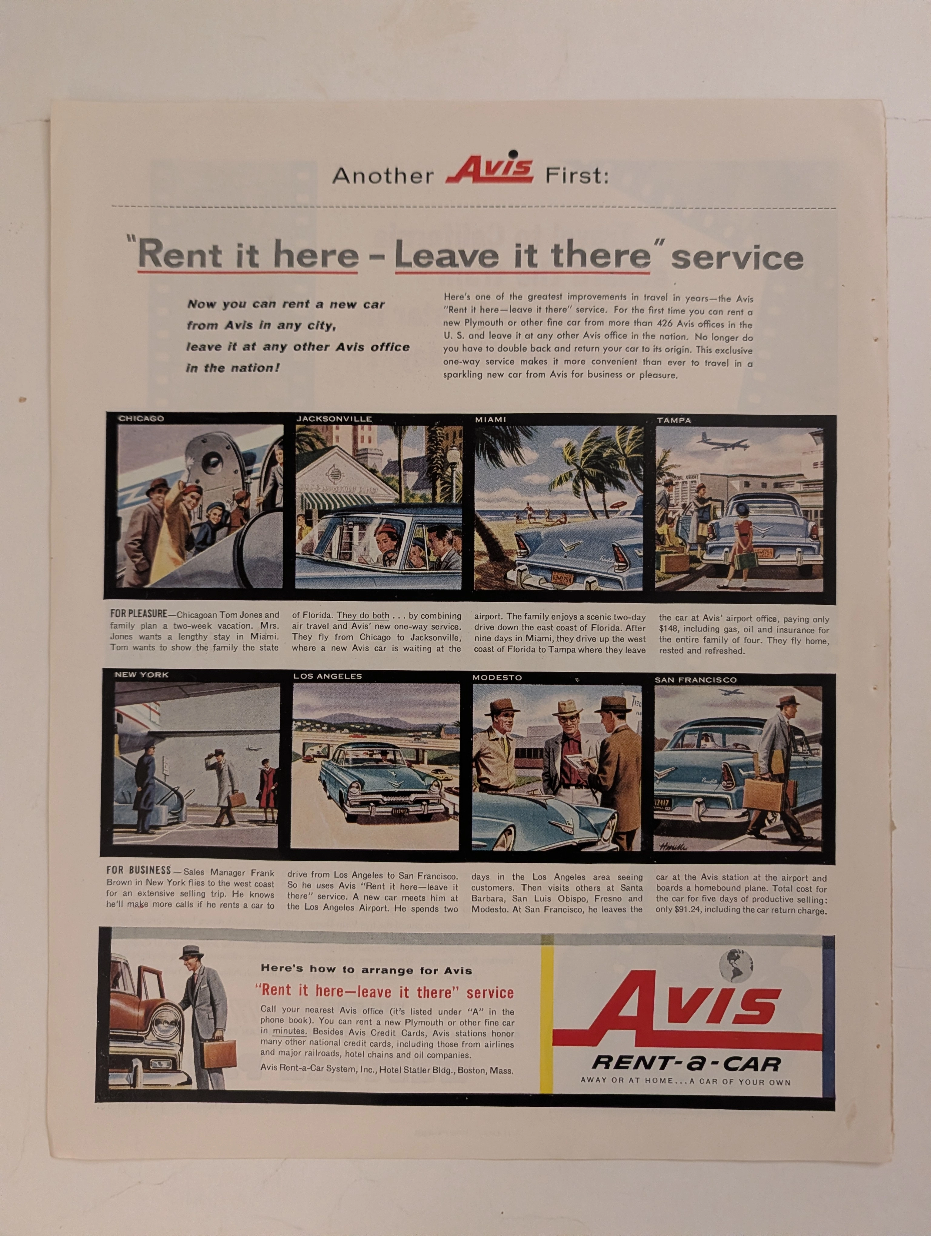
The Time Traveller's Dossier: The Architecture of Unrestricted Mobility – Avis "Rent it Here - Leave it There" Advertisement (Circa 1956)
History is not merely recorded; it is engineered, paved, and conquered through the relentless expansion of commercial logistics. Long before digital networks rendered physical distances obsolete, and before the globalized travel infrastructure became a mundane background hum of modern life, the conquest of geography was executed through bold, capital-intensive logistical paradigms. The historical artifact before us is not merely a nostalgic mid-century magazine advertisement for a car rental agency. It is a perfectly weaponized blueprint of post-war American expansionism, a visual manifesto of the "fly-drive" revolution, and an unwavering testament to an era when mastering the vast North American continent was sold as the ultimate consumer luxury. This museum-grade, academic archival dossier presents an exhaustive deconstruction of a mid-1950s print advertisement for the Avis Rent-a-Car system, specifically introducing their groundbreaking "Rent it here - Leave it there" service. Operating on a profound, dual-narrative storyboard structure, this document records a calculated paradigm shift within the global travel and transportation industry. It captures the precise historical fracture where the American public conceptually transitioned from the localized, static constraints of pre-war rail and personal automobile travel into the hyper-mobile, fluid, and aerospace-integrated era of the 1950s. Through the highly specialized lens of late-analog commercial illustration and stringent visual forensics, this document serves as a masterclass in the psychological marketing of freedom and corporate efficiency. It established the foundational archetype for the modern, frictionless travel economy—an archetype that unconditionally dictates the logistical strategies of the global tourism and business travel sectors today.
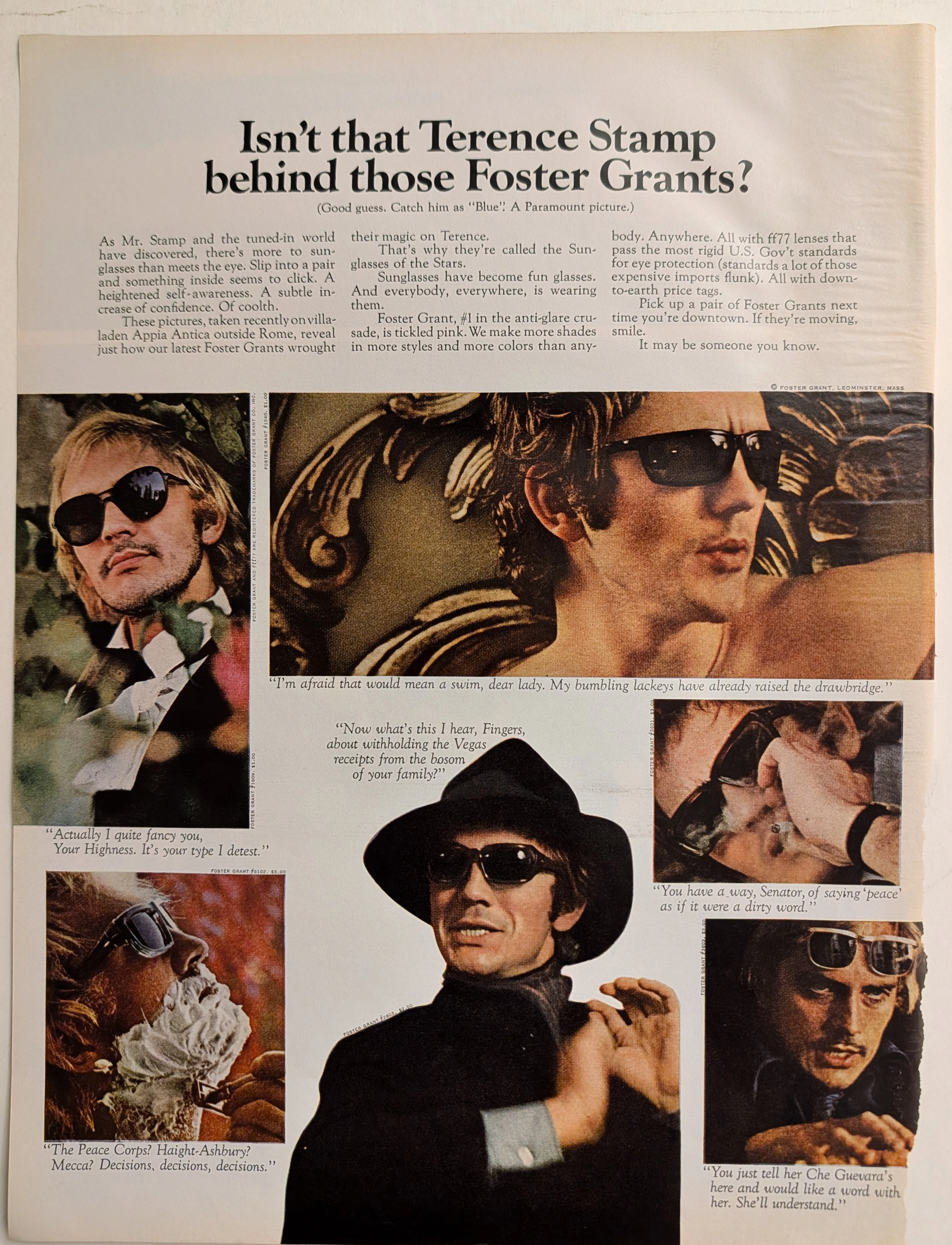
The Time Traveller's Dossier: The Sartorial Armor of Terence Stamp – A Foster Grant Exhibition
The metamorphosis of sunglasses from a purely utilitarian device designed to protect the human cornea into a profound instrument of psychological transformation and sartorial armor is one of the most fascinating narratives in the history of modern fashion. The historical artifact elegantly and securely positioned upon the analytical table of The Record Institute today is a majestic, large-format print advertisement for Foster Grant Sunglasses, featuring the internationally renowned British actor Terence Stamp, originating from approximately 1968. This document completely transcends the traditional boundaries of optical equipment marketing. It operates as a highly sophisticated, multi-layered cultural mirror, reflecting the exact moment when celebrity mystique, mass-market manufacturing, and the volatile sociopolitical crosscurrents of the late 1960s converged on a single printed page. This world-class, comprehensive dossier conducts a meticulous, unyielding, and exceptionally deep examination of the artifact, operating under the absolute most rigorous parameters of historical, sociological, and material science evaluation. We will decode the brilliant advertising strategy that successfully elevated injection-molded plastics to the realm of high fashion, analyze the complex biographical and cultural significance of Terence Stamp as the chosen emissary of this campaign, and dissect the rich, era-defining semiotics embedded within the six distinct personas he portrays. Furthermore, as we venture deeply into the chemical and physical foundations of this analog printed ephemera, we will reveal the precise mechanical fingerprints of the CMYK halftone rosettes and the graceful, natural oxidation of the paper substrate. This precise intersection of visual nostalgia, mid-century commercial artistry, and the immutable chemistry of time cultivates a serene wabi-sabi aesthetic—a natural, irreversible phenomenon that serves as the primary engine driving up its market value exponentially within the elite global spheres of Vintage Fashion Ephemera and Cinematic Memorabilia collecting.

Sky Way · Travel
The Time Traveller's Dossier: The Aesthetics of Gifting and Consumer Hypnosis – Skyway Luggage Advertisement (Circa 1950s)
The history of commercial marketing is rarely driven by cold, rational logic; it is forged, molded, and dictated through the weaponization of emotion, manufactured desire, and the carefully engineered magic of the holiday season. Long before digital algorithms were deployed to predict and manipulate our purchasing behaviors, social engineering and consumer psychology were executed with devastating precision through the tip of a master illustrator’s brush on the pages of glossy magazines. The historical artifact standing before us is not merely a run-of-the-mill mid-century holiday campaign for a luggage brand. It is an absolute visual "Trojan Horse"—one of the most cunningly designed blueprints ever utilized to bypass the consumer's psychological defenses. It serves as an unwavering testament to an era when the stark, industrial rigidity of manufactured goods was brilliantly concealed beneath the irresistible wrapping paper of festive innocence. This museum-grade academic archival dossier presents an exhaustive, uncompromising deconstruction of a late-analog print advertisement from Skyway Luggage. Operating on a ruthlessly calculated, gender-segregated binary narrative structure, this campaign captures a critical paradigm shift: the exact historical moment when luggage transcended its utilitarian status as a mere "storage box" and was conceptually elevated into a highly coveted "dream Christmas gift." Through the highly specialized lens of mid-century commercial artistry and stringent visual forensics, this document serves as a masterclass in the psychological marketing of manufactured desire. It established the foundational archetype for the holiday retail economy—an archetype that unconditionally dictates the global lifestyle merchandising strategies of today.