
The Time Traveller's Dossier: The Architecture of Slumber – The 1967 Simmons Golden Value
Click any image to view in high resolution
The History
To fully appreciate the immense cultural magnitude and sociological importance of this artifact, one must meticulously contextualize the profound shifts in American domestic life during the 1960s. Following the post-WWII housing boom, the American middle class experienced unprecedented economic mobility. Concurrently, the 1960s witnessed an explosion in commercial travel, leading to the rapid development of high-end hotel and motel chains across the nation. For many Americans, these modern hotels offered a level of climate control, sophisticated design, and ergonomic comfort that surpassed their own homes. Simmons brilliantly recognized this psychological association between travel and luxury.
The headline "FIRST PUBLIC SALE!" emblazoned across the top of the spread is a masterclass in manufactured exclusivity. The copywriting explicitly states, "Simmons hotel mattress redesigned especially for your home." This strategy bypasses the traditional metric of selling a mattress based purely on materials, instead selling the authority of the hospitality industry. The text reassures the consumer: "Hotels rely on experts to select their mattresses... So do you, but you don't need to be an expert. Simmons has taken the guesswork out." It effectively democratizes luxury, offering the working-class consumer the exact same sleep architecture enjoyed by the traveling elite for a highly accessible $49.95.
The visual composition reinforces this narrative of structural superiority. The bottom of the left page features a sprawling, modernist cityscape, suggesting that the very foundation of modern urban development rests upon Simmons engineering. On the right page, a beautifully sketched illustration of a towering hotel building proudly declares, "America's finest hotels choose the individual coil construction of famous Beautyrest". This architectural imagery equates the structural integrity of a steel-and-glass skyscraper with the internal steel coil construction of the mattress, implying unmatched durability.
Further reinforcing consumer trust is the prominent inclusion of the "Good Housekeeping Guarantees" seal. In 1967, this seal was the ultimate cultural proxy for safety, reliability, and value. For the mid-century housewife, who functioned as the primary domestic purchasing agent, this red star and its promise of "replacement or refund to consumer" neutralized any perceived financial risk associated with the $49.95 investment.
Simultaneously, the artifact reveals a fascinating duality in aesthetic trends. While the engineering is marketed as modern and industrial, the visual presentation of the mattress itself clings to European aristocratic signifiers. The "handsome new cover with luxurious quilting" is adorned with repeating heraldic crests featuring a fleur-de-lis and a shield design. This specific semiotic choice provides an aura of old-world royalty to a mass-produced item. Conversely, the side panel introduces the famous "Beautyrest by Simmons" line featuring a deeply traditional, romantic floral pattern, utilizing a higher price point starting at $79.50. This dual-presentation highlights the sophisticated "good, better, best" tiered pricing architecture that defined mid-century retail strategy.
The Paper
As a physical entity, this printed artifact functions as a living, breathing, and profound record of mid-twentieth-century graphic reproduction and substrate chemistry. Under exceptional macro-lens examination, this document reveals the stunning complexity and mathematical precision of analog color printing. The intricate architectural shadows of the modern buildings, the delicate blue and gold threads of the printed heraldic crest, and the crisp, bold typography of the $49.95 price tag are all meticulously constructed from a precise, mathematically rigorous galaxy of halftone rosettes. This intricate pattern constitutes the mechanical fingerprint of the pre-digital analog offset printing press. Microscopic, varying sizes of Cyan, Magenta, Yellow, and Key (Black) ink dots are elegantly and systematically layered at specific angles to trick the human eye and the biological visual cortex into perceiving continuous, vibrant, and dimensional reality.
Yet, the most profound and impactful factor elevating the immense value of this artifact in the contemporary collector's market is the natural, organic, and entirely irreversible process of Material Degradation. The expansive margins and the overall paper substrate exhibit a genuine, unavoidable, and entirely unforgeable "Toning." This gradual, graceful transition from the original bright, bleached manufactured paper to a warm, antique ivory and golden hue is caused by the slow chemical oxidation of Lignin—the complex organic polymer that binds cellulose fibers together within the raw wood pulp of the paper. As the substrate is exposed to ambient oxygen and ultraviolet light over a span of nearly six decades, the molecular structure of the lignin gracefully and systematically breaks down. This accumulation of time, this naturally evolving patina, represents the absolute core of the wabi-sabi aesthetic. The profound appreciation for the beauty found in natural aging, impermanence, and the physical manifestation of history upon a fragile medium is an irreversible chemical reaction. It is precisely this authentic, unreplicable degradation that acts as the primary engine driving up its market value exponentially among elite collectors, as it provides the ultimate, irrefutable proof of the artifact's historical authenticity and its magnificent journey through time.
The Rarity
RARITY CLASS: B (Very Good Archival Preservation with Visible Centerfold Wear)
Evaluated under the most exacting, rigorous, and uncompromising archival parameters, this artifact is definitively and securely designated as Class B.
The remarkable and defining paradox of mid-century commercial ephemera is that these specific documents were produced by the millions as explicitly and intentionally "disposable media." Inserted into thick consumer magazines, they were inherently destined by their very nature to be briefly observed, casually folded, and ultimately discarded. For a large-format, two-page centerfold advertisement to survive since 1967 constitutes a highly significant statistical archival anomaly.
This specific artifact is a highly vulnerable two-page spread. While the rich blues of the typography and the golden yellows of the mattress quilting remain remarkably vibrant and unfaded, close inspection reveals the prominent vertical bindery crease running directly down the center of the image. Along this central fold, there is visible structural stress and slight organic discoloration inherent to the staples or adhesive of the original publication's binding. In the rigorous world of paper archiving, this physical interruption precludes a Class A grading. However, this environmental wear does not detract from its immense value; rather, it authenticates the document's journey. The sheer sociological weight of the subject matter—the translation of hotel luxury to the suburban bedroom—makes this minor structural wear aesthetically acceptable. It is ardently sought after by global curators, domestic historians, and design archivists to ensure its historical permanence through acid-free, UV-protected conservation framing.
Visual Impact
The aesthetic brilliance and psychological power of this artifact lie in its masterful execution of "Scale Juxtaposition." The art director has intentionally manipulated perspective to elevate a mundane domestic object into a monument of modern engineering.
The massive, floating Simmons Golden Value mattress dominates the absolute center of the composition, rendered in sharp, hyper-realistic detail. Beneath it, the sprawling mid-century cityscape is painted in loose, stylized, almost impressionistic strokes of blue and green. This deliberate contrast in rendering styles and scale visually communicates that the mattress is larger than life—a foundational monolith that dwarfs even the city itself. The eye is naturally drawn from the bold, commanding typography of "FIRST PUBLIC SALE!" down to the intricate gold crests of the quilting, and finally out toward the supporting architectural vignettes. It is a seamless, highly effective integration of industrial product photography and aspirational lifestyle illustration.
Exhibition Halls
The Archive Continues
Continue the Exploration
John Paul Jones · Entertainment
THE TIME TRAVELER'S DOSSIER: HOLLYWOOD PROPAGANDA AND THE DAWN OF MULTIMEDIA SYNERGY
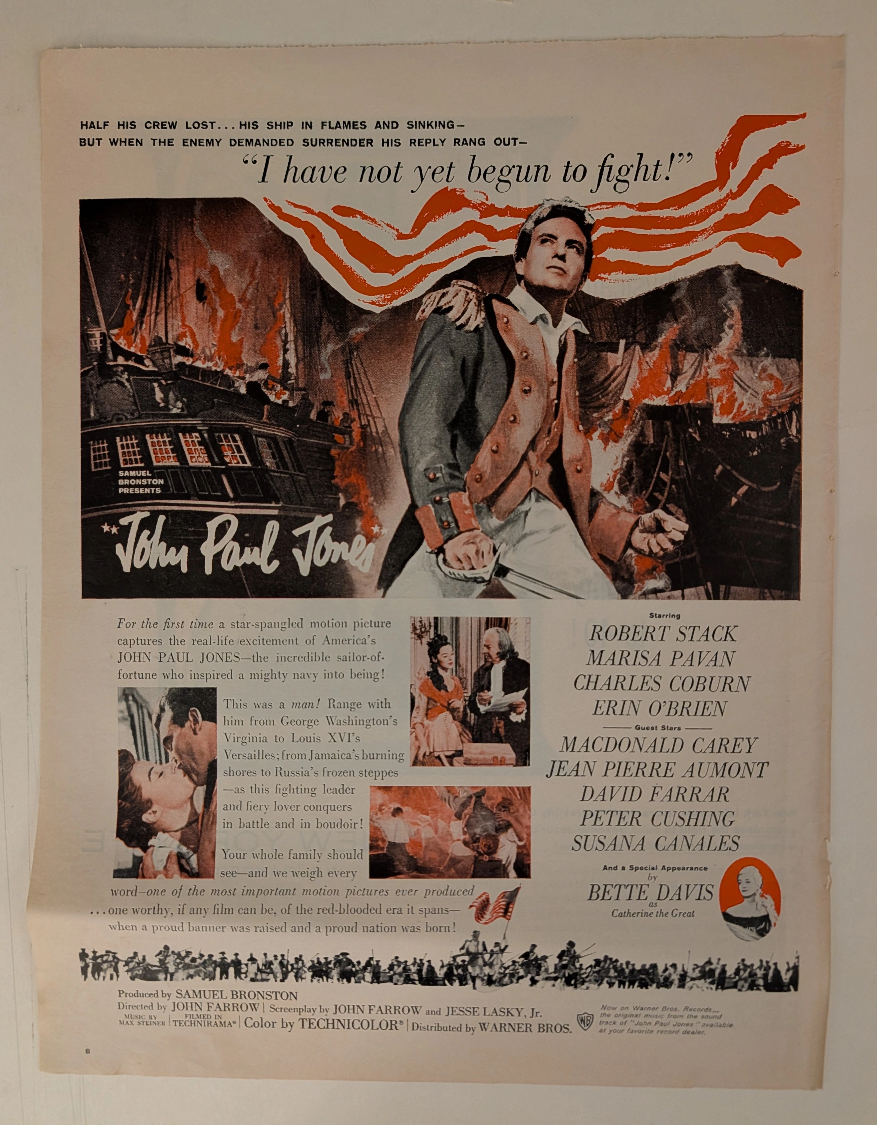
The artifact under exhaustive, uncompromising, and unprecedented museum-grade analysis is a remarkably preserved Historical Relic originating from the zenith of Hollywood's post-war epic era. This Primary Art Document is a monumental, full-page theatrical advertisement for the 1959 biographical epic "John Paul Jones", produced by the legendary independent film mogul Samuel Bronston and distributed by Warner Bros.. This is not merely a movie poster; it is a "Forensic Blueprint of Cold War American Nationalism and Multimedia Synergy." Released in 1959, at the height of the Cold War, the advertisement aggressively weaponizes the foundational mythos of the United States Navy. The commanding, blood-red headline, "I have not yet begun to fight!", serves as a psychological anchor, projecting unyielding American defiance to both domestic audiences and global adversaries. Visually dominated by the rugged, heroic portrait of Robert Stack, the ad expertly balances masculine wartime aggression with romantic subplots and diplomatic intrigue featuring Charles Coburn as Benjamin Franklin. Furthermore, it showcases elite Hollywood casting power by explicitly highlighting a "Special Appearance by Bette Davis as Catherine the Great" in a striking red cameo vignette. Crucially, this artifact documents an early, masterful execution of cross-platform corporate synergy. The bottom corner explicitly markets the original Max Steiner soundtrack on Warner Bros. Records, proving that the commercialization of the "Original Motion Picture Soundtrack" was already highly codified. Rescued from the inevitable oblivion of disposable entertainment media, this pre-2000s analog artifact is a breathtaking embodiment of the Japanese aesthetic of wabi-sabi. Printed on inherently acidic mid-century wood-pulp paper, it exhibits beautifully authentic edge wear and a profound, warm amber oxidation across its surface. This unstoppable molecular death transforms a mass-produced piece of Hollywood propaganda into an irreplaceable, ready-to-frame Primary Art Document of cinematic and sociological history.
Longines · Fashion
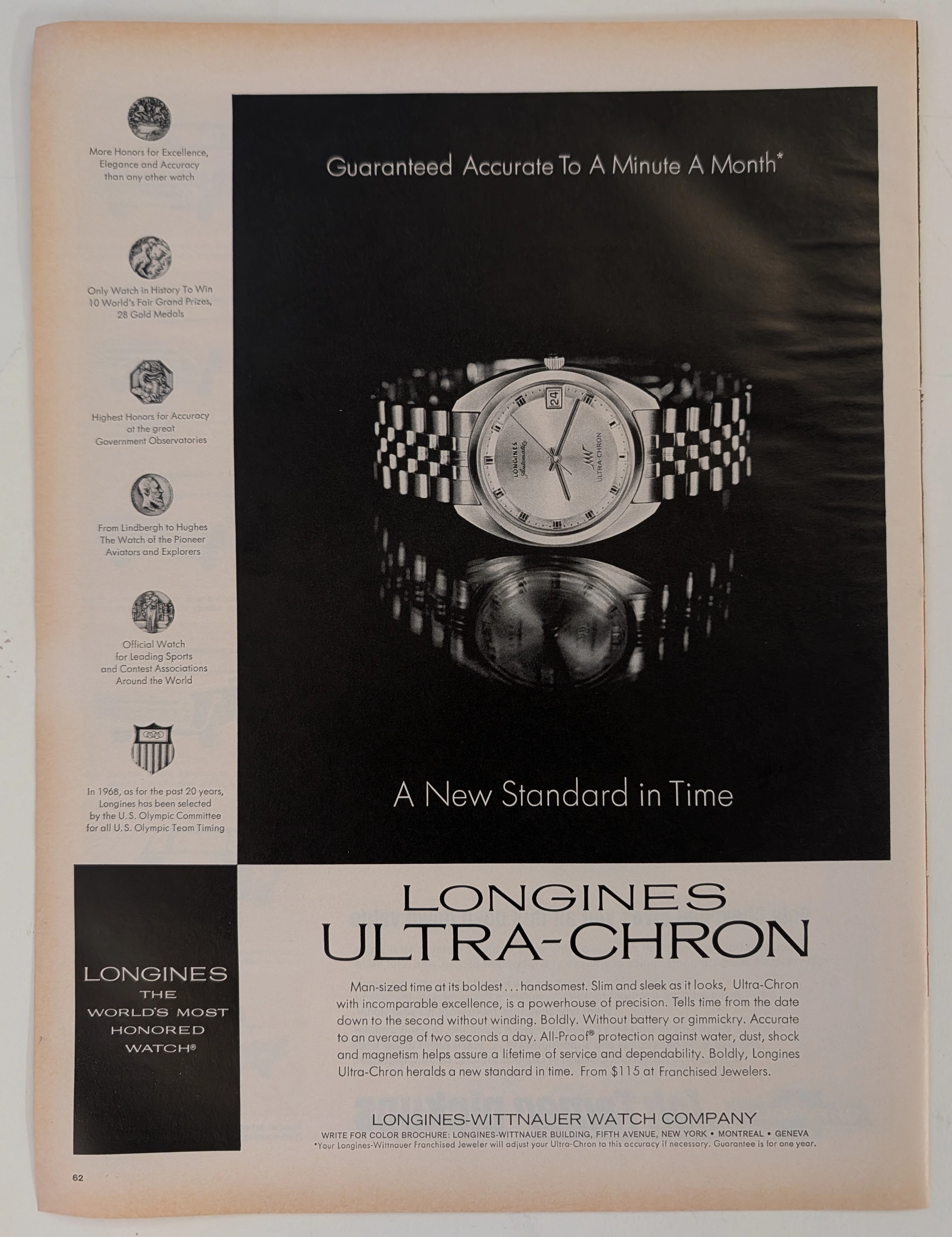
The Time Traveller's Dossier: The Ultimate Horological Supremacy – A Museum-Grade Forensic Deconstruction of the 1968 Longines Ultra-Chron
The evolution of human timekeeping is not merely a passive record of hands rotating in concentric circles; it is a brutal, centuries-long engineering war waged against the absolute, unforgiving laws of physics—specifically gravity, temperature fluctuation, and physical friction. The historical artifact placed upon The Record Institute’s forensic examination table today is a monumental full-page print advertisement for the 1968 Longines Ultra-Chron, extracted from a mid-twentieth-century publication. Released precisely on the precipice of the "Quartz Crisis"—a technological tsunami that would soon decimate the traditional Swiss watch industry—this document represents the absolute pinnacle, the zenith, and the glorious final, defiant stand of analog mechanical engineering. This exhaustive, world-class academic archival dossier will ruthlessly dissect the artifact with microscopic precision, operating under the most rigorous parameters of historical and physical evaluation. We will decode the arrogant yet mathematically backed copywriting that boldly claims "A Minute A Month" accuracy, the profound mechanical significance of the 36,000 vibrations per hour (vph) high-beat movement, and the five specific medallions of honor that permanently anchor the brand’s bloodline to legendary aviation pioneers such as Charles Lindbergh and Howard Hughes. Furthermore, we will subject the heavy, dark-field offset lithography to a rigorous material science analysis, exposing the mechanical fingerprints of the analog halftone rosettes and the inevitable, profoundly beautiful wabi-sabi oxidation of the paper substrate. It is this exact intersection of horological mastery and chemical degradation that acts as the primary engine driving the artifact's market value exponentially upward among serious global collectors.

Sky Way · Travel
The Time Traveller's Dossier: The Aesthetics of Gifting and Consumer Hypnosis – Skyway Luggage Advertisement (Circa 1950s)
The history of commercial marketing is rarely driven by cold, rational logic; it is forged, molded, and dictated through the weaponization of emotion, manufactured desire, and the carefully engineered magic of the holiday season. Long before digital algorithms were deployed to predict and manipulate our purchasing behaviors, social engineering and consumer psychology were executed with devastating precision through the tip of a master illustrator’s brush on the pages of glossy magazines. The historical artifact standing before us is not merely a run-of-the-mill mid-century holiday campaign for a luggage brand. It is an absolute visual "Trojan Horse"—one of the most cunningly designed blueprints ever utilized to bypass the consumer's psychological defenses. It serves as an unwavering testament to an era when the stark, industrial rigidity of manufactured goods was brilliantly concealed beneath the irresistible wrapping paper of festive innocence. This museum-grade academic archival dossier presents an exhaustive, uncompromising deconstruction of a late-analog print advertisement from Skyway Luggage. Operating on a ruthlessly calculated, gender-segregated binary narrative structure, this campaign captures a critical paradigm shift: the exact historical moment when luggage transcended its utilitarian status as a mere "storage box" and was conceptually elevated into a highly coveted "dream Christmas gift." Through the highly specialized lens of mid-century commercial artistry and stringent visual forensics, this document serves as a masterclass in the psychological marketing of manufactured desire. It established the foundational archetype for the holiday retail economy—an archetype that unconditionally dictates the global lifestyle merchandising strategies of today.