The Time Traveller's Dossier: The Illumination of Memory – The Kodak Instamatic 104 and the Flashcube Revolution
The History
To fully appreciate the immense historical gravity, cultural magnitude, and sociological importance of this artifact, one must meticulously contextualize the profound paradigm shift in visual documentation that occurred in the 1960s, a shift built directly upon the foundational philosophy of George Eastman. George Eastman (1854–1932) was the visionary American innovator, entrepreneur, and philanthropist who founded the Eastman Kodak Company. Prior to Eastman's interventions in the late 19th century, photography was a highly arduous, deeply technical, and chemically hazardous profession restricted to trained specialists hauling heavy glass plates and toxic developing agents. Eastman’s singular, world-changing philosophy was summarized in his legendary 1888 slogan: "You press the button, we do the rest." He invented flexible roll film and the inexpensive Brownie camera, effectively placing the power of documentation into the hands of the amateur. The Kodak Instamatic 104, heralded in this specific artifact, represents the absolute mid-century zenith of Eastman’s original democratization of the image.
By the early 1960s, the post-World War II baby boom had created a massive, unprecedented demographic of young, prosperous families in suburban America. These families possessed a deep sociological desire to record their growing children, their vacations, and their newly acquired domestic prosperity. However, 35mm film cameras of the era still required a certain level of technical dexterity. Loading a 35mm spool involved manually pulling the film leader, threading it into a take-up spool, advancing it carefully to avoid tearing the sprocket holes, and ensuring the back was perfectly sealed. It was an intimidating process for the casual user. In 1963, Kodak answered this hesitation with "Project 13," which birthed the Instamatic line and the revolutionary 126 film cartridge.
The advertisement's copy brilliantly addresses this historical pain point with serene, comforting authority: "Kodak Instamatic cameras load instantly. No threading. No fumbling". The 126 cartridge was a drop-in, fool-proof plastic cassette. It was impossible to load incorrectly. This engineering marvel completely removed the mechanical barrier between the user and the memory they wished to capture. The copy casually instructs the user to "Just drop in the film and shoot," promising "good, clear, sharp pictures again and again". This is the ultimate realization of George Eastman's vision, refined for the space-age consumer.
Yet, the true historical centerpiece of this specific artifact—and the technological marvel that dominates the visual hierarchy of the page—is the Flashcube. Prior to 1965, indoor or low-light amateur photography required the use of individual, single-use flashbulbs. After taking a single photograph, the user had to manually eject the scorching hot glass bulb, retrieve a new one from a box, carefully insert it into the reflector, and prepare for the next shot. This cumbersome process consistently interrupted the natural flow of social events and made capturing candid, sequential moments nearly impossible.
The Flashcube, prominently held aloft by a graceful hand in the advertisement, was a collaborative engineering triumph between Kodak and Sylvania Electric Products. It was a compact, transparent plastic cube containing four distinct, miniature M3 flashbulbs, each nestled within its own dedicated, mathematically engineered parabolic reflector. The advertising copy presents this innovation with almost mythological grandeur: "Your sun, the flashcube". This headline is a masterclass in mid-century psychological marketing. It does not merely sell a lighting accessory; it metaphorically bestows upon the consumer the divine power to summon daylight at will. The copy continues, "It shines when and where the sun doesn't. Just pop one on your Kodak Instamatic camera. You'll get four sunny shots without changing bulbs".
The mechanical genius of the Instamatic 104 was that the simple action of advancing the film automatically rotated the flashcube precisely ninety degrees, instantaneously positioning a fresh, unburned bulb for the next photograph. This allowed the amateur photographer to take four brightly illuminated indoor photographs in rapid succession, fundamentally altering the sociology of domestic documentation. Birthday parties, holiday gatherings, and quiet evening moments could now be recorded fluidly and continuously. The macro-lens inspection of the flashcube in the artifact reveals the intricate internal architecture of the reflectors and the protective blue safety coating applied to the bulbs, designed to color-balance the harsh light for Kodacolor-X daylight film.
The visual presentation of the camera itself communicates accessible modernity. The "INSTAMATIC 104 CAMERA" badge is rendered in clean, sans-serif typography, projecting an aura of scientific precision. The familiar, deeply comforting red "Kodak" logo is positioned prominently on the sleek, silver-toned faceplate. The camera is designed to look like a sophisticated instrument, yet the interface is minimal, featuring only the essential elements: the lens, the viewfinder, and the shutter release.
Economically, this artifact documents the perfection of the "razor and blades" business model. The copy quietly but effectively states, "All this for less than $20". When adjusted for inflation, this represents an incredibly accessible entry point for the average family. Kodak's primary objective was not to generate massive profits on the camera hardware itself, but to place an Instamatic into every American household, thereby ensuring a perpetual, continuous revenue stream from the subsequent, endless sales of 126 film cartridges, processing services, and the revolutionary flashcubes. The inclusion of the formal "Kodak TRADEMARK" text at the bottom right of the page serves as a subtle, legal anchor, reminding the consumer of the vast, trusted corporate empire standing behind this $20 instrument of memory.
Ultimately, this artifact is a profound historical testament to the era when the capturing of personal history became universally accessible. It represents the exact moment when the technological barriers of photography were entirely dissolved, allowing the visual documentation of the American dream to become a standard, effortless, and brilliantly illuminated aspect of daily life.
The Paper
As a physical entity, this printed artifact functions as a living, breathing, and profound record of mid-twentieth-century graphic reproduction and substrate chemistry. Under exceptional, high-magnification macro-lens examination, this document reveals the stunning complexity and mathematical precision of analog color printing. The intricate, shaded details of the hand holding the flashcube, the precise rendering of the red Kodak logo, and the subtle metallic gradients of the camera body are all meticulously constructed from a precise, mathematically rigorous galaxy of halftone rosettes. This intricate, overlapping dot pattern constitutes the mechanical fingerprint of the pre-digital analog offset printing press. Microscopic, varying sizes of Cyan, Magenta, Yellow, and Key (Black) ink dots are elegantly and systematically layered at highly specific angles to trick the human eye and the biological visual cortex into perceiving a continuous, vibrant, and dimensional photographic reality out of mere clusters of ink. The macro imagery also beautifully captures the porous, fibrous texture of the uncoated magazine paper stock, illustrating how the ink was absorbed and spread into the fibers during the 1960s printing process.
Yet, the most profound and beautifully impactful factor elevating the immense value of this artifact in the contemporary global collector's market is the natural, organic, and entirely irreversible process of Material Degradation. The expansive margins and the overall paper substrate exhibit a genuine, unavoidable, and entirely unforgeable "Toning." This gradual, graceful, and chronological transition from the original bright, bleached manufactured paper to a warm, antique ivory and golden hue is caused by the slow, relentless chemical oxidation of Lignin—the complex organic polymer that naturally binds cellulose fibers together within the raw wood pulp of the paper. As the substrate is exposed to ambient oxygen and ultraviolet light over a span of decades, the molecular structure of the lignin gracefully and systematically breaks down, creating chromophores that absorb specific wavelengths of light and reflect the warm, golden tones we perceive as aging. This accumulation of time, this naturally evolving patina, represents the absolute core of the wabi-sabi aesthetic. The profound appreciation for the beauty found in natural aging, impermanence, and the physical manifestation of history upon a fragile, analog medium is an irreversible chemical reaction. It is precisely this authentic, unreplicable degradation that acts as the primary engine driving up the market value of these individual sheets exponentially among elite curators and collectors. It provides the ultimate, irrefutable, and scientific proof of the artifact's historical authenticity and its miraculous, delicate journey through time.
The Rarity
RARITY CLASS: B (Very Good Archival Preservation)
Evaluated under the most exacting, rigorous, and uncompromising archival parameters established by The Record Institute (which utilizes a rigorous classification scale from Class A down to Class D), this specific artifact is definitively and securely designated as Class B. We must prioritize the inherent rarity of the media when assigning this classification.
The remarkable and defining paradox of mid-century commercial ephemera is that these specific documents were produced by the millions as explicitly and intentionally "disposable media." Inserted into high-volume consumer publications of the 1960s, they were inherently destined by their very nature to be briefly observed, casually folded, subjected to the rigors of domestic life, and ultimately discarded into the recycling bins of history. For a full-page, graphically significant advertisement to survive entirely intact from the mid-1960s without catastrophic structural tearing, without destructive moisture staining, or without the fatal, irreversible fading of the delicate, light-sensitive halftone inks constitutes a highly significant statistical archival anomaly.
The structural integrity of this paper remains exceptionally sound. While the analog reproduction—particularly the defining red of the Kodak branding and the crisp black typography—remains astonishingly legible, there is a beautiful, mathematically even, natural lignin oxidation reflecting its era. This displays a warm, pronounced ivory patina consistently across the entire sheet, particularly noticeable in the expansive negative space surrounding the headline. This environmental interaction does not detract from its immense value; rather, it authentically validates the document's chronological journey. The sheer sociological weight of the subject matter—the definitive documentation of the Kodak Instamatic and the revolutionary flashcube at the height of American photographic culture—makes this a highly prized, museum-worthy piece of history. As these original magazines become increasingly scarce, the preservation of this individual artifact sheet becomes paramount. It is ardently sought after by global curators, photography historians, and design archivists to ensure its historical permanence through acid-free, UV-protected conservation framing.
Visual Impact
The aesthetic brilliance and psychological power of this artifact lie in its masterful execution of "Technological Elegance." The art director has deliberately constructed a visual hierarchy that elevates a mass-produced consumer camera into an object of near-magical desirability.
The composition is entirely dominated by the gracefully poised, impeccably manicured female hand gently holding the pristine, crystalline flashcube at the top of the page. This specific imagery serves a profound dual psychological purpose. First, it immediately communicates effortless simplicity and lightness—if this elegant hand can manipulate the device with merely two fingers, anyone in the American household can use it. Second, the flashcube itself, catching the light and reflecting the intricate geometry of its internal parabolic reflectors, is presented not as a mundane, disposable bulb, but as a precious, glowing jewel of modern engineering.
Directly beneath this aspirational imagery, the Kodak Instamatic 104 sits firmly as the solid, geometric anchor of the layout. Its sharp lines, the brushed metallic aura of its faceplate, and the striking, definitive red Kodak logo project an aura of scientific precision and reliability, yet the camera remains completely unintimidating. The typography plays a crucial, masterful balancing act: the massive, elegant, serif font of the headline, "Your sun, the flashcube," provides a soft, authoritative, and almost poetic voice. This contrasts beautifully with the clean, modern, sans-serif badging on the camera body itself. It is a flawless, textbook integration of aspirational lifestyle marketing and sophisticated mid-century product design.
Exhibition Halls
The Archive Continues
Continue the Exploration
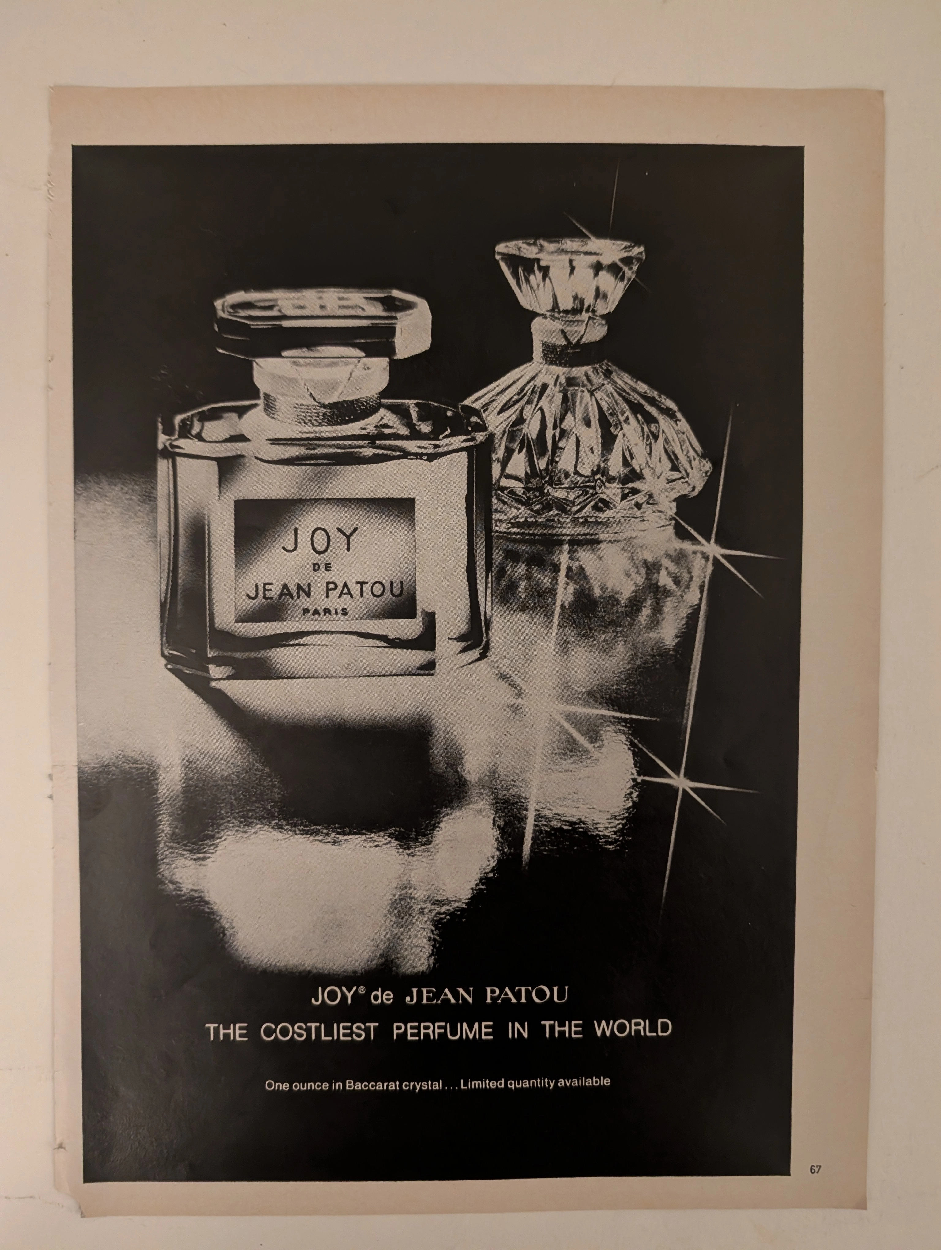
๋Joy De Jean Patou · Fashion
The Time Traveller's Dossier: The Semantics of Arrogance – JOY de Jean Patou Advertisement (Circa 1980s)
History is not written by the victors; it is printed by the industrialists. Long before digital algorithms began to sterilely dictate human consumption and virtual reality stripped away authentic tactile sensation, societal engineering and consumer psychology were executed through the calculated, mathematical geometry of the four-color offset press and the absolute mastery of analog darkroom photography. The historical artifact before us is not merely a disposable magazine tear sheet meant to peddle a fragrance. It is a perfectly weaponized blueprint of absolute capitalist supremacy, a visual declaration of class warfare, and an unwavering testament to an era of uncompromising, unapologetic ultra-luxury. This museum-grade, academic archival dossier presents an exhaustive deconstruction of a late-analog print advertisement for the legendary fragrance "JOY de Jean Patou," dating from the late 1970s to the early 1980s. Operating on a profound and ruthless binary structure, this document records a calculated paradigm shift within the global luxury goods industry. It captures the precise historical fracture where luxury transitioned conceptually from being a mere indicator of high-quality craftsmanship into a blatant, arrogant weapon of socioeconomic exclusion. Through the highly specialized lens of late-analog commercial artistry and stringent visual forensics, this document serves as a masterclass in psychological marketing. It established the foundational archetype for selling astronomically priced, exclusionary items—an archetype that unconditionally dictates the visual and strategic totems of modern ultra-luxury brands today.
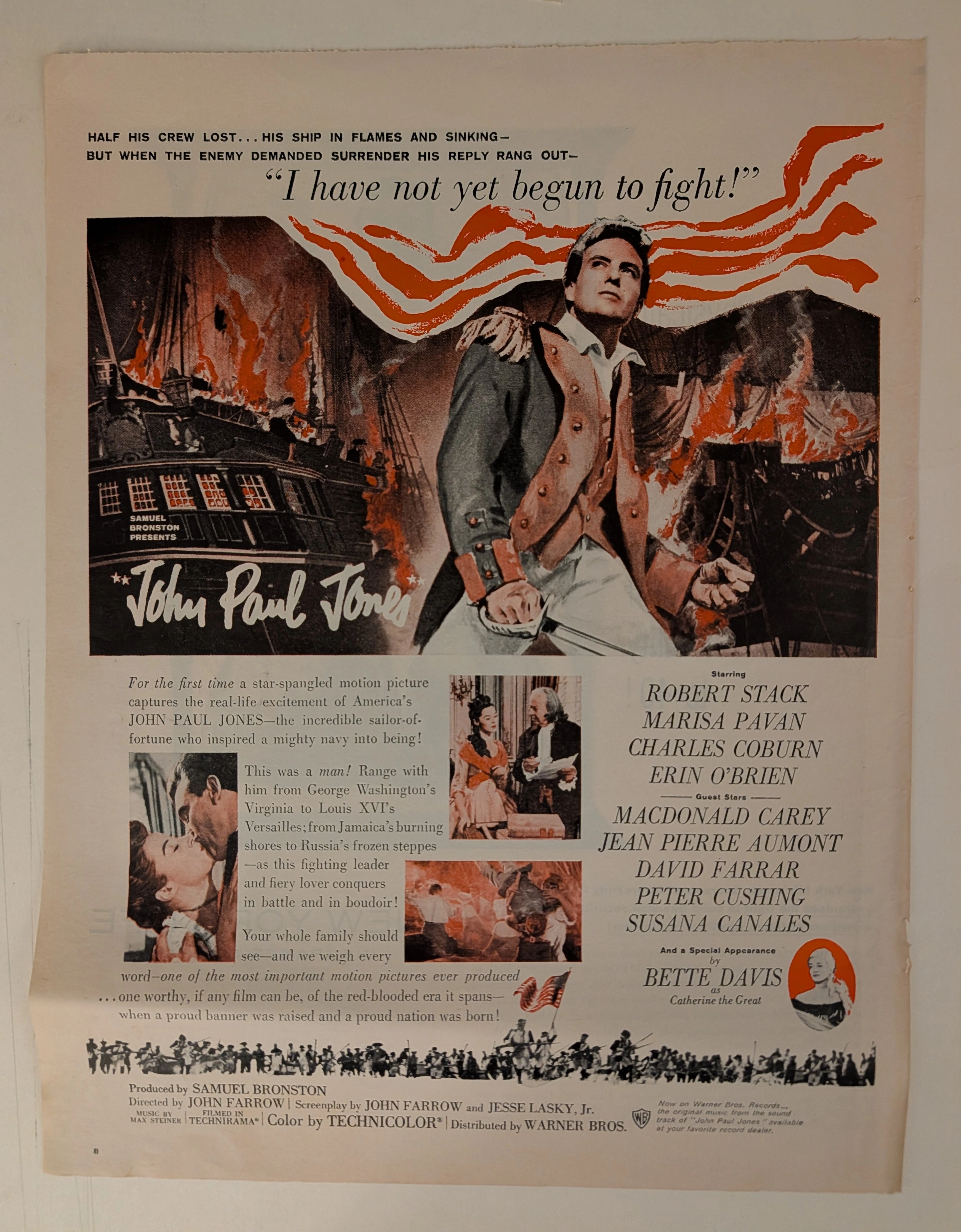
John Paul Jones · Entertainment
THE TIME TRAVELER'S DOSSIER: HOLLYWOOD PROPAGANDA AND THE DAWN OF MULTIMEDIA SYNERGY
The artifact under exhaustive, uncompromising, and unprecedented museum-grade analysis is a remarkably preserved Historical Relic originating from the zenith of Hollywood's post-war epic era. This Primary Art Document is a monumental, full-page theatrical advertisement for the 1959 biographical epic "John Paul Jones", produced by the legendary independent film mogul Samuel Bronston and distributed by Warner Bros.. This is not merely a movie poster; it is a "Forensic Blueprint of Cold War American Nationalism and Multimedia Synergy." Released in 1959, at the height of the Cold War, the advertisement aggressively weaponizes the foundational mythos of the United States Navy. The commanding, blood-red headline, "I have not yet begun to fight!", serves as a psychological anchor, projecting unyielding American defiance to both domestic audiences and global adversaries. Visually dominated by the rugged, heroic portrait of Robert Stack, the ad expertly balances masculine wartime aggression with romantic subplots and diplomatic intrigue featuring Charles Coburn as Benjamin Franklin. Furthermore, it showcases elite Hollywood casting power by explicitly highlighting a "Special Appearance by Bette Davis as Catherine the Great" in a striking red cameo vignette. Crucially, this artifact documents an early, masterful execution of cross-platform corporate synergy. The bottom corner explicitly markets the original Max Steiner soundtrack on Warner Bros. Records, proving that the commercialization of the "Original Motion Picture Soundtrack" was already highly codified. Rescued from the inevitable oblivion of disposable entertainment media, this pre-2000s analog artifact is a breathtaking embodiment of the Japanese aesthetic of wabi-sabi. Printed on inherently acidic mid-century wood-pulp paper, it exhibits beautifully authentic edge wear and a profound, warm amber oxidation across its surface. This unstoppable molecular death transforms a mass-produced piece of Hollywood propaganda into an irreplaceable, ready-to-frame Primary Art Document of cinematic and sociological history.
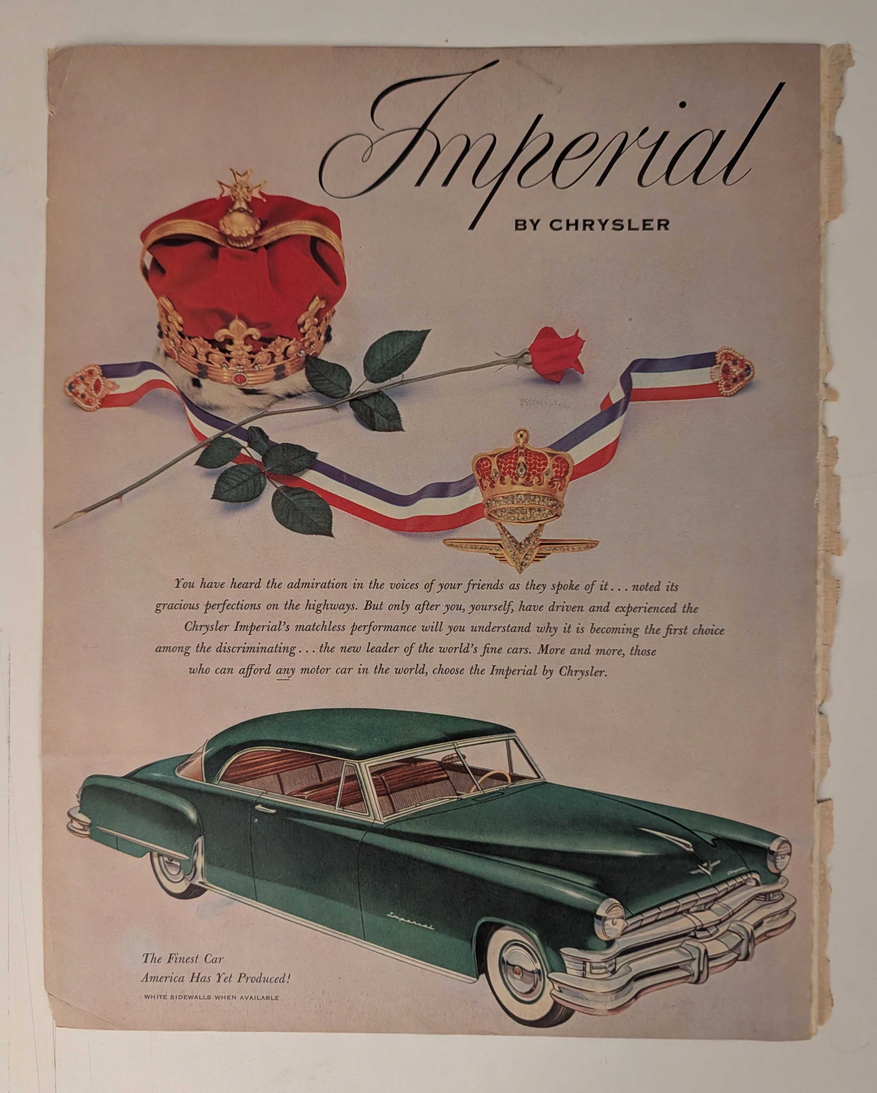
Chrysler · Automotive
THE TIME TRAVELER'S DOSSIER: THE KOREAN WAR ANCHOR AND THE SCARCITY OF LUXURY
The artifact under our uncompromising, unprecedented museum-grade analysis is a profoundly preserved Historical Relic excavated from the golden age of post-WWII American opulence. This Primary Art Document is a monumental magazine advertisement for the Imperial by Chrysler, dating to the pivotal 1951-1952 era. This document is a "Forensic Blueprint of American Aristocracy and Geopolitical Crisis." It masterfully weaponizes regal European iconography to elevate Chrysler's flagship model above mere transportation, explicitly targeting "those who can afford any motor car in the world". Yet, its most significant historical anchor is hidden in the microscopic fine print: "WHITE SIDEWALLS WHEN AVAILABLE". This single sentence instantly transforms the advertisement into a wartime relic, reflecting the severe rubber shortages imposed during the Korean War. Grounded by the iconic jeweled emblem and its breathtaking wabi-sabi chemical degradation—highlighted by its violently torn binding edge—this artifact commands an irreplaceable status, cementing its Rarity Class A designation.