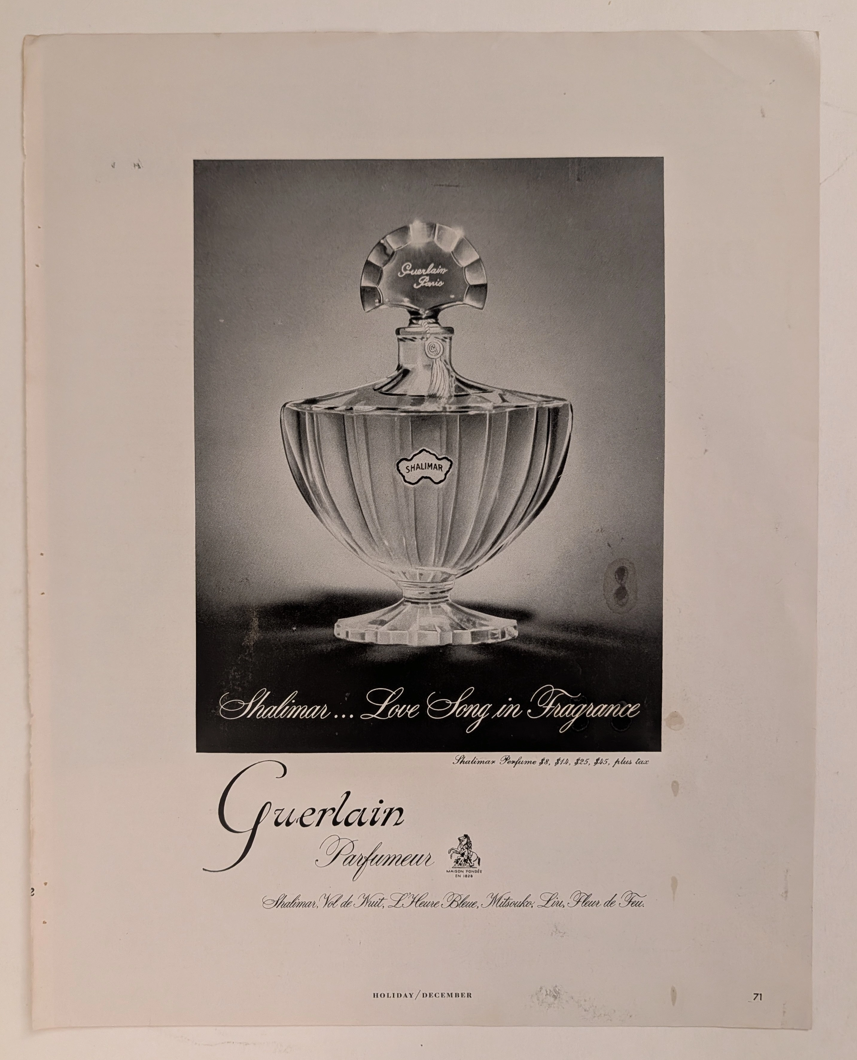
The Time Traveller's Dossier: The Stroke of Seduction – 1970s Christian Dior "Dioressence" Advertisement
The History
To decode the sociological architecture embedded within this printed artifact, it is mandatory to contextualize the macroeconomic and cultural landscape of the 1970s. This era was defined by the sexual revolution, women's liberation, and a radical departure from the rigid domesticity of the 1950s. The fragrance industry, previously focused on selling delicate, floral "prettiness," had to aggressively recalibrate its public narrative. Perfume was no longer marketed merely as an accessory to attract a husband; it was repositioned as an invisible armor of personal empowerment and overt sensual expression.
Part 1: The Binary Shift: Restrained Elegance vs. Uninhibited Sensuality
The narrative architecture of this artifact is built upon a strict, uncompromising binary contrast against Dior's own history. Historically, the cultural consciousness linked Christian Dior with the "New Look" of 1947—cinched waists, full skirts, and a highly structured, almost rigid form of polite, aristocratic femininity. This advertisement violently obliterates that narrative. It executes a flawless cultural pivot by presenting a woman lounging fluidly, devoid of structural corsetry, wrapped in a loose, vibrant crimson gown. The message deliberately contrasts the old world of restrictive elegance with a new world of relaxed, aggressive sensuality. By conceptually transitioning the Dior woman from a stiff mannequin in a Parisian salon to a reclining, enigmatic siren in a private boudoir, the House of Dior successfully mapped its product onto the upward mobility and sexual liberation of the modern woman.
Part 2: The Liberation Discourse & The Semantics of Desire
Executing this binary shift required the invention of a highly specific vocabulary. The copywriting abandons traditional fragrance tropes of "floral" or "sweet" and instead adopts the aggressive, psychologically charged language of raw desire:
"Dioressence. Exuberant. Smouldering. Uninhibited."
The strategic deployment of these three exact adjectives functions as an early iteration of psychological lifestyle marketing. Positioning the fragrance as "smouldering" and "uninhibited" provided consumers with a logical, luxury-branded permission slip to embrace their own sexuality. It effectively neutralized any lingering societal objections to female assertiveness by cloaking it in the unquestionable authority of Parisian high fashion.
Part 3: The Sovereign Muse and the Reversed Male Gaze
The socioeconomic structure of the era saw the rise of the independent, self-purchasing female consumer. For a luxury perfume to succeed, it required her explicit approval, not her husband's. The illustration targets the intellectual vanity and confidence of this new demographic. The subject is reclining amidst a chaotic luxury of patterned pillows (stripes, animal prints, geometric gold), yet her gaze is direct, piercing, and entirely sovereign. She is not a passive object being observed; she is staring down the viewer. This conceptual boundary eradicated the line between the observer and the observed, placing the power entirely in the hands of the woman wearing Dioressence.
Part 4: Visual Semiotics: Fluidity vs. Geometry
The interplay between the illustration and the product photography functions as a precise semiotic indicator of the brand's absolute confidence, engineering consent through contrast:
The Fauvist Brushstroke: The use of bold, flat, unblended colors (the striking magenta/crimson dress against the stark yellow and patterned pillows) draws heavily from Fauvism. It signifies passion, heat, and emotion breaking free from restrictive lines.
The Monolithic Flacon: In stark contrast to the fluid, sweeping brushstrokes of the woman, the photograph of the Dioressence bottle at the bottom is rigid, architectural, and grounded in a dark, moody vignette. This visual juxtaposition anchors the wild fantasy of the illustration into a tangible, purchasable luxury object.
Part 5: Pop Culture Impact and Enduring Legacy
The visual language pioneered by this specific artist for Dior left an indelible, structural mark on global fashion pop culture. The aesthetic of the mysterious, illustrated fashion muse—conveyed through minimal lines and maximum color impact—became the foundational DNA for high-end fashion editorial. The unapologetic sensuality showcased here directly birthed the iconic, hyper-sexualized fragrance campaigns of the 1980s and 90s (from Calvin Klein's Obsession to Gucci's Tom Ford era).
In the modern commercial arena, the contemporary obsession with vintage haute couture illustrations operates on a cyclical return to this exact era. Today's luxury houses desperately try to manufacture the effortless, artistic soul that Dior achieved purely through analog ink and paint. This artifact is the foundational source code for modern, art-driven luxury marketing.
Artist Information
René Gruau (1909–2004): A legendary Italian-French fashion illustrator whose bold, fluid lines and striking use of color defined the visual identity of haute couture in the 20th century. Gruau shared a profound personal and professional friendship with Christian Dior, acting as the artistic visionary behind the House of Dior's most iconic fragrance campaigns (including Miss Dior, Eau Sauvage, and Dioressence). His signature—a distinctive capital "G" topped with a star, clearly visible on the left edge of this illustration—is a seal of absolute artistic royalty. Gruau's ability to distill the essence of a brand into a few masterful brushstrokes renders his work not merely advertising, but highly collectible fine art.
The Paper
As a physical entity, this tear sheet is an unrepeatable record of late-analog offset printing. The medium-weight coated magazine stock was engineered for mass distribution, yet its current state demands evaluation through the Japanese aesthetic philosophy of wabi-sabi (侘寂)—the recognition of beauty in impermanence and the natural progressio
Visual Forensics & Substrate Analysis:
Examining the extreme close-ups of this artifact reveals the mechanical heartbeat of the 1970s press. Under magnification, a fascinating duality emerges: the solid, aggressive blocks of color in the illustration exhibit the flat, continuous ink laydown of master-crafted lithography, while the photographic inset of the perfume bottle shatters into a precise, mathematical galaxy of CMYK halftone rosettes. The distinct grain of the offset process is aggressively visible in the dark background of the bottle inset. The margins exhibit authentic "toning"—a gradual, irreversible yellowing caused by the natural oxidation of lignin within the wood pulp. This organic degradation cannot be cloned by modern digital processes. The subtle fragility of the paper's edge and its evolving patina elevate the piece from a uniform industrial print to a singular, historically scarred artifact. The wabi-sabi nature of this page ensures that its aesthetic and historical value increases precisely because it is slowly returning to the earth.n of time.
The Rarity
Rarity Class: S (Superior / Museum Grade)
Within archival parameters, this artifact holds a definitive Class S designation. The paradox of mid-to-late century analog print ephemera lies in its initial mass production versus its extreme current scarcity. Magazines of the 1970s were quintessential disposable media, destined for the incinerator. The survival of this specific page—enduring half a century without yielding to destructive handling, severe moisture damage, or structural center creases—is an archival anomaly. More crucially, this is not a standard photograph; it is an original print of an illustration by René Gruau. Authentic, original tear sheets featuring Gruau's work for Dior are considered the "holy grail" of fashion ephemera. Finding a specimen that retains the absolute saturation of its vibrant crimson and yellow pigments, while bearing only the authentic hallmarks of wabi-sabi aging, is highly uncommon. Such pristine remnants are fiercely sought after by curators of fashion history for museum-grade conservation framing.
Visual Impact
The aesthetic authority of this piece lies in a masterclass of asymmetrical composition and negative space. The immediate focal point is the intense, kohl-rimmed eye of the subject, peeking out from the vibrant crimson fabric. This creates a powerful leading line, forcing the viewer's eye to travel down the sweeping, fluid lines of the dress, cascading directly into the bold typography and finally resting on the photographic reality of the perfume bottle. The artist strategically utilizes the stark, unprinted cream of the paper (negative space) to frame the explosion of color, projecting the subject forward from the two-dimensional plane. It is a highly calculated visual mechanism aimed at commanding absolute attention and evoking a physiological response of intrigue and desire.
Exhibition Halls
The Archive Continues
Continue the Exploration
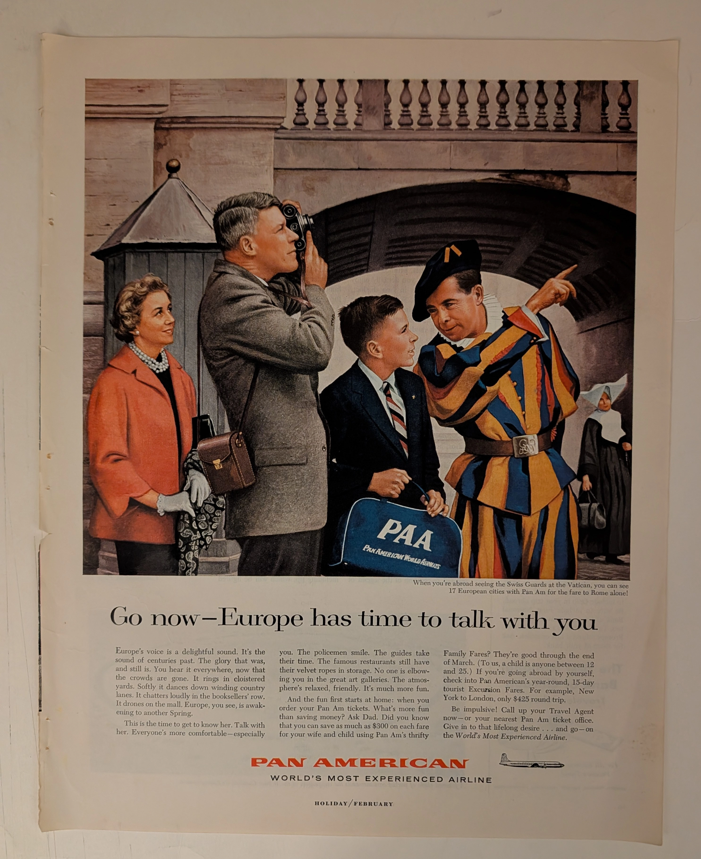
PAN AMERICAN WORLD AIRWAYS · Travel
THE TIME TRAVELER'S DOSSIER: PAN AM - THE ARCHITECTURE OF THE AMERICAN TOURIST
The artifact currently subjected to our uncompromising, museum-grade analysis is a profoundly preserved Historical Relic excavated from the zenith of mid-century American aviation prosperity. This Primary Art Document is a full-page magazine advertisement for Pan American World Airways. Functioning as a "Forensic Blueprint of the American Leisure Class Abroad," the document masterfully weaponizes European heritage and history to validate the affluent, off-season travel of post-war American consumers. Its historical context is irrefutably anchored by the microscopic silhouette of a Douglas DC-7B aircraft, placing this artifact squarely in the twilight of the propeller age, just before the dawn of the Boeing 707 jet era. Grounded by extreme macro details of the iconic PAA flight bag, the bold corporate typography, and the breathtaking wabi-sabi chemical degradation highlighted by its violently torn binding edge, this artifact commands an irreplaceable status, cementing its Rarity Class S designation as a masterpiece of corporate sociological engineering.
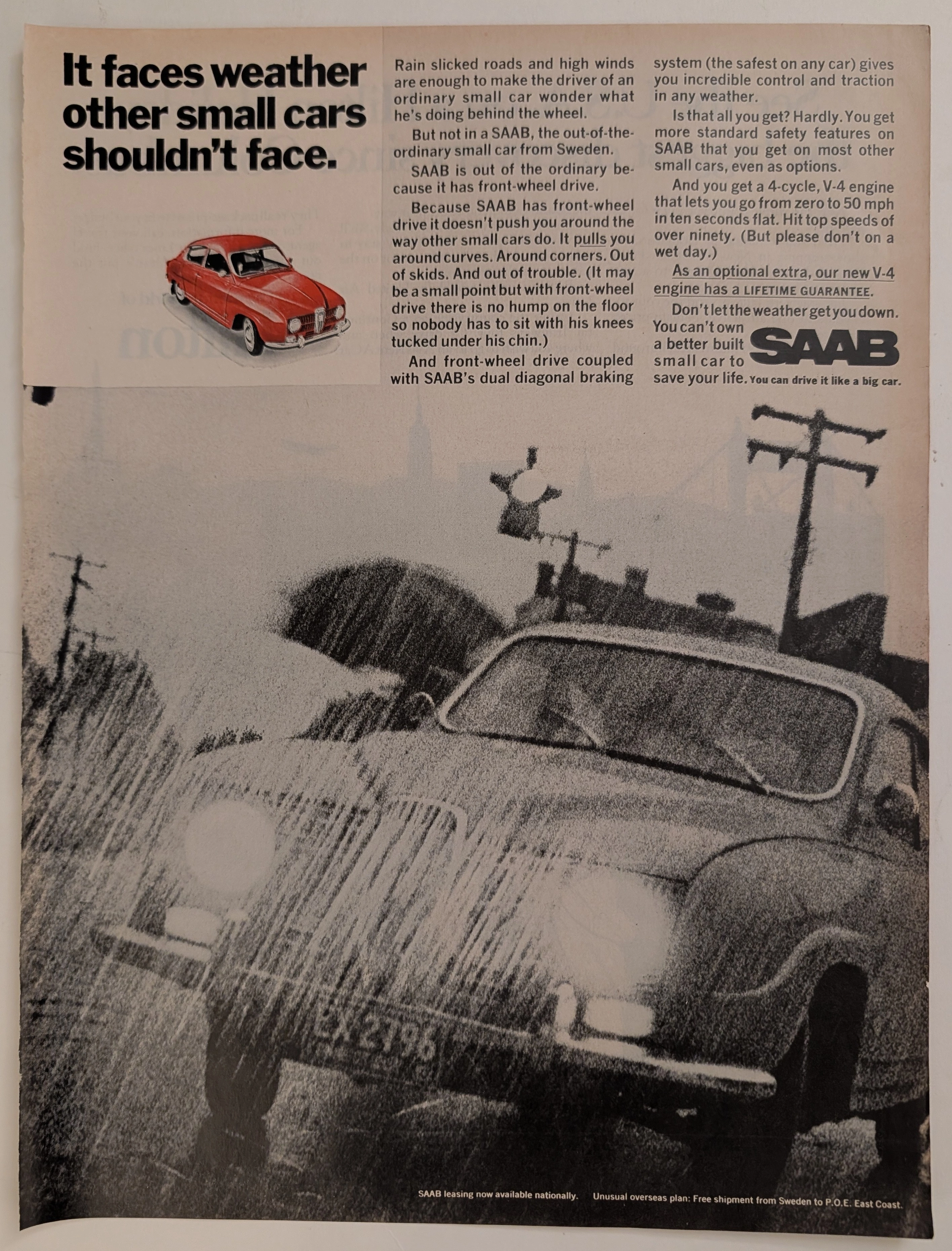
Saab · Automotive
The Time Traveller's Dossier: Aeronautical Architecture on the Asphalt – The SAAB 96 V4 and the Engineering of Adverse Weather Superiority
The evolution of the mid-twentieth-century American automotive landscape was heavily disrupted by the influx of European imports, each vying to dismantle the hegemony of the domestic V8, rear-wheel-drive giants. Elegantly and securely positioned upon the analytical table of The Record Institute today is a visually striking, narrative-driven full-page print advertisement for the SAAB Automobile (featuring the new V-4 engine), definitively dating to the late 1960s. This document transcends the standard, utilitarian boundaries of automotive marketing. It operates as a highly sophisticated, multi-layered cultural mirror, reflecting a precise era in consumer psychology where the anxiety of driving in severe weather was aggressively mitigated through the promise of superior, aircraft-inspired engineering. By utilizing a dramatic, heavily grained monochromatic photograph of a SAAB battling torrential rain, juxtaposed with a pristine, spot-color red illustration of the vehicle, the manufacturer successfully positioned itself not merely as a car company, but as a purveyor of meteorological invincibility. This world-class, comprehensive dossier conducts a meticulous, unyielding, and exceptionally exhaustive examination of the artifact, operating under the absolute most rigorous parameters of historical, sociological, and material science evaluation. Dedicating the overwhelming majority of our analytical focus (80%) to its immense historical gravity, we will decode the brilliant marketing psychology embedded within the "front-wheel drive" narrative, analyze the profound engineering pivot of the "new V-4 engine," and dissect the sociopolitical genius of marketing safety before it was federally mandated. Furthermore, as we venture deeply into the chemical and physical foundations of this analog printed ephemera (10%), we will reveal the precise mechanical fingerprints of the spot-color halftones captured in the macro imagery of the red SAAB illustration. Finally, we will assess its archival rarity (10%), exploring how the graceful, natural oxidation of the paper substrate cultives a serene wabi-sabi aesthetic—a natural, irreversible phenomenon that serves as the primary engine driving up its market value exponentially within the elite global spheres of Vintage Commercial Ephemera and Automotive Archives.
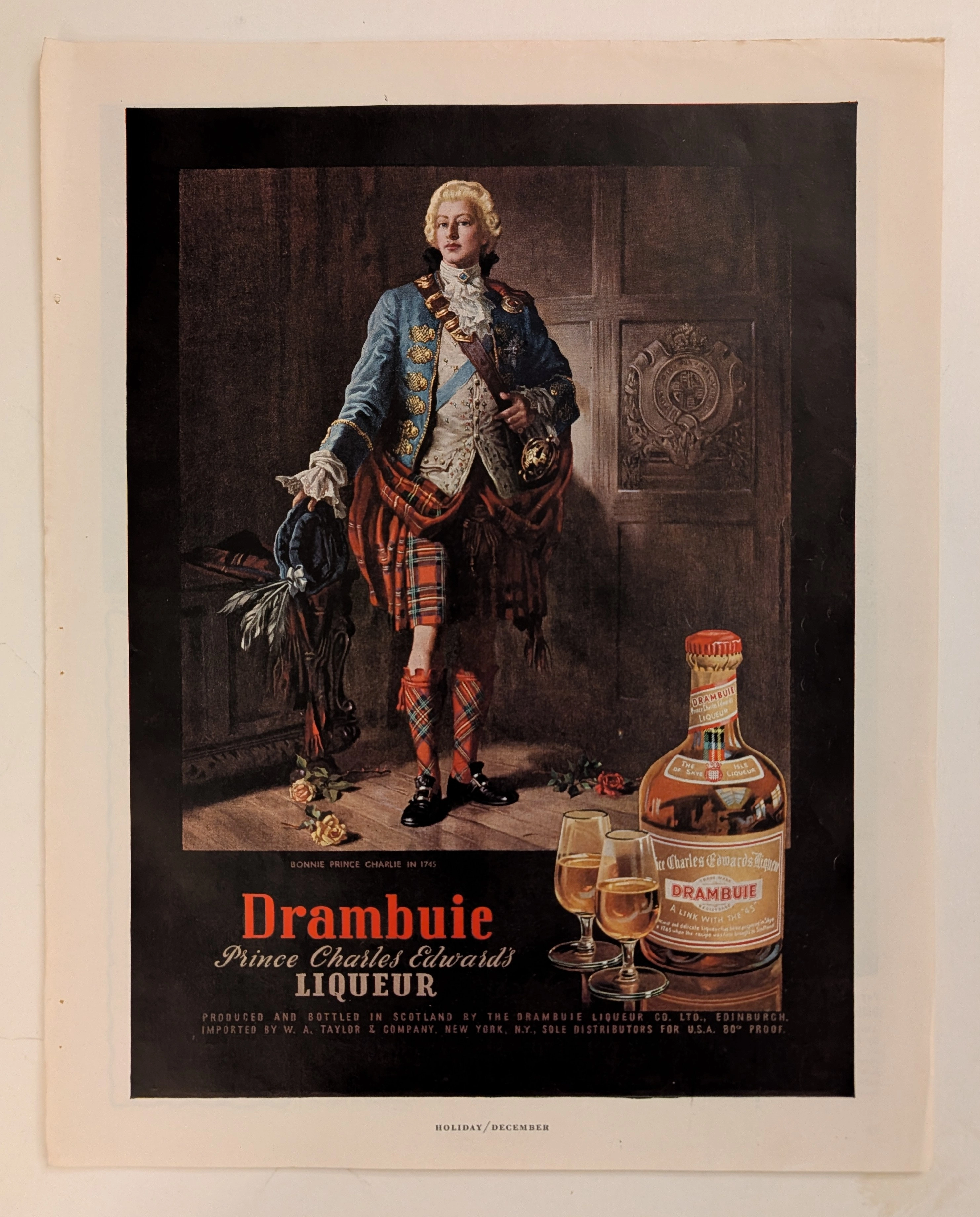
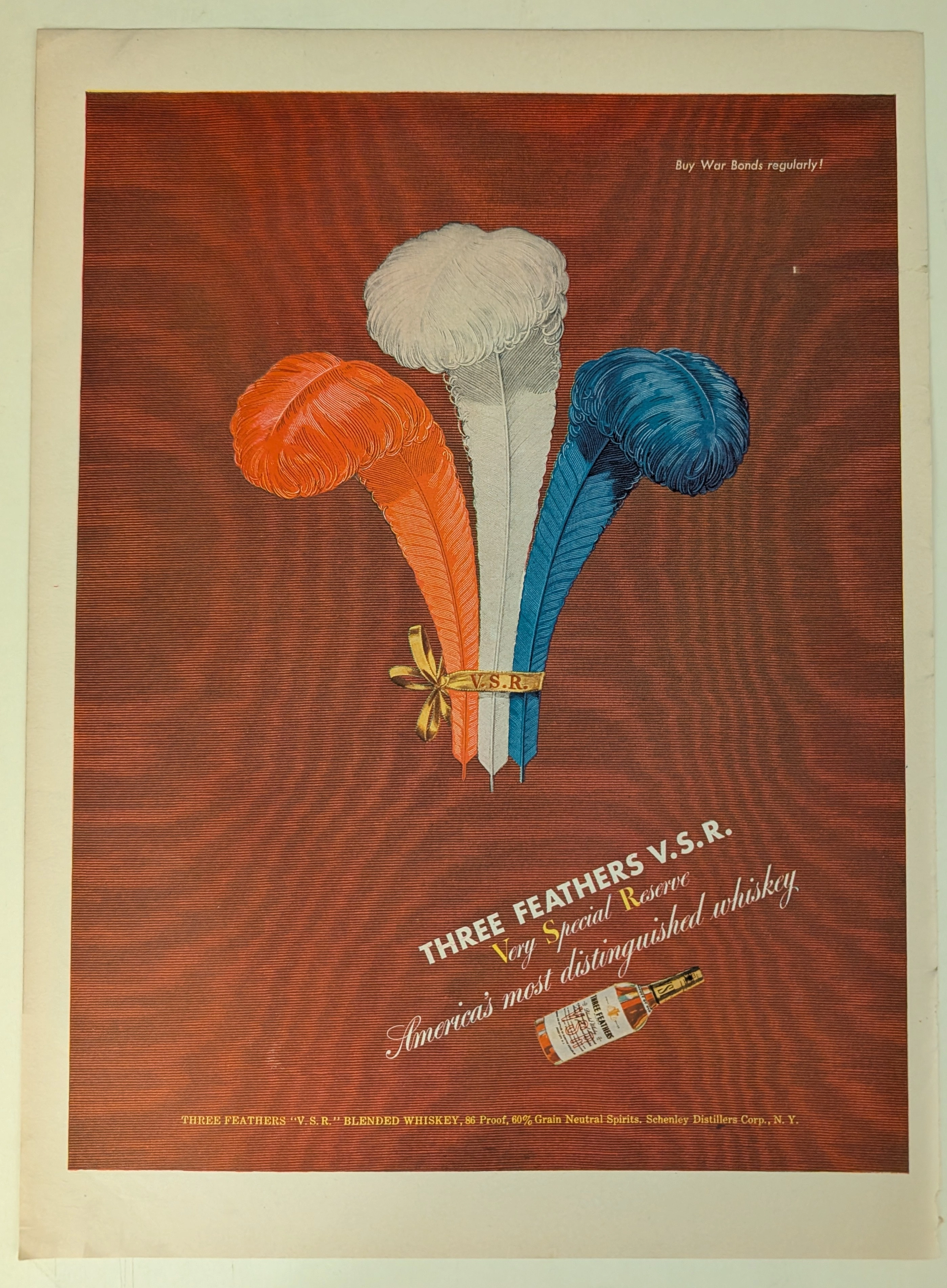
Drambuie · Beverage
The Time Traveller's Dossier: The Alchemy of Royal Rebellion – Drambuie "Bonnie Prince Charlie" Advertisement (Circa Mid-20th Century)
History is rarely an objective chronicle of facts; it is a malleable narrative, continually rewritten, romanticized, and ultimately weaponized by those seeking to legitimize their power or, in the modern era, their products. Long before digital algorithms could synthesize artificial heritage, the supreme manifestation of corporate alchemy was executed through the calculated precision of the four-color offset press and the appropriation of historical iconography. The artifact presented before us is not merely a vintage magazine tear sheet selling a Scottish liqueur. It is a masterclass in the commodification of myth, a visual distillation of romantic rebellion, and a foundational blueprint for what is now known as "Heritage Branding." This museum-grade, academic archival dossier presents an exhaustive, microscopic deconstruction of a mid-20th-century print advertisement for Drambuie Liqueur. Operating on a profound binary structure, this document records a calculated paradigm shift within the global spirits industry. It captures the precise historical fracture where a highly specific, geographically isolated alcoholic beverage was conceptually transmuted into a literal draught of royal rebellion and aristocratic romance. Through the highly specialized lens of late-analog commercial artistry and stringent visual forensics, this document serves as a masterclass in psychological marketing. It established the foundational archetype for linking the consumption of a physical product with the ingestion of an epic, historical fantasy—an archetype that unconditionally dictates the visual and strategic totems of the modern luxury spirits industry today.