


THE TINY TEXT THAT AUTHENTICATES HISTORY Why Fine Print in Magazine Advertisements Matters More Than You Think
The History
" The Tiny Text in the Corner: Why Magazine Advertisement Fine Print Is the Most Overlooked Historical Record of the 20th Century "
— When Miniature Type Tells the Biggest Story
Pick up any vintage magazine. Your eye lands on the bold headline, the lavish illustration, the aspirational tagline. But tilt the page toward the light and you discover another world entirely: miniature text tucked into corners and margins, declaring copyright years, company names, street addresses, proof ratings, and the names of photographers and calligraphers. These are not editorial afterthoughts — they are the legal and cultural DNA of the advertisement, deliberately embedded by lawyers, regulators, and brand managers whose job it was to protect and authenticate the creative work.
Today, in an era of sophisticated reproduction and a booming vintage market, this fine print has evolved into something its creators never fully anticipated: one of the most reliable authentication tools available to collectors, dealers, and historians of printed ephemera.
1. The Legal and Regulatory Origins of Advertisement Fine Print
1.1 Copyright Law: Notice Was Not Optional
Under the United States Copyright Act of 1909 — the governing statute for most of the advertisements shown in these photographs — copyright protection was conditional on proper notice. Works published without a valid copyright notice (the word 'Copyright' or the symbol ©, followed by the year and the copyright owner's name) could immediately pass into the public domain, forfeiting all legal protection. This was not a technicality lawyers could afford to overlook.
For major corporations investing heavily in national advertising campaigns — R.J. Reynolds Tobacco Company's Camel campaign in The Saturday Evening Post (September 16, 1933), The Seven-Up Company's war-era Buy More War Bonds advertisement (1943), or General Tire & Rubber Co.'s patriotic 1942 appeal — the copyright line was mandatory. Advertising managers were required by their legal departments to include it in every insertion, regardless of how small the type had to be to fit the layout.
The 1976 Copyright Act updated and extended these requirements, which is why advertisements from the late 1970s onward (Nikon Inc. 1979, Chanel Inc. 1980, Toyota Motor Sales 1981, Schenley Imports 1981) all bear © notices in the same consistent legal tradition.
1.2 Industry-Specific Regulatory Requirements
Beyond copyright, several industries faced additional mandated disclosures. The Schenley Imports Scotch Whisky advertisement's fine print — 'Blended Scotch Whisky · 86.8 Proof · © 1981 Schenley Imports Company N.Y., N.Y.' — is a masterclass in regulatory layering. The proof designation was required by the Bureau of Alcohol, Tobacco and Firearms (BATF). The company address was required by various state alcohol control regulations. The copyright notice was required by federal intellectual property law. Three different regulatory regimes, all compressed into a single line of 6-point type.
The Swiss Federation of Watch Manufacturers advertisement (1949) demonstrates international regulatory compliance: the federation's seal and copyright notice were part of a coordinated campaign to certify the Swiss Made designation in the American market, governed by Swiss federal law and bilateral trade agreements.
1.3 Business Address as Temporal Marker
The business addresses printed in advertisement fine print are among the most historically useful pieces of information for researchers and authenticators. Nikon Inc.'s Garden City, New York 11530 address identifies a specific chapter in the company's American expansion history. Power and Speed Equipment's P.O. Box 511, Burlingame, California, dated June 14, 1949, places the document precisely in the post-war automotive performance aftermarket boom.
These addresses often changed as companies grew, merged, or relocated — meaning the address itself can serve as a cross-reference against corporate histories, helping to narrow the date range of an advertisement even when the copyright year is not immediately legible.
2. Fine Print as Authentication Evidence for Vintage Collectibles
2.1 The Reprint Problem
The vintage print market faces a persistent challenge: high-quality reproductions. Modern printing technology can produce facsimiles that are visually indistinguishable from originals at casual inspection distance. For dealers and collectors, the fine print is where fakes most often betray themselves — not through dramatic forgeries, but through small inconsistencies that only become visible under magnification or to a trained eye.
The key authentication indicators embedded in fine print include: typographic characteristics consistent with the printing technology of the claimed era; ink penetration patterns consistent with aged paper; copyright notice format conventions appropriate to the stated year; and the presence or absence of specific regulatory language that was required only during certain historical periods.
2.2 A Systematic Authentication Framework
Professional authenticators apply a four-layer verification process to vintage magazine advertisements:
*Layer 1 — Chronological Consistency: Does the fine print content match the historical context? A 1933 Camel advertisement should not contain a ZIP code (introduced 1963) or a corporate name reflecting a merger that occurred after 1933. The term 'Copyright' spelled out in full was standard in the 1930s; the © symbol became common only after the 1952 Universal Copyright Convention.
**Layer 2 — Regulatory Language Accuracy: Does the technical disclosure language match what was actually required at the stated time? An alcohol advertisement's proof designation, product classification, and distributor information must all align with the regulatory framework in effect on the publication date.
***Layer 3 — Paper and Ink Forensics: Under magnification, does the type show characteristics consistent with the printing technology of the era? Hot-metal typesetting (used through the 1970s) produces slightly irregular letterforms with characteristic ink trapping at corners. Digital typesetting (post-1980s) produces uniformly sharp edges. A supposed 1933 advertisement with digitally sharp fine print is suspicious.
***Layer 4 — Contextual Integrity: Are the surrounding elements — adjacent advertisements, editorial content, page numbering, binding evidence — consistent with the claimed publication and date?
3. The Disappearing Archive: Pre-2000 Magazine Pages and Why They Matter
3.1 The Acid Paper Crisis
The majority of magazines published between roughly 1850 and 1980 were printed on groundwood paper with high acid content. Acidic paper destroys itself from within through oxidation and hydrolysis reactions, causing the characteristic yellowing, brittleness, and eventual disintegration that librarians and archivists call 'slow fire.' The Library of Congress has estimated that 25-30% of paper-based materials from this era will be unusable by 2050.
This means that surviving examples of advertisements from the 1930s-1940s — the Camel ad from 1933, the General Tire ad from 1942, the Seven-Up war bond appeal from 1943 — are not merely old; they are increasingly rare physical objects whose condition and completeness directly affect their historical and monetary value.
3.2 The Digitization Gap
While major institutions have digitized some magazine archives, vast quantities of periodical advertising have never been digitized. The economics of digitization favor editorial content (articles, covers) over advertising pages, meaning that the fine print records contained in millions of pages of advertising — arguably the most precise dating and attribution information in the entire publication — exists only in physical form and is actively disappearing.
For researchers in economic history, cultural anthropology, legal history, and brand studies, this represents an accelerating loss of primary source material that cannot be recovered once the paper is gone.
3.3 What the Fine Print Preserves That Nothing Else Does
The fine print in vintage advertisements preserves information that appears nowhere else in the historical record with the same precision: exact corporate names and legal structures at specific dates; regulatory standards in force at specific times; pricing and product information; and the names of creative professionals — photographers, calligraphers, illustrators — whose work would otherwise be entirely anonymous.
4. Lessons from Vintage Band Tees: When Small Print Determines Big Prices
4.1 The Band Tee Authentication Market
The vintage concert shirt market offers a near-perfect parallel to vintage magazine advertisement authentication. A Rolling Stones 1981 North American Tour shirt authenticated as original can sell for USD 500-2,000; the same design in a modern reproduction sells for USD 20-50. The difference is established almost entirely through fine print analysis.
Authentication services including Recess LA, Last Call Vintage, and resale platforms like The RealReal have developed detailed authentication protocols that center on printed fine print. The '© 1981 B&W T Co' mark visible in the images accompanying this article is a prime example: B&W T Co. (Brown & Williamson's licensing arm, or a contemporary garment licensor of that era) printed copyright notices directly onto garments, and the typography, placement, and format of these notices changed over time in ways that specialists have catalogued exhaustively.
4.2 The Parallel Authentication Logic
The parallel between band tee authentication and magazine advertisement authentication is not superficial. Both fields rely on the same fundamental principle: counterfeiters and reproduction makers typically focus their energy on replicating the dominant visual elements, and consistently underinvest in the fine print — either because they are unaware of its significance, or because accurately replicating period-appropriate typography is technically demanding.
Magazine advertisements have one significant authentication advantage over garments: they are embedded in a physical context (the magazine) that itself provides multiple independent verification points — publication date, neighboring editorial content, paper batch characteristics — making fabrication of an entire plausible context exponentially more difficult.
5. Collaboration Credits: When Two Legends Met in the Margins
5.1 Brand Partnership Credits
The most commercially and historically significant fine print in vintage magazine advertisements is often not the copyright notice but the collaboration credit — the line that identifies a partnership between two brands, or between a brand and a creative professional, that might otherwise be lost to history.
'Pierre Cardin Men — Jewelry courtesy of Tiffany & Co.' is not merely a prop credit. It documents a specific business relationship: Tiffany & Co., at the height of its prestige as an American luxury institution, authorized Pierre Cardin to feature its jewelry in a national advertising campaign. This tells us something about both brands' relative status in the market at that moment, about the business practices of luxury advertising in the pre-internet era, and about the social codes governing how luxury goods were presented and certified.
5.2 Creative Professional Credits
'Photography by Ronald G. Harris / Calligraphy by Ray Cruz / Fashions by Yves St. Laurent' — this three-line credit sequence is a complete production record. In an era when advertising photography was regularly commissioned from recognized editorial and fashion photographers (Richard Avedon and Irving Penn both did significant advertising work), and when calligraphy by named artists was used to connote handcrafted luxury, these credits establish an entire creative genealogy.
The presence of Yves St. Laurent's name in a credit — rather than as the advertiser — means this was likely an editorial-style advertisement in a fashion magazine, in which St. Laurent's involvement lent the advertisement the status of a fashion editorial rather than pure commercial promotion. The credit is therefore evidence of a specific advertising strategy: borrowed prestige through creative attribution.
5.3 Cross-Reference Value for Authentication and Research
Named creative credits provide a powerful cross-reference mechanism. Photographers have careers with documented timelines; their work for specific clients can often be verified against photographic archives, union records, and contemporary reviews. If a claimed 1975 advertisement credits a photographer whose career records show no work for that client until 1982, the discrepancy is significant.
Similarly, brand collaboration credits can be cross-referenced against business histories, trade press archives, and licensing records, providing a multi-source verification that greatly strengthens or undermines authenticity claims.
Conclusion — The Smallest Text, the Largest Story
The fine print in vintage magazine advertisements is one of the most information-dense records of 20th-century commercial culture. In a few square centimeters of 6-point type, these notices encode legal history, regulatory history, corporate history, creative history, and cultural history simultaneously — with a precision that larger, more prominent texts often lack.
As the paper on which they are printed continues its slow molecular dissolution, and as the market for vintage print collectibles continues to grow, the ability to read, interpret, and authenticate this fine print becomes more valuable with every passing year. The collectors, dealers, and historians who have mastered this skill possess something rare: fluency in a language that most people walk past every day without noticing.
Exhibition Halls
The Archive Continues
Continue the Exploration
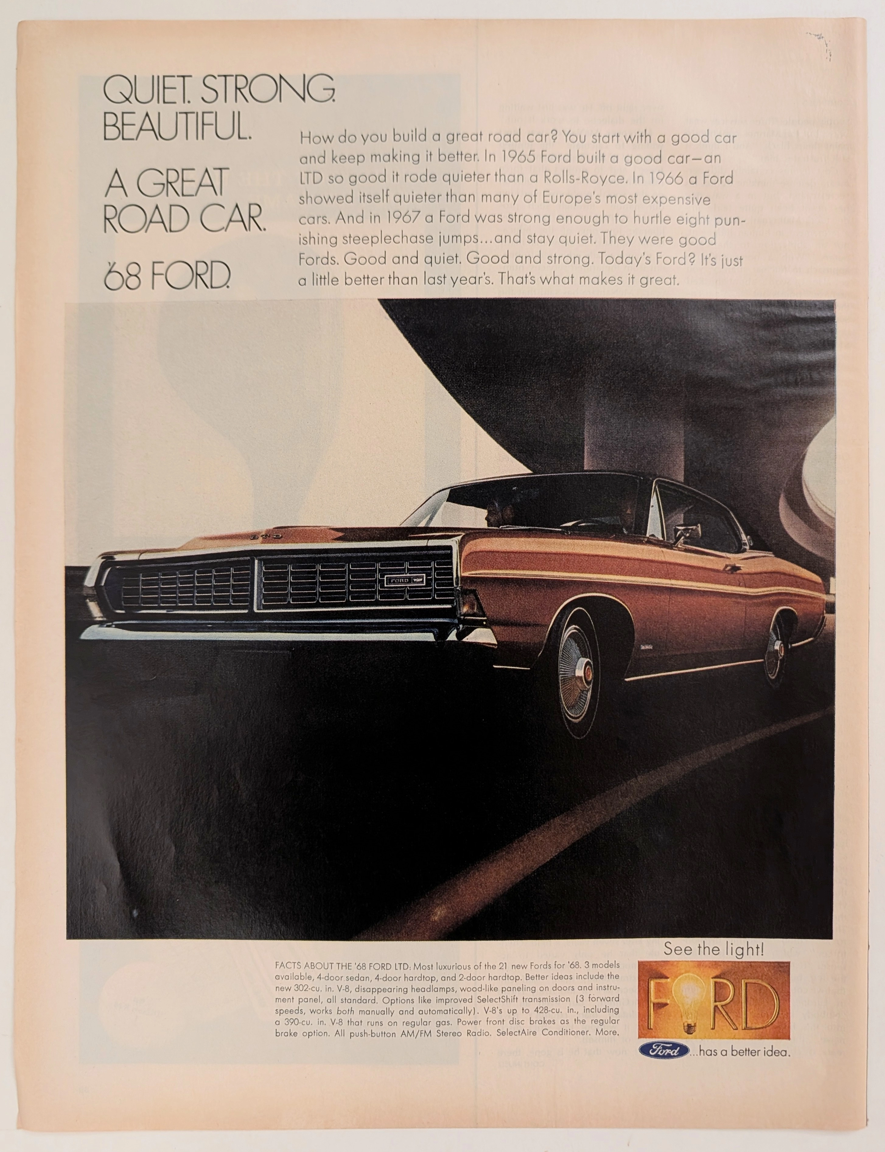
Ford · Automotive
The Time Traveller's Dossier: The Sanctuary of the Highway – The 1968 Ford LTD and the Democratization of Silence
The evolution of the American domestic automobile during the mid-twentieth century was fundamentally propelled by a relentless pursuit of accessible luxury and physical isolation from the rapidly expanding, concrete-laden modern world. The historical artifact elegantly and securely positioned upon the analytical table of The Record Institute today is a striking, full-page print advertisement for the 1968 Ford LTD, originating from a highly volatile and transformative year in American history. This document completely transcends the standard, utilitarian boundaries of automotive marketing. It operates as a highly sophisticated, multi-layered cultural mirror, reflecting the precise era when raw horsepower was momentarily subjugated to the pursuit of absolute silence, and European-grade luxury was explicitly packaged and sold to the American middle-class consumer. This world-class, comprehensive dossier conducts a meticulous, unyielding, and exceptionally exhaustive examination of the artifact, operating under the absolute most rigorous parameters of historical, sociological, and material science evaluation. With the vast majority of our analytical focus dedicated to its immense historical gravity (80%), we will decode the brilliant marketing psychology embedded within Ford's audacious "Quiet" campaign, analyze the brutalist architectural juxtaposition of the concrete overpass against the sleek lines of the vehicle, and dissect the profound corporate semiotics of the iconic "Ford has a better idea" lightbulb logo. Furthermore, as we venture deeply into the chemical and physical foundations of this analog printed ephemera (10%), we will reveal the precise mechanical fingerprints of the CMYK halftone rosettes captured in the macro imagery of the wheel hubcap. Finally, we will assess its archival rarity (10%), exploring how the graceful, natural oxidation of the paper substrate cultivates a serene wabi-sabi aesthetic—a natural, irreversible phenomenon that serves as the primary engine driving up its market value exponentially within the elite global spheres of Vintage Commercial Ephemera and Automotive Archives.
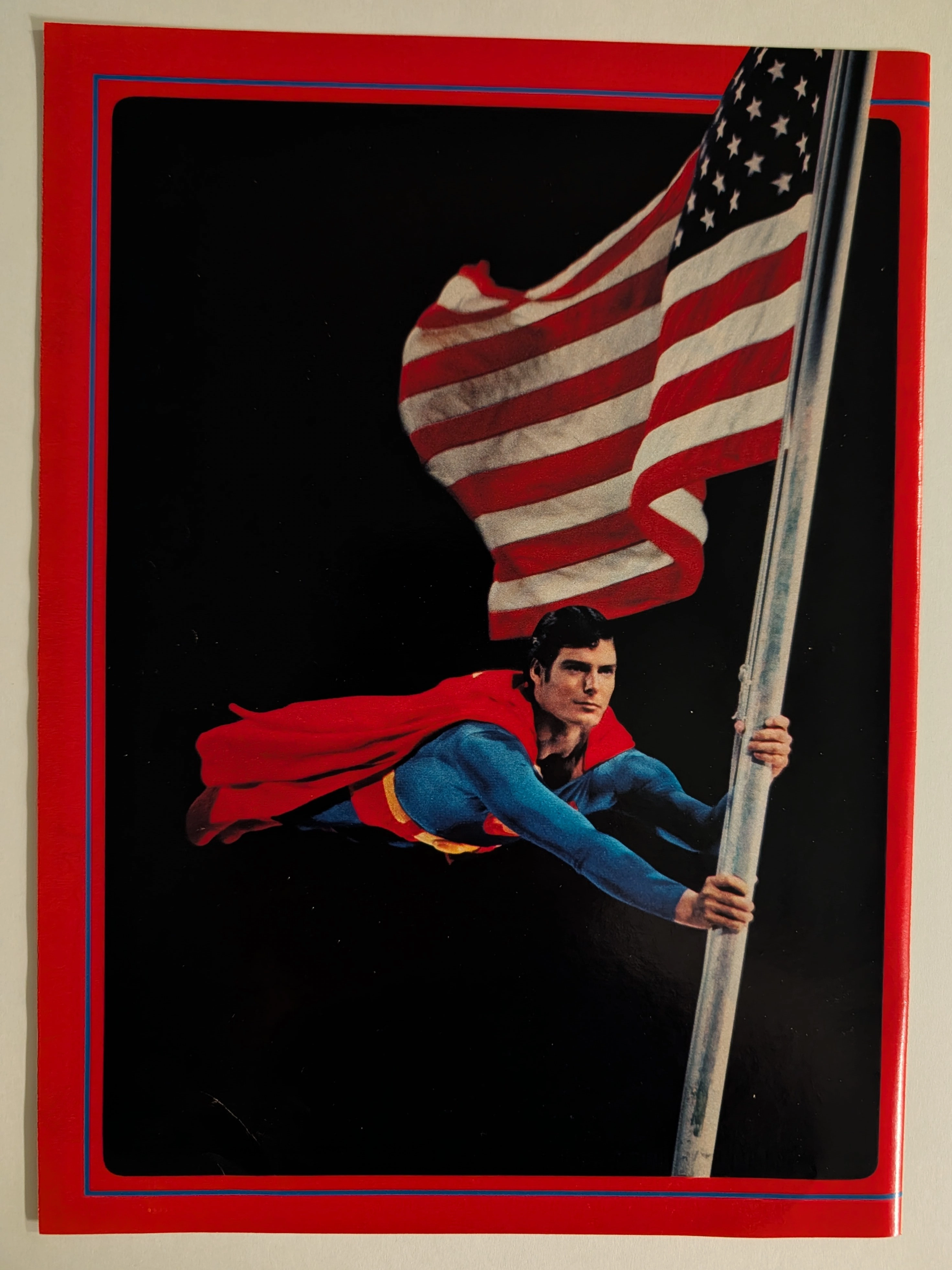
THE TIME TRAVELLER'DOISSIER : SUPERMAN — The Christopher Reeve Flagpole Postcard and the Birth of the Superhero Blockbuster
The item analyzed is an official Superman movie merchandise postcard or large-format photo card, featuring Christopher Reeve as Superman clinging dramatically to a metal flagpole while a large American flag billows behind him against a pure black background. The image is framed with a bold red outer border and a thin blue inner rule — a design consistent with the official Superman: The Movie (1978) merchandising aesthetic produced under license from Warner Bros. and DC Comics. Christopher Reeve (September 25, 1952 – October 10, 2004) portrayed Superman in four films (1978, 1980, 1983, 1987) and is universally regarded as the definitive cinematic Superman. This specific image — the flagpole scene lit dramatically against black — is one of the most iconic publicity photographs from the original film's promotional campaign. The physical item shows signs of age consistent with approximately 45–47 years, with slight surface wear and minor corner softening visible. The postcard format (estimated 4×6 or 5×7 inches) and the glossy coated stock are typical of high-quality movie merchandise of the late 1970s.
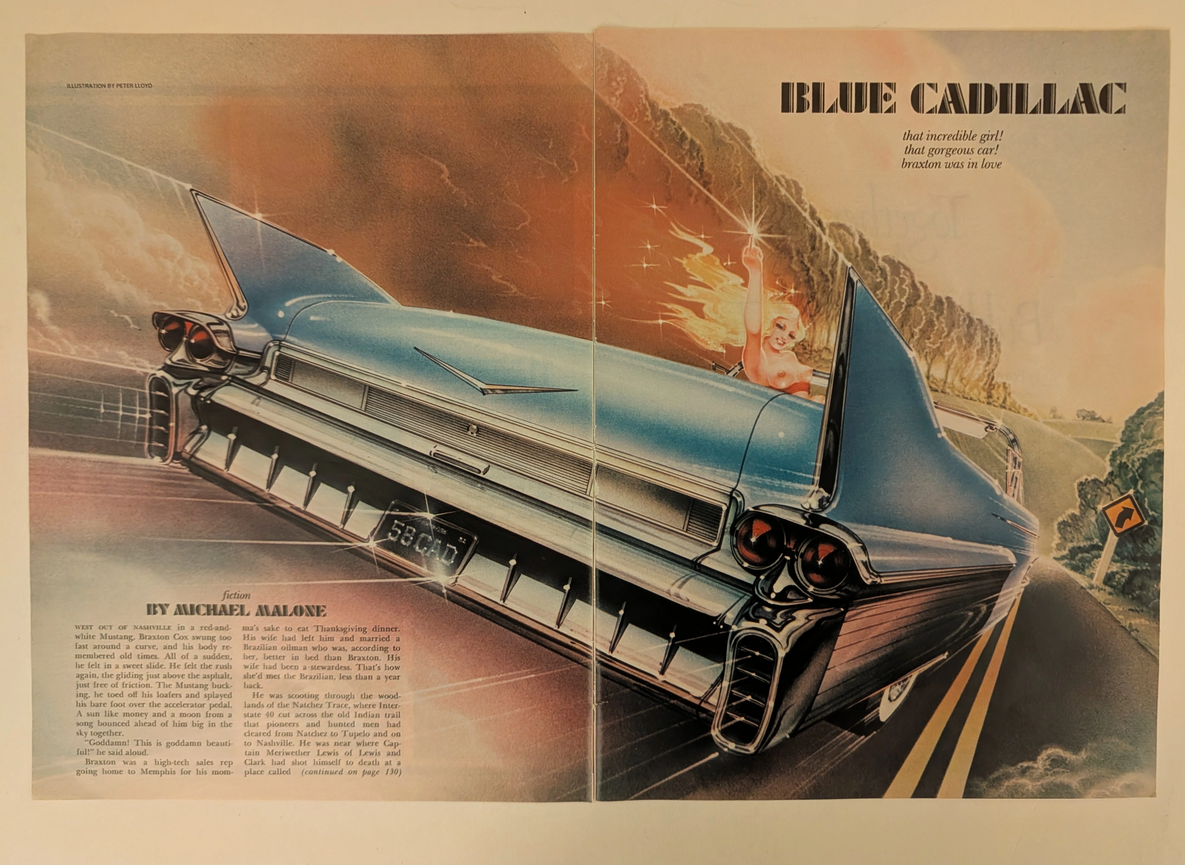
Cadillac · Automotive
The Time Traveller's Dossier: The Tailfin of Rebellion – "Blue Cadillac" by Peter Lloyd
History is not written; it is printed. Before digital algorithms dictated human behavior, societal engineering was executed through the calculated geometry of the four-color offset press. The historical artifact before us is a magnificent two-page magazine spread—an original, magazine-sized print carefully extracted from its source publication. It serves as a weaponized blueprint of counter-culture defiance and a testament to the absolute zenith of the golden age of airbrush illustration. This museum-grade archival dossier presents an academic deconstruction of Peter Lloyd’s breathtaking illustration for Michael Malone’s fiction piece, "Blue Cadillac." Operating on a profound binary structure, it documents a calculated paradigm shift where the wholesome, conservative American Dream of the 1950s is violently hijacked by the liberated, rebellious spirit of the late 20th century. Through the lens of late-analog commercial artistry and precise visual forensics, this document serves as a masterclass in psychological semiotics, establishing the visual tropes of the American open road that relentlessly dominate modern retro-futuristic pop culture.