The Time Traveller's Dossier: The Sanctuary of the Highway – The 1968 Ford LTD and the Democratization of Silence
역사
To fully appreciate the immense historical gravity, cultural magnitude, and sociological importance of this artifact, one must meticulously contextualize the psychological, economic, and infrastructural landscape of the American driver in 1968. This was a year characterized by intense domestic and international turmoil; the sociopolitical fabric of the United States was vibrating with the anxieties of the Vietnam War, civil rights struggles, and generational shifts. Concurrently, the physical landscape of America was being radically permanently altered by the Federal-Aid Highway Act, which was rapidly pouring millions of tons of concrete to create the Interstate Highway System.
Within this noisy, turbulent, and concrete-heavy environment, the American consumer developed a profound psychological desire for a sanctuary. They craved a controlled, isolated environment. The Ford Motor Company, possessing an exceptionally astute reading of this sociological undercurrent, responded not merely with a car, but with a mobile isolation chamber. The 1968 Ford LTD represented the pinnacle of this philosophy.
The bold, authoritative typography anchoring the top left of the artifact reads: "QUIET. STRONG. BEAUTIFUL. A GREAT ROAD CAR.". The deliberate placement of "QUIET" as the very first adjective is a monumental departure from traditional automotive marketing, which typically prioritized speed, horsepower, or aggressive styling. Ford was selling the absence of noise. The advertising copy delves deeply into this legendary engineering narrative, referencing a marketing campaign that began three years prior: "In 1965 Ford built a good car—an LTD so good it rode quieter than a Rolls-Royce".
This specific claim—that a mass-produced, middle-class American sedan was acoustically superior to the bespoke, hand-built pinnacle of British automotive aristocracy—was one of the most audacious and successful marketing strategies of the 20th century. Ford actually hired acoustic engineers to measure the decibel levels of an LTD against a Rolls-Royce Silver Cloud, utilizing the scientific data to democratize the concept of luxury. The copy in this 1968 artifact reminds the consumer of this continuous legacy, noting that in 1966 it was quieter than European cars, and in 1967 it was strong enough to survive "eight punishing steeplechase jumps... and stay quiet". Ford was not just selling a vehicle; they were selling an impenetrable fortress of domestic tranquility.
The visual composition of the advertisement brilliantly reinforces this narrative of the "Great Road Car." The 1968 Ford LTD 2-door hardtop is photographed parked beneath the massive, sweeping, brutalist curves of a modern concrete highway overpass. The lighting is moody and cinematic, casting the harsh infrastructure in deep shadows while the warm, metallic bronze paint of the car gleams with sophisticated elegance. This deliberate juxtaposition highlights the car as a refined, beautiful haven amidst the cold, unforgiving reality of modern American infrastructure. The car features "disappearing headlamps," a hallmark of high-end 1960s automotive design that allowed the front grille to appear as a single, unbroken, and menacingly wide horizontal graphic element, further emphasizing its sleek, aerodynamic isolation.
Furthermore, the artifact documents a critical shift in corporate branding via the secondary focal point at the bottom right of the page: the "See the light!" inset. This macro section highlights the legendary "Ford ...has a better idea" campaign. The visual substitution of the letter 'O' in FORD with a glowing, incandescent lightbulb was a stroke of genius. During an era when competitors like Chevrolet and Pontiac were heavily focused on muscle and brute force, Ford positioned itself as the intellectual automaker. They were selling innovation, smart engineering, and "better ideas"—such as the optional "push-button AM/FM Stereo Radio," the "SelectAire Conditioner," and "Power front disc brakes" detailed in the fine print. The lightbulb symbolized that buying a Ford was not an act of passion, but an act of supreme, calculated intelligence.
종이
As a physical entity, this printed artifact functions as a living, breathing, and profound record of mid-twentieth-century graphic reproduction and substrate chemistry. Under exceptional, high-magnification macro-lens examination, this document reveals the stunning complexity and mathematical precision of analog color printing.
The extraordinary macro photograph of the LTD's wheel hubcap and lower fender provides a textbook visualization of a CMYK halftone rosette pattern. The intricate, radial spokes of the hubcap, the deep shadows of the wheel well, and the metallic glint of the central red emblem are not solid colors, but are meticulously constructed from a precise, mathematically rigorous galaxy of microscopic ink dots. Cyan, Magenta, Yellow, and Key (Black) inks are elegantly and systematically layered at highly specific angles to trick the human eye and the biological visual cortex into perceiving a continuous, vibrant, and dimensional photographic reality out of mere clusters of ink. This overlapping dot pattern constitutes the unforgeable mechanical fingerprint of the pre-digital analog offset printing press.
Yet, the most profound and impactfully beautiful factor elevating the immense value of this artifact in the contemporary global collector's market is the natural, organic, and entirely irreversible process of Material Degradation. The expansive margins and the overall paper substrate exhibit a genuine, unavoidable "Toning." This gradual, chronological transition from the original bright, bleached manufactured paper to a warm, antique ivory and golden hue is caused by the slow, relentless chemical oxidation of Lignin—the complex organic polymer that naturally binds cellulose fibers together within the raw wood pulp of the paper. As the substrate is exposed to ambient oxygen and ultraviolet light over a span of nearly six decades, the molecular structure of the lignin gracefully breaks down. This naturally evolving patina represents the absolute core of the wabi-sabi aesthetic. It is precisely this authentic, unreplicable degradation that acts as the primary engine driving up its market value exponentially among elite curators and collectors, as it provides the ultimate, irrefutable scientific proof of the artifact's historical authenticity and its delicate journey through time.
희귀도
RARITY CLASS: B (Very Good Archival Preservation with Natural Margin Toning)
Evaluated under the most exacting, rigorous, and uncompromising archival parameters established by The Record Institute, this artifact is definitively and securely designated as Class B.
The remarkable and defining paradox of mid-century commercial ephemera is that these specific documents were produced by the millions as explicitly and intentionally "disposable media." Inserted into high-volume consumer publications of 1968, they were inherently destined by their very nature to be briefly observed, casually folded, and ultimately discarded into the recycling bins of history. For a full-page, graphically intensive automotive advertisement to survive entirely intact from the late 1960s without catastrophic structural tearing, without destructive moisture staining, or without the fatal, irreversible fading of the delicate, light-sensitive halftone inks constitutes a highly significant statistical archival anomaly.
The structural integrity of this paper remains exceptionally sound. While the rich analog colors—particularly the warm bronze of the car's paint and the deep, moody blacks of the concrete shadows—remain astonishingly vibrant, there is a beautiful, mathematically even, natural lignin oxidation reflecting its era. This displays a pronounced, warm ivory patina heavily along the top and side margins. This environmental interaction does not detract from its immense value; rather, it authentically validates the document's chronological journey. The sheer sociopolitical weight of the subject matter—the definitive documentation of Ford’s "Quiet" luxury campaign during a tumultuous era of American history—makes this a highly prized, museum-worthy piece of automotive heritage, requiring acid-free, UV-protected conservation framing to ensure its historical permanence.
시각적 임팩트
The aesthetic brilliance and psychological power of this artifact lie in its masterful execution of "Brutalist Juxtaposition." The art director has deliberately constructed a visual hierarchy that contrasts the cold, unforgiving reality of modern infrastructure with the warm, isolated sanctuary of the automobile.
The composition is heavily dominated by the massive, sweeping curves of the concrete highway overpass that looms over the vehicle. This heavy, shadowy, and almost oppressive architectural element serves a profound psychological purpose: it represents the noisy, chaotic outside world from which the 1968 consumer desperately wished to escape. In brilliant, stark contrast, the Ford LTD sits below it, bathed in warm, cinematic light. The rich bronze paint and the unbroken, sleek horizontal lines of the disappearing headlamp grille project an aura of impenetrable, sophisticated tranquility.
The typography anchors this visual narrative with absolute authority. The top-left quadrant commands immediate attention with the heavy, clean sans-serif declaration: "QUIET. STRONG. BEAUTIFUL. A GREAT ROAD CAR.". This immense typographic weight is perfectly counterbalanced in the bottom-right quadrant by the glowing, almost magical inset of the "See the light!" lightbulb logo. This creates a flawless, diagonal focal path across the entire page—guiding the eye from the authoritative promise of silence, across the sleek sanctuary of the vehicle, and down to the glowing symbol of intellectual engineering. It is a textbook integration of moody environmental photography and psychological corporate branding.
아카이브는 계속됩니다
탐험 계속
시간 여행자의 기록: 자동차 귀족주의와 폐허의 미학
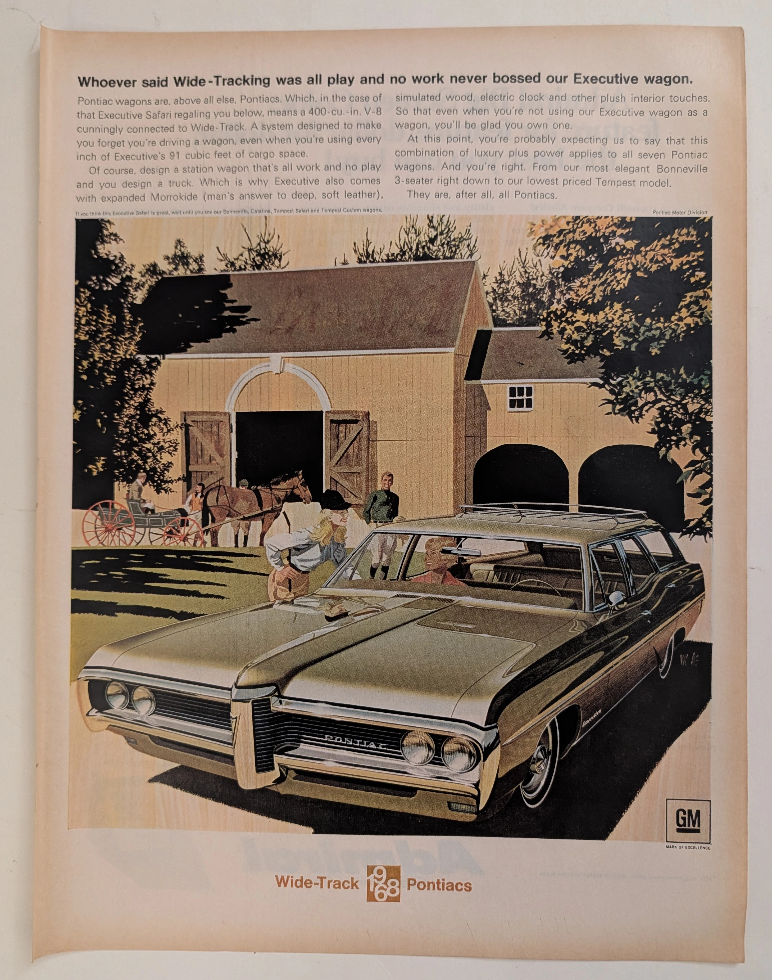
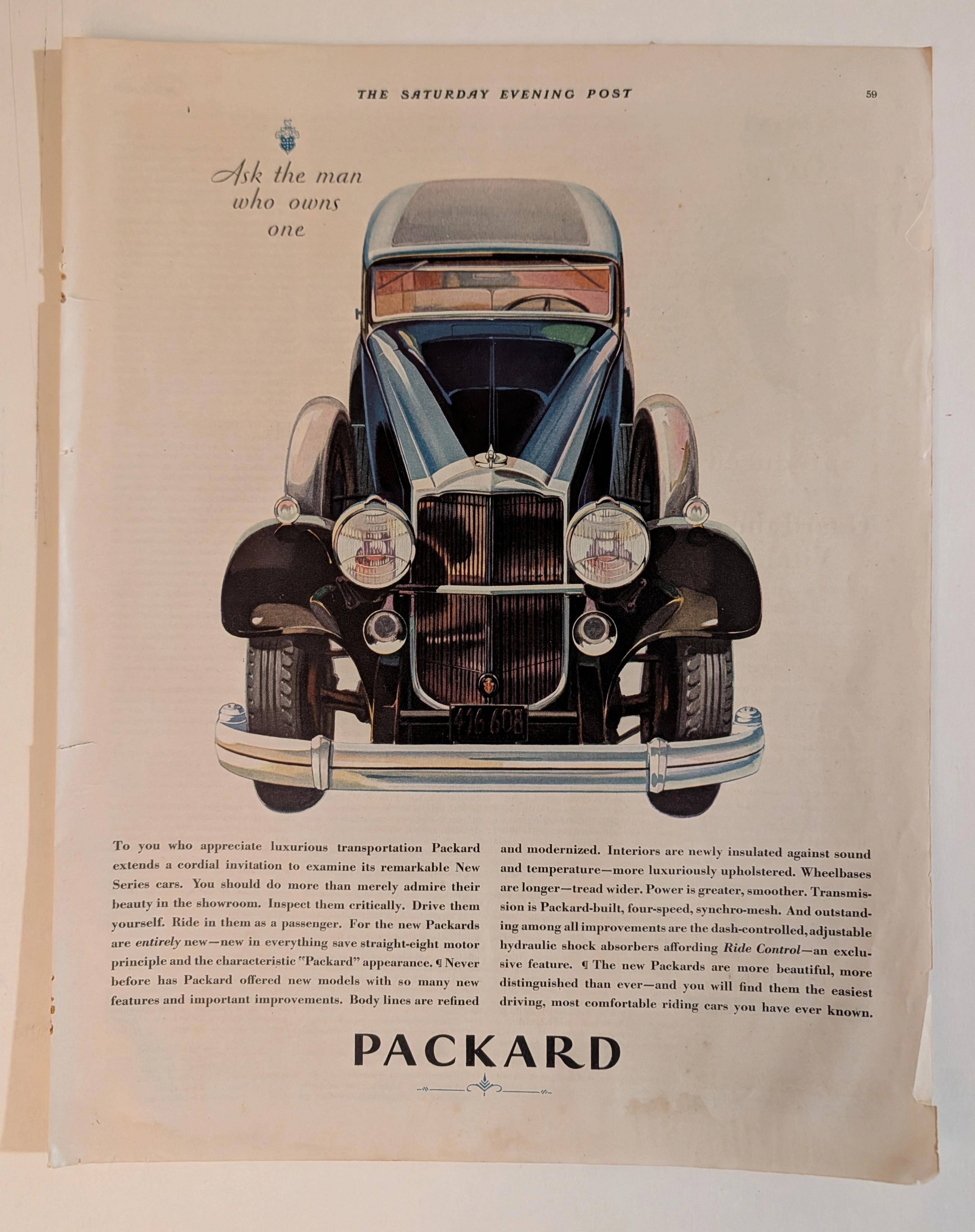
엄격한 박물관 수준의 분석 대상이 되는 이 유물은 미국 자동차 산업의 황금기에서 유래한, 탁월하게 보존된 역사적 유물입니다. The Saturday Evening Post의 빈티지 발행본에서 발췌된 이 원본 예술 자료(Primary Art Document)는 세계 역사상 가장 명망 높은 럭셔리 자동차 제조업체 중 하나인 Packard의 압도적인 전면 광고를 담고 있습니다. New Series Packard의 인상적인 정면 일러스트레이션이 시각적으로 지배적인 이 작품은 전설적인 기업 슬로건인 "Ask the man who owns one"을 명확하게 부각시킵니다. 1930년대 초 대공황이라는 격동적인 경제 환경 속에서 발행된 이 광고는 심오한 사회학적 지표입니다. 이는 4단 싱크로메시 변속기(four-speed synchro-mesh transmission)와 "라이드 컨트롤(Ride Control)" 쇼크 업소버(shock absorbers)와 같은 기능을 자랑하며, 당대의 금융 붕괴로부터 대체로 격리된 엘리트 귀족층에게 타협 없는 럭셔리를 과감하게 마케팅합니다. 물리적으로, 이 2000년대 이전의 아날로그 유물은 와비사비(wabi-sabi)의 숨 막히는 구현입니다. 거칠게 찢어진 왼쪽 제본 가장자리, 하단 여백을 따라 현저하게 번진 습기 흔적, 그리고 깊은 호박색의 리그닌 산화(lignin oxidation)를 보여줍니다. 이러한 자연적인 화학적 및 환경적 열화는 대량 생산된 상업 인쇄물을 대체 불가능하며, 바로 액자에 넣을 수 있는 원본 예술 자료(Primary Art Document)로 변모시켜, 아날로그 시대의 웅장한 필멸성을 영원히 포착합니다.
Longines · Fashion
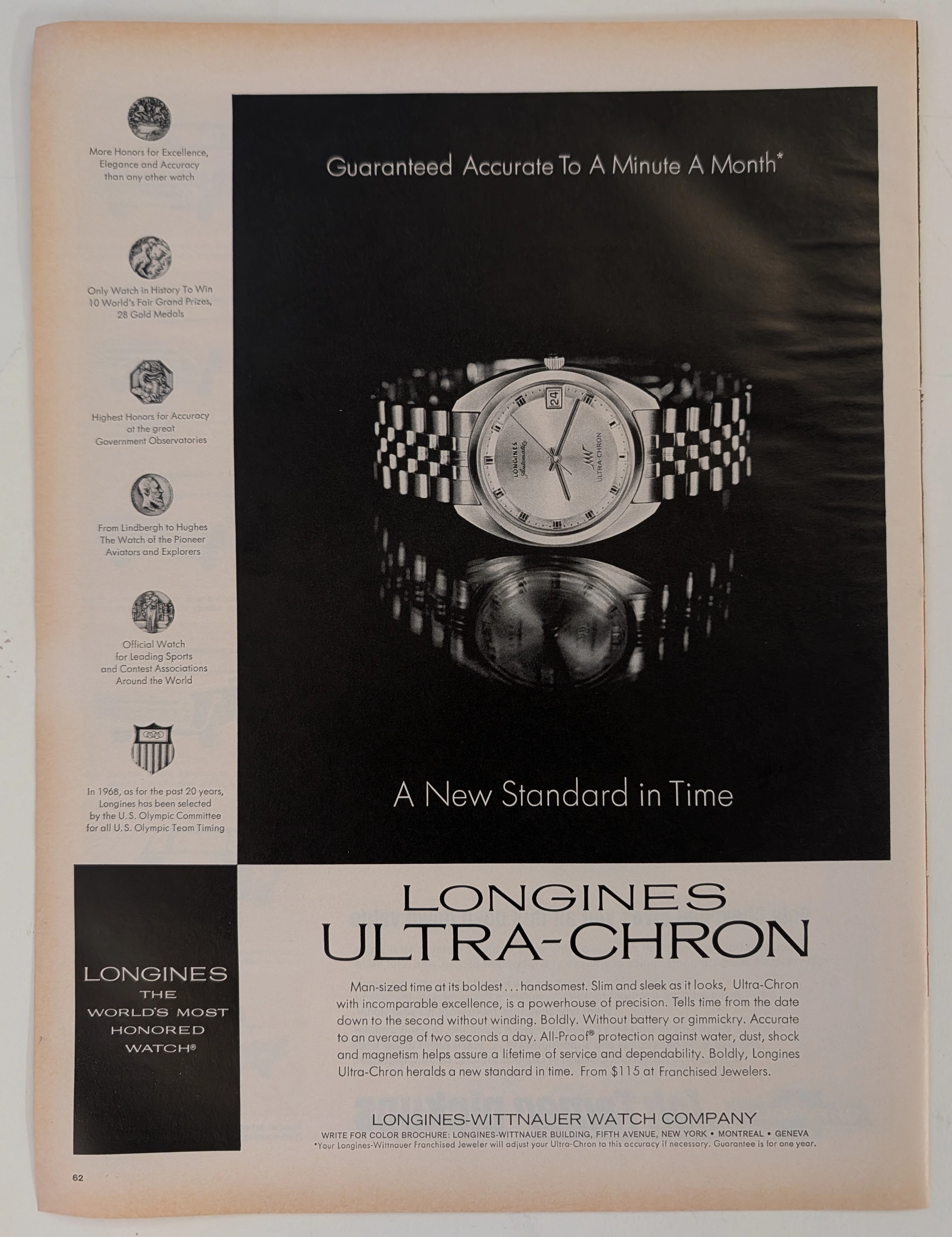
The Time Traveller's Dossier : 기계식 시계공학의 절대적 패권 – 1968년 론진 울트라-크론(Longines Ultra-Chron) 광고의 박물관급 법의학적 해부
인류의 시간 측정 연대기는 단순히 시침과 분침이 원형 궤도를 도는 수동적인 기록이 아니다. 그것은 중력, 온도 변화, 그리고 물리적 마찰이라는 자연의 무자비한 법칙에 맞서 수 세기 동안 전개되어 온 치열한 기계공학 전쟁의 서사다. 오늘 'The Record Institute'의 법의학 해부대 위에 오른 역사적 성물(Artifact)은 20세기 중반의 출판물에서 추출된 1968년 론진 울트라-크론의 전면 인쇄 광고다. 스위스 전통 시계 산업을 초토화시킨 ‘쿼츠 파동(Quartz Crisis)’의 거대한 해일이 닥치기 직전, 그 절벽의 끝에서 발표된 이 문서는 아날로그 기계공학이 도달한 절대적 정점이자 찬란한 최후의 저항을 상징한다. 이 세계 최고 수준의 학술적 아카이브 보고서는 현미경 수준의 정밀도로 이 아티팩트를 무자비하게 해체할 것이다. '한 달에 1분'이라는 경이로운 정확도를 오만하게, 그러나 수학적 근거를 바탕으로 선언하는 카피라이팅, 시간당 36,000진동(vph)에 달하는 하이비트(High-beat) 무브먼트의 심오한 공학적 의의, 그리고 브랜드의 혈통을 찰스 린드버그와 호워드 휴즈 같은 전설적인 비행 선구자들에게 영구적으로 결속시키는 5개의 명예 훈장을 해독한다. 나아가, 극도로 무거운 잉크 부하를 견뎌낸 다크필드 오프셋 리토그래피의 물리적 기질을 분석하여 하프톤 망점(Halftone rosettes)의 기계적 지문과 종이 기질의 필연적이고 아름다운 와비사비(Wabi-sabi) 산화 과정을 폭로한다. 시계학적 숙련도와 화학적 퇴행이 정교하게 교차하는 지점이야말로 전 세계 엘리트 수집가들 사이에서 이 아티팩트의 시장 가치를 기하급수적으로 폭등시키는 핵심 엔진이다.
Chevrolet · Automotive
타임 트래블러의 조서 : 1969년 카마로 SS와 100주년의 여왕 - 미국 문화의 결정적 교차점
이 아티팩트(유물) 이전. 자동차는 그저 실용적인 도구에 불과했다. 대학은 세속과 분리된 학문의 성역이었다. 미인 대회는 그들만의 고립된 행사였다. 디트로이트는 기계를 팔았고, 대학은 학위를 팔았다. 그리고, 거대한 지각 변동이 일어났다. 1969년 대학 미식축구 100주년 기념 여왕 선발대회(College Football Centennial Queen Contest). 이것은 미국 문화를 지탱하는 핵심 기둥들의 심오한 교차점이었다. 대학 스포츠의 열광, 폭발적으로 팽창하던 '머슬카(Muscle car)' 시대의 절정, 그리고 대학 내 여성성의 상품화가 한데 얽힌 것이다. 쉐보레(Chevrolet)는 단순한 미식축구 기념행사의 스폰서에 머물지 않았다. 그들은 새롭게 디자인된 1969년형 카마로 SS 396을 향한 원초적이고 기계적인 욕망을, '여왕(Queen)'으로 추대된 여대생(Coed)의 살균되고 선망받는 화려함과 융합하여 전국적인 규모의 참여형 스펙터클을 기획했다. 그것은 우편 투표용지라는 형태로 정교하게 포장된, '선택권의 민주화'의 극치였다. 당신은 그저 미식축구 경기의 얼굴을 뽑고 있는 것이 아니었다. 당신은 '쉐보레 라이프스타일'의 대관식에 적극적으로 동참하고 있었던 것이다.