THE TIME TRAVELER'S DOSSIER: THE FALLEN IDOL AND THE MASTER'S REBELLION
The History
**"WARNING: HISTORICAL & MATURE CONTENT" > The following archive contains explicit vintage satirical art by Neal Adams. Viewer discretion is advised.**
( THE HISTORY: The Dismantling of the American Dream, the Genius of Neal Adams, and the Ultimate Iconoclasm )
As the Chief Curator of The Record, I welcome you to the darkest, most potent corner of American publishing history. The impeccably preserved Historical Relic before you is not merely a piece of bawdy, low-brow vintage humor. It is a forensic "cultural time bomb" that was specifically engineered to detonate against the pristine, sanitized facade of 1970s Americana. This Primary Art Document, titled "CLARK GHENT'S SCHOOL DAYS", represents a ruthless, unapologetic desecration of the ultimate American symbol of righteousness, moral absolutism, and hope: Superman.
To truly absorb the staggering, visceral gravity of this preserved document, you must immediately direct your analytical focus to the artist's credit: Neal Adams (ironically misspelled here as 'Neil Adams', a common, almost deliberate quirk of anti-establishment underground publishing). Neal Adams is not a mere illustrator; he is an undeniable deity of the comic book Bronze Age. He is the visionary architect who rescued Batman from campy obscurity, returning him to the shadows as a brooding, terrifying detective. He is the master who drew Superman and Green Lantern with an anatomical realism and dynamic hyper-perfection previously unseen in the history of DC Comics. Adams’ linework was literally synonymous with "heroic truth" and moral superiority.
Yet, the 1970s was an era defined by fierce, post-Vietnam cynicism and counter-cultural rebellion. The American youth were actively dismantling the sacred institutions of their parents—questioning the war, exposing political corruption (Watergate), and suffocating under the draconian censorship of the era. Satirical underground juggernauts provided an unfiltered, anarchic arena for this rebellion. It is within this chaotic crucible that a master like Neal Adams chose to unleash his absolute, unbridled subversion. He deliberately weaponized the very style that made him famous.
By illustrating a legally safe parody of Superman ("Clark Ghent") utilizing his god-like powers—his heat and x-ray vision—to melt through the brick wall of the "Littleville High Girls Gym" to voyeuristically observe terrified, nude women, Adams delivered a devastating, masterful slap in the face to the draconian Comics Code Authority (CCA). Look closely at the artwork. Adams uses the exact same hyper-realistic musculature, the same dramatic, explosive foreshortening he used to sell millions of superhero comics, but applies it to the most base, prurient, and pathetic human desires. The heroic jawline is twisted into a lecherous, maniacal grin.
Paired with Robert S. Wieder's biting satirical prose, which mocks the iconic Superman introduction—"able to spit tacks through a chevrolet! more brainy than a bunch of carrots! look! heading for the whorehouse! it's absurd! it's inane! it's the boy of steel!"—the artifact becomes a masterclass in Iconoclasm. This preserved page documents the exact, agonizing moment when American pop culture became mature enough, and cynical enough, to ruthlessly drag its own infallible gods down into the mud.
( THE PAPER: The Aesthetics of Decay — The Chemistry of Rebellious Pulp )
At The Record, our ultimate reverence is reserved for the inevitable, tragic beauty of analog destruction. This standalone Primary Art Document was surgically rescued and preserved from a vintage 1970s underground publication. These counter-culture magazines were printed on cheap, highly acidic wood-pulp paper. They were explicitly designed for mass, disposable consumption, harboring a chemical death sentence within their very fibers from the moment they rolled off the printing press.
After half a century, ambient oxygen and ultraviolet light have waged a relentless chemical war against the paper's inherent lignin. This irreversible oxidation process has birthed the magnificent, undeniable "patina" you see creeping inward from the edges. The once-stark margins have gracefully degraded into a warm, creamy ivory and deep, burning amber. The authentic analog halftone dots of the lithography ink have settled permanently into the brittle, degrading fibers. This is the profound aesthetic of wabi-sabi—finding absolute perfection in impermanence. This paper is literally burning itself alive at a molecular level. No modern digital reprint, no high-resolution scan can ever replicate the fragile, tactile soul, nor the distinct olfactory signature of aging 1970s pulp. Its slow, majestic death is precisely what transfigures it from a magazine page into immortal Primary Art.
( THE RARITY: Class S — A Survivor of the Censorship Purges )
To understand the valuation of this artifact, you must comprehend the survival odds of explicit, subversive material from the 1970s. These publications were the primary targets of societal destruction. They were confiscated and burned by outraged parents, thrown away during coming-of-age purges, or left to rot and mold in damp basements. The statistical probability of a page containing explicit nudity and savage, copyright-skirting satire surviving fifty years in such crisp, visually immaculate condition is staggeringly low.
When you fuse this extreme physical scarcity with the monumental historical presence of Neal Adams—an artist whose original comic pages regularly command hundreds of thousands of dollars at auction—and the artifact's sheer audacity as a piece of savage pop-culture deconstruction, it unequivocally commands a Rarity Class S designation. It has evolved far beyond a disposable piece of ephemera. It is a highly coveted Historical Relic, demanding to be framed and preserved by a curator who truly understands the heavy, beautiful weight of an artistic rebellion that can never be replicated.
Exhibition Halls
The Archive Continues
Continue the Exploration
Chesterfield · Tobacco
THE TIME TRAVELER'S DOSSIER:THE SMILE IN THE TRENCHES AND THE HOME FRONT BRAINWASHING
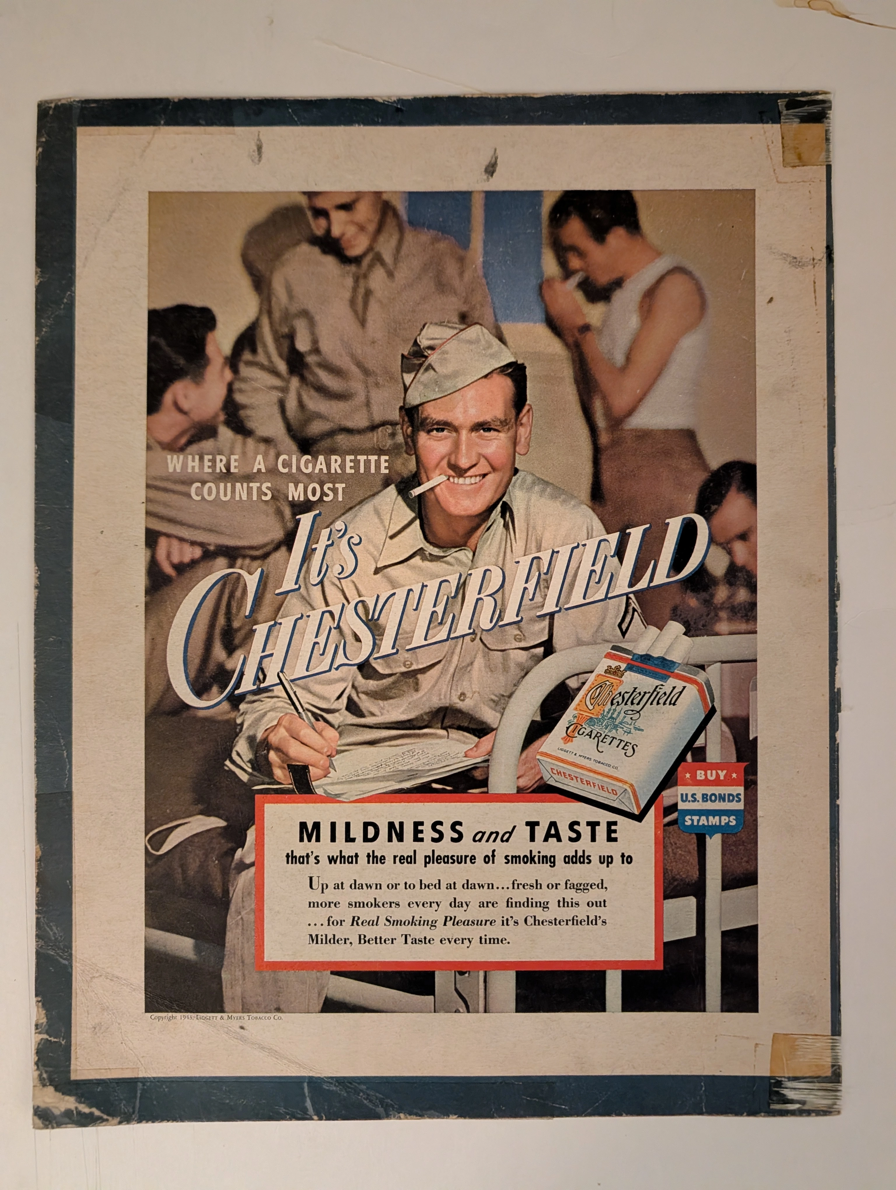
The artifact under exhaustive, uncompromising museum-grade analysis is a profoundly battle-scarred Historical Relic originating from the absolute climax of World War II. This Primary Art Document is a monumental advertisement for Chesterfield Cigarettes, forensically dated to 1943 (verified by the copyright text: "Copyright 1943, LIGGETT & MYERS TOBACCO CO."). This document transcends mere tobacco marketing; it is a profound "Sociological Blueprint of Wartime Psychological Comfort." The visual architecture targets the Home Front by depicting a wholesome American G.I. writing a letter home on a military cot. The headline, "WHERE A CIGARETTE COUNTS MOST", positions the product as a vital psychological lifeline. Furthermore, it explicitly functions as state-aligned propaganda, featuring a patriotic shield commanding citizens to "BUY U.S. BONDS STAMPS". Printed on highly acidic wood-pulp paper, it exhibits severe edge trauma, heavy oxidation, and the calcified residue of ancient cellophane tape applied by a desperate owner decades ago. This unstoppable molecular death transforms a mass-produced piece of wartime propaganda into an irreplaceable Primary Art Document of Rarity Class S.
General Motors · Automotive
The Time Traveller's Dossier: The Zenith of General Motors
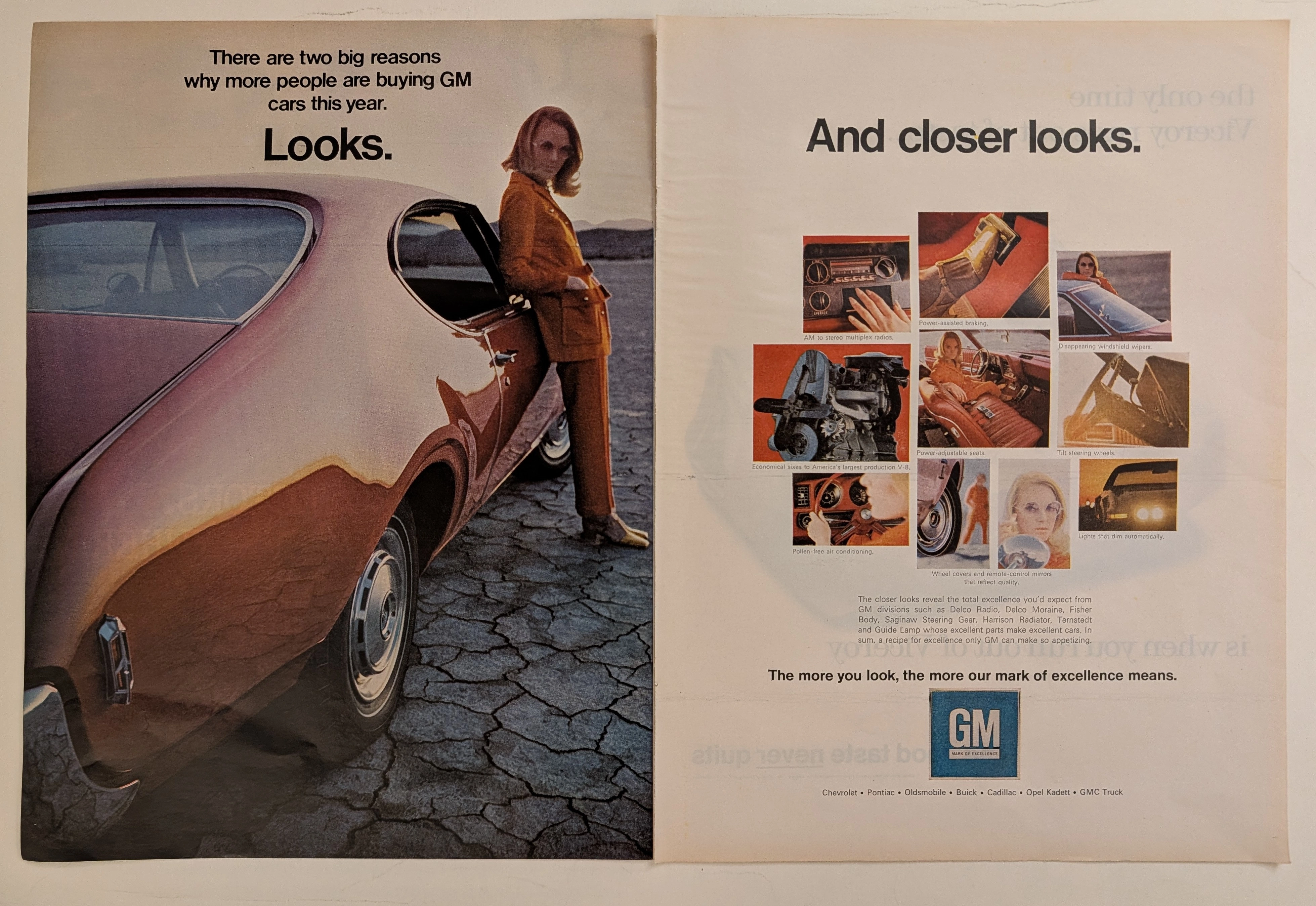
The automobile in mid-twentieth-century America was never merely a mode of transportation; it was a colossal canvas projecting industrial pride, technological advancement, and shifting consumer identities. The historical artifact elegantly and securely positioned upon the analytical table of The Record Institute today is a magnificent, large-format, two-page print advertisement for General Motors (GM), originating from the late 1960s to early 1970s. This document completely transcends the traditional boundaries of automotive catalogs. It operates as a highly sophisticated, dual-narrative cultural mirror: the left page captures the visceral, visual desire of "Looks" intertwined with a radical new era of feminine empowerment, while the right page dissects the mechanical and electronic mastery of "And closer looks," showcasing the vast ecosystem of GM's specialized manufacturing divisions. This world-class, comprehensive dossier conducts a meticulous, unyielding, and exceptionally deep examination of the artifact, operating under the absolute most rigorous parameters of historical, sociological, and material science evaluation. We will decode the immense industrial weight of the "Mark of Excellence" campaign, analyze the profound sociological implications of the female model's tailored pantsuit as a symbol of women's liberation, and dissect the anatomy of the nine revolutionary automotive technologies that defined modern driving. Furthermore, as we venture deeply into the chemical and physical foundations of this analog printed ephemera, we will reveal the precise mechanical fingerprints of the CMYK halftone rosettes and the graceful, natural oxidation of the paper substrate. This precise intersection of visual nostalgia, mid-century commercial artistry, and the immutable chemistry of time cultivates a serene wabi-sabi aesthetic—a natural, irreversible phenomenon that serves as the primary engine driving up its market value exponentially within the elite global spheres of Vintage Automotive Ephemera and Industrial Design collecting.
ฺีฺBulova · Fashion
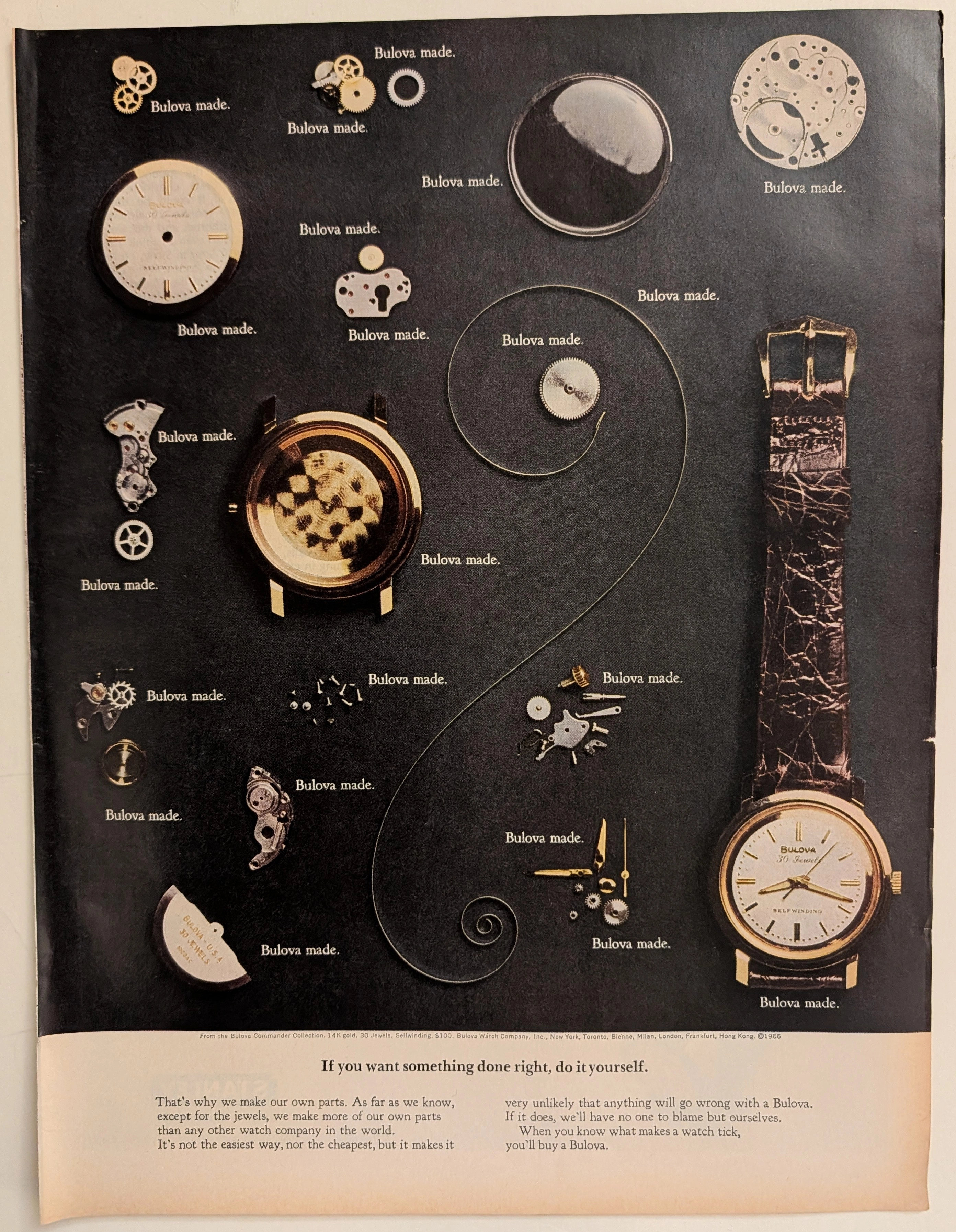
The Time Traveller's Dossier: The Anatomy of Autonomy – The 1966 Bulova Commander Collection and the American System of Watchmaking
The evolution of the mid-twentieth-century luxury consumer market was fundamentally propelled by an intense post-war desire for unwavering reliability and transparent corporate accountability. The historical artifact elegantly and securely positioned upon the analytical table of The Record Institute today is a striking, full-page print advertisement for the 1966 Bulova Commander Collection, originating from a highly transformative era in global horology. This document completely transcends the standard, utilitarian boundaries of jewelry marketing. It operates as a highly sophisticated, multi-layered cultural mirror, reflecting the precise era when American industrial might directly challenged the fragmented traditions of European watchmaking, explicitly packaging and selling the concept of total mechanical autonomy to the American middle-class consumer. This world-class, comprehensive dossier conducts a meticulous, unyielding, and exceptionally exhaustive examination of the artifact, operating under the absolute most rigorous parameters of historical, sociological, and material science evaluation. With the vast majority of our analytical focus dedicated to its immense historical gravity, we will decode the brilliant marketing psychology embedded within the "If you want something done right, do it yourself" campaign, analyze the sociopolitical impact of the "American System of Watchmaking," and dissect the profound visual semiotics of the exploded mechanical view. Furthermore, as we venture deeply into the chemical and physical foundations of this analog printed ephemera, we will reveal the precise mechanical fingerprints of the CMYK halftone rosettes captured in the macro imagery of the watch dial and alligator strap. Finally, we will assess its archival rarity, exploring how the graceful, natural oxidation of the paper substrate cultivates a serene wabi-sabi aesthetic—a natural, irreversible phenomenon that serves as the primary engine driving up its market value exponentially within the elite global spheres of Vintage Commercial Ephemera and Horological Archives.