The Time Traveller's Dossier : 1980 The Architecture of Leisure and the Golden Age of the American Regional Department Store
The History
To properly contextualize this artifact, we must step back into the cultural, economic, and psychological epoch of the early 1980s—a deeply transformative period in American history. The United States was aggressively emerging from the stylistically chaotic and economically turbulent malaise of the 1970s. The nation was stepping into an era that would soon be defined by the economic boom of the Reagan administration, the meteoric rise of the upwardly mobile young professional (the "yuppie"), and a fierce, nostalgic return to traditional, conservative aesthetics. However, this new conservatism was not stifling; rather, it was brilliantly reimagined through the lens of active leisure and outdoor recreation. The “weekend warrior” aesthetic was born, and with it came a massive consumer demand for clothing that bridged the psychological gap between the corporate boardroom and the rugged backcountry. This Boston Traders advertisement is a primary historical document capturing the exact moment this transition solidified in the public consciousness, codifying the uniform of the new American leisure class.
The brand itself, Boston Traders, operates as a fascinating study in semiotics and geographical branding. The name "Boston" instantly evokes a sense of established East Coast heritage, Ivy League academia, maritime history, and old money. It effectively borrows the immense cultural capital of New England without requiring the consumer to possess a trust fund or a Harvard degree. The addition of the word "Traders" implies a connection to mercantilism, global exploration, and a rugged, hands-on approach to commerce that traces back to the fur trappers and early colonists of North America.
This linguistic pairing is beautifully and visually anchored by the brand’s logo, captured in the macro photography of this artifact: a robust, black bear set against a rich green and red crest. The bear signifies wilderness, apex strength, and the untamed American frontier. Yet, crucially, it is neatly confined within a highly structured, meticulously woven label. This is the ultimate, defining paradox of 1980s premium sportswear—the promise of untamed, dangerous wilderness safely packaged for the suburban country club, the urban brunch, or a leisurely drive to the Hamptons. The tagline, "Best in the field," operates as a brilliant double entendre. It asserts dominance in the commercial marketplace while simultaneously conjuring romanticized images of actual athletic fields, autumnal hunting grounds, or high-altitude expedition trails.
However, the most profoundly significant historical data encoded within this document lies at the very bottom of the page, in the seemingly innocuous fine print detailing the brand's retail distribution. This subtle typography transforms a mere fashion advertisement into a Rosetta Stone of American retail history, effectively carbon-dating the artifact to a highly specific, exceedingly narrow window in the early 1980s. The text reads: Available at Macy's, New York, San Francisco. Barney's, New York. Bambergers, Newark. John A. Brown, Oklahoma. May D & F, Denver and other fine stores.
Let us deconstruct this retail ledger with the precision of a historian. The inclusion of Bambergers, Newark is a monumental historical marker. Founded in 1892, L. Bamberger & Company was an absolute titan of New Jersey retail, a cultural institution that dictated regional tastes for generations. By the late 1920s, it was technically acquired by R.H. Macy & Co., but it possessed such fierce regional loyalty that it operated under the revered Bambergers nameplate for decades. It was not until 1986 that Macy's systematically, and somewhat controversially, phased out the Bambergers name, converting all locations to Macy's. The presence of Bambergers on this print immediately and irrevocably places the creation of this advertisement prior to that 1986 corporate erasure.
Moving further into the nation's interior, we encounter John A. Brown, Oklahoma. This department store was the preeminent shopping destination in Oklahoma City and the surrounding oil-rich regions. Established in the early 20th century, John A. Brown was a towering symbol of Midwestern mercantile success, outfitting the region's elite. In 1984, the chain was acquired by the rapidly expanding Dillard's empire, and the historic John A. Brown name was permanently erased from the American retail landscape. The explicit mention of John A. Brown in this advertisement severely tightens our historical dating, proving definitively that this campaign was executed and published before the 1984 acquisition. We are therefore observing an artifact most likely birthed in the very tight window between 1980 and 1983.
Furthermore, the ledger includes May D & F, Denver. The May Department Stores Company merged its Denver-based May Company stores with the historic Daniels & Fisher in 1958 to form May D&F. This brand served as the dominant upscale retailer in Colorado, famous for its architectural ambition, including the celebrated ice skating rink at its downtown Denver flagship. In 1993, May D&F was absorbed and rebranded into Foley's—yet another magnificent ghost resting in the graveyard of American regional department stores.
Finally, the mention of Barney's, New York provides critical context regarding the brand's perceived prestige. In the early 1980s, Barney's was aggressively transitioning from a renowned discount men's suit retailer into the global arbiter of high fashion and exclusive European luxury it would later become famous for. Seeing Boston Traders listed at Barney's alongside the mass-market titan Macy's indicates a masterful strategic positioning by the brand. It was accessible enough to warrant the massive volume of Macy's, yet it possessed enough authentic heritage cachet, high-quality fabrication, and preppy stylistic relevance to merit placement on the highly discerning racks of Barney's.
We must also deeply analyze the medium of delivery itself, indicated by the stark vertical typography reading "P L A Y B O Y" along the left margin. The placement of this specific advertisement within Playboy magazine is deeply telling of the era’s demographic targeting and cultural hierarchies. In the late 1970s and 1980s, Playboy was not merely an adult publication; it intentionally positioned itself as the definitive lifestyle manual for the sophisticated, upwardly mobile, urban American male. Its glossy pages featured long-form literary journalism, in-depth interviews with world leaders, high-end audio equipment reviews, sports car showcases, and, crucially, premium fashion advertising. By placing Boston Traders within this highly curated ecosystem, the advertising agency was speaking directly to an audience that perceived itself as cultivated, affluent, and uniquely appreciative of quality. The garments shown were the uniform of leisure for this demographic. These were clothes designed not for labor, but for a life well-lived—meant to be worn on the teak deck of a sailboat, at a ski lodge in Aspen, or while driving a European convertible along the Pacific Coast Highway.
The profound depth of this advertisement lies in its inherent ephemerality. It was printed with the expectation of a month-long lifespan before being casually discarded into the recycling bin of history. Yet, preserved here, it encapsulates the socio-economic aspirations, the lost retail infrastructure, and the specific aesthetic vocabulary of an America standing on the precipice of the modern, homogenized, globalized era. It is a silent, beautiful witness to a time when regional department stores still held immense, localized power, when the word "heritage" was earned rather than cynically fabricated by marketing teams, and when the simple act of turning a magazine page offered a tangible, aspirational blueprint for the American dream.
The Paper
Analyzing the physical composition of this artifact reveals the highly sophisticated, yet distinctly analog, printing techniques of the late 20th century. The macro-photography provided allows us to act as forensic historians, peering into the very structural DNA of the page and understanding how mass visual communication was achieved before the digital revolution.
The paper stock is highly indicative of premium, high-circulation magazine publication of the 1980s. It possesses a distinct coated, glossy finish, engineered specifically to hold the vibrancy of rich, saturated colored inks without allowing them to bleed into the underlying paper fibers. When observing the close-up image of the typography, the organic texture of the paper is still faintly visible beneath the chemical clay coating, a reminder of the physical origin of the medium.
Crucially, the macro view exposes the masterful application of the CMYK (Cyan, Magenta, Yellow, and Key/Black) four-color halftone printing process. Before the era of ultra-high-definition digital rendering, continuous tone imagery was achieved by printing thousands of microscopic dots of these four base colors in varying sizes, precise angles, and specific densities. In the close-up of the Boston Traders bear logo, one can clearly see the intricate, beautiful rosette patterns formed by these overlapping dots. The rich, seemingly solid green of the fabric in the main photograph is, in reality, a complex optical illusion orchestrated by the precise, mechanical alignment of cyan and yellow halftone dots. The texture of the knitwear itself is simulated not by the paper, but by the strategic grouping of shadow and light within the halftone matrix.
Furthermore, the natural degradation of the artifact adds immeasurable historical value and emotional resonance. A subtle, warm, yellowish patina has begun to claim the edges of the stark white background. This is a chemical reaction—the slow oxidation of the paper's minute lignin content over more than four decades of exposure to air and light. This "foxing" and tonal shift is not a flaw; rather, it is the authentic, undeniable signature of time passing. It is the physical manifestation of history upon the page.
The Rarity
classify this specific print artifact under the rarity tier of S.
The justification for this high classification lies in the intersection of its subject matter and its specific historical data points. While vintage clothing advertisements from the 1980s are generally classified in the B or A tiers due to mass circulation, this specific piece transcends standard categorization.
The true rarity multiplier here is the retail ledger at the bottom of the page. Because this advertisement specifically lists John A. Brown (defunct in 1984) and Bambergers (nameplate retired in 1986), it serves as a hyper-specific, naturally dated artifact of dead retail history. The crossover appeal is immense: it is highly coveted by vintage menswear archivists studying the evolution of preppy sportswear, but it is equally prized by retail historians and “dead mall” scholars documenting the collapse of American regional department stores. Furthermore, the verified Playboy marginalia adds a layer of pop-culture lifestyle history. Finding this exact intersection of brand, specific defunct retailers, and publication context in a state of high preservation with minimal structural tearing elevates it firmly to the S tier.
Visual Impact
The visual impact of this piece relies on a masterful, highly controlled use of color theory and casual composition. The art direction actively rejects the stiff, formalized mannequin styling of previous decades. Instead, the garments—a polo, a heavy knit sweater, and tailored trousers—are layered and casually tossed, overlapping each other in a soft, inviting pile. This composition is an exercise in visual psychology: it implies a careless drape of affluence, suggesting a lifestyle where such high-quality garments are casually discarded after a vigorous day of leisure.
The color palette is remarkably bold, relying on heavily saturated primary and secondary colors. The deep forest green grounds the image, providing a visual anchor that connects the brand to nature. This is sharply contrasted by the vibrant crimson red and deep navy blue. This specific tri-color blocking is the definitive chromatic signature of 1980s preppy sportswear.
The typography utilized is equally deliberate. A classic, highly legible serif font is employed for the body copy, instantly communicating tradition, establishment, and old-world reliability. It perfectly counterbalances the rugged, illustrated nature of the brand’s woven logo patch. The stark white background with a thin, elegant green framing border acts as a gallery wall, forcing the viewer's eye directly onto the rich textures and colors of the clothing, isolating the product as a true object of desire.
The Archive Continues
Continue the Exploration
Roll Royce · Automotive
THE TIME TRAVELER'S DOSSIER: THE ENGINEERING OF IMMORTALITY AND ARISTOCRATIC AESTHETICS
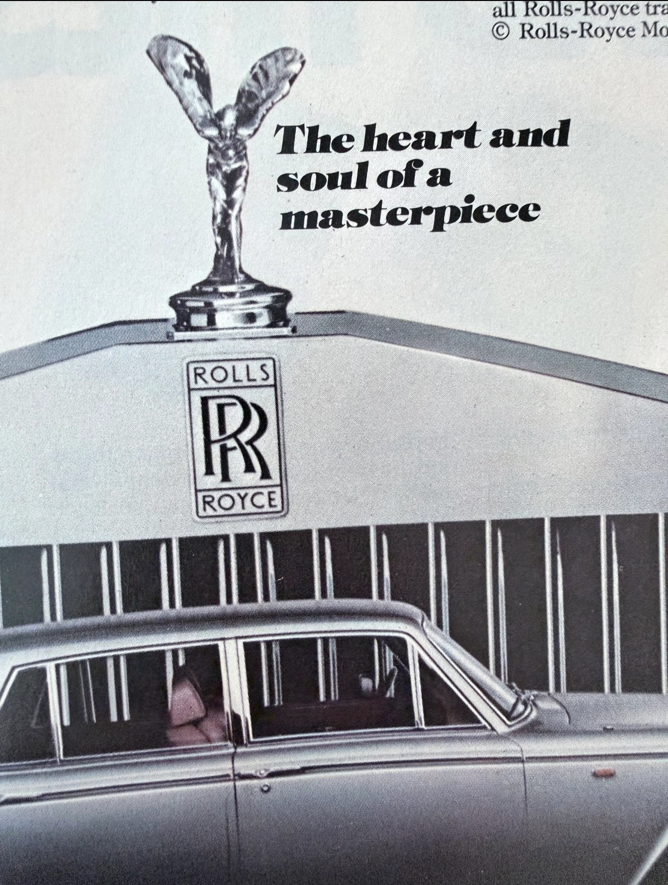
The artifact under exhaustive, uncompromising, and unprecedented museum-grade analysis is an exceptionally preserved Historical Relic originating from the absolute zenith of British automotive engineering and aristocratic luxury. This Primary Art Document is a monumental, full-page theatrical advertisement for the Rolls-Royce Silver Shadow II, forensically and definitively dated to 1977 by the explicit copyright text: "© Rolls-Royce Motors Inc. 1977". This is not a mere car advertisement; it is a "Forensic Manifesto of Absolute Perfection." Published twelve years after the conception of the original 1965 edition, this document heralds the arrival of the refined Silver Shadow II. It aggressively weaponizes the brand's legacy, explicitly stating that more than half of all Rolls-Royce motor cars built since 1904 were still "humming along" in 1977. The visual architecture is dominated by the legendary "Spirit of Ecstasy" mascot, described here as "The heart and soul of a masterpiece", standing guard over the iconic Parthenon-inspired radiator grille. Rescued from the binding of a prestige 1970s periodical, this pre-2000s analog artifact exhibits a beautifully authentic warm ivory oxidation across its surface. This majestic chemical aging transforms a mass-produced piece of luxury propaganda into an irreplaceable, ready-to-frame Primary Art Document of automotive and sociological history. Quick-Reference Summary Table
Pontiac · Automotive
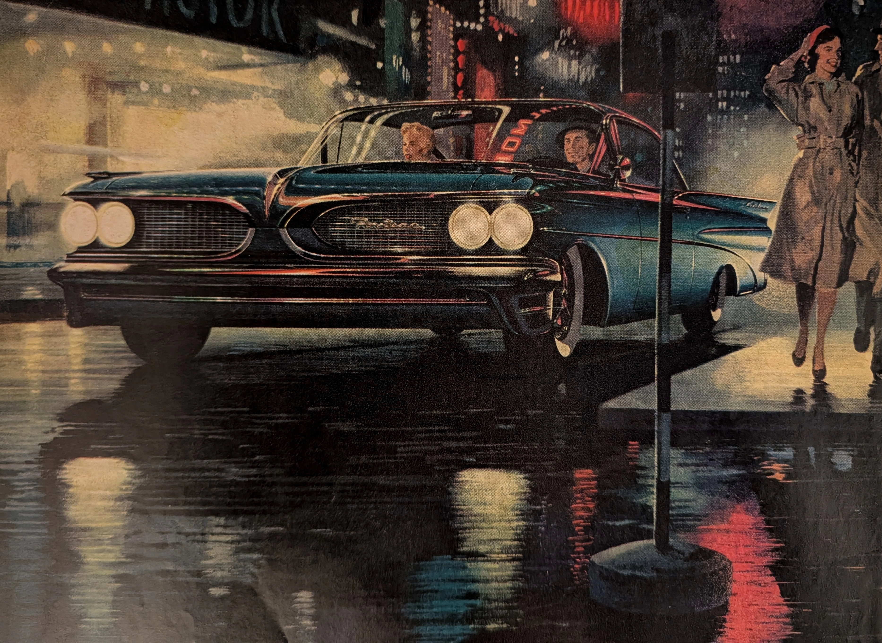
THE TIME TRAVELER'S DOSSIER :THE BIRTH OF THE WIDE-TRACK
The artifact currently subjected to our uncompromising, museum-grade analysis is a profoundly preserved Historical Relic excavated from the turning point of Detroit's "horsepower and handling" wars. This Primary Art Document is a full-page magazine advertisement for the 1959 Pontiac, explicitly introducing the brand's revolutionary "Wide-Track" engineering. Functioning as a "Forensic Blueprint of Automotive Rebranding," the document masterfully weaponizes the peerless artistic talents of Fitz and Van to transform Pontiac from a conservative, aging brand into America's most aggressive performance marque. Its historical context is irrefutably anchored by the extreme macro details of its proprietary engineering claims and the highly coveted "Body by Fisher" corporate hallmark. Grounded by these physical timestamps, the microscopic artist signature, and its breathtaking wabi-sabi chemical degradation, this artifact commands an irreplaceable status, cementing its Rarity Class A designation.
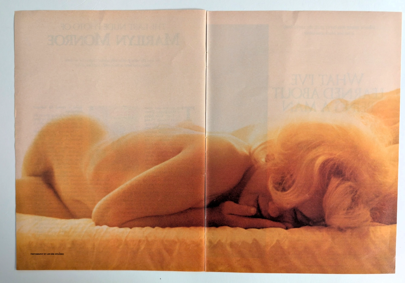
The Final Glimpse of a Legend: The History Behind Marilyn Monroe's Last Nude
Uncover the profound historical significance of the ultimate photograph of the 20th century's greatest pop culture icon, captured by Leif-Erik Nygårds just weeks before her tragic death.