The Time Traveller's Dossier: Terrestrial Navigation – The Timberland Boat Shoe and the Evolution of Amphibious Footwear
The History
To fully appreciate the immense historical gravity, cultural magnitude, and sociological importance of this artifact, one must meticulously contextualize the complex landscape of American footwear and the distinct sociological shifts occurring during the late 1970s and early 1980s. This era marked a profound transformation in men's fashion, characterized by the rising popularity of the "preppy" aesthetic. Clothing originally designed for specific, affluent leisure activities—such as sailing, tennis, and polo—began to permeate everyday suburban and urban environments.
The advertisement addresses this sociological phenomenon with remarkable clarity in its opening thesis: "Most people who wear boat shoes never set foot on a boat." This statement is a profound observation of consumer behavior. The boat shoe, as the copy correctly notes, had transitioned from an exclusive piece of maritime safety equipment to a versatile staple, deemed as acceptable with a sport jacket and tie on a Saturday night as it was with foul-weather gear.
To understand the weight of this comparative advertisement, it is essential to understand the individuals and histories shaping the brands involved. The advertisement directly references Sperry Topsiders. The Sperry brand was founded by Paul Sperry, an avid sailor and inventor who, in 1935, noticed his cocker spaniel's ability to run effortlessly over ice without slipping. Inspired by the grooves on his dog's paws, Sperry carved a similar siped pattern into a rubber sole, inventing the world's first specialized boat shoe to provide traction on wet decks. Sperry's invention became the undisputed standard in maritime footwear for decades.
In contrast, The Timberland Company emerged from a different lineage of craftsmanship. Founded by Nathan Swartz, a shoemaker who began his career as an apprentice in Boston, the company (originally the Abington Shoe Company) revolutionized the industry in 1965 by introducing innovative injection-molding technology. This allowed soles to be fused to leather uppers without stitching, creating truly waterproof boots. The "Timberland" name was introduced in 1973 for their waterproof leather boots, and its massive success led the company to rebrand entirely. By the time this advertisement was published, Timberland was seeking to expand its reputation for rugged, waterproof durability into the lucrative boat shoe market.
The advertising strategy employed here is a masterclass in methodical, academic persuasion. Rather than relying on emotional appeals, Timberland dissects the anatomy of the shoe, inviting the consumer to participate in a logical evaluation of material science and craftsmanship. The artifact details five specific areas of comparative superiority:
The Sole: The advertisement thoughtfully critiques the standard soft rubber compound used by competitors, introducing a rugged Vibram® sole. It introduces the reader to the concept of an "abrasion count," a scientific metric for wear and tear. By stating that Sperry's count is about 70 while Timberland's is twice that, the brand appeals to the consumer's desire for long-lasting value and quantitative data.
The Stitching: The document explains a crucial difference in cobbling techniques. While others stitch soles directly to the uppers (leading to flapping when the stitching breaks), Timberland bonds the sole to a mid-sole, ensuring structural integrity even under duress.
The Leather: Through a detailed macro photograph of an awl and thread piercing leather, the ad contrasts Timberland's oil-impregnated waterproof leather—which remains soft and supple—against painted-on pigment finishes that eventually dry out and crack. This highlights a commitment to organic material treatments over superficial coatings.
The Hardware: The imagery of laces and eyelets provides another point of meticulous comparison. Timberland proudly utilizes authentic rawhide laces and solid brass eyelets to resist salt and prevent rusting, distinguishing them from painted metal alternatives where the protection is lost once the paint wears away.
The Craftsmanship: Finally, the advertisement appeals to the romance and tradition of New England manufacturing. It emphasizes that Timberland boat shoes are completely handsewn by artisans whose families have practiced the art for generations, subtly contrasting this heritage with the realities of mass machine manufacturing.
This comprehensive narrative elevates the shoe from a simple fashion accessory to a carefully engineered instrument, designed to hold up on land just as well as it does at sea.
The Paper
As a physical entity, this printed artifact functions as a living, breathing, and profoundly detailed record of late-twentieth-century graphic reproduction and substrate chemistry. Under exceptional, high-magnification macro-lens examination, this document reveals the stunning complexity and mathematical precision of analog offset printing.
The visual brilliance of this artifact lies in its capacity to render tactile textures through a two-dimensional medium. The macro photography of the shoe's side profile, specifically focusing on the embossed Timberland tree logo, provides a textbook, museum-grade visualization of a CMYK halftone rosette pattern. The rich, warm, and highly textured appearance of the brown suede leather is not a solid, continuous swatch of ink. Instead, it is meticulously and flawlessly constructed from a precise, mathematically rigorous galaxy of microscopic ink dots. The Cyan, Magenta, Yellow, and Key (Black) inks are elegantly and systematically layered at highly specific angles to trick the human eye and the biological visual cortex into perceiving a continuous, vibrant, and dimensional photographic reality out of mere clusters of overlapping pigment. The texture of the uncoated magazine paper stock further illustrates how the liquid ink was absorbed into the organic cellulose fibers, creating a soft, matte finish that is highly characteristic of commercial lithography of the era.
Yet, the most profound and beautifully impactive factor elevating the immense value of this artifact in the contemporary global collector's market is the natural, organic, and entirely irreversible process of Material Degradation. The expansive margins of the page exhibit a genuine, unavoidable "Toning." This gradual, chronological transition from the original bright, bleached manufactured paper to a warm, antique ivory hue is caused by the slow, relentless chemical oxidation of Lignin—the complex organic phenolic polymer that naturally binds cellulose fibers together within the raw wood pulp of the paper. As the substrate is exposed to ambient atmospheric oxygen and ultraviolet light over a span of several decades, the molecular structure of the lignin gracefully breaks down and darkens. This naturally evolving patina represents the absolute core of the wabi-sabi aesthetic. It is precisely this authentic, unreplicable degradation that acts as the primary engine increasing its market value exponentially among elite curators and collectors, as it provides the ultimate, irrefutable scientific proof of the artifact's historical authenticity and its delicate, unbroken journey through time.
The Rarity
RARITY CLASS: B (Very Good Archival Preservation with Natural Margin Toning)
Evaluated under the most exacting and rigorous archival parameters established by The Record Institute (which spans a meticulous classification system from Pristine Class A down to Heavily Degraded Class D), this artifact is definitively and securely designated as Class B.
The remarkable and defining paradox of late-century commercial ephemera is that these specific documents were produced by the millions as explicitly and intentionally "disposable media." Inserted into high-volume, mass-market consumer publications, they were inherently destined by their very nature to be briefly observed, casually folded, used as scrap paper, or ultimately discarded into the recycling bins of history. For a full-page, graphically complex, and textually dense comparative advertisement to survive entirely intact without catastrophic structural tearing, without destructive moisture staining, or without the fatal, irreversible fading of the delicate analog inks constitutes a highly significant statistical archival anomaly.
The structural integrity of this paper remains exceptionally sound. While the rich analog colors—particularly the warm earth tones of the leather illustrations—remain astonishingly vivid, there is a beautiful, mathematically even, natural lignin oxidation reflecting its era. This displays a pronounced, warm ivory patina heavily along the expansive margins. This environmental interaction does not detract from its immense value; rather, it authentically validates the document's chronological journey. The sheer sociopolitical and fashion history weight of the subject matter—the definitive documentation of Timberland's strategic entry into the boat shoe market and the meticulous comparison of traditional shoemaking techniques—makes this a highly prized, museum-worthy piece of consumer culture heritage, requiring acid-free, UV-protected conservation framing to ensure its historical permanence.
Visual Impact
The aesthetic brilliance and psychological power of this artifact lie in its masterful execution of "Informational Hierarchy and Material Authenticity." The art director was tasked with communicating a dense amount of technical information while maintaining a sense of refined, premium craftsmanship.
The composition utilizes a highly effective modular layout. The bold, authoritative headline commands the upper section, immediately establishing the core thesis. Below, the page is divided into clear, digestible visual segments. The use of isolated, deeply focused macro photography—the awl and leather, the rawhide laces, the profile of the shoe—acts as visual evidence, supporting the claims made in the text. By showcasing the raw materials (brass, rawhide, oiled leather) independent of the finished product, the advertisement invites the consumer to appreciate the fundamental ingredients of quality. The typography is elegant and highly readable, employing a classic serif font that evokes a sense of established tradition and academic rigor. It is a thoughtful masterclass in utilizing layout to simultaneously educate the consumer on complex material science while gently encouraging an appreciation for generational craftsmanship.
Exhibition Halls
The Archive Continues
Continue the Exploration
Marantz · Entertainment
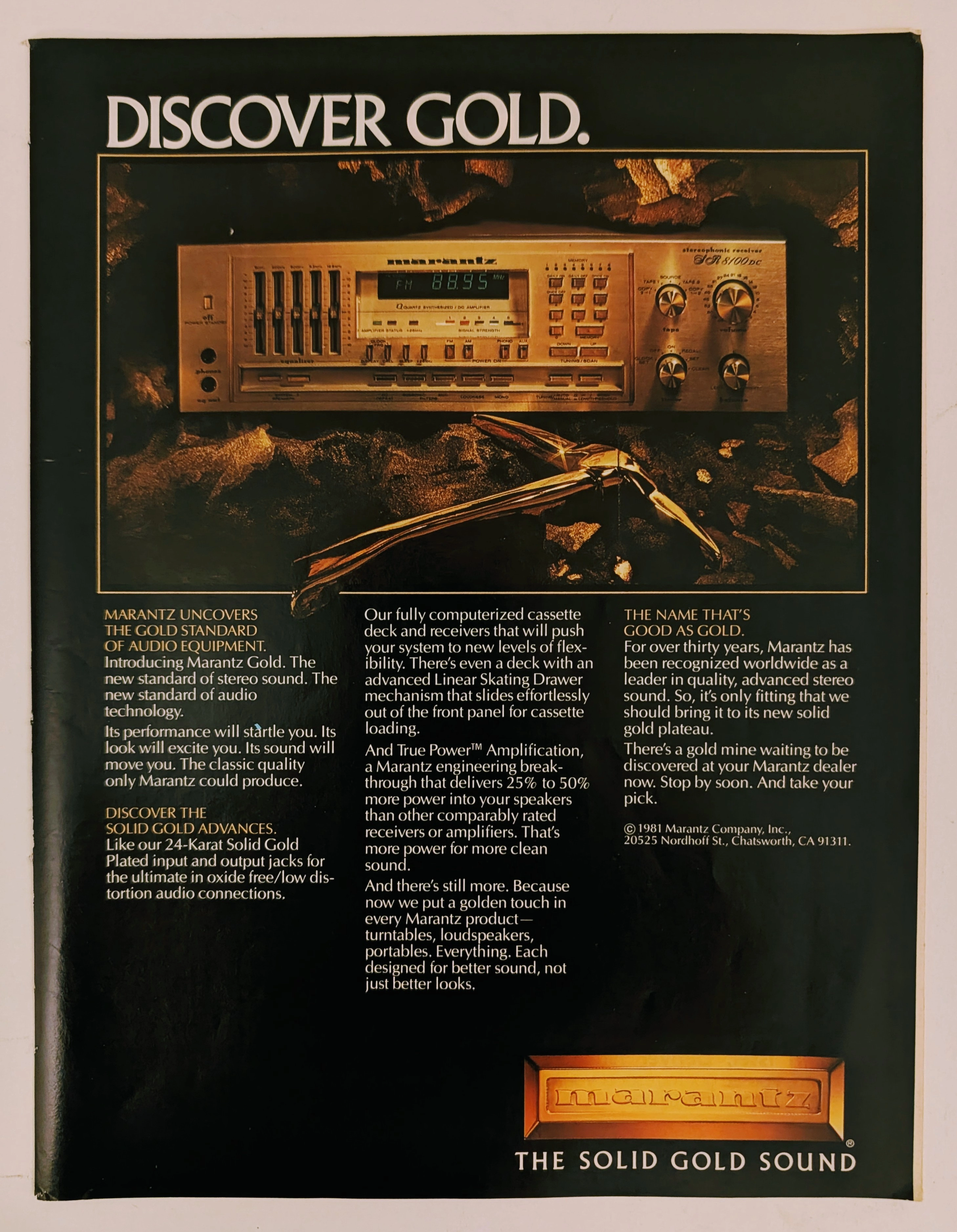
The Time Traveller's Dossier: The Alchemy of Acoustics – Marantz "Discover Gold" Advertisement (1981)
History is not an accidental sequence of events; it is a meticulously engineered illusion crafted by those who command the aesthetic and cultural narratives of their time. Long before digital algorithms could sterilely dictate consumer preferences, the ultimate manifestation of psychological manipulation and corporate alchemy was executed through the calculated precision of the offset printing press and the absolute mastery of analog darkroom photography. The historical artifact before us is not merely a disposable page torn from a vintage magazine. It is a perfectly weaponized blueprint of audio-exoticism, a visual declaration of extreme consumer luxury, and an unwavering testament to an era where electronic hardware was sold not merely as a functional utility, but as a precious, excavated commodity. This museum-grade, academic archival dossier presents an exhaustive, microscopic deconstruction of a 1981 print advertisement for the Marantz "Solid Gold" audio equipment line. Operating on a profound and ruthless binary structure, this document records a calculated paradigm shift within the global consumer electronics industry. It captures the precise historical fracture where silicon, copper, and plastic were conceptually transmuted into a literal, physical embodiment of a precious metal. Through the highly specialized lens of late-analog commercial artistry and stringent visual forensics, this document serves as a masterclass in psychological marketing. It established the foundational archetype for selling technology as a high-yield status symbol—an archetype that unconditionally dictates the visual and strategic totems of the modern high-end audiophile industry today.
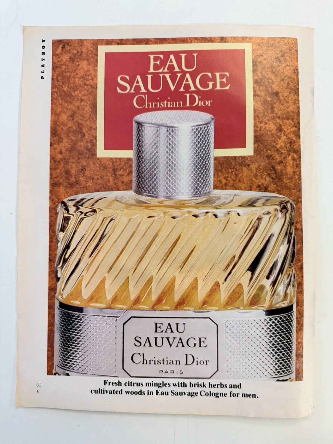
THE TIME TRAVELER'S DOSSIER: THE DAWN OF ELEGANCE AND THE EXTINCT $1,500 HOLY GRAIL
The artifact under museum-grade analysis is an exceptionally preserved Historical Relic originating from the golden age of analog publishing—a vintage issue of PLAYBOY magazine (circa late 1960s to 1970s). It features a striking, deeply sophisticated advertisement for one of the most revolutionary men's fragrances in modern human history: EAU SAUVAGE by Christian Dior. This Primary Art Document does not merely advertise a grooming product; it serves as a tangible historical marker of a monumental cultural paradigm shift. Prior to its introduction in 1966, men's fragrances were exclusively heavy, musky, and brutally spiced. Eau Sauvage, formulated by the legendary Master Perfumer Edmond Roudnitska, shattered this archaic mold by introducing Hedione (an airy, luminous synthetic jasmine compound) to men's perfumery, forever altering the trajectory of the global fragrance industry. Crucially, the original mid-century formulation and the specific ribbed-glass bottle design depicted in this artifact are permanently discontinued and lost to time. Modern reformulations driven by strict chemical regulations (such as the banning of natural oakmoss) have forever altered Roudnitska's original masterpiece. Consequently, surviving vintage bottles of this exact era have achieved mythical "Holy Grail" status, currently commanding astronomical prices of up to $1,500 USD in the global collector's market. This transforms the preserved advertisement from a commercial print into an invaluable piece of historical provenance—a birth certificate for an extinct luxury. Rescued from destruction and preserved as a standalone Archival Artifact, the inherently acidic, glossy paper stock of the mid-century era is undergoing a slow, breathtaking chemical degradation. This natural aging process (oxidation and lignin breakdown) transforms the mass-produced print into an irreplaceable, ready-to-frame Primary Art Document, embodying the ultimate aesthetic of analog impermanence.
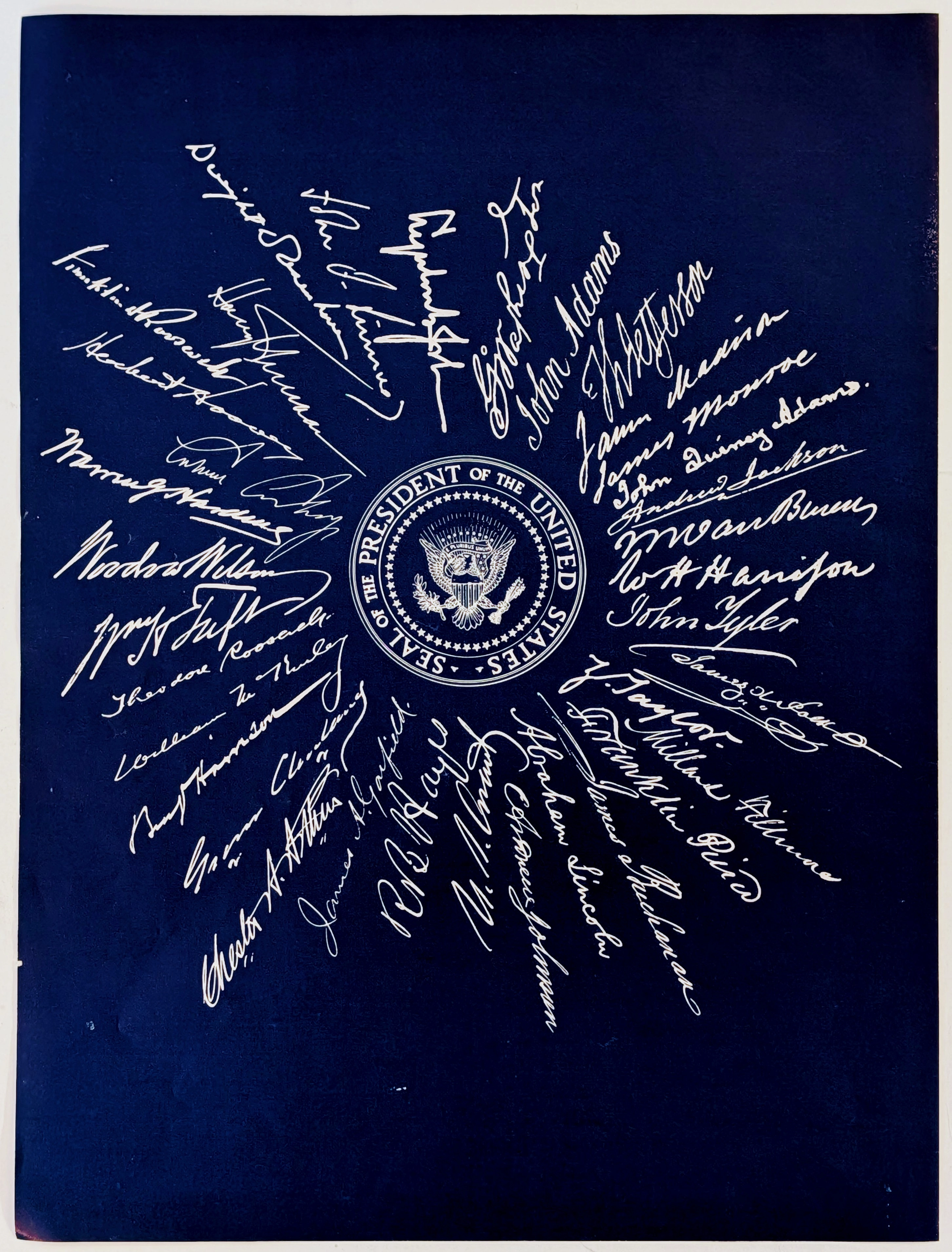
The Time Traveller’s Dossier: The Graphology of Supreme Power – A Forensic Deconstruction of the 35 Presidential Signatures
The exercise of supreme executive power is not exclusively documented through monumental architectural achievements, the mobilization of armed forces, or the grand rhetoric of inaugural addresses. Frequently, the ultimate manifestation of absolute authority is captured in a single, decisive moment of physical friction: the precise instant a quill, steel nib, or fountain pen touches paper to forge a leader's signature. A signature is the ultimate physical projection of political will; it is the legal instrument that declares wars, emancipates millions, and authorizes humanity's journey to the stars. The historical artifact presented before us today for museum-grade forensic analysis is an exceedingly rare and profound educational print. Rendered in a striking reverse lithography technique—featuring a deep, commanding navy blue background with brilliant white text—it displays the Seal of the President of the United States, completely enveloped by the radiating facsimile signatures of the first thirty-five individuals to hold the highest office in the land. This exhaustive, world-class academic archival dossier will dissect the artifact with microscopic precision. We will conduct an individual forensic breakdown of all thirty-five presidential signatures, exploring the graphological (handwriting) structures that mirror their personalities, their educational backgrounds, and their historical eras. Furthermore, we will decode the profound engineering logic behind the radial visual design and conduct a rigorous material science analysis of this reverse-printed substrate. In an analog era devoid of digital fonts and electronic authorizations, a leader's penmanship was their ultimate visual DNA. We will meticulously explore the chemical mechanics of the aging paper beneath this sea of dark ink—the elegant wabi-sabi oxidation process that serves as the primary engine driving up its market value exponentially.