
The Time Traveller's Dossier: The Ten-Dollar Titan – The Autolite Ford Indianapolis 500 Exhibition
Click any image to view in high resolution
The History
To fully appreciate the immense historical gravity and cultural magnitude of this artifact, one must meticulously contextualize the shifting paradigm of the American automotive industry and the legendary "Total Performance" era of the 1960s. During this period, the Ford Motor Company, under the aggressive leadership of Henry Ford II, initiated one of the most dominant corporate motorsport campaigns in global history. The directive was clear: dominate every major racing circuit on the planet, from the endurance crucible of Le Mans to the high-speed oval of the Indianapolis 500. This campaign was driven by the timeless industry adage: "Win on Sunday, sell on Monday."
A crucial, yet often overlooked, component of this global dominance was Autolite. Ford acquired the Autolite spark plug and ignition business in 1961 to ensure they had in-house control over the electrical lifelines of their high-performance engines. The distinct "Autolite Ford" logo became a ubiquitous symbol of reliability and power across international raceways. This specific advertisement brilliantly captures the essence of that corporate synergy. It features a stunning, aerodynamic open-wheel Indy car—bearing the number 23—undergoing swift maintenance by a dedicated pit crew.
The advertisement's copy is a masterstroke of psychological anchoring and economic contrast. The primary headline declares with absolute, pragmatic authority: "With a $50,000 racing car, they weren't about to scrimp on the ignition coil. So they got an Autolite coil. Almost a carbon copy of the one you buy. For under $10." This highly specific calculation serves a profound purpose. The text further breaks down the staggering costs: a $20,000 engine, a $2,000 fuel-injection system, contrasted against a sub-ten-dollar coil. By utilizing the "authority of numbers," the brand reassures the consumer of the machine's overwhelming capability while simultaneously making that elite technology accessible. It transfers the prestige, durability, and extreme stress-testing of the Indianapolis 500 directly to the average driver's station wagon or daily commuter. It is a promise that the heart of a champion beats within the engine of the common man.
The Paper
As a physical entity, this printed artifact functions as a living, breathing record of mid-twentieth-century graphic reproduction and substrate chemistry. Under exceptional macro-lens examination, this document reveals a fascinating application of analog printing technology harmonizing upon the canvas. The chaotic, sprawling background of the pit crew in motion is rendered with an intentional photographic blur, capturing the frantic kinetic energy of a mid-race pit stop.
However, squarely anchoring the foreground of the composition is the sharp, pristine aerodynamic nose of the race car. When examined closely, this specific section is revealed to be constructed from a precise, mathematically rigorous galaxy of halftone rosettes. This constitutes the mechanical fingerprint of the pre-digital analog offset printing press. Microscopic, varying sizes of Cyan, Magenta, Yellow, and Key (Black) ink dots are elegantly and systematically layered. In the context of the advertisement, this full-color, photorealistic halftone rendering captures the highly reflective sheen of the car's paintwork and the metallic gleam of the suspension components, orchestrating the human eye's perception of dimensional depth and blistering speed.
Yet, the most profound factor elevating the immense value of this artifact in the contemporary collector's market is the natural, organic process of Material Degradation. The expansive margins and the overall paper substrate exhibit a genuine, unavoidable, and entirely unforgeable "Toning." This gradual, graceful transition from the original bright manufactured paper to a warm, antique ivory hue is caused by the chemical oxidation of Lignin—the complex organic polymer that binds cellulose fibers together within the raw wood pulp of the paper. As the substrate is exposed to ambient oxygen and ultraviolet light over a span of decades, the molecular structure of the lignin gracefully breaks down. This accumulation of time, this naturally evolving patina, represents the absolute core of the wabi-sabi aesthetic. The profound appreciation for the beauty found in natural aging, impermanence, and the physical manifestation of history is an irreversible chemical reaction. It is precisely this authentic degradation that acts as the primary engine driving up its market value exponentially among elite collectors, as it provides the ultimate, irrefutable proof of the artifact's historical authenticity and its high-speed journey through time.
The Rarity
RARITY CLASS: S (Rare Crossover / Historic Motorsports Era)
Evaluated under the most exacting and rigorous archival parameters, this artifact is definitively designated as Class S.
The remarkable paradox of mid-century print advertising is that these documents were produced by the millions as explicitly "disposable media." They were inherently destined to be briefly observed in a magazine, read over morning coffee, and ultimately discarded into the recycling bins of history. Furthermore, automotive advertisements from the 1960s are highly susceptible to damage, often being torn out and pinned in garages, exposing them to grease, extreme temperature fluctuations, and fatal moisture. For a full-page advertisement celebrating the pinnacle of the Ford Total Performance era to survive intact without catastrophic structural tearing, destructive moisture staining, or fatal fading of the delicate halftone inks constitutes a highly significant statistical archival anomaly. The impeccable structural integrity of this paper, combined with the immense historical pedigree of the Autolite and Ford racing partnership, elevates the desirability of this document far beyond standard automotive collectors, making it a "Holy Grail" for historians of American motorsports. It is ardently sought after to ensure its historical permanence through museum-grade, acid-free conservation framing.
Visual Impact
The aesthetic brilliance of this artifact lies in its masterful execution of "Kinetic Contrast and Focal Depth." The art director has orchestrated a profound psychological landscape across the page. The background is a deliberate blur of visual noise—a frenetic, high-stakes moment where mechanics in red jackets rush to service the vehicle, their movements smeared across the film to emphasize the absolute premium placed on fractions of a second.
Yet, precisely in the foreground, thrusting out towards the reader, is the sharp, immaculate, and highly detailed nose of the race car, proudly bearing the number 23. This acts as a profound visual anchor. Despite the absolute chaos and speed surrounding it, the machine itself is a pillar of engineered perfection. The bright red and white livery demands attention, establishing a flawless hierarchy of visual information. The eye is instantly drawn to the massive air intake and the sleek bodylines before traveling up to the meticulously structured typography. This stark contrast delivers a highly potent subconscious message to the consumer: amidst the extreme, chaotic pressures of professional racing, Autolite components provide sharp, unwavering, and crystal-clear reliability.
Exhibition Halls
The Archive Continues
Continue the Exploration
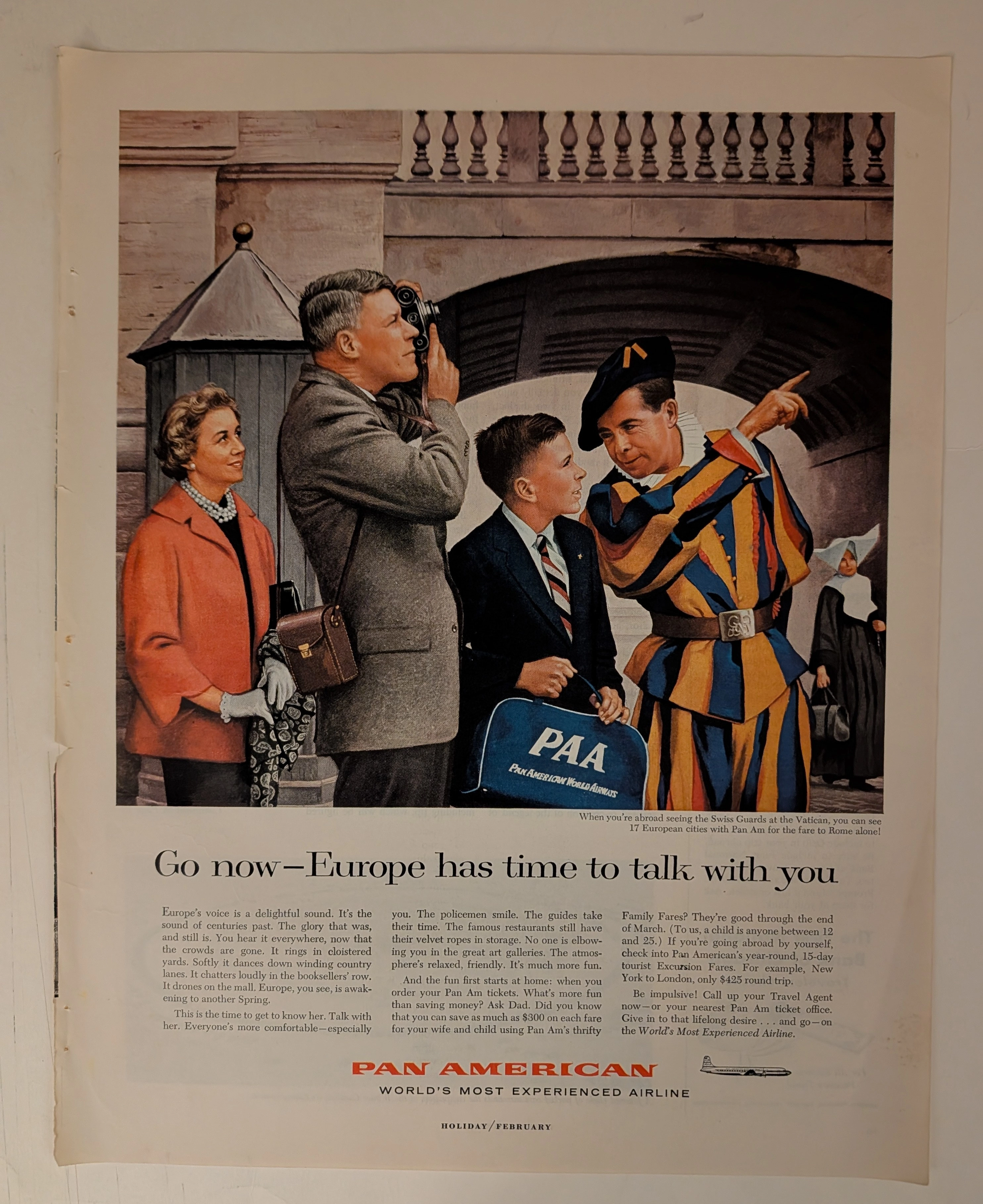
PAN AMERICAN WORLD AIRWAYS · Travel
THE TIME TRAVELER'S DOSSIER: PAN AM - THE ARCHITECTURE OF THE AMERICAN TOURIST
The artifact currently subjected to our uncompromising, museum-grade analysis is a profoundly preserved Historical Relic excavated from the zenith of mid-century American aviation prosperity. This Primary Art Document is a full-page magazine advertisement for Pan American World Airways. Functioning as a "Forensic Blueprint of the American Leisure Class Abroad," the document masterfully weaponizes European heritage and history to validate the affluent, off-season travel of post-war American consumers. Its historical context is irrefutably anchored by the microscopic silhouette of a Douglas DC-7B aircraft, placing this artifact squarely in the twilight of the propeller age, just before the dawn of the Boeing 707 jet era. Grounded by extreme macro details of the iconic PAA flight bag, the bold corporate typography, and the breathtaking wabi-sabi chemical degradation highlighted by its violently torn binding edge, this artifact commands an irreplaceable status, cementing its Rarity Class S designation as a masterpiece of corporate sociological engineering.
Gucci x Mercedes Benz · Fashion
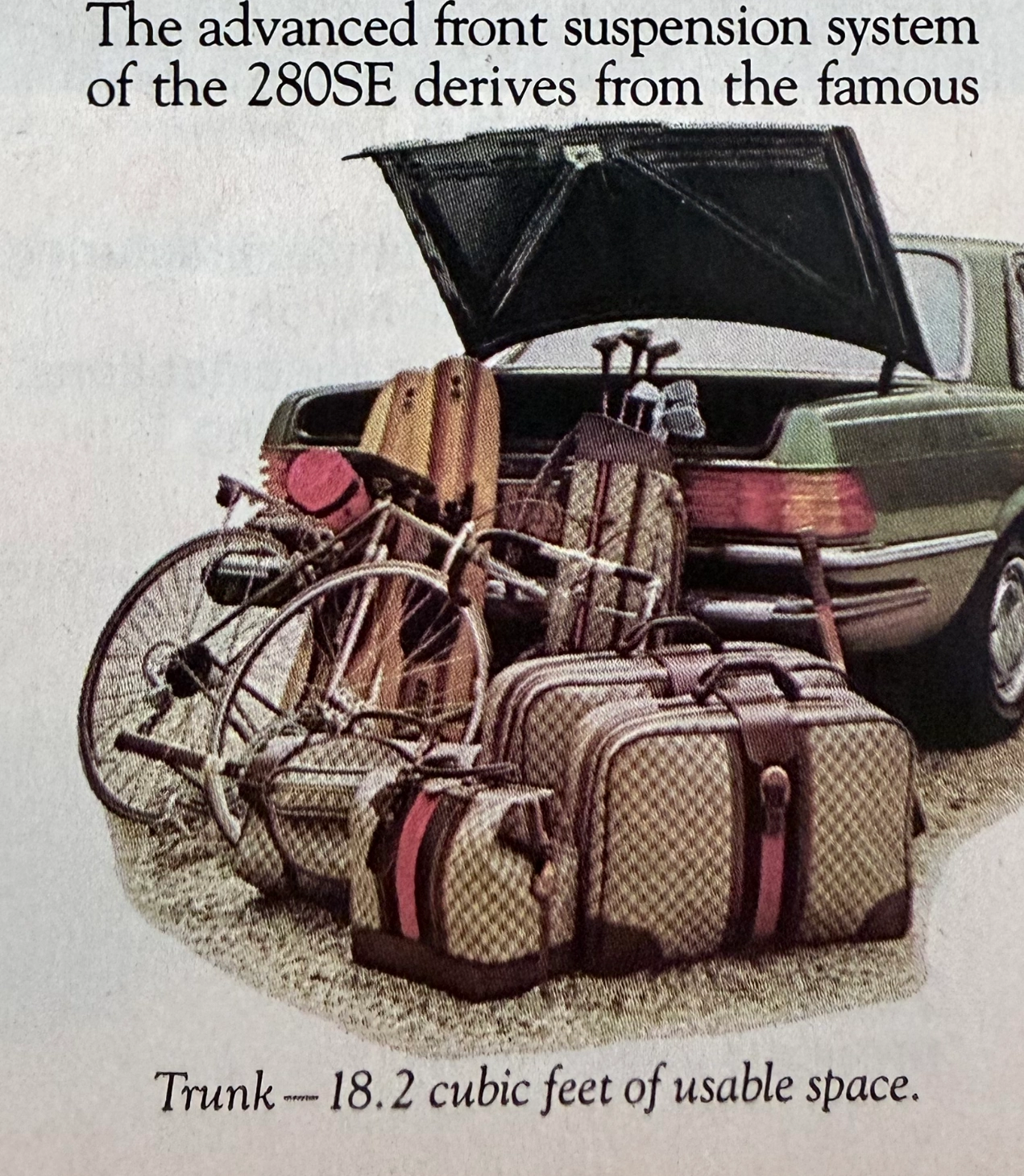
THE TIME TRAVELER'S DOSSIER:THE ENGINEERING OF ELEGANCE, THE GUCCI TRUNK, AND THE ARCHITECTURE OF REASON
The artifact under exhaustive, uncompromising, and unprecedented museum-grade analysis is a remarkably preserved Historical Relic originating from the absolute zenith of West German automotive engineering. This Primary Art Document is a densely informative, multi-column magazine advertisement for the Mercedes-Benz 280SE Sedan (W116 chassis). This document is a "Forensic Blueprint of Engineered Elegance and Status Commodification." It aggressively markets the 280SE as the "Heir to a Classic," positioning it as a vehicle that inherits the legendary proportions of the 450 Series but is powered by a highly advanced, fuel-injected 6-cylinder engine. The copywriting reads like an arrogant technical dossier, boasting of the "Continuous Injection System" (CIS) and a fully independent "Suspense-free suspension" derived from the legendary C-111 high-speed research vehicle. However, the absolute psychological masterstroke lies in the lower-left illustration. To visually prove the cavernous "18.2 cubic feet of usable space," the artist meticulously illustrated the trunk effortlessly swallowing a bicycle, golf clubs, and a set of Gucci luggage. The unmistakable beige geometric monogram and the iconic red-and-green Web stripe on the suitcases serve as a deliberate, powerful socio-economic signal. It explicitly communicates that the Mercedes-Benz trunk is designed exclusively for the "Jet-Set" elite who travel with Italian haute couture. Rescued from a mass-market periodical, this pre-2000s analog artifact exhibits a beautifully authentic warm ivory oxidation across its surface. This majestic chemical aging transforms a mass-produced piece of technical propaganda into an irreplaceable Primary Art Document of automotive and sociological history.
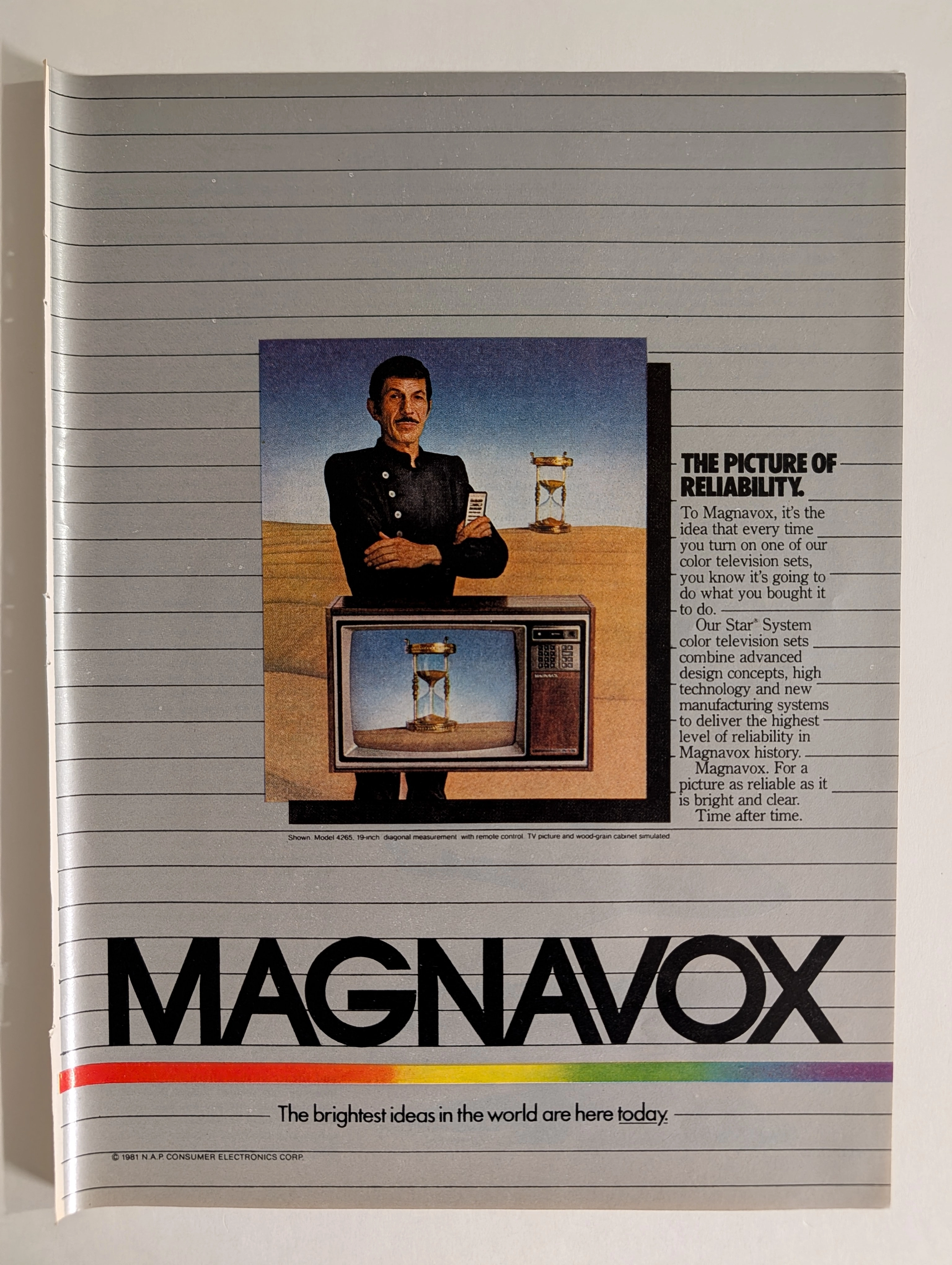
Magnavox Star System 1981 Leonard Nimoy TV Advertisement | 'The Picture of Reliability' | Deep Analysis Rarity Class A-SS
The advertisement analyzed here is a full-page full-color magazine promotion for Magnavox's Star® System color television sets, copyright © 1981 N.A.P. Consumer Electronics Corp. The ad features what is almost certainly Leonard Nimoy — iconic for his role as Mr. Spock in Star Trek — dressed in a black nehru-collar uniform against a surrealist desert landscape, standing above a Magnavox color TV set (Model 4265, 19-inch diagonal) that displays an hourglass on screen. A second hourglass appears behind him. The visual concept communicates timeless reliability. The headline 'The Picture of Reliability' and tagline 'The brightest ideas in the world are here today' frame Magnavox's Star System as the pinnacle of 1981 television technology. The rainbow spectrum stripe at the bottom is a distinctive brand element that ran across Magnavox advertising throughout the early 1980s. N.A.P. (North American Philips) Consumer Electronics Corp. was the American subsidiary of Philips that owned the Magnavox brand at this time, having acquired it in 1974.