THE TIME TRAVELER'S DOSSIER: ARROGANCE AND INNOVATION IN THE ABYSS OF THE DEPRESSION
The History
( THE HISTORY: The Balance Revolution, The White Dot, and 1931 Defiance )
As the Chief Curator of The Record, I invite you to step into the darkest, most desperate economic abyss of the 20th century. The impeccably preserved Historical Relic before you is not merely a vintage stationery advertisement. It is a monumental "Document of Arrogance and Survival." This Primary Art Document was published in The Saturday Evening Post, carrying a definitive copyright date of 1931 in the lower right corner.
The year 1931 was the merciless epicenter of the Great Depression. American banks were collapsing, breadlines stretched for miles, and millions were utterly destitute. Yet, amidst this apocalyptic financial ruin, the W.A. Sheaffer Pen Company purchased a full-page spread to aggressively market the ultimate symbol of frivolous luxury: the Sheaffer's "Balance" Lifetime Pen, specifically the Marine Green model, priced at a staggering $15. (In 1931, $15 could feed a family for a month). This was a masterstroke of psychological marketing, a defiant declaration to the elite that even as the world burned, true aristocracy demanded instruments worthy of their status.
From an Industrial Design perspective, this artifact documents an absolute revolution. Prior to 1929, every fountain pen on Earth was a blunt, flat-topped cylinder. Sheaffer annihilated that paradigm with the "Balance" design—the world's first cigar-shaped, streamlined, ergonomically crafted pen. This advertisement chronicles the exact moment the flat-top era died.
Furthermore, the document highlights the legendary "White Dot"—a brilliant visual shorthand for Sheaffer's unconditional lifetime guarantee. In the 1930s, a white dot peeking out of a gentleman's breast pocket was a louder declaration of wealth than the car he drove. The top-tier model showcased also features the 14-karat solid gold "Autograph" band, engraved with an exact replica of the owner's signature (depicting "John Adams"). This piece encapsulates the zenith of mechanical perfection and luxury, audaciously flaunted in the face of widespread poverty.
( THE PAPER: The Aesthetics of Destruction (Wabi-Sabi) — The Scars of the 1930s )
At The Record, we do not fetishize pristine, sterile modern reproductions; we fiercely worship the "Scars of Time." This 90-plus-year-old Primary Document is the ultimate physical manifestation of the Japanese philosophy of wabi-sabi—finding profound beauty in imperfection and decay. Direct your analytical gaze to the left margin: witness the severe, violent edge trauma, the jagged loss of paper, and the deep, creeping moisture stains. This is not damage to be hidden; it is the unforgeable "Signature of History."
Manufactured in 1931 from cheap, highly acidic wood-pulp, this paper was genetically programmed to self-destruct. Over nearly a century, the inherent lignin has engaged in a slow chemical war with ambient oxygen, transmuting the paper from white to a deep, burning amber patina. The extreme fragility of the fibers, which threaten to crumble upon touch, validates its absolute authenticity. This paper is burning alive at a molecular level. By preserving and framing it, we freeze this magnificent chemical destruction, elevating it from a disposable ad to immortal Primary Art.
( THE RARITY: Class S — A Survivor of the Depression and War )
The statistical probability of a magazine page surviving from 1931 is astronomically low. During the Great Depression, magazines were a luxury few could save. A decade later, the devastating paper drives of World War II saw millions of these publications pulped and recycled into artillery boxes. The survival of this specific Primary Document—detailing Sheaffer's greatest industrial triumph—complete with its majestic, battered physical scars, makes it infinitely more valuable than a pristine copy.
Synthesizing its paramount importance to the history of industrial design, the psychological audacity of a $15 luxury item during the Depression, and the breathtaking visual trauma of its analog decay, this artifact unequivocally commands a Rarity Class S designation. It is a museum-grade Historical Relic, demanding to be possessed by a curator who understands the heavy, beautiful weight of 1930s defiance.
Exhibition Halls
The Archive Continues
Continue the Exploration
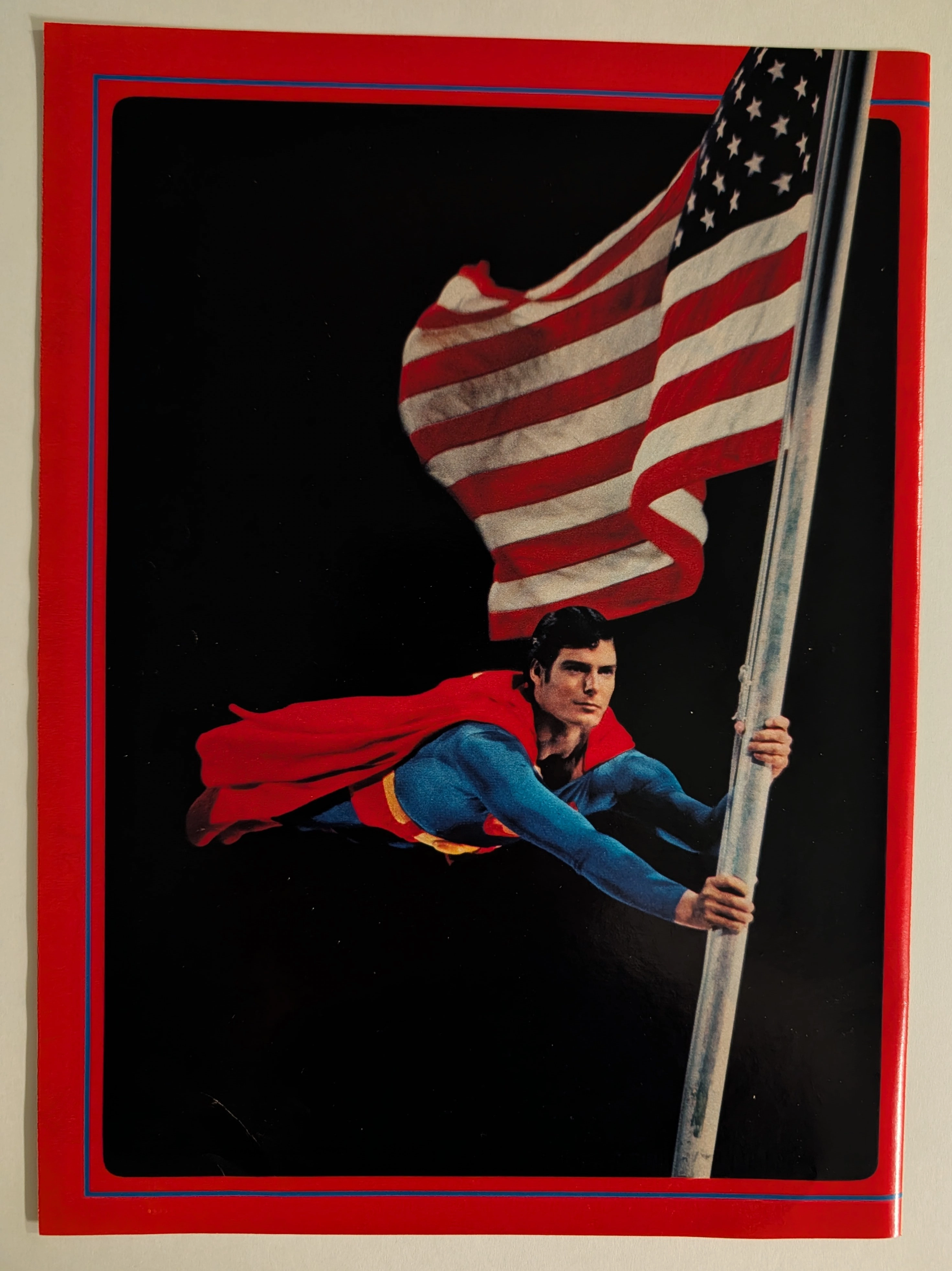
THE TIME TRAVELLER'DOISSIER : SUPERMAN — The Christopher Reeve Flagpole Postcard and the Birth of the Superhero Blockbuster
The item analyzed is an official Superman movie merchandise postcard or large-format photo card, featuring Christopher Reeve as Superman clinging dramatically to a metal flagpole while a large American flag billows behind him against a pure black background. The image is framed with a bold red outer border and a thin blue inner rule — a design consistent with the official Superman: The Movie (1978) merchandising aesthetic produced under license from Warner Bros. and DC Comics. Christopher Reeve (September 25, 1952 – October 10, 2004) portrayed Superman in four films (1978, 1980, 1983, 1987) and is universally regarded as the definitive cinematic Superman. This specific image — the flagpole scene lit dramatically against black — is one of the most iconic publicity photographs from the original film's promotional campaign. The physical item shows signs of age consistent with approximately 45–47 years, with slight surface wear and minor corner softening visible. The postcard format (estimated 4×6 or 5×7 inches) and the glossy coated stock are typical of high-quality movie merchandise of the late 1970s.
๋Joy De Jean Patou · Fashion
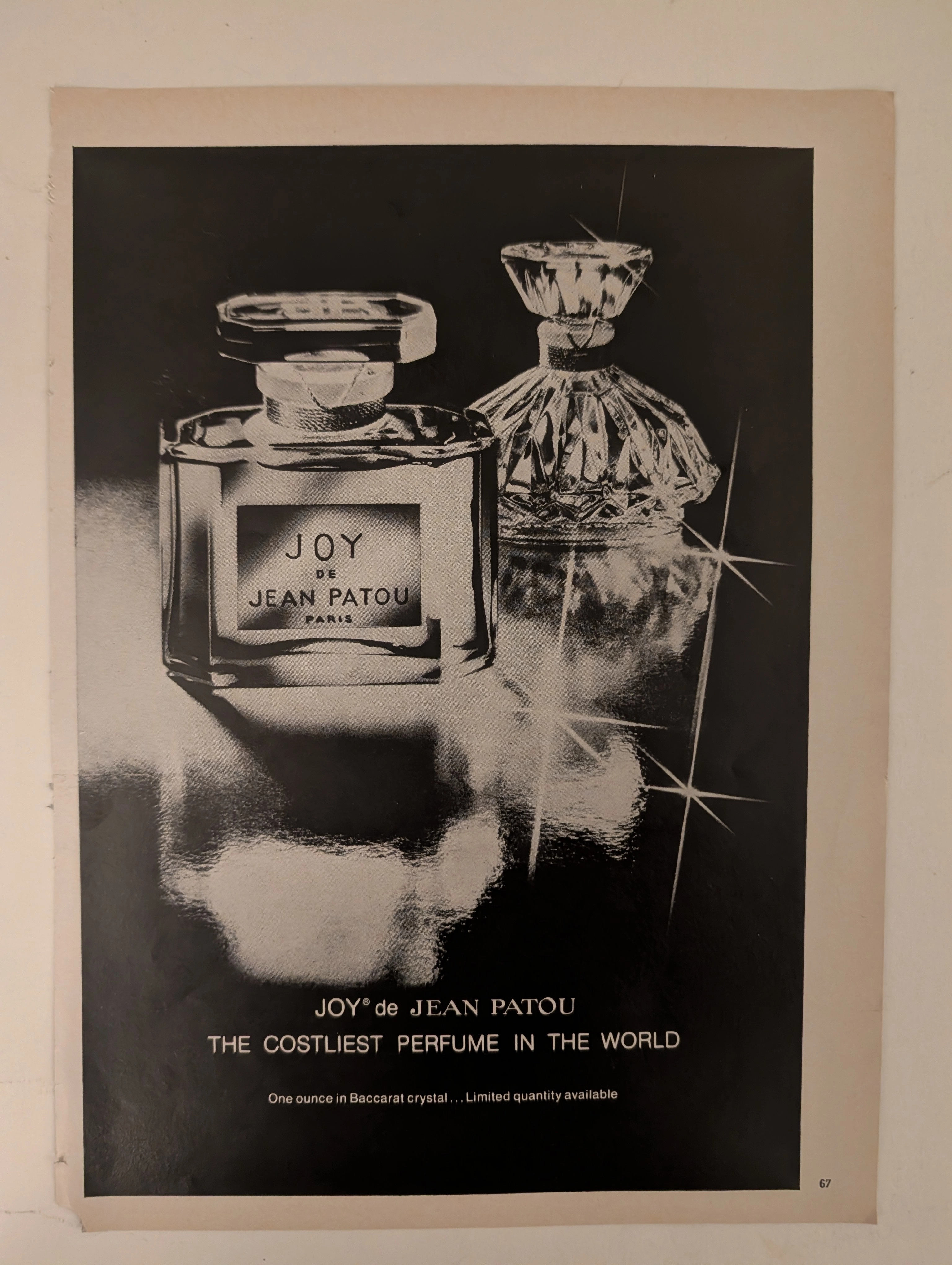
The Time Traveller's Dossier: The Semantics of Arrogance – JOY de Jean Patou Advertisement (Circa 1980s)
History is not written by the victors; it is printed by the industrialists. Long before digital algorithms began to sterilely dictate human consumption and virtual reality stripped away authentic tactile sensation, societal engineering and consumer psychology were executed through the calculated, mathematical geometry of the four-color offset press and the absolute mastery of analog darkroom photography. The historical artifact before us is not merely a disposable magazine tear sheet meant to peddle a fragrance. It is a perfectly weaponized blueprint of absolute capitalist supremacy, a visual declaration of class warfare, and an unwavering testament to an era of uncompromising, unapologetic ultra-luxury. This museum-grade, academic archival dossier presents an exhaustive deconstruction of a late-analog print advertisement for the legendary fragrance "JOY de Jean Patou," dating from the late 1970s to the early 1980s. Operating on a profound and ruthless binary structure, this document records a calculated paradigm shift within the global luxury goods industry. It captures the precise historical fracture where luxury transitioned conceptually from being a mere indicator of high-quality craftsmanship into a blatant, arrogant weapon of socioeconomic exclusion. Through the highly specialized lens of late-analog commercial artistry and stringent visual forensics, this document serves as a masterclass in psychological marketing. It established the foundational archetype for selling astronomically priced, exclusionary items—an archetype that unconditionally dictates the visual and strategic totems of modern ultra-luxury brands today.
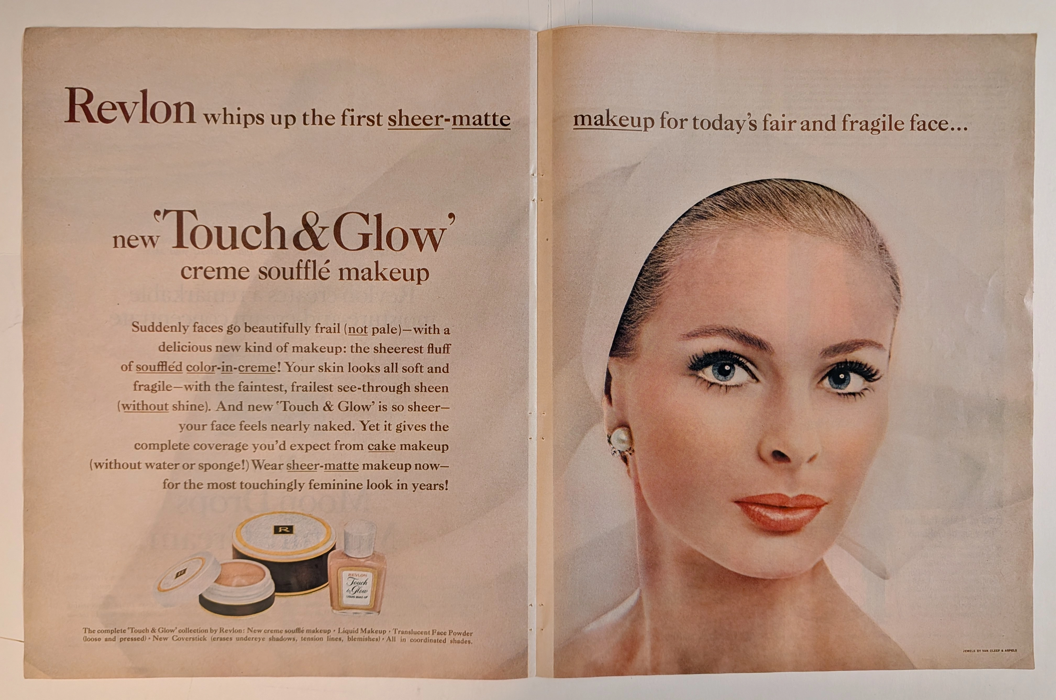
THE TIME TRAVELER'S DOSSIER: THE ILLUSION OF FRAGILITY AND THE ARCHITECTURE OF 60S BEAUTY
The artifact under rigorous, museum-grade analysis is a breathtaking, meticulously preserved Double-Page Historical Relic originating from the glamorous, highly engineered world of early 1960s American publishing. It features a sweeping, visually arresting advertisement for Revlon's "Touch & Glow" creme soufflé makeup. This Primary Art Document is not merely a cosmetic promotion; it is a profound sociological blueprint of mid-century feminine ideals. The ad's commanding copy, declaring makeup for "today's fair and fragile face," perfectly encapsulates the era's prescribed aesthetic: an aristocratic, porcelain delicacy juxtaposed with the striking, graphic eye makeup synonymous with the early 1960s. Crucially, this artifact documents the absolute genius of Charles Revson’s psychological marketing. By explicitly styling the model with "JEWELS BY VAN CLEEF & ARPELS" (as verified by the microscopic credit in the bottom right corner and the exquisite pearl/diamond earring), Revlon brilliantly anchored its accessible consumer cosmetics to the highest echelons of European haute joaillerie. Rescued from the binding of a forgotten periodical, this expansive double-page spread is printed on inherently acidic, mass-market wood-pulp paper. It is currently undergoing a slow, majestic chemical degradation. This natural oxidation—visible in the warm ivory patina and the delicate aging of the central seam—transforms a disposable commercial message into an irreplaceable, ready-to-frame Primary Art Document of mid-century beauty history.