THE TIME TRAVELER'S DOSSIER: THE ILLUSION OF FRAGILITY AND THE ARCHITECTURE OF 60S BEAUTY
The History
( THE HISTORY: Charles Revson's Psychology, the Feminine Ideal, and the Haute Joaillerie Alliance )
As the Chief Curator of The Record, I invite you to submerge your senses into the psychological battlefield of mid-century consumerism. The impeccably preserved Double-Page Historical Relic before you is not a mere cosmetic wallpaper. It is a calculated "Psychological Blueprint" engineered to define and control the parameters of feminine beauty in the early 1960s. This is a masterwork by Revlon, orchestrated by Charles Revson, the titan of the cosmetics industry who famously declared: "In the factory we make cosmetics; in the store we sell hope."
To decode the immense historical gravity of this Primary Art Document, we must analyze the sociological context of Mid-Century America. The sweeping headline—"Revlon whips up the first sheer-matte makeup for today's fair and fragile face..."—is a flawless encapsulation of the era's gendered expectations. In the early 60s, women were not necessarily marketed to look strong or pragmatic; the ultimate status symbol was to appear aristocratic, flawless, and as delicate as porcelain. The "fragile" aesthetic implied a life of luxury, shielded from harsh labor or the elements.
In terms of technological evolution in the beauty industry, this advertisement marks a critical turning point. The 1950s were dominated by heavy "cake makeup" (like Max Factor's Pan-Cake), which required water to apply and left a thick, mask-like finish. Revlon was selling the future: "Creme Soufflé Makeup." It promised a whipped, aerated texture that delivered full coverage without the stifling weight, achieving the coveted "Sheer-Matte" finish—a face that felt "nearly naked." Paired with the heavy, graphic black eyeliner and subdued lips that defined the dawn of the 1960s (pioneered by icons like Audrey Hepburn), this page perfectly archives a monumental shift in cosmetic fashion.
The Historical Masterstroke:
The truly priceless nature of this artifact lies hidden in a microscopic, yet infinitely powerful detail. Direct your focus to the small text in the bottom right corner: "JEWELS BY VAN CLEEF & ARPELS," and observe the magnificent pearl and diamond cluster earring adorning the model. This is no coincidence; it is a masterclass in Psychological Luxury Marketing.
Revlon was a mass-market brand accessible in local drugstores and department stores. But Charles Revson craved the aura of the aristocracy. By strategically partnering with Van Cleef & Arpels—a Parisian house of Haute Joaillerie whose pieces cost tens of thousands of dollars—Revlon brilliantly hijacked their prestige. When the image of a $2 Revlon makeup jar is placed directly alongside elite European diamonds, the consumer's brain subconsciously fuses the two levels of luxury. The woman buying "Touch & Glow" wasn't just buying foundation; she was purchasing the manufactured feeling of being a high-society woman wearing Van Cleef. This advertisement is a definitive historical record of how mid-century capitalism successfully elevated a democratic commodity into an aspirational luxury object.
( THE PAPER: The Aesthetics of Decay — The Center Seam of Time )
At The Record, we do not worship pristine modern reproductions; we revere the "Signatures of Time." This historical artifact is a Double-Page Spread, surgically rescued from the spine of a decaying periodical. The fashion magazines of this era were printed on high-speed presses using acidic wood-pulp paper. It was an inherently fragile medium, harboring a chemical death sentence.
The most beautiful physical attribute of this piece is its "Center Seam"—the vertical line bearing the original staple holes that once bound the magazine together. This is the ultimate proof of its authenticity as a Primary Art Document. Over the past 60 years, the lignin within the paper fibers has engaged in a relentless chemical war with ambient oxygen. This oxidation has birthed a stunning, warm ivory "patina" that radiates from the edges inward. The vintage halftone lithography dots making up the model's flawless face have settled permanently into the degrading, brittle pulp. This is the profound aesthetic of wabi-sabi—the Japanese philosophy of finding perfection in impermanence and decay. This paper is quietly burning itself alive at a molecular level, and it is this exact, irreversible death that transfigures it into immortal art.
( THE RARITY: Class A — The Survival of the Double-Page Spread )
While preserving a single vintage magazine page is challenging, rescuing a complete, intact Double-Page Spread without the imagery tearing, splitting at the seam, or being consumed by moisture is an archival triumph. The vast majority of 1960s fashion magazines were cut up for mood boards, thrown into the trash, or lost to environmental rot.
When you synthesize the sociological history of 1960s beauty standards, the brilliant cross-branding alliance with Van Cleef & Arpels, and the breathtaking physical condition of this decaying analog double-spread, this artifact undeniably commands a Rarity Class A designation. It has evolved far beyond commercial ephemera. It is a massive, highly coveted Historical Relic, demanding to be framed and exhibited by a curator who truly understands the heavy, beautiful weight of mid-century architectural glamour.
Exhibition Halls
The Archive Continues
Continue the Exploration
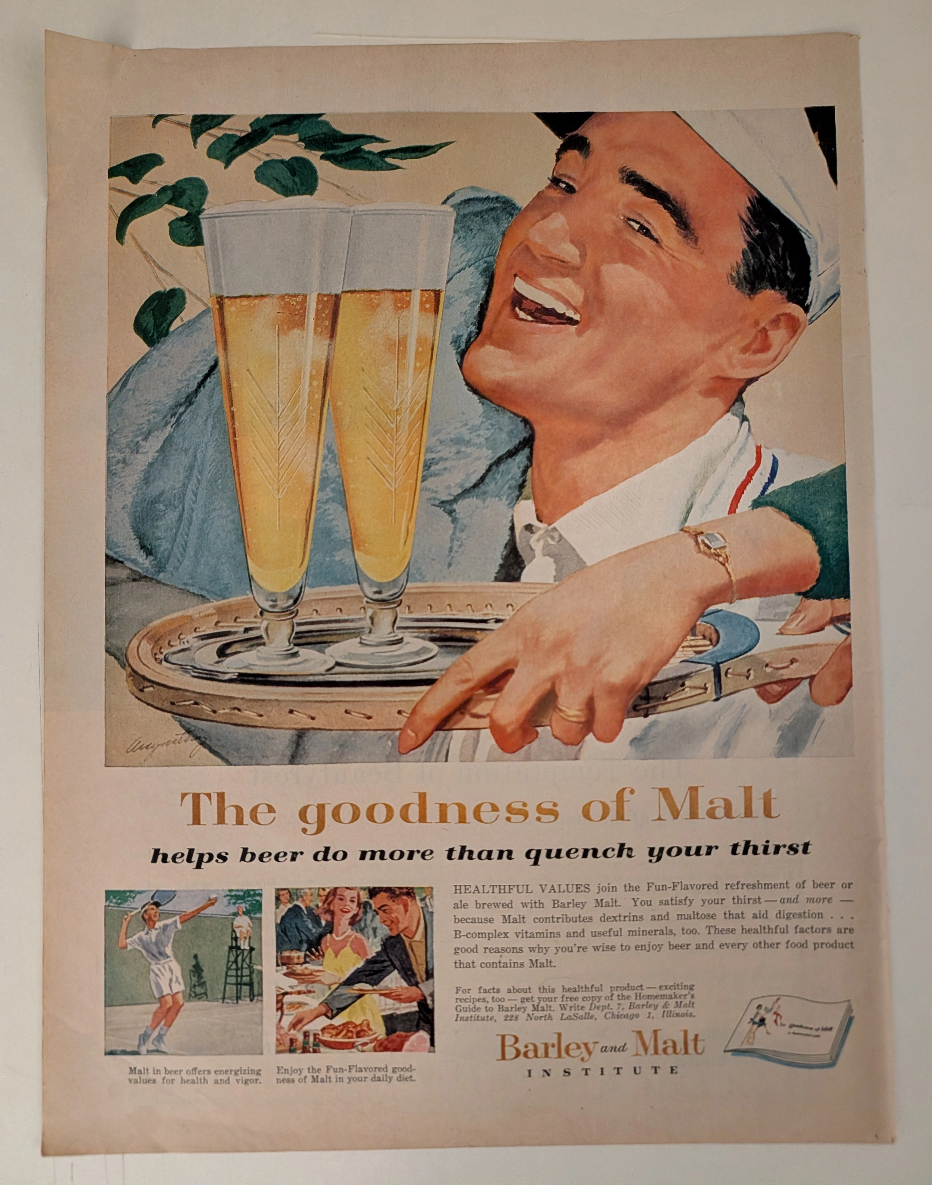
The Time Traveller's Dossier: How a 1959 Beer Ad Turned Alcohol into 'Health Food' – Barley and Malt Institute Advertisement
History is not written; it is printed. Before digital algorithms dictated human behavior, societal engineering was executed through the calculated geometry of the four-color offset press. The artifact before us is not merely an advertisement; it is a weaponized blueprint of middle-class aspiration. This museum-grade archival dossier presents an academic deconstruction of a 1959 print advertisement commissioned by the Barley and Malt Institute of Chicago. Operating on a profound binary structure, it documents a calculated paradigm shift within the American alcohol industry. It illustrates the precise historical fracture where beer was conceptually transitioned from a stigmatized working-class vice into a health-conscious staple of suburban domesticity. Through the lens of mid-century commercial artistry and precise visual forensics, this document serves as a masterclass in psychological marketing, establishing cultural tropes that unconditionally dominate modern pop culture and contemporary branding
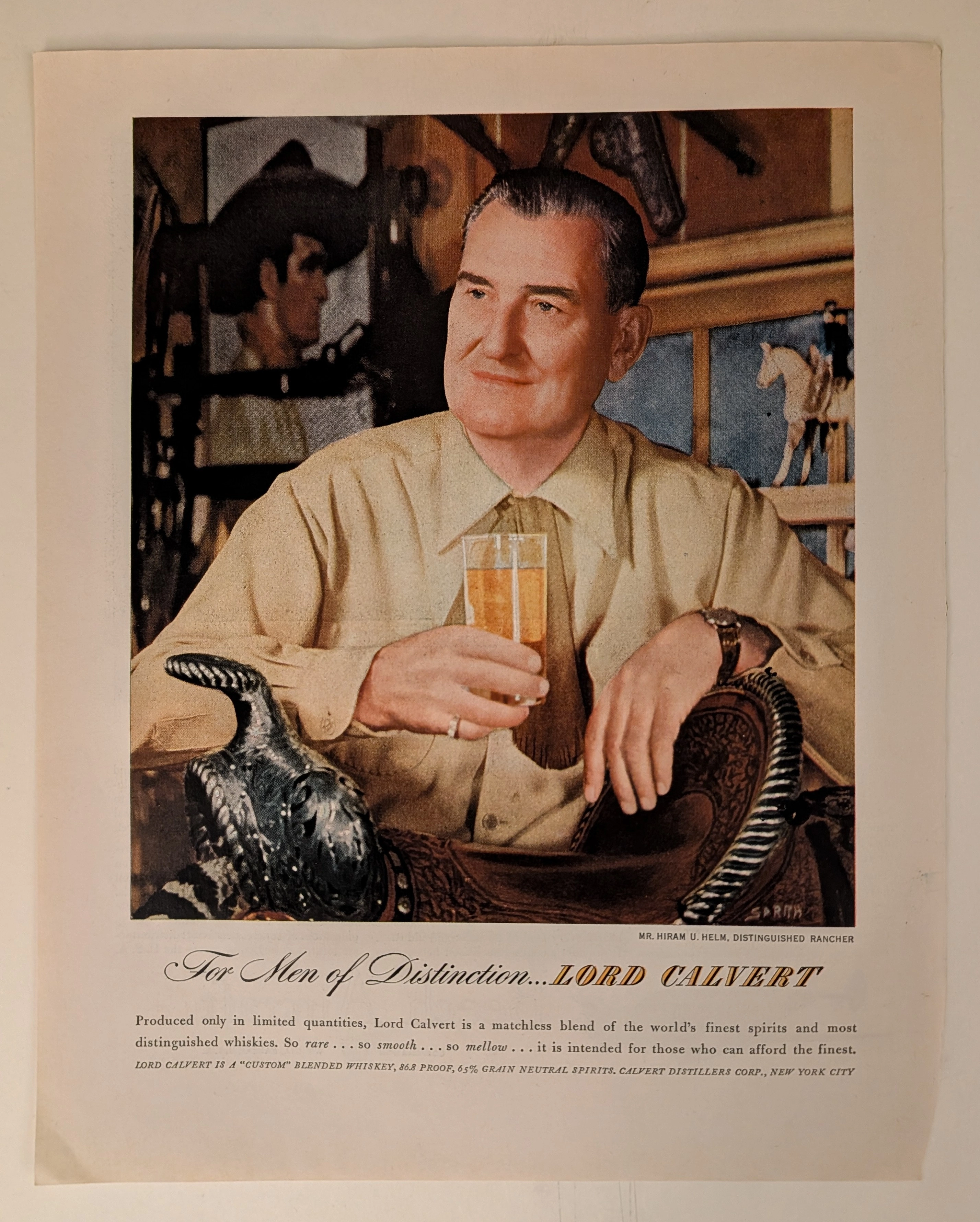
THE TIME TRAVELER'S DOSSIER: THE COMMODIFICATION OF STATUS AND THE ART OF THE ELEGANT ILLUSION
The artifact under exhaustive, uncompromising, and unprecedented museum-grade analysis is an exceptionally preserved Historical Relic originating from the absolute zenith of Madison Avenue's psychological marketing era (circa late 1940s to 1950s). This Primary Art Document is a monumental, full-page advertisement for LORD CALVERT, produced by the Calvert Distillers Corp., New York City. This piece represents the visual anchor for one of the most legendary, extensively studied, and phenomenally successful advertising campaigns in the history of American capitalism: "For Men of Distinction". It features a masterful, hyper-realistic portrait of Mr. Hiram U. Helm, Distinguished Rancher, deliberately painted/photographed to exude rugged sophistication, wealth, and aristocratic leisure. The artwork proudly bears the signature of SARRA (Valentino Sarra), a titan of mid-century commercial photography and illustration known for his cinematic lighting and profound character studies. This document is a profound "Sociological Blueprint of Aspirational Wealth." It masterfully utilized the psychology of exclusivity, marketing a blended whiskey composed of "65% Grain Neutral Spirits" as a "Custom" blend intended only "for those who can afford the finest". Rescued from the inevitable oblivion of disposable mass media, this mid-century analog artifact is a breathtaking embodiment of the Japanese aesthetic of wabi-sabi. Printed on inherently acidic wood-pulp paper, it exhibits a beautifully authentic, warm amber oxidation across its entire surface. This unstoppable molecular death transforms a piece of mass-produced corporate propaganda into an irreplaceable, ready-to-frame Primary Art Document of post-war sociological history.
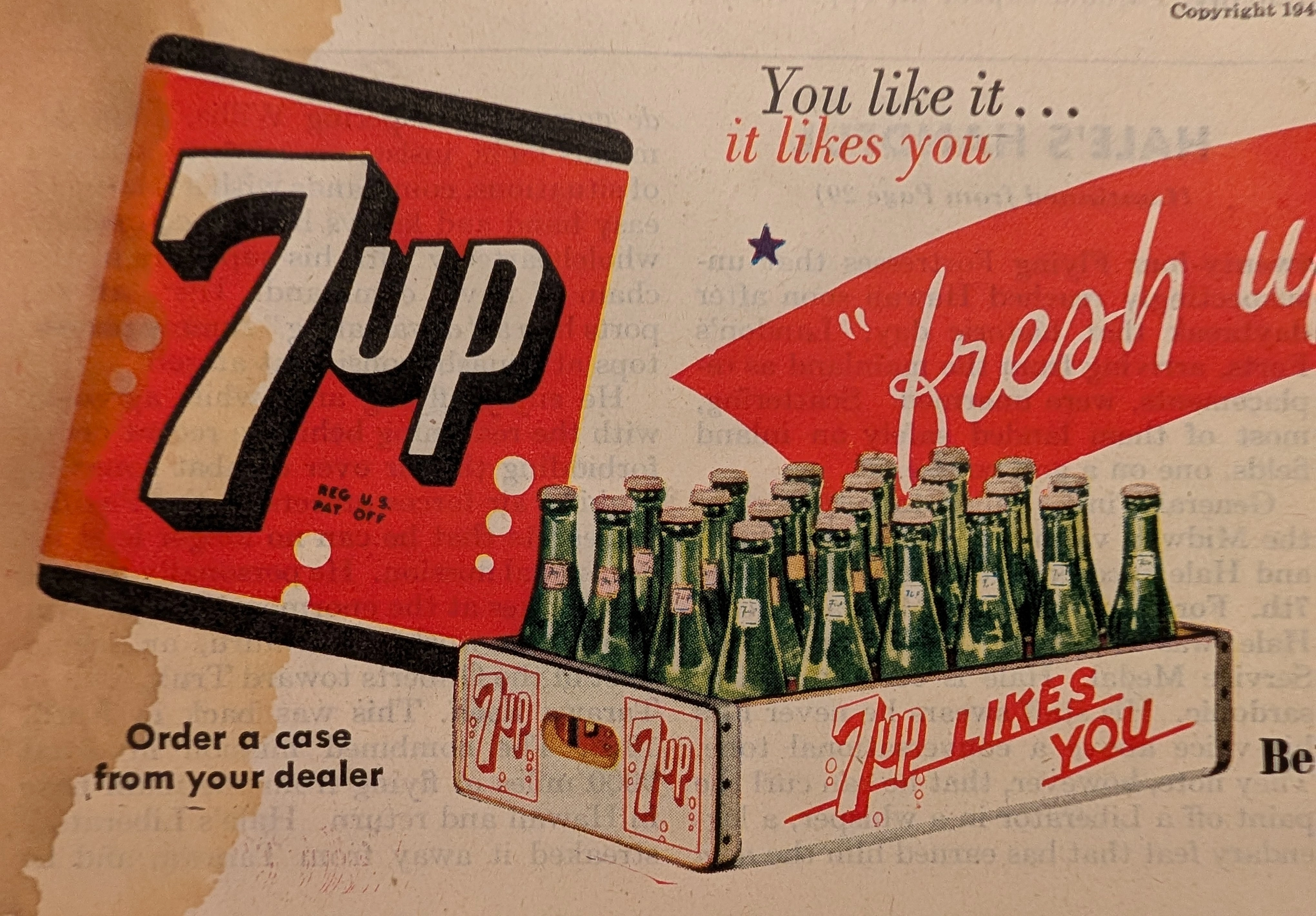
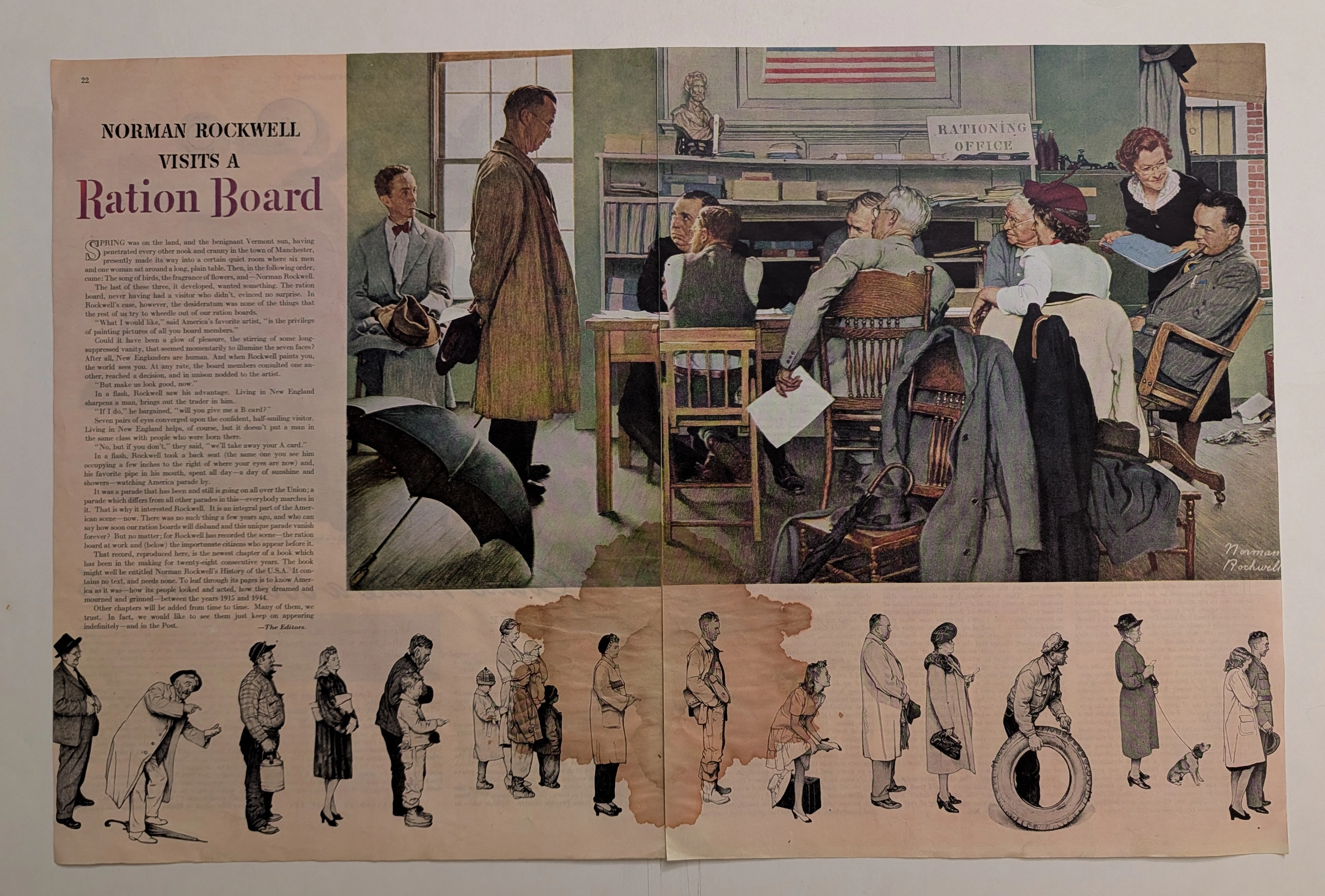
THE TIME TRAVELER'S DOSSIER: THE HOME FRONT SMILE AND THE 1944 PSYCHOLOGICAL WAR
This original 1944 7-Up advertisement cut page from The Saturday Evening Post is a vital piece of WWII Home Front ephemera. Beneath the wholesome mid-century illustrations lies a patriotic directive to support the war effort by adhering to rationing laws. The massive water stain and natural oxidation of the 80-year-old acidic paper highlight the beautiful aesthetic of decay, elevating this to a Class A primary art print.