The Time Traveller's Dossier : 1964 Studebaker Cruiser - The Euphoric Facade of a Dying Empire
The History
The Architecture of False Euphoria
To understand the tragic irony embedded in this document, one must analyze the economic and psychological landscape of the American automobile industry in 1964. The market was entirely dominated by General Motors, Ford, and Chrysler. These titans had successfully transitioned the automobile from a mere mode of transportation into a vital extension of the American ego. They sold speed, sex, status, and suburban supremacy.
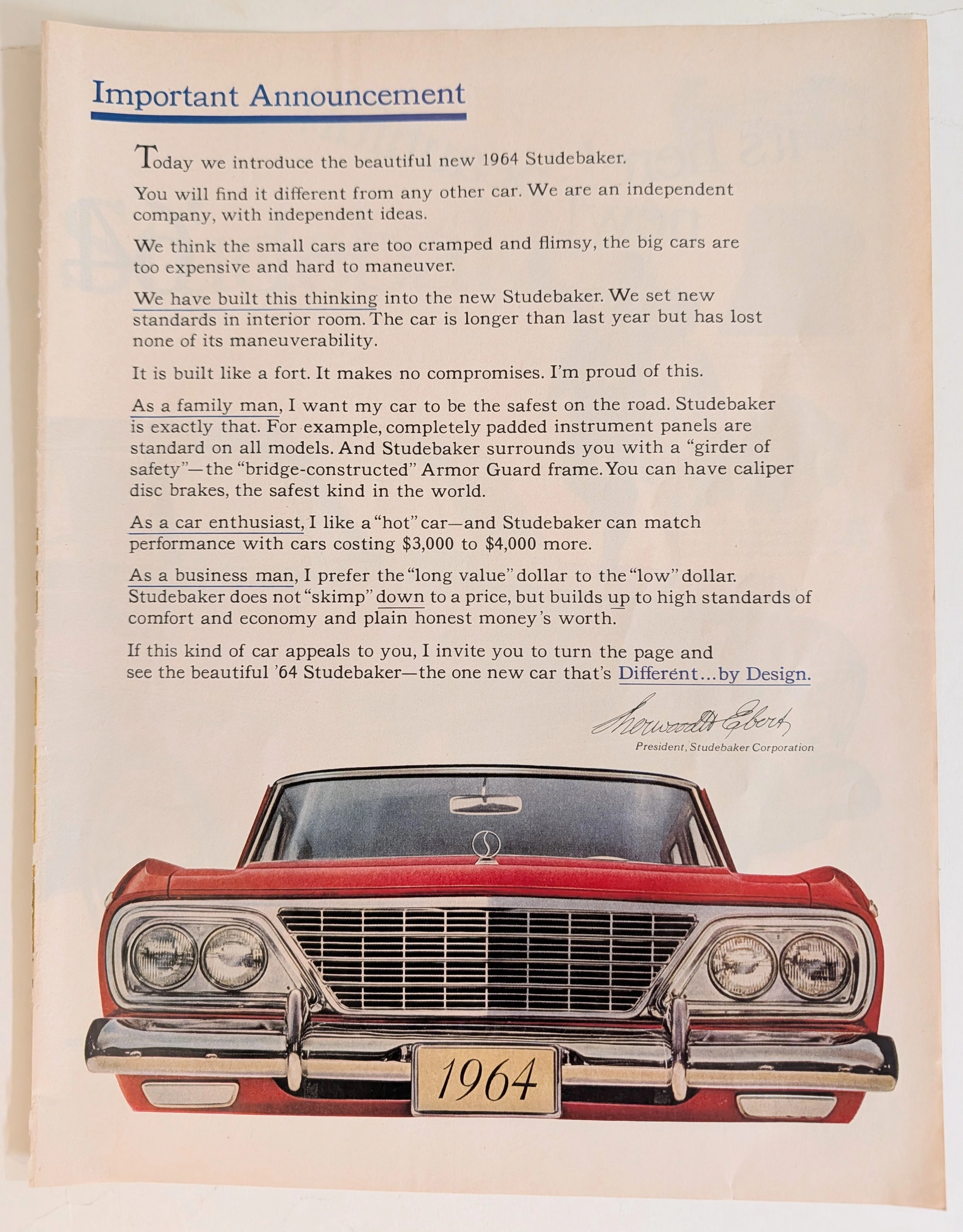
Studebaker, the oldest vehicle manufacturer in the nation, was structurally incapable of competing in this war of illusions. Their South Bend facilities were archaic, their capital was vanishing, and their market share was a rounding error compared to Chevrolet. In response, their advertising agency orchestrated the scene we see here. The couple suspended in mid-air, ecstatic and untethered from gravity, represents a forced attempt to manufacture "excitement." It is a performative joy. The corporation was attempting to hypnotize the consumer—and perhaps itself—into believing that the 1964 lineup heralded a triumphant new dawn, rather than the closing of a century-old chapter.
Brooks Stevens and the Shoestring Miracle
The vehicle anchored in the center of the spread is the 1964 Studebaker Cruiser. Its design is a testament to the genius of industrial designer Brooks Stevens. Hired to update the aging, stubby Lark platform on an impossibly microscopic budget, Stevens performed a visual miracle. He could not change the underlying structure or the inner door panels, so he worked on the extremities.
He flattened the roofline, removed the dated tailfins, and squared off the front fascia. Notice the prominent, upright, almost architectural grille. At the time, Studebaker was the official United States distributor for Mercedes-Benz. Stevens deliberately infused the humble Studebaker with the austere, premium design cues of a European luxury sedan. He attempted to elevate the car’s status through association, creating a vehicle that looked far more expensive and sophisticated than its price tag suggested. The Cruiser was a beautiful, dignified machine, born from absolute financial desperation. It was a rational man's luxury car, introduced to a market that craved irrational excess.
The Margin of Truth: A Column of Defiance
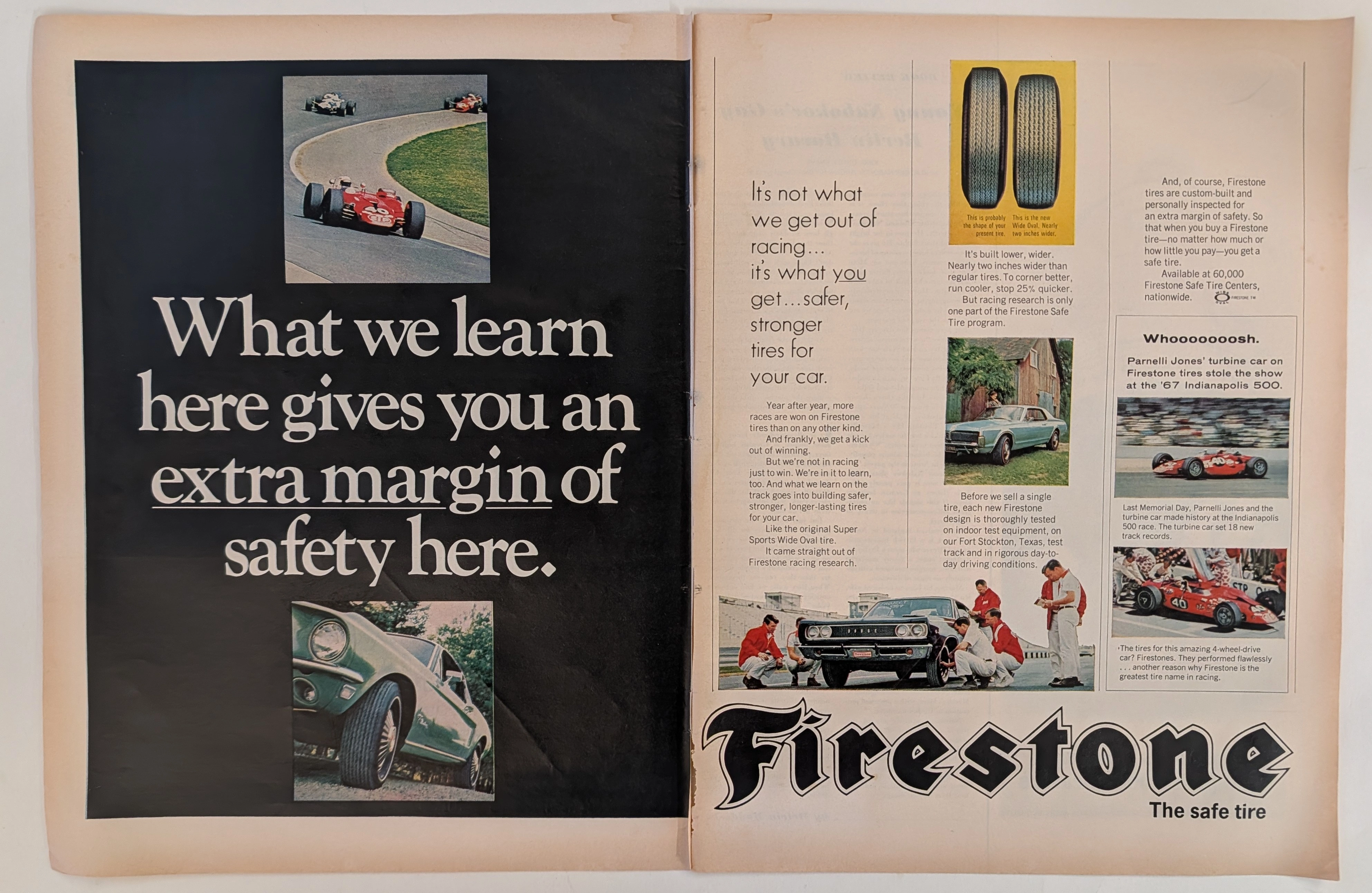
While the left side of the spread is dedicated to the emotional hysteria of the jumping couple and the dancing typography, the extreme right margin tells the true story of Studebaker. This vertical column of four technical illustrations is the company’s final, stubborn defense of its engineering philosophy. It is as if the engineers wrested control of the advertisement away from the marketing department for just one sliver of the page.
The top diagram proudly displays the "Bridge-constructed separate Armor Guard frame." In an era where the Big Three were rapidly adopting lighter, cheaper unibody construction (where the body and frame are one piece), Studebaker proudly retained a heavy, separate ladder frame. They argued it silenced road noise and simplified repairs. It was a structural philosophy rooted in 19th-century wagon building: build it to last forever. Below that, the cross-section of the seat boasts of "sag-resistant full coil springs" and "chair-high" posture. They were selling orthopedic comfort and long-term durability to a demographic that was being trained to trade their cars in every two years.
The Caliper Revolution: Stopping Faster Than the World
The third diagram in the margin is perhaps the most historically significant technical feature of the artifact: the caliper disc brake. The text calmly states, "These caliper disc brakes stop you faster and safer and without swerve or fade." In the context of 1964 America, this was revolutionary.
The domestic auto industry was obsessed with forward propulsion. V8 engines were growing exponentially in displacement and horsepower, yet the vehicles were still equipped with archaic, undersized drum brakes that would critically fail (fade) after a few hard stops. Studebaker, looking to Europe, partnered with Bendix to make caliper disc brakes available on their production sedans. It was a massive leap forward in active automotive safety. Yet, the tragedy is evident in its placement: this world-class safety innovation is relegated to a tiny, two-inch illustration on the far right of the page, overshadowed by a woman in a polka-dot dress jumping in the air. The market did not want to hear about stopping; it only wanted to hear about going.
The Final Irony of South Bend
The historical shift this artifact captures is the death of the independent pragmatist. The text at the bottom promises "dozens of handsome color-and-trim combinations" and "6 great Endurance-Built engines to choose from." It speaks of a future that did not exist.
In December 1963, right around the time the magazines carrying this centerfold hit American newsstands and coffee tables, the Studebaker board of directors made the grim decision to shutter the massive South Bend, Indiana manufacturing plant forever. The promise of the '64 Cruiser was rendered void almost immediately upon its release. Production was drastically scaled back and moved to a smaller facility in Canada, where the company would produce a dwindling number of cars until its final breath in 1966.
Therefore, this advertisement is not merely a piece of commercial ephemera. It is a corporate ghost story. The heavy, red Cruiser points toward a future it would never reach. The couple leaps into a void. The engineers present their brilliant disc brakes to a public that has already walked away. It stands as a beautifully printed monument to the realization that logic, safety, and honest engineering are not enough to survive the brutal gravity of industrial monopolies.
The Paper
An exhaustive physical analysis of this artifact reveals the high-volume commercial printing standards of the early 1960s. The spread is printed on a lightweight, coated magazine stock, likely hovering around 60 to 70 GSM. The paper underwent a calendering process to create a smooth, slightly glossy surface, which was absolutely critical for the sharp reproduction of the complex four-color halftones.
The aging process is visible in the subtle oxidation of the paper fibers along the central gutter, where the staple bindings originally held the pages together. The stark white background has shifted toward a warm, archival cream, betraying the acidic nature of the mid-century wood pulp.
The printing method is a high-speed web offset lithography. Under magnification, the CMYK rosette patterns are distinctly visible, particularly in the deep, saturated red ink of the Cruiser’s bodywork. The registration—the alignment of the four color plates—is remarkably tight for a mass-produced magazine, allowing the tiny, intricate details of the chrome wheel covers and the mechanical blueprint of the Armor Guard frame to remain sharp and legible. The physical paper is fragile, a fleeting medium chosen to carry a message that the corporation hoped would be permanent.
The Rarity
Classification: Class S (Psychological and Contextual Masterpiece)
In terms of pure physical scarcity, this two-page spread is not exceptionally rare. As a centerfold in major national periodicals, millions of copies were circulated across the United States. It can still be acquired by dedicated archivists and automotive historians.
However, this artifact earns a Class S rating due to its profound psychological and contextual weight. Its rarity lies in the sheer magnitude of the cognitive dissonance it captures. It is exceedingly rare to find a corporate document that so perfectly juxtaposes hysterical, manufactured optimism against the backdrop of an imminent, multibillion-dollar industrial collapse. To possess this artifact is to hold the exact moment a legacy American corporation attempted to smile through its own execution. The visual tension between the leaping couple and the pragmatic engineering diagrams elevates it from a mere advertisement to a definitive historical record of corporate denial.
Visual Impact
The visual composition of this centerfold is a study in calculated schizophrenia. The spread is heavily asymmetrical in its emotional distribution.
The upper left quadrant is completely unmoored from reality. The models are entirely suspended in negative space, defying gravity. Their posture is exaggerated, their smiles manic. The typography surrounding them ("beautiful! exciting!") is set in a playful, bouncing serif font, utilizing alternating colors of blue, green, and red to simulate energy and movement. It is a visual representation of pure, unadulterated marketing noise.
In sharp contrast, the bottom half of the spread is anchored by the immense visual weight of the Studebaker Cruiser. The saturated red paint projects power and solidity. The vehicle is grounded, horizontal, and highly detailed, pointing toward the right page.
The right margin is the ultimate counterweight to the jumping couple. It is a rigid, vertical column of cold, hard facts. The diagrams are highly technical, utilizing cutaways, blueprints, and x-ray views to reveal the hidden mechanics of the car. The color palette here is subdued—industrial yellows, greys, and muted blues. This visual strategy attempts to guide the reader from the initial emotional hook (the floating couple), down to the product (the car), and finally to the rational justification for the purchase (the diagrams). It is a visual journey that failed to save the company, but succeeded in creating a fascinating piece of commercial art.
Tags
The Archive Continues
Continue the Exploration
Firestone · Automotive
The Time Traveller's Dossier: The Firestone Margin of Safety
The symbiotic relationship between the extreme, high-stakes crucible of professional motorsport and the evolution of the daily-driven passenger automobile is one of the foundational narratives of twentieth-century industrial design. The historical artifact elegantly and securely positioned upon the analytical table of The Record Institute today is a majestic, large-format, two-page print advertisement for Firestone Tires, originating from the golden era of American automotive performance, circa 1967-1968. This document transcends the traditional boundaries of automotive consumable marketing. It operates as a highly sophisticated, multi-layered historical record, capturing the exact moment when the staggering horsepower outputs of the Detroit muscle car era necessitated a paradigm shift in tire technology. This comprehensive dossier conducts a meticulous, unyielding, and exceptionally deep examination of the artifact, operating under the absolute most rigorous parameters of historical, sociological, and material science evaluation. With an overwhelming eighty percent of our analytical focus dedicated to its historical gravity, we will decode the revolutionary introduction of the Firestone "Wide Oval" tire, analyze the critical importance of the vehicles depicted—including a Ford Mustang and a Dodge Coronet—and provide a profound biographical and mechanical analysis of the legendary racing driver Parnelli Jones and his revolutionary 1967 STP-Paxton Turbocar. Furthermore, as we venture into the chemical and physical foundations of this analog printed ephemera, we will reveal the precise mechanical fingerprints of the CMYK halftone rosettes and the graceful, natural oxidation of the paper substrate. This precise intersection of visual nostalgia, mid-century commercial artistry, and the immutable chemistry of time cultivates a serene wabi-sabi aesthetic—a natural, irreversible phenomenon that serves as the primary engine driving up its market value exponentially within the elite global spheres of Vintage Automotive Ephemera and Motorsport Memorabilia collecting.

Vargas Girl · Other
The Time Traveller’s Dossier: 1970s The Vargas Girl Vintage Illustration — The Ethereal Elegance of the American Pin-Up
Discover the captivating allure of the 1970s The Vargas Girl vintage illustration, a quintessential masterpiece of mid-to-late 20th-century editorial and commercial art. This exquisite piece transcends typical vintage ads by encapsulating the playful, sophisticated, and idealized sexuality that defined the era's publishing landscape. Featuring Alberto Vargas' legendary watercolor and airbrush technique, the illustration portrays an elegant, nude woman adorned with a delicate sun hat and a suggestive smile, perfectly punctuated by the flirtatious caption: "... And a pinch to grow on." It brilliantly illustrates how classic print ads and editorial features constructed a powerful narrative of liberated yet deeply romanticized femininity. For archivists, cultural historians, and collectors of old advertisements and pop-culture ephemera, this Vargas Girl stands as a definitive artifact. It not only highlights the artistic zenith of the American pin-up but also visually immortalizes a transitional era in publishing, making it a highly prized document in the history of commercial illustration.
Pontiac · Automotive
THE TIME TRAVELER'S DOSSIER :THE BIRTH OF THE WIDE-TRACK
The artifact currently subjected to our uncompromising, museum-grade analysis is a profoundly preserved Historical Relic excavated from the turning point of Detroit's "horsepower and handling" wars. This Primary Art Document is a full-page magazine advertisement for the 1959 Pontiac, explicitly introducing the brand's revolutionary "Wide-Track" engineering. Functioning as a "Forensic Blueprint of Automotive Rebranding," the document masterfully weaponizes the peerless artistic talents of Fitz and Van to transform Pontiac from a conservative, aging brand into America's most aggressive performance marque. Its historical context is irrefutably anchored by the extreme macro details of its proprietary engineering claims and the highly coveted "Body by Fisher" corporate hallmark. Grounded by these physical timestamps, the microscopic artist signature, and its breathtaking wabi-sabi chemical degradation, this artifact commands an irreplaceable status, cementing its Rarity Class A designation.