The Time Traveller's Dossier : 1964 Studebaker - The Final Defiance of the Independent Automaker
The History
The Architecture of an Oligopoly and the Independent’s Dilemma
To understand the gravity of this artifact, one must understand the economic battleground of 1964 America. The post-war economic boom had stabilized, but the mechanics of industrial production had fundamentally shifted. Economies of scale governed survival. The Big Three automakers could absorb the massive tooling costs required to redesign their vehicles entirely every two to three years. This created a culture of planned obsolescence, a psychological cycle where the consumer was trained to discard the old merely because it looked old.
Studebaker did not possess the capital to play this game. As an independent manufacturer operating out of aging facilities in South Bend, Indiana, their production costs per unit were structurally higher. Their response, as crystallized in this document, was a pivot away from fleeting style and toward enduring substance. They sought to redefine the parameters of the automotive purchase. The text explicitly attacks the binary choice offered by Detroit: "small cars are too cramped and flimsy, the big cars are too expensive and hard to maneuver." Studebaker attempted to carve out a hyper-rational middle ground. They proposed a vehicle scaled for utility, not status. This was a direct contradiction to the prevailing consumer psychology of the 1960s, where the automobile was primarily an extension of ego, a rolling avatar of suburban success.
Engineering as a Fortress: The Premature Pivot to Safety
The most striking element of this document is its heavy reliance on safety as a core value proposition. In the early 1960s, safety did not sell cars. The industry operated on the tacit assumption that discussing safety reminded consumers of mortality, thereby dampening the buying impulse. Chrome, horsepower, and jet-age styling were the established currencies of persuasion. Ralph Nader’s seminal critique, Unsafe at Any Speed, which would eventually force federal safety regulations upon the industry, was not published until 1965.
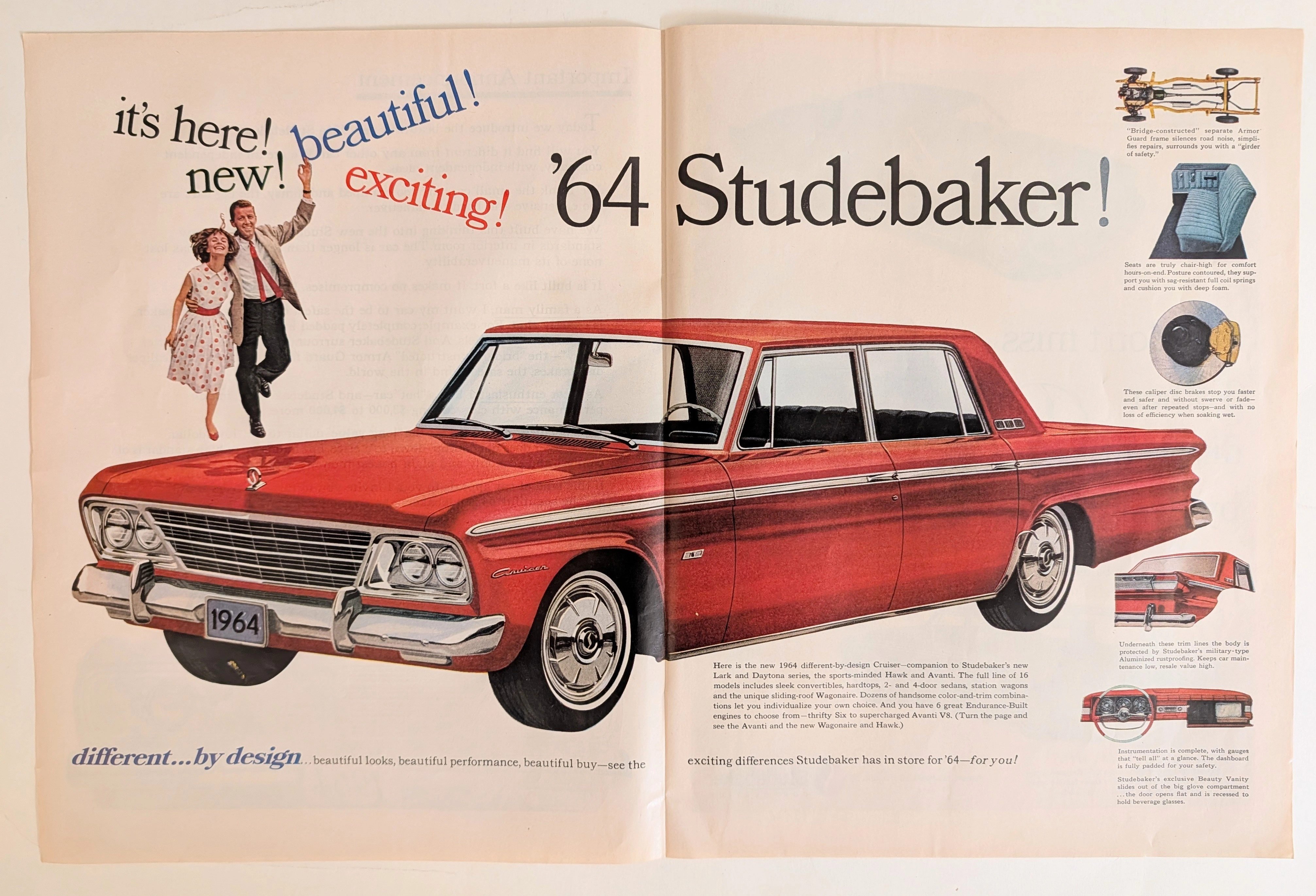
Yet, here in the documentation for the 1964 model year, Studebaker explicitly markets a "girder of safety" and a "bridge-constructed Armor Guard frame." They declare the vehicle is "built like a fort." This is not mere hyperbole; it represents a specific engineering philosophy. While competitors were moving toward lighter unibody constructions to save weight and cost, Studebaker retained a heavy, separate perimeter ladder frame. Furthermore, the advertisement prominently features the availability of "caliper disc brakes, the safest kind in the world." At a time when almost every American car relied on fade-prone drum brakes, introducing European-style caliper disc brakes (supplied by Bendix and pioneered on their Avanti sports car) was a massive leap forward in active safety.
Studebaker was offering a technical solution to a problem the American public had not yet been conditioned to care about. They built a safer machine for a society that was entirely willing to trade structural integrity for superficial aesthetics. This misalignment between product virtue and market desire is the tragedy of the 1964 Studebaker.
The Tripartite Rhetoric: Appealing to the Fragmented Consumer
The copywriting employs a highly structured, tripartite logical appeal. It segments the reader into three distinct psychological profiles: the Family Man, the Car Enthusiast, and the Business Man.
"As a family man, I want my car to be the safest on the road... completely padded instrument panels are standard." This addresses the protective instinct, leaning heavily on the aforementioned safety features.
"As a car enthusiast, I like a 'hot' car—and Studebaker can match performance with cars costing $3,000 to $4,000 more." This leverages Studebaker’s legacy of supercharged V8 engines, a remnant of their desperate bid to capture the youth market.
"As a business man, I prefer the 'long value' dollar... Studebaker does not 'skimp' down to a price, but builds up to high standards." This is an appeal to fiscal conservatism, attempting to frame the purchase as a calculated investment rather than a depreciating liability.
The strategic error here is one of dilution. By attempting to be the perfect rational choice for every demographic, the vehicle lost a distinct, cohesive identity. In advertising, appealing to pure logic often fails to trigger the emotional resonance required to finalize a purchase. Detroit sold dreams; Studebaker was attempting to sell a spreadsheet.
The President’s Ghost and the Collapse of South Bend
The presence of Sherwood H. Egbert’s signature at the bottom right of the text elevates this document from a mere advertisement to a historical artifact of immense poignancy. Egbert was brought in as President of the Studebaker Corporation in 1961 to execute a turnaround. He was an outsider, a dynamic executive from McCulloch Motors, who famously commissioned the radical Studebaker Avanti in a matter of weeks to inject life into the brand.
However, by the time this 1964 advertisement was printed, the reality behind the curtain was grim. Egbert was severely ill with stomach cancer. The board of directors was deeply fractured. Sales were plummeting despite the objective quality of the vehicles. The promise embedded in this document—the "Important Announcement" of a revitalized, independent company—was an illusion constructed to maintain dealer confidence and stave off creditor panic.
In December 1963, just as these '64 models were reaching showrooms, the Studebaker board voted to permanently shut down the massive South Bend assembly plant, ending over a century of manufacturing history in Indiana. Production was shifted entirely to a smaller facility in Hamilton, Ontario, Canada, where the company limped along until its final closure in 1966.
Therefore, this document is a paradox. It reads as a confident declaration of a new beginning, signed by a resolute leader. In truth, it was drafted on the precipice of ruin, signed by a dying man trying to save a dying company.
The Historical Shift: The End of the Alternate Path
The artifact marks a definitive shift in the history of industrial design and corporate survival. It signifies the moment the door closed on the independent American automaker. Studebaker, Packard, Hudson, Nash—they had all offered alternate visions of what the automobile could be. They experimented with aerodynamics, compact dimensions, and advanced safety features far earlier than the monopolistic giants.
When Studebaker fell, it proved that in the modern industrial economy, a superior idea without the backing of overwhelming capital is a dead idea. The failure of the 1964 Studebaker was not a failure of engineering. It was not a failure of logic. It was the harsh realization that the market does not reward righteousness; it rewards momentum. This advertisement remains as a fossilized record of that realization, a highly logical argument made to a jury that had already left the room.
The Paper
An analysis of the physical medium reveals the standard practices of mid-century mass communication. The substrate is a standard commercial magazine stock, likely weighing between 65 to 80 GSM (Grams per Square Meter). It features a light calendering process, providing a slight gloss necessary for the reproduction of photographic halftones.
The aging process is evident in the oxidation of the paper fibers. The inherent acidity of the wood pulp used in 1960s commercial printing has resulted in a uniform, subtle yellowing across the negative space, shifting the original stark white background into a warmer, archival tone.
The printing method is a four-color offset lithography process. Under magnification, the CMYK (Cyan, Magenta, Yellow, Key/Black) rosette patterns are visible, particularly in the deep red tones of the vehicle's hood and the intricate reflections rendered in the chrome grille. The ink absorption is stable, though the edges of the serif typography show the microscopic spread typical of high-speed web presses of the era. As an artifact recording time, the paper itself is ordinary; its weight comes entirely from the text it carries and the era it failed to survive.
The Rarity
Classification: Class A (Contextually Profound)
In terms of physical scarcity, this advertisement is not exceptionally rare. Millions of copies were distributed across national publications like Life, Look, and Time magazines in late 1963. Copies can still be procured through ephemera dealers and private collections.
However, the artifact achieves a Class A rating based on its contextual value. Its rarity is derived from the dissonance between its message and historical reality. Documents that capture a major corporation in the exact moment of its existential failure are uncommon. Documents that do so while actively boasting about longevity and structural integrity are historically profound. The presence of Egbert's signature, knowing his imminent departure and death, elevates the artifact's significance from commercial ephemera to a primary historical record of corporate desperation.
Visual Impact
The visual composition is ruthlessly direct. Unlike contemporary advertisements that placed vehicles in aspirational lifestyle settings—country clubs, sweeping coastal highways, or modernist driveways—this layout strips away all environmental context.
The vehicle is presented head-on, anchored at the bottom third of the page. This direct, frontal perspective is confrontational. The dual headlights stare directly at the reader, demanding engagement. The dominant color is a saturated, aggressive red, utilizing color psychology to project power, urgency, and vitality—traits the corporation desperately lacked.
The top two-thirds of the page are dominated by typography. The headline "Important Announcement" utilizes an authoritative, institutional blue serif font, styled deliberately to resemble a corporate memo or a formalized press release. This visual cue bypasses the defensive mechanisms consumers build against traditional advertising; it signals that the following text is functional information, not mere persuasion.
The negative space is abundant, forcing the eye down through the heavily structured text blocks directly into the grille of the car. The final visual anchor is the gold-toned "1964" license plate, centrally aligned, acting as a definitive timestamp on a doomed endeavor. The overall visual strategy is one of unadorned honesty. It strips away the illusion of lifestyle to present pure, unyielding machinery and logic.
The Archive Continues
Continue the Exploration
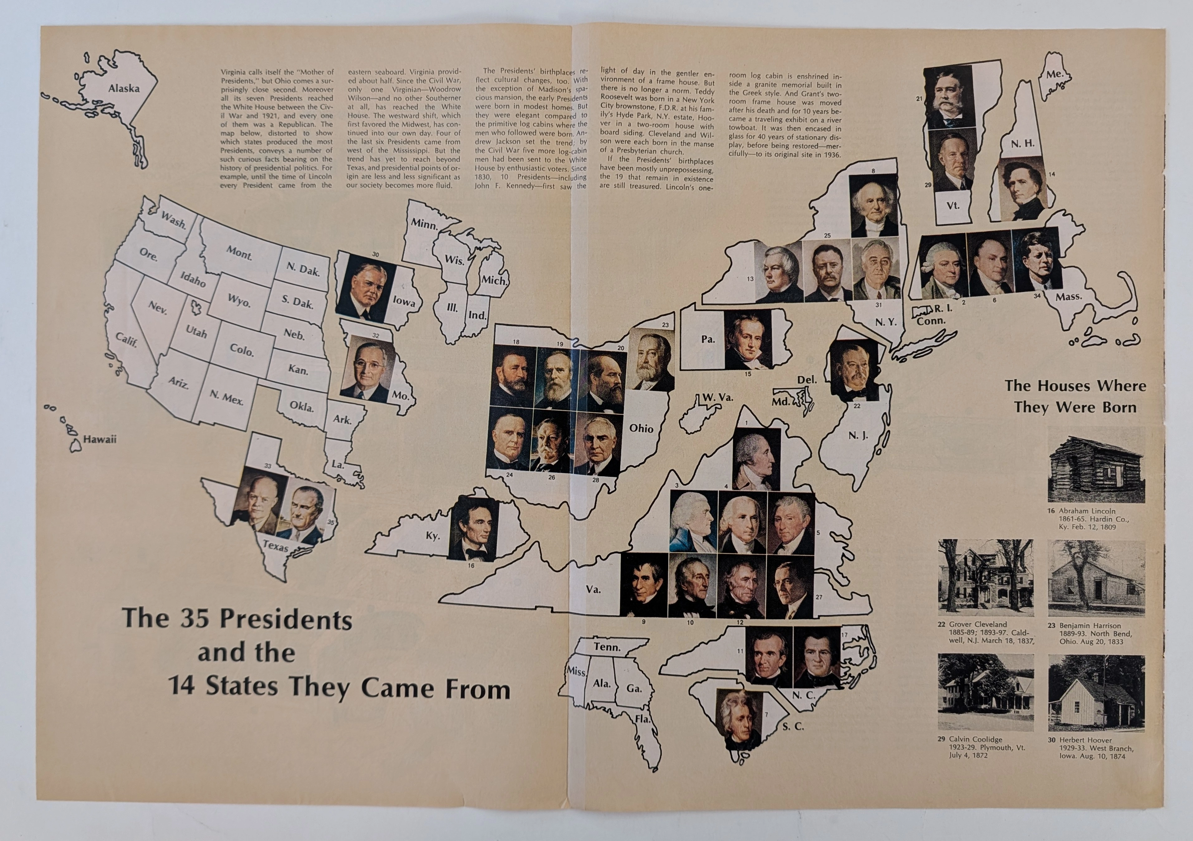
The Time Traveller's Dossier: The Geopolitics of Supreme Power – Cartographic Origins of the 35 U.S. Presidents (Circa Mid-1960s)
The history of supreme executive power is not inscribed solely within the text of legal documents, constitutional amendments, or international treaties; it is deeply rooted in the geographical origins and territorial foundations of political leaders. Long before the modern era of complex spatial data analysis or digital infographics, the structural understanding of state power in the United States was conveyed through the meticulous art of cartographic illustration. The historical artifact presented before us for museum-grade forensic analysis is not merely a conventional fold-out extracted from a mid-20th-century educational publication. It is a profound "geopolitical visual encyclopedia," meticulously compiling and categorizing the geographic birthplaces of the thirty-five individuals who had ascended to the highest office in the White House up to that point in history. This academic archival dossier presents an exhaustive, microscopic deconstruction of the historical and aesthetic framework of the diagram titled "The 35 Presidents and the 14 States They Came From." Operating on a profound scholarly narrative structure, this document decodes the shifting tectonic plates of executive power in the United States—from the foundational era concentrated on the Eastern Seaboard, moving steadily into the Midwest, and ultimately expanding toward the Southern and Western frontiers. Through the highly specialized lens of late-analog print analysis, American political history, and rigorous visual forensics, this document serves as a temporal window. It allows us to explore the foundational roots of the "American Dream" as conveyed through the birthplaces of these statesmen, ranging from humble log cabins to opulent estates, all rendered with the mechanical precision of mid-century offset lithography.
General Motors · Automotive
The Time Traveller's Dossier: The Zenith of General Motors
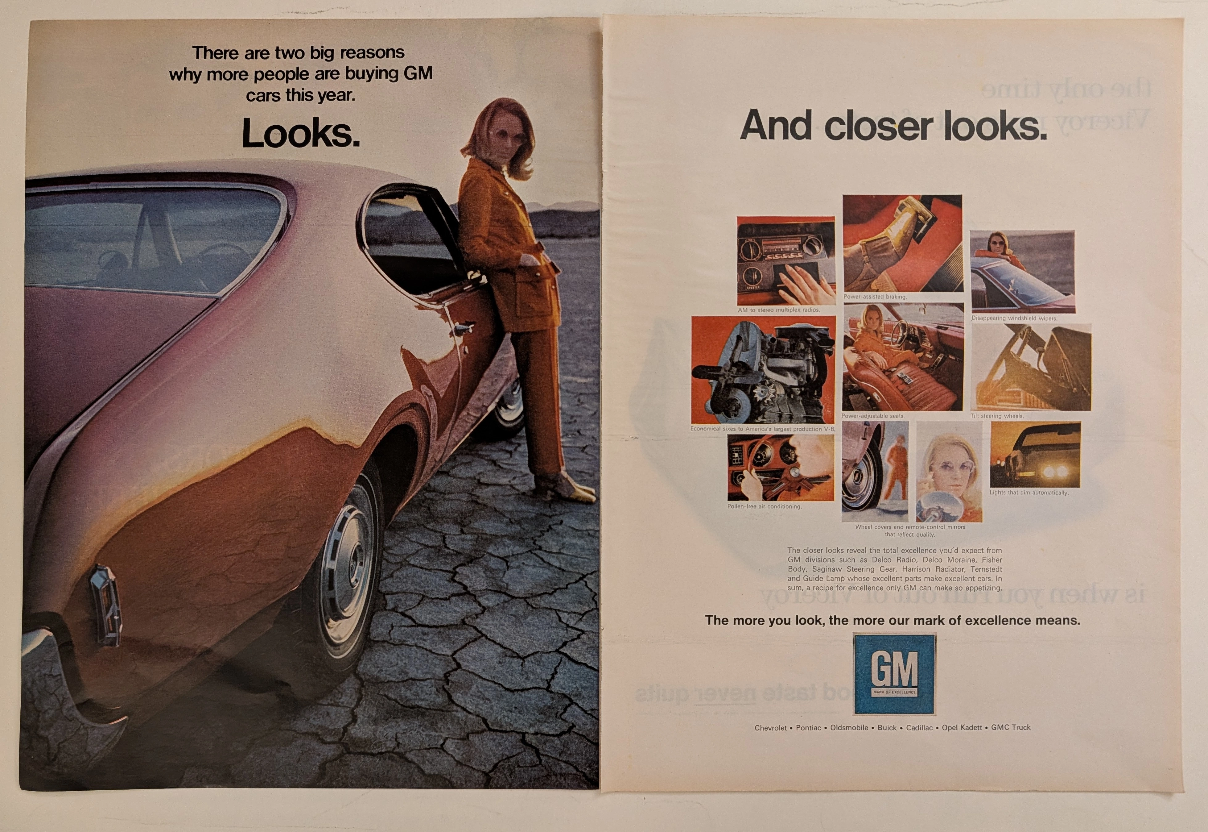
The automobile in mid-twentieth-century America was never merely a mode of transportation; it was a colossal canvas projecting industrial pride, technological advancement, and shifting consumer identities. The historical artifact elegantly and securely positioned upon the analytical table of The Record Institute today is a magnificent, large-format, two-page print advertisement for General Motors (GM), originating from the late 1960s to early 1970s. This document completely transcends the traditional boundaries of automotive catalogs. It operates as a highly sophisticated, dual-narrative cultural mirror: the left page captures the visceral, visual desire of "Looks" intertwined with a radical new era of feminine empowerment, while the right page dissects the mechanical and electronic mastery of "And closer looks," showcasing the vast ecosystem of GM's specialized manufacturing divisions. This world-class, comprehensive dossier conducts a meticulous, unyielding, and exceptionally deep examination of the artifact, operating under the absolute most rigorous parameters of historical, sociological, and material science evaluation. We will decode the immense industrial weight of the "Mark of Excellence" campaign, analyze the profound sociological implications of the female model's tailored pantsuit as a symbol of women's liberation, and dissect the anatomy of the nine revolutionary automotive technologies that defined modern driving. Furthermore, as we venture deeply into the chemical and physical foundations of this analog printed ephemera, we will reveal the precise mechanical fingerprints of the CMYK halftone rosettes and the graceful, natural oxidation of the paper substrate. This precise intersection of visual nostalgia, mid-century commercial artistry, and the immutable chemistry of time cultivates a serene wabi-sabi aesthetic—a natural, irreversible phenomenon that serves as the primary engine driving up its market value exponentially within the elite global spheres of Vintage Automotive Ephemera and Industrial Design collecting.
Firestone · Automotive
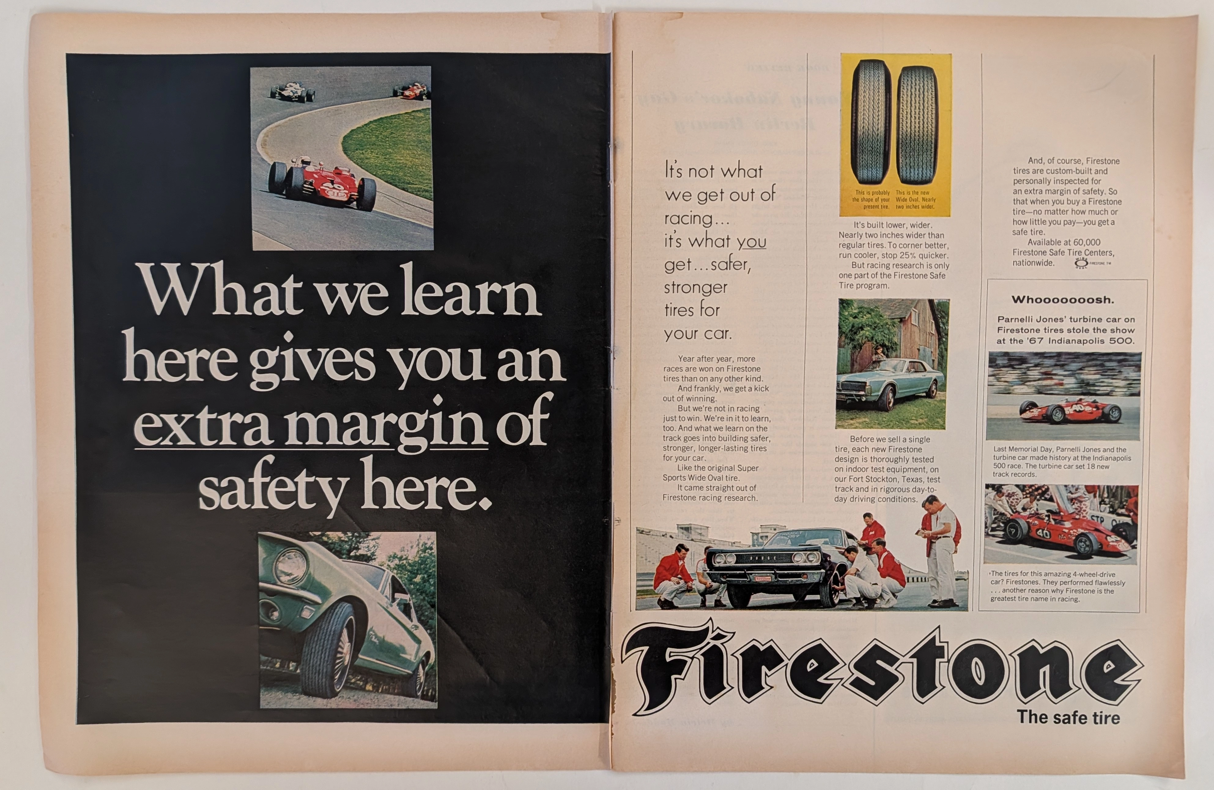
The Time Traveller's Dossier: The Firestone Margin of Safety
The symbiotic relationship between the extreme, high-stakes crucible of professional motorsport and the evolution of the daily-driven passenger automobile is one of the foundational narratives of twentieth-century industrial design. The historical artifact elegantly and securely positioned upon the analytical table of The Record Institute today is a majestic, large-format, two-page print advertisement for Firestone Tires, originating from the golden era of American automotive performance, circa 1967-1968. This document transcends the traditional boundaries of automotive consumable marketing. It operates as a highly sophisticated, multi-layered historical record, capturing the exact moment when the staggering horsepower outputs of the Detroit muscle car era necessitated a paradigm shift in tire technology. This comprehensive dossier conducts a meticulous, unyielding, and exceptionally deep examination of the artifact, operating under the absolute most rigorous parameters of historical, sociological, and material science evaluation. With an overwhelming eighty percent of our analytical focus dedicated to its historical gravity, we will decode the revolutionary introduction of the Firestone "Wide Oval" tire, analyze the critical importance of the vehicles depicted—including a Ford Mustang and a Dodge Coronet—and provide a profound biographical and mechanical analysis of the legendary racing driver Parnelli Jones and his revolutionary 1967 STP-Paxton Turbocar. Furthermore, as we venture into the chemical and physical foundations of this analog printed ephemera, we will reveal the precise mechanical fingerprints of the CMYK halftone rosettes and the graceful, natural oxidation of the paper substrate. This precise intersection of visual nostalgia, mid-century commercial artistry, and the immutable chemistry of time cultivates a serene wabi-sabi aesthetic—a natural, irreversible phenomenon that serves as the primary engine driving up its market value exponentially within the elite global spheres of Vintage Automotive Ephemera and Motorsport Memorabilia collecting.