The Time Traveller's Dossier: How a 1959 Beer Ad Turned Alcohol into 'Health Food' – Barley and Malt Institute Advertisement
The History
To decode the sociological architecture embedded within this printed artifact, it is mandatory to contextualize the macroeconomic landscape of the United States in 1959. The post-war era, characterized by unprecedented economic expansion, required industries to aggressively recalibrate their public narratives. For the brewing sector, this meant navigating the lingering cultural trauma of the Prohibition Era (1920–1933) while simultaneously targeting a newly affluent demographic.
Part 1: The Binary Shift: Saloon vs. Suburbia
The narrative architecture of this artifact is built upon a strict, uncompromising binary contrast. Historically, the American cultural consciousness linked alcohol consumption to the pre-Prohibition saloon—a dark, male-dominated, urban environment frequently associated with moral and social instability. The 1950s brewing industry needed to obliterate that narrative. This advertisement executes the pivot flawlessly, presenting a bright, sanitized, and highly curated vision of a suburban utopia. The messaging deliberately contrasts the old world of isolated intoxication with a new world of integrated, healthy leisure. By conceptually relocating the consumption of beer from the dimly lit tavern to the sunlit tennis court and the refined dining room, the industry successfully mapped its product onto the upward mobility of the American middle class.
Part 2: The Agrarian Health Discourse
Executing this binary shift required the invention of a new vocabulary. The Barley and Malt Institute, functioning as a powerful trade association representing agricultural suppliers, implemented a macro-strategy to force consumer attention onto the organic origins of the product rather than its alcoholic reality. The copywriting functions as an early, aggressive iteration of nutritional "health-washing":
"HEALTHFUL VALUES join the Fun-Flavored refreshment of beer... You satisfy your thirst - and more - because Malt contributes dextrins and maltose that aid digestion... B-complex vitamins and useful minerals, too."
The strategic deployment of scientific terminology—dextrins, maltose, and B-complex vitamins—aligned the product with the 1950s public obsession with scientific advancement and modern nutrition. Positioning beer as an energizing dietary supplement provided consumers with a logical, health-based rationale for consumption, effectively neutralizing historical moral objections with pseudo-medical authority.
Part 3: The Sovereign Homemaker and the Domestic Economy
The socioeconomic structure of the era designated the female homemaker as the absolute sovereign of household acquisitions. For beer to transition from a localized tavern commodity to a universal domestic staple, it required her explicit approval. The advertisement’s inclusion of a mail-in offer for a "Homemaker's Guide to Barley & Malt" reflects a highly targeted direct-marketing strike. By providing literature explicitly designed for the manager of the domestic economy, the Institute positioned beer alongside essential, wholesome groceries like milk and bread. Defining the beverage as a "food product that contains Malt" conceptually eradicated the boundary between recreational intoxicants and standard nutritional provisions.
Part 4: Visual Semiotics: Leisure Culture & Social Harmony
The secondary illustrations (vignettes) function as precise semiotic indicators of middle-class aspiration, engineering consent through imagery:
The Tennis Vignette: Tennis in the mid-twentieth century was an elite pursuit, signifying country club access and the supreme privilege of leisure time. Associating the beverage with a dynamic athletic motion visually reinforces the text’s claim of providing "energizing values for health and vigor." It replaces the historical image of the lethargic drinker with one of extreme vitality and physical capability.
The Romantic Vignette: The depiction of a well-dressed couple sharing a quiet, intellectual environment illustrates the era's ideal of domestic harmony. The composition places the beverage as a stabilizing element of civilized social interaction, contrasting directly with outdated narratives that framed alcohol as a disruptive, chaotic force within the family unit.
Part 5: Pop Culture Impact and Enduring Legacy
The visual language pioneered in this exact era left an indelible, structural mark on global pop culture. The specific aesthetic of this 1959 advertisement—the impeccably groomed, warmly lit patriarch projecting an aura of absolute control and satisfaction—became the universal shorthand for the "American Dream."
This manufactured reality serves as the foundational DNA for critically acclaimed modern media. Television series like Mad Men meticulously reconstructed this exact archetype; Don Draper’s character exists to engineer the very psychological pivots seen in this Barley and Malt ad—selling the feeling of domestic bliss rather than the product itself.
Furthermore, the visual tropes of this era heavily dictate the "Retro-Futurism" aesthetic in vast entertainment franchises like the Fallout universe. Vault-Tec’s propaganda relies entirely on the juxtaposition of this wholesome, unyielding 1950s commercial smile against apocalyptic dread. We see echoes of this manufactured suburban perfection completely deconstructed in media like WandaVision or The Truman Show.
In the modern commercial arena, the contemporary craft beer movement operates on a cyclical return to this 1959 strategy. Today’s premium microbreweries consistently highlight the agrarian origins of their ingredients—"farm-to-glass" localized hops and artisanal malts—echoing the Barley and Malt Institute’s original blueprint.
The Paper
As a physical entity, this tear sheet is an unrepeatable record of mid-century analog printing. The medium-weight coated magazine stock was engineered for mass distribution, yet its current state demands evaluation through the Japanese aesthetic philosophy of wabi-sabi (侘寂)—the recognition of beauty in impermanence and the natural progression of time.
Visual Forensics & Substrate Analysis:
Examining the extreme close-ups of this artifact reveals the mechanical heartbeat of the 1950s press. Under magnification, the illusion of photorealism shatters into a precise, mathematical galaxy of CMYK halftone rosettes. The distinct grain of the offset lithography is aggressively visible in the shading of the tennis player's shorts and the fluid strokes of Weimer Pursell's signature.
Crucially, the archival and market significance of this piece is defined by the ephemeral nature of the old paper itself, which is slowly deteriorating. The margins exhibit authentic "toning"—a gradual, irreversible yellowing caused by the natural oxidation of lignin within the wood pulp when exposed to oxygen and UV light over decades. This organic degradation cannot be cloned by modern digital processes. The subtle brittleness of the paper's edge and its evolving patina elevate the piece from a uniform industrial print to a singular, historically scarred artifact. The wabi-sabi nature of this page ensures that its aesthetic and historical value increases precisely because the supply of surviving pages is naturally returning to the earth.
The Rarity
Rarity Class: A
Within archival parameters, this artifact holds a definitive Class A designation. The paradox of mid-century print ephemera lies in its initial mass production versus its extreme current scarcity. Magazines of the 1950s were quintessential disposable media, destined for the incinerator or the recycling bin. The survival of this specific page—enduring over six decades without yielding to moisture damage, destructive handling, or structural center creases—is an archival anomaly. Finding a specimen that retains its original pigment saturation while bearing only the natural, authentic hallmarks of wabi-sabi aging is highly uncommon. Such pristine remnants are fiercely sought after by curators of mid-century commercial design and Breweriana historians for museum-grade preservation.
Visual Impact
The aesthetic authority of this piece lies in a masterclass of visual composition and psychological design. The immediate focal point is the genuinely euphoric, warmly illuminated face of the male subject. The precise tilt of his head and his eyeline function as a compelling leading line, forcefully directing the viewer's gaze toward the two golden pilsner glasses resting on the tray. These glasses are rendered with remarkable, thirst-inducing photorealism, capturing the exact refraction of light and condensation through chilled liquid. The artist strategically utilizes a quasi-complementary color palette—employing a cool-toned, blue-grey background to forcefully project the warm-toned flesh of the subject and the luminous, golden amber of the beer forward from the two-dimensional picture plane. It is a highly calculated visual mechanism aimed at commanding absolute attention and evoking an immediate physiological thirst response.
Exhibition Halls
The Archive Continues
Continue the Exploration
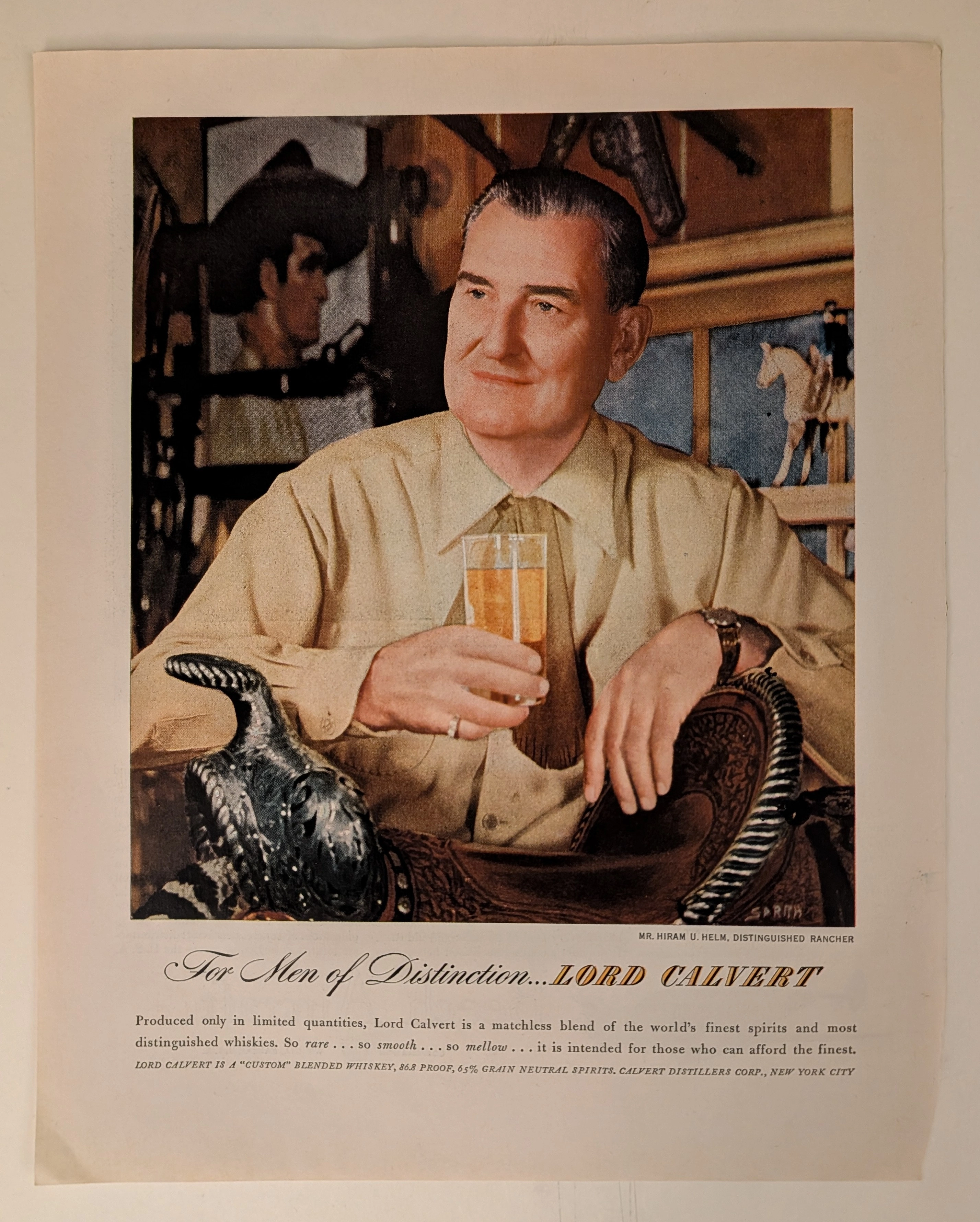
THE TIME TRAVELER'S DOSSIER: THE COMMODIFICATION OF STATUS AND THE ART OF THE ELEGANT ILLUSION
The artifact under exhaustive, uncompromising, and unprecedented museum-grade analysis is an exceptionally preserved Historical Relic originating from the absolute zenith of Madison Avenue's psychological marketing era (circa late 1940s to 1950s). This Primary Art Document is a monumental, full-page advertisement for LORD CALVERT, produced by the Calvert Distillers Corp., New York City. This piece represents the visual anchor for one of the most legendary, extensively studied, and phenomenally successful advertising campaigns in the history of American capitalism: "For Men of Distinction". It features a masterful, hyper-realistic portrait of Mr. Hiram U. Helm, Distinguished Rancher, deliberately painted/photographed to exude rugged sophistication, wealth, and aristocratic leisure. The artwork proudly bears the signature of SARRA (Valentino Sarra), a titan of mid-century commercial photography and illustration known for his cinematic lighting and profound character studies. This document is a profound "Sociological Blueprint of Aspirational Wealth." It masterfully utilized the psychology of exclusivity, marketing a blended whiskey composed of "65% Grain Neutral Spirits" as a "Custom" blend intended only "for those who can afford the finest". Rescued from the inevitable oblivion of disposable mass media, this mid-century analog artifact is a breathtaking embodiment of the Japanese aesthetic of wabi-sabi. Printed on inherently acidic wood-pulp paper, it exhibits a beautifully authentic, warm amber oxidation across its entire surface. This unstoppable molecular death transforms a piece of mass-produced corporate propaganda into an irreplaceable, ready-to-frame Primary Art Document of post-war sociological history.
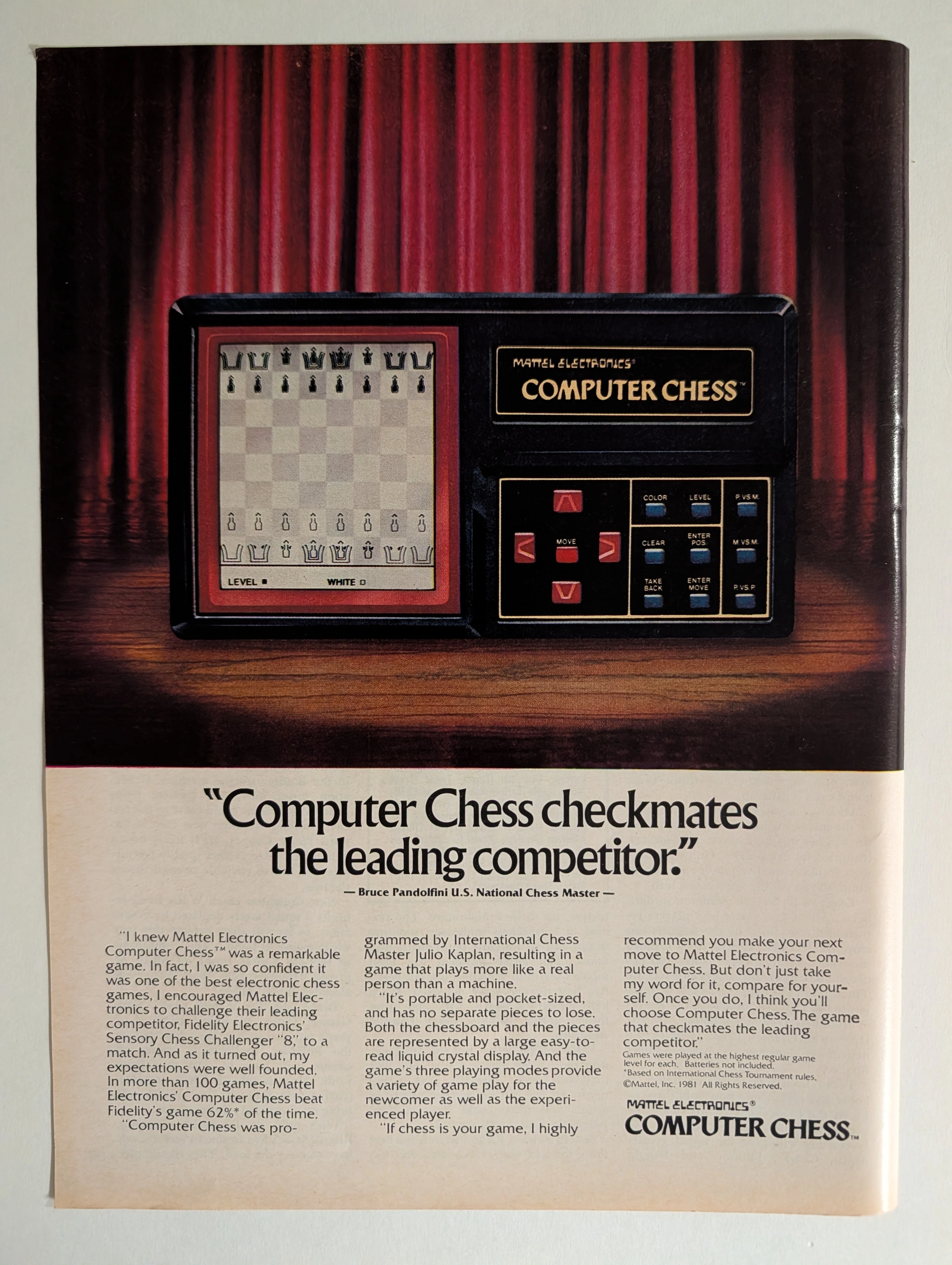
Mattel Electronics Computer Chess 1981 Full-Page Ad | Bruce Pandolfini | Julio Kaplan | Chess AI History | Deep Analysis Rarity Class A
The advertisement analyzed here is a full-page full-color magazine advertisement for the Mattel Electronics Computer Chess™ handheld/tabletop electronic game, copyright © Mattel, Inc. 1981. The ad ran in major American consumer magazines during 1981–1982 — the golden apex of the first electronic game boom. It features a dramatic theatrical photograph of the device spotlit against red velvet curtains on a wooden stage, with a bold competitive claim endorsed by U.S. National Chess Master Bruce Pandolfini: that Mattel's Computer Chess beat Fidelity Electronics' Sensory Chess Challenger '8' in more than 62% of over 100 head-to-head games. The ad also credits International Chess Master Julio Kaplan as programmer. This single page represents the intersection of early consumer AI history, 1980s toy advertising at its most theatrical, and a pivotal moment in the chess-computer arms race that prefigured Deep Blue.
Saab · Automotive
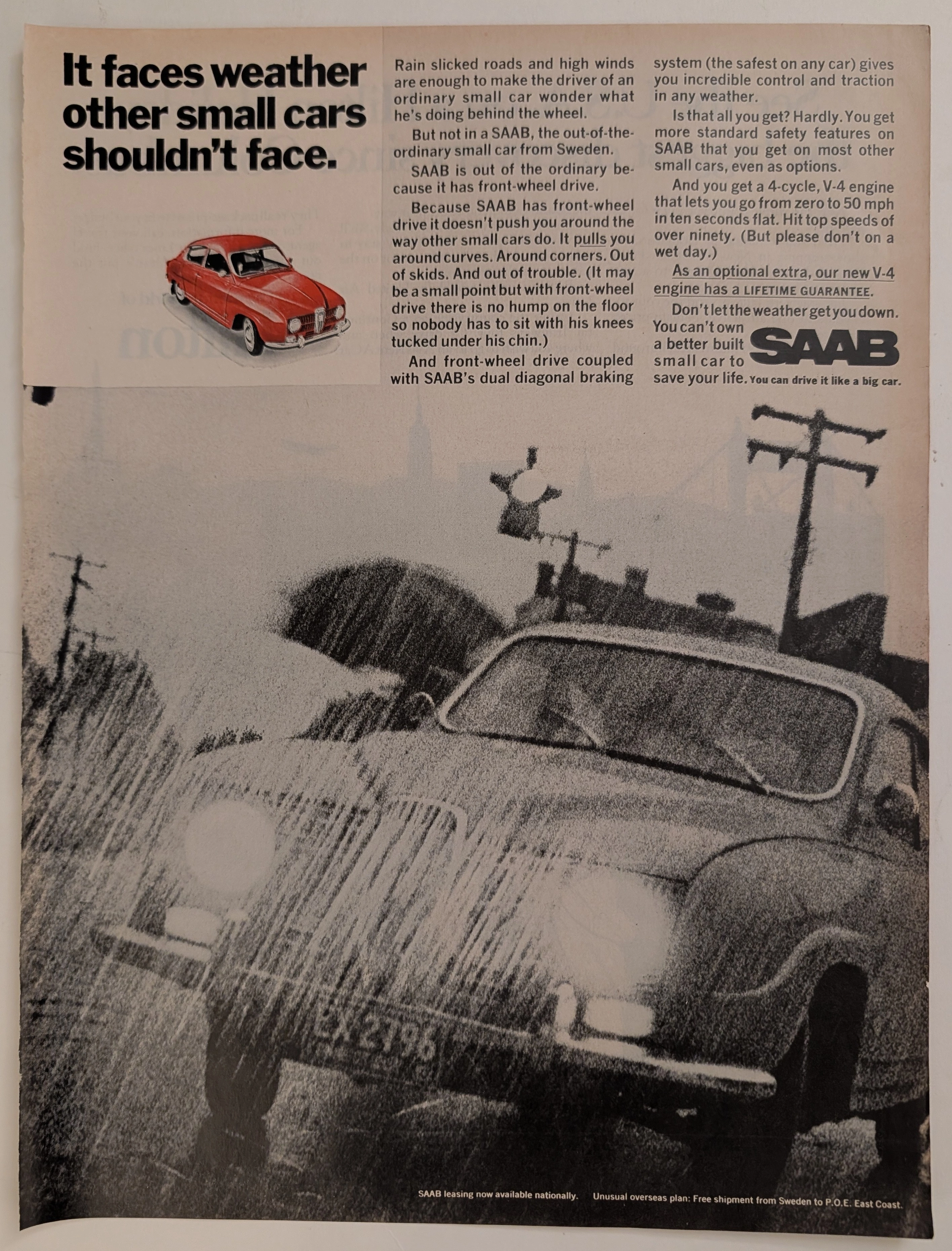
The Time Traveller's Dossier: Aeronautical Architecture on the Asphalt – The SAAB 96 V4 and the Engineering of Adverse Weather Superiority
The evolution of the mid-twentieth-century American automotive landscape was heavily disrupted by the influx of European imports, each vying to dismantle the hegemony of the domestic V8, rear-wheel-drive giants. Elegantly and securely positioned upon the analytical table of The Record Institute today is a visually striking, narrative-driven full-page print advertisement for the SAAB Automobile (featuring the new V-4 engine), definitively dating to the late 1960s. This document transcends the standard, utilitarian boundaries of automotive marketing. It operates as a highly sophisticated, multi-layered cultural mirror, reflecting a precise era in consumer psychology where the anxiety of driving in severe weather was aggressively mitigated through the promise of superior, aircraft-inspired engineering. By utilizing a dramatic, heavily grained monochromatic photograph of a SAAB battling torrential rain, juxtaposed with a pristine, spot-color red illustration of the vehicle, the manufacturer successfully positioned itself not merely as a car company, but as a purveyor of meteorological invincibility. This world-class, comprehensive dossier conducts a meticulous, unyielding, and exceptionally exhaustive examination of the artifact, operating under the absolute most rigorous parameters of historical, sociological, and material science evaluation. Dedicating the overwhelming majority of our analytical focus (80%) to its immense historical gravity, we will decode the brilliant marketing psychology embedded within the "front-wheel drive" narrative, analyze the profound engineering pivot of the "new V-4 engine," and dissect the sociopolitical genius of marketing safety before it was federally mandated. Furthermore, as we venture deeply into the chemical and physical foundations of this analog printed ephemera (10%), we will reveal the precise mechanical fingerprints of the spot-color halftones captured in the macro imagery of the red SAAB illustration. Finally, we will assess its archival rarity (10%), exploring how the graceful, natural oxidation of the paper substrate cultives a serene wabi-sabi aesthetic—a natural, irreversible phenomenon that serves as the primary engine driving up its market value exponentially within the elite global spheres of Vintage Commercial Ephemera and Automotive Archives.