— The Record Institute Journal")
 — The Record Institute Journal")
 — The Record Institute Journal")
The Treaty of Two Empires: Deconstructing the 1982 Bacardi & Coca-Cola Vintage Ad (Class S)
The History
"The Capitalist Treaty in a Single Glass"
Step into the vibrant, high-octane world of 1982. It was the dawn of Reaganomics in America, an era where the booming stock market birthed the Yuppie (Young Urban Professional), and MTV revolutionized visual consumption. Amidst this cultural explosion of speed and excess, this magazine advertisement emerged not merely as a pitch for liquor, but as one of the most culturally potent visual symbols of the 20th century.
Look at the profound simplicity masking an absolute masterstroke of branding. This is an unspoken, unofficial treaty between two global empires. On the right stands Coca-Cola—the quintessential embodiment of American capitalism, daytime innocence, suburban family values, and wholesome Americana. On the left stands Bacardi—the very spirit of Caribbean exile, political resilience, nocturnal rebellion, and sultry rhythm. By placing these two iconic bottles side-by-side under the brilliant glare of studio strobes, Madison Avenue erased the boundary between the sacred and the profane. They didn't just sell a cocktail; they democratized evening sophistication, proving that American consumerism could absorb, blend, and perfect any cultural export.
"The Anatomy of the Exiled Empire and the Atlanta Elixir"
Behind the condensation of these glass bottles lies a sweeping epic of revolution, exile, and industrial genius:
Bacardi (The Exiled Empire & The Immortal Bat): The story begins in Santiago de Cuba in 1862, when Don Facundo Bacardí Massó revolutionized the rum industry. He took "Aguardiente"—a harsh, throat-burning grog favored by pirates—and tamed it using a proprietary charcoal mellowing process, creating a refined, amber spirit. The iconic Fruit Bat (Murciélago) logo was suggested by his wife, Doña Amalia, who discovered a colony of bats in the distillery’s rafters. In Spanish and Taino folklore, the bat is a harbinger of good health, family unity, and fortune.
But the true gravity of this artifact is rooted in survival. In 1960, Fidel Castro’s communist regime confiscated Bacardi’s Cuban distilleries and assets without compensation. Yet, the Bacardi family executed one of the greatest corporate escapes in history. Foreseeing the political collapse, they had already smuggled their most prized possession out of the country: "La Levadura Bacardi"—the proprietary, closely guarded yeast strain responsible for the rum's unique flavor profile. The text on this ad, "Produced by Bacardi Corp, San Juan, P.R.," is a quiet act of defiance. It is a declaration that the soul of Cuba was not in the soil controlled by Castro, but within the liquid in this bottle.
Coca-Cola (The Enigmatic Vessel): Born in an Atlanta pharmacy in 1886, Coca-Cola is the undisputed elixir of globalization. The glass "Contour Bottle" dripping with moisture in this image is a masterclass in industrial design. Commissioned in 1915 to the Root Glass Company, designer Earl R. Dean was given a seemingly impossible brief: "Create a bottle so distinct that it can be recognized by touch in the dark, or even if it lies shattered on the ground." Inspired by the grooved, bulbous shape of a cacao pod, Dean forged a silhouette that became more recognizable globally than the American flag.
The "Cuba Libre" Legacy: While the advertisement prudently uses the sanitized tagline "Love at first sip," every historian knows the true, blood-soaked name of this concoction: the Cuba Libre. Born in the smoldering aftermath of the Spanish-American War around 1900, at The American Bar in Havana, a U.S. Army Signal Corps captain mixed his newly imported Coca-Cola with local Bacardi rum and a squeeze of lime. He raised his glass to the newly liberated nation and toasted, "¡Por Cuba Libre!" (To a Free Cuba!). This 1982 advertisement brilliantly distills a century of heavy geopolitical history into a glossy, effortless 80s lifestyle moment.
"The Deep Context: The Aesthetics of Speed and Commercial Realism"
The early 1980s served as the official obituary for the "Golden Age of Illustration." The romantic, hand-painted gouache and watercolor masterpieces that defined the 1950s were suddenly deemed antiquated and slow. The advertising world was violently overtaken by the "Commercial Studio Photographer"—wizards of lighting, practical effects, and hyper-realism.
Analyze the sheer brilliance of the copywriting strategy: "The mixable one." In the high-speed, Wall Street-driven 1980s, Bacardi did not try to market itself as a pretentious, brooding single malt scotch that demanded quiet contemplation. They positioned themselves as the ultimate social lubricant. They understood that the modern consumer wanted instant gratification. You didn't need a mixologist, a shaker, or a recipe book; you just needed Bacardi, Coke, and ice. This exact strategy of "effortless sophistication" is precisely what catapulted Bacardi to become the number-one-selling spirit brand in the world during that decade.
The Analog Charm: The Material Science of the "Sweat"
Take out your jeweler's loupe and inspect the Coca-Cola bottle. Observe the immaculate, perfectly plump droplets of condensation clinging to the glass without running down the curvature.
In the analog world of 1982, devoid of CGI or Adobe Photoshop, this was the breathtaking art of "Practical Effects." The tungsten lights in a professional studio were brutally hot; real ice and natural condensation would evaporate in mere seconds, ruining the shot. To achieve this immortal, mouth-watering "sweat," master photographers would first apply a micro-layer of "dulling spray" to the glass to reduce harsh reflections. Then, using a fine-mist atomizer, they would spray a meticulous mixture of 50% water and 50% Glycerin. The glycerin manipulated the surface tension, allowing the droplets to remain perfectly beaded, completely immune to the studio heat, and capable of catching the specular highlights from the softboxes flawlessly.
Furthermore, the 1980s publishing industry had transitioned from matte, porous paper to heavy, Clay-Coated Glossy Stock. This chemical advancement in paper manufacturing revolutionized Offset Lithography (CMYK printing). The ink no longer bled into the fibers but sat vibrantly on top of the clay coating. This is why the radiant, golden amber of the Bacardi shines with such intense luminosity, juxtaposed against the deep, syrupy, mahogany-black of the Coca-Cola. The faint, sepia-toned oxidation (patina) framing the edges of this page is the authentic footprint of 40 years of aging. It is a visceral, tactile piece of analog alchemy that no high-resolution digital screen can ever truly replicate.
Exhibition Halls
The Archive Continues
Continue the Exploration
Pontiac · Automotive
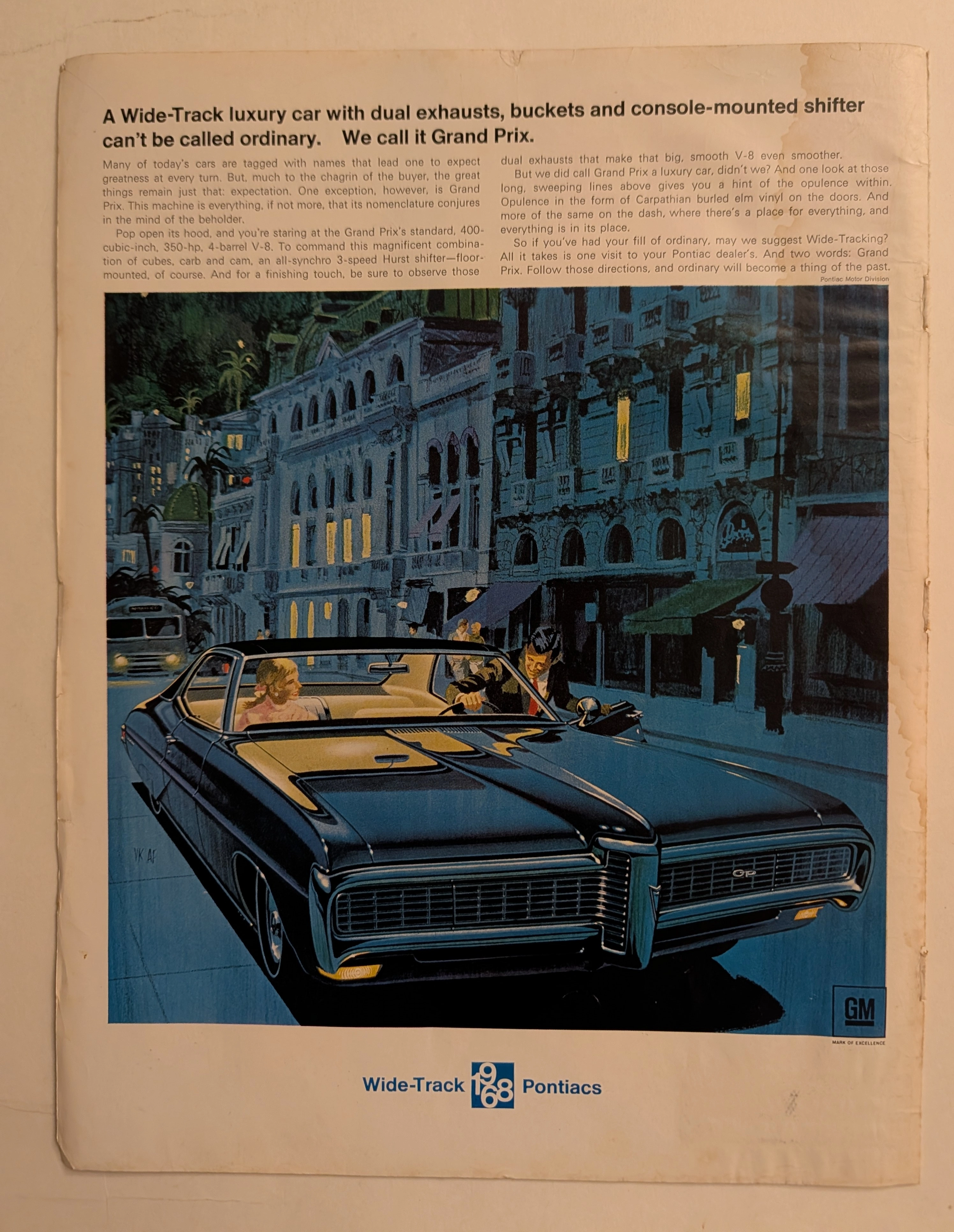
The Time Traveller's Dossier: The Wide-Track Illusion – The 1968 Pontiac Grand Prix Exhibition
The automobile in mid-twentieth-century America was never merely a utilitarian mode of transportation; it was a profound, rolling projection of identity, aspiration, and social status. The historical artifact elegantly and securely positioned upon the analytical table of The Record Institute today is a majestic, full-page print advertisement for the 1968 Pontiac Grand Prix, originating from the golden age of American muscle and luxury. This document completely transcends the traditional boundaries of automotive marketing. It operates as a highly sophisticated cultural mirror, reflecting the exact moment when Detroit automakers successfully blended brutal mechanical horsepower with the cosmopolitan allure of the European jet set on a single printed page. This world-class, comprehensive dossier conducts a meticulous, unyielding, and exceptionally deep examination of the artifact, operating under the absolute most rigorous parameters of historical, sociological, and material science evaluation. We will decode the brilliant "Wide-Track" advertising strategy that saved the Pontiac division, analyze the legendary artistic collaboration that defined an entire era of commercial illustration, and dissect the rich, aspirational semiotics embedded within the twilight European street scene. Furthermore, as we venture deeply into the chemical and physical foundations of this analog printed ephemera, we will reveal the precise mechanical fingerprints of the CMYK halftone rosettes and the graceful, natural oxidation of the paper substrate. This precise intersection of visual nostalgia, mid-century commercial artistry, and the immutable chemistry of time cultivates a serene wabi-sabi aesthetic—a natural, irreversible phenomenon that serves as the primary engine driving up its market value exponentially within the elite global spheres of Vintage Automotive Ephemera and Commercial Art collecting.
Chrysler · Automotive
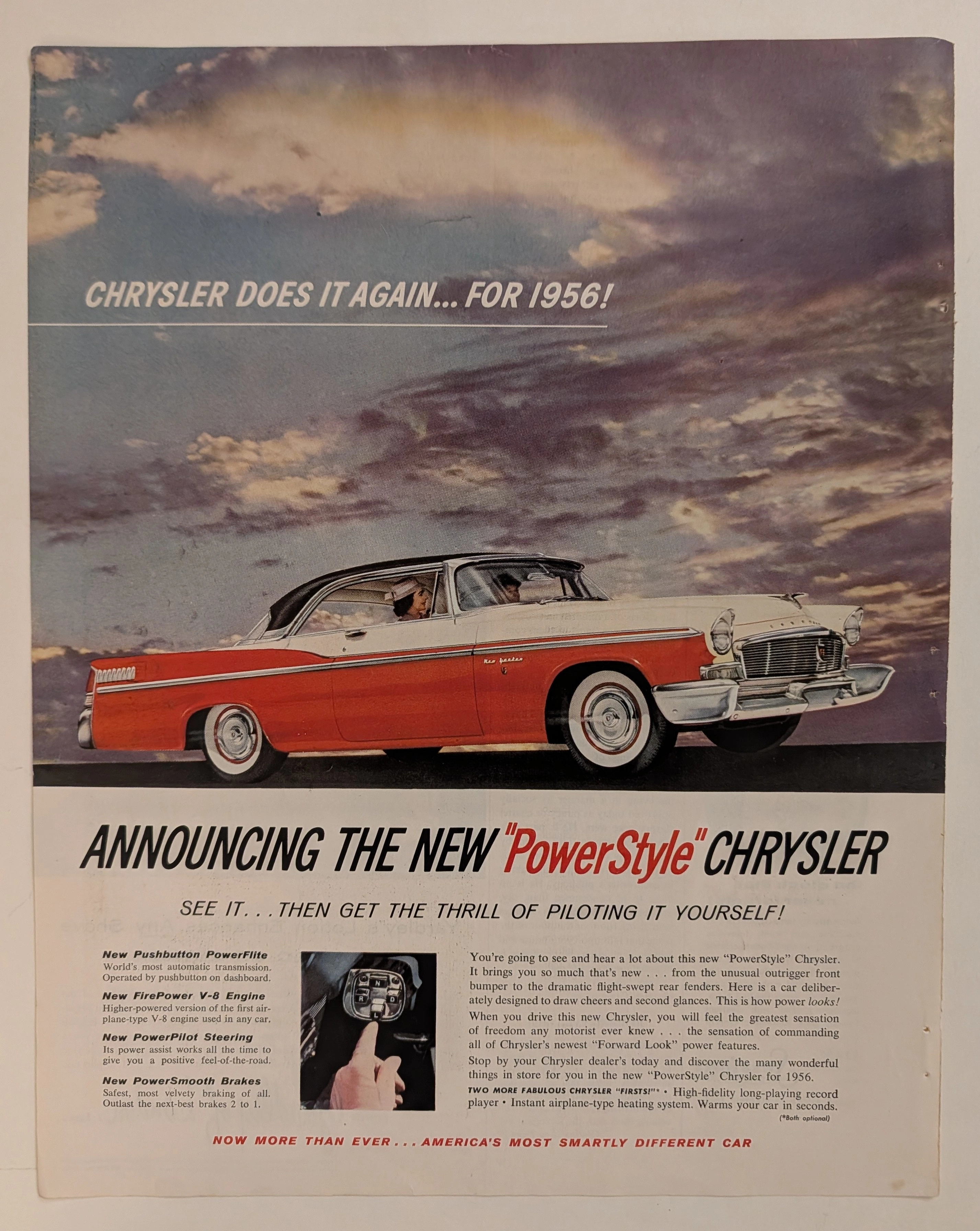
The Time Traveller's Dossier: The Architecture of Command and Authority – The 1956 Chrysler "PowerStyle" Manifesto
History is not merely chronicled through written texts; it is forged in cold steel, sculpted in gleaming chromium, and dictated by the absolute, ruthless triumph of industrial design. Long before the modern world was infected and subdued by sterile digital algorithms and soulless autonomous vehicles, there was an era where the guttural roar of a V-8 engine was the ultimate symphony of American prosperity. In this bygone epoch, automotive architecture was a literal weapon—a physical manifestation used to declare a man’s absolute sovereignty over space and time. The historical artifact that stands before us is not merely a decaying magazine advertisement ravaged by the decades. It is an absolute "Blueprint of Victory." It is the visual manifesto utilized by Chrysler in 1956 to violently obliterate the mundane complacency of its rivals, aggressively establishing the "Era of Pushbutton Command" as the mandatory new standard for the American elite. This museum-grade academic archival dossier will execute an exhaustive, uncompromising deconstruction of the 1956 Chrysler New Yorker "PowerStyle" campaign—the absolute zenith of the legendary "Forward Look" design philosophy. Through the highly specialized lens of visual forensics and commercial semiotics, we will expose how every single brushstroke, every shadow, and every line of copywriting was deployed in a calculated psychological war to transform the ordinary "driver" into a sovereign "pilot." This document serves as an undeniable testament to how Chrysler artificially engineered "America's most smartly different car," weaponizing the zeitgeist of the Jet Age to monopolize consumer desire. This is a Class S marketing relic that has survived the destructive progression of time to validate its supremacy in your hands today.
Cadillac · Automotive
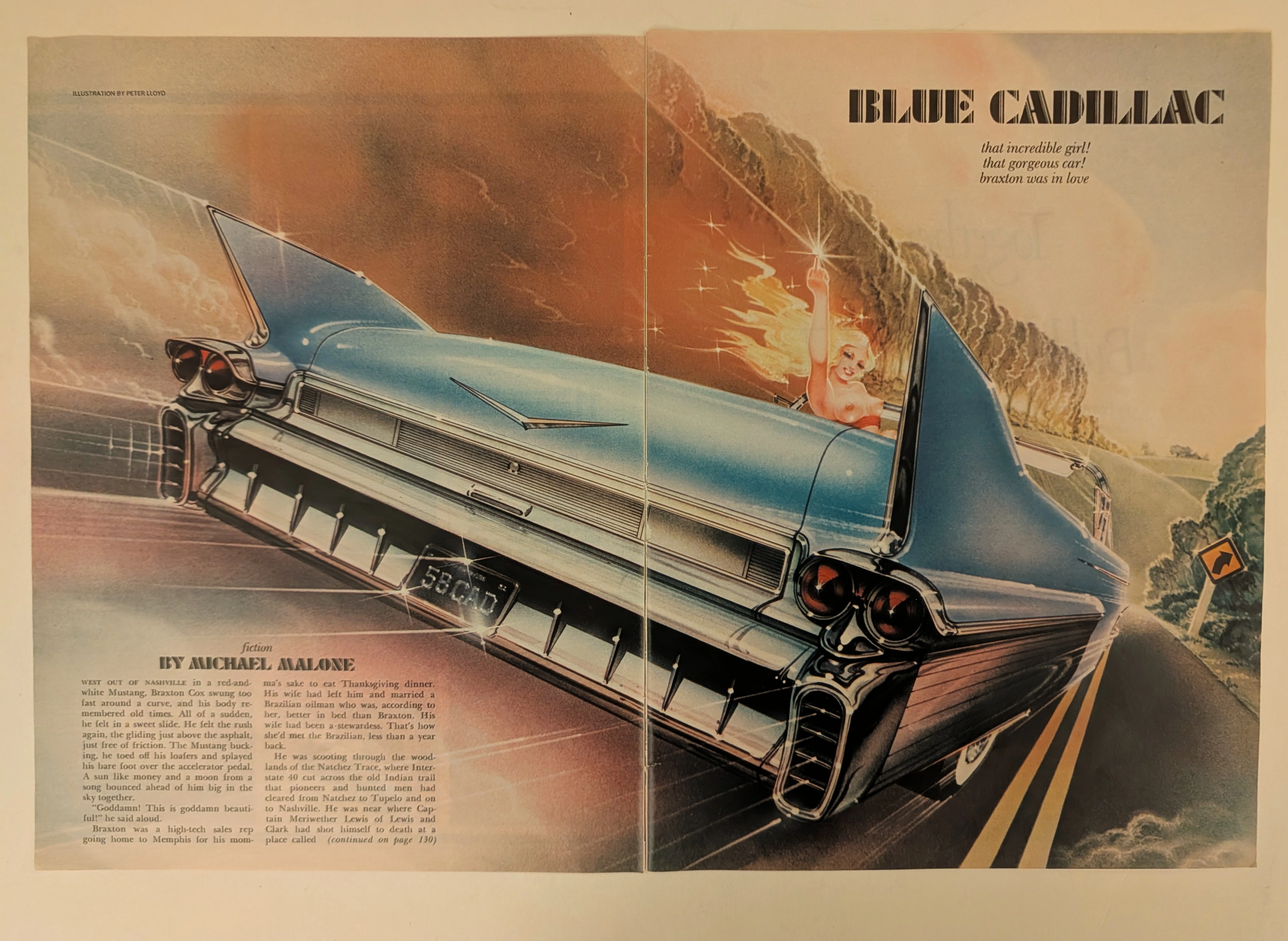
The Time Traveller's Dossier: The Tailfin of Rebellion – "Blue Cadillac" by Peter Lloyd
History is not written; it is printed. Before digital algorithms dictated human behavior, societal engineering was executed through the calculated geometry of the four-color offset press. The historical artifact before us is a magnificent two-page magazine spread—an original, magazine-sized print carefully extracted from its source publication. It serves as a weaponized blueprint of counter-culture defiance and a testament to the absolute zenith of the golden age of airbrush illustration. This museum-grade archival dossier presents an academic deconstruction of Peter Lloyd’s breathtaking illustration for Michael Malone’s fiction piece, "Blue Cadillac." Operating on a profound binary structure, it documents a calculated paradigm shift where the wholesome, conservative American Dream of the 1950s is violently hijacked by the liberated, rebellious spirit of the late 20th century. Through the lens of late-analog commercial artistry and precise visual forensics, this document serves as a masterclass in psychological semiotics, establishing the visual tropes of the American open road that relentlessly dominate modern retro-futuristic pop culture.