THE TIME TRAVELER'S DOSSIER: THE KOREAN WAR ANCHOR AND THE SCARCITY OF LUXURY
The History
[ PART I: THE KOREAN WAR ANCHOR AND THE SCARCITY OF LUXURY ]
Welcome to the hushed, heavily guarded vaults of American industrial royalty. To merely glance at this document is a severe dereliction of curatorial duty; one must forensically interrogate it. At first glance, this advertisement appears to be a standard, albeit highly opulent, promotion for a luxury automobile. However, the true historical gravity of this artifact is hidden in plain sight, tucked away in the unassuming, capitalized fine print at the bottom left corner.
Direct your analytical focus to the text: "WHITE SIDEWALLS WHEN AVAILABLE".
This single, five-word sentence is the ultimate historical timestamp. It instantly transports us out of the realm of abstract advertising and slams us into the geopolitical reality of the early 1950s. During the Korean War (1950-1953), the United States government, via the National Production Authority (NPA), imposed severe restrictions on civilian access to critical wartime materials. Natural rubber and titanium dioxide (the pigment required to make tires bright white) were strictly rationed for the military effort. Consequently, the production of iconic white sidewall tires—the absolute prerequisite for any respectable luxury car of the era—was federally banned or severely limited.
By printing this disclaimer, Chrysler was not just making an excuse; they were documenting a global crisis. They were telling the wealthiest citizens of America that despite their immense capital, despite being able to afford the "Finest Car America Has Yet Produced!", they still had to bow to the realities of a nation at war. This transforms the advertisement from a mere piece of commercial propaganda into a profound Primary Art Document of sociological and wartime history.
[ PART II: THE PSYCHOLOGICAL ARCHITECTURE OF AMERICAN ARISTOCRACY ]
The United States of America was founded on the violent rejection of monarchy. Yet, the psychological architecture of this advertisement demonstrates a chilling, brilliant paradox: the American elite's desperate, unyielding hunger for royal validation.
Examine the upper hemisphere of the artifact. Before the viewer even registers the automobile, they are assaulted by the iconography of kings and queens. The physical crown, resting upon white ermine fur—the traditional heraldic symbol of sovereignty—is a blatant appeal to old-world European aristocracy. The single, hyper-realistic red rose laid across the tricolor ribbon acts as a symbol of romanticized nobility and exclusivity.
Then, hover your gaze over the meticulously illustrated jeweled Imperial emblem. The artist has rendered every individual diamond, ruby, and gold facet of the crown and the stylized eagle/V-wings with microscopic precision. This is "Social Engineering" at its most potent. Chrysler was locked in a brutal war for high-society dominance against Cadillac and Lincoln. By explicitly using the word "Imperial" in an elegant, sweeping script, and pairing it with literal crowns, Chrysler bypassed rational engineering arguments and attacked the consumer's ego directly. They were not selling a machine; they were selling a knighthood.
[ PART III: THE COPYWRITING — SNOBBERY AS A WEAPON ]
The copywriting in the center of the page is a masterclass in weaponized snobbery and exclusionary marketing. Let us dissect the text line by line.
"You have heard the admiration in the voices of your friends as they spoke of it...". Immediately, the ad establishes social proof. It relies on the assumption that the reader exists within an elite echo chamber where everyone is already discussing this specific vehicle.
"But only after you, yourself, have driven and experienced the Chrysler Imperial's matchless performance will you understand why it is becoming the first choice among the discriminating...". The use of the word "discriminating" is a highly calculated socio-economic dog whistle. It implies that only those with superior taste, breeding, and intellect can truly appreciate the vehicle. Furthermore, the phrase "matchless performance" is a clandestine, heavily veiled reference to the greatest engineering triumph of the era. In 1951, Chrysler introduced the legendary 331 cubic-inch "FirePower" V8 engine—the very first generation of the mythical Hemi. While the ad portrays a serene, aristocratic carriage, underneath the hood of that green hardtop lurked a monstrous, world-beating powerplant that would soon dominate international racing. The ad whispers of luxury but conceals a drag racer's heart.
The paragraph delivers its final, lethal blow: "More and more, those who can afford any motor car in the world, choose the Imperial by Chrysler.". Notice the italicization of the word "any". This is supreme, hegemonic arrogance. It challenges the millionaires. It tells them: You could buy a Rolls-Royce, you could buy a Bentley, but if you truly understand power and prestige, you will buy this.
[ PART IV: FORENSIC ICONOGRAPHY AND MACRO DETAILS ]
At The Record, our curatorial eye misses nothing. The extreme focal points of the vehicle itself reveal the transitional nature of automotive design in the early 1950s.
Direct your attention to the macro-crop of the hood. The front end is dominated by a massive, imposing chrome grille, affectionately known by historians as the "egg-crate" or "waterfall" grille. The artist has perfectly captured the heavy, reflective gleam of the chrome bars. Above it, resting proudly on the deep green hood, is the V-shaped emblem with a subtle gold center, and right beside it, the delicate, almost microscopic silver script reading "Chrysler".
This is a critical detail. In just a few short years (1955), "Imperial" would be spun off into its own distinct, standalone marque, completely dropping the "Chrysler" name to compete directly with Cadillac. This artifact captures the exact historical moment before that divorce—it is still proudly an "Imperial BY CHRYSLER". The deep Forest Green paint job on the 2-door hardtop body (the "Newport" style) reflects the conservative, "old money" aesthetics of the early 50s, standing in stark contrast to the wild, neon tail-fin era that would explode later in the decade.
The Paper
The physical medium of this artifact is just as historically profound as the ink printed upon it. We must maintain absolute, uncompromising reverence for the inevitable, tragic beauty of analog destruction.
Examine the extreme right edge of the entire canvas. You will notice a jagged, uneven, beautifully violent tear running vertically from top to bottom. Amateurs and sterile perfectionists might view this as a flaw or damage. At The Record, we view this as the "Scar of Liberation." It is the physical, forensic proof that this thick, high-quality periodical page was forcefully and purposefully ripped from the binding of a heavy, original 1950s mass-market magazine. It was rescued from an incinerator or a landfill by someone who recognized its artistic value decades ago.
Furthermore, observe the surface of the paper itself. Over more than 70 years, ambient oxygen and ultraviolet light have waged a relentless chemical war against the paper's inherent lignin. This irreversible oxidation process has birthed a magnificent, undeniable "patina." What was once a sterile, bright white background has gracefully degraded into a deep, warm, toasted Antique Ivory. The rich green of the car and the crimson of the velvet crown have sunken deeply into the porous fibers, adopting a soft, matte finish that modern glossy screens cannot replicate.
This is the profound Japanese aesthetic of wabi-sabi—the spiritual realization of finding absolute perfection in impermanence, flaw, and decay. This paper is quietly, literally burning itself alive at a molecular level. Its slow, majestic, and irreversible death is precisely what transfigures it from a disposable piece of mid-century corporate marketing into an immortal piece of Primary Art.
The Rarity
To understand the immense, almost incalculable valuation of this artifact, you must comprehend the brutal reality of ephemera survival from the early 1950s. The post-war era was a time of rapid consumption and disposal. Magazines were read and immediately thrown away.
The statistical probability of a full-page, highly detailed Chrysler Imperial advertisement surviving over seven decades with its colors so vividly saturated, its typography perfectly intact, and its historical "White Sidewall" context preserved is staggeringly, miraculously low.
When you fuse this extreme, pristine physical scarcity with the monumental historical presence of the Korean War rubber shortage, the clandestine birth of the mighty Hemi V8, the explicit sociological signaling of American royalty, and the breathtaking wabi-sabi degradation of its paper stock, this artifact unequivocally commands the highly prestigious Rarity Class A designation. It has evolved far beyond a disposable piece of vintage commercial advertising. It is a highly coveted Historical Relic, a museum-grade testament to mid-century American capitalism and geopolitical reality, demanding to be framed and fiercely protected by an alpha curator who understands the heavy, beautiful, and irreplaceable weight of automotive history.
Visual Impact
The Visual Impact of this extraordinary vertical canvas is a masterclass in psychological manipulation and aristocratic signaling. The architectural layout abandons the typical action-oriented car advertisements of the era; instead, it demands quiet, breathless reverence. The background is a vast, ethereal expanse of pale, warm ivory—a deliberate choice to evoke the walls of a high-society art gallery or the interior of a royal vault.
The upper hemisphere is dominated not by machinery, but by the ultimate symbols of absolute monarchy. A plush, crimson velvet crown rests upon an ermine-trimmed pillow, accompanied by a single, flawless red rose draped over a tricolor ribbon. Hovering below this organic still-life is the meticulously rendered, bejeweled Imperial crown and eagle emblem. This heavy, golden iconography forces the viewer to associate the brand with untouchable European royalty before they even look at the vehicle.
In the lower hemisphere, the Imperial by Chrysler (specifically the Newport 2-door hardtop configuration) is presented in a deeply saturated, aristocratic Forest Green. The car is not moving; it is positioned as a static monument to American industrial wealth. The contrast between the rich green of the coachwork, the vibrant red of the rose and crown, and the oxidized ivory paper creates a three-dimensional depth that is visually arresting. The torn right edge of the page serves as a violent, physical frame—a reminder of its extraction from the real world into the archive.
The Archive Continues
Continue the Exploration
Ballantine · Beverage
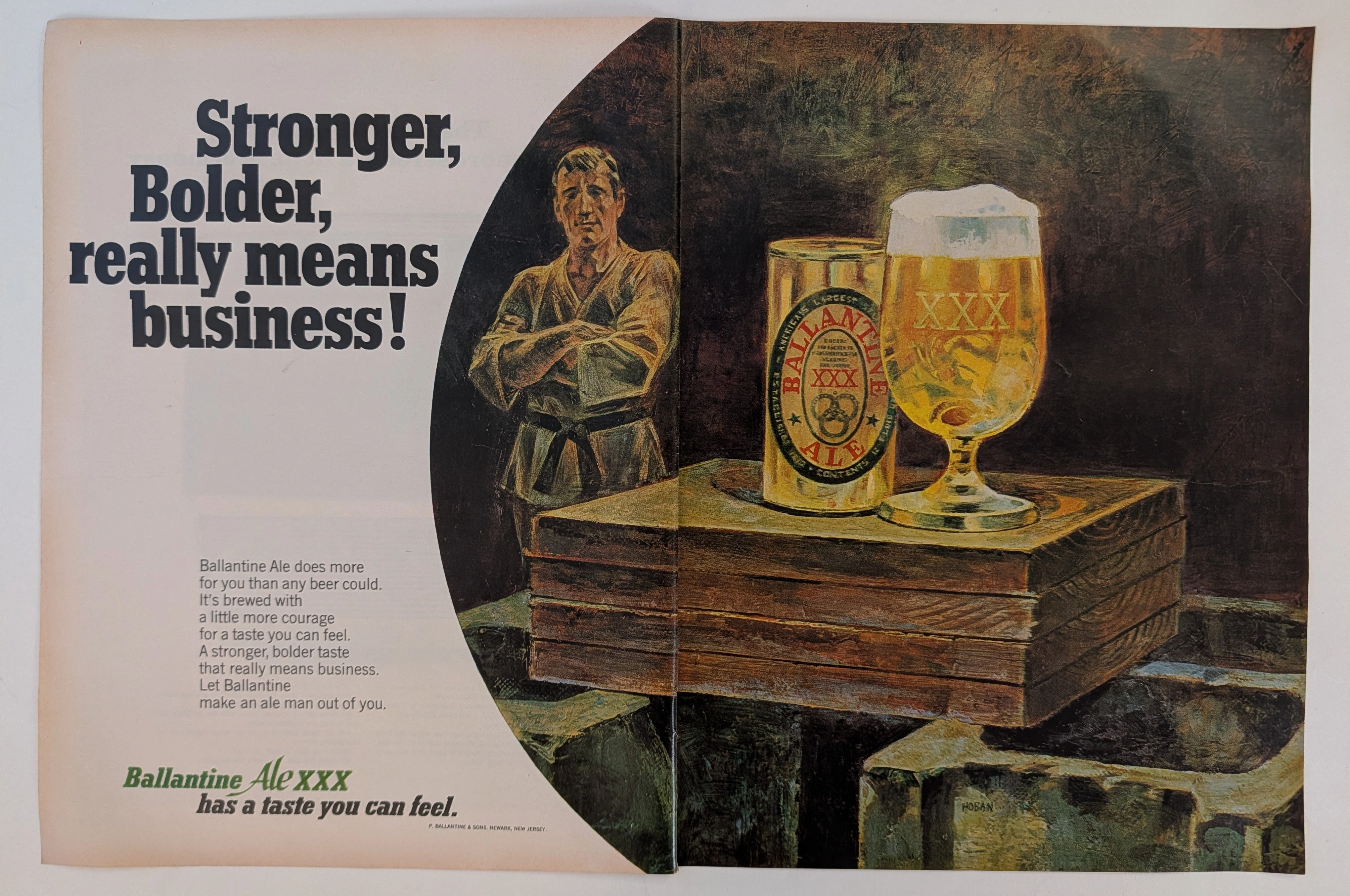
The Time Traveller's Dossier: The Martial Authority of the Brew – An Academic Archival Analysis of the 1968 Ballantine Ale Advertisement
The cultivation of brand identity through visual symbolism is a profound psychological discipline, acting as a mirror to the cultural aspirations of its era. The historical artifact elegantly positioned upon the analytical table of The Record Institute today is a majestic two-page print advertisement for Ballantine Ale, originating from approximately 1968. This document completely transcends the boundaries of conventional beverage promotion; it stands as a masterclass in the semiotics of mid-twentieth-century American masculinity. By seamlessly aligning the consumption of a traditional ale with the disciplined, formidable imagery of a martial arts master, the advertisement constructs a compelling narrative of strength, boldness, and unyielding character. This world-class, comprehensive academic archival dossier will conduct a meticulous and deep examination of the artifact, operating under the most rigorous parameters of historical and material science evaluation. We will decode the strategic copywriting that challenges the consumer to embrace a "stronger, bolder taste," and illuminate the profound historical lineage of the P. Ballantine & Sons brewing empire. Furthermore, as we venture into the chemical and physical foundations of this analog offset lithography, we will reveal the mechanical fingerprints of the halftone rosettes and the graceful, natural oxidation of the paper substrate. This precise intersection of visual nostalgia, mid-century commercial artistry, and the chemistry of time cultivates a serene wabi-sabi aesthetic—a natural phenomenon that serves as the primary engine driving up its market value exponentially within the elite global spheres of Vintage Breweriana collecting.
Polaroid · Technology
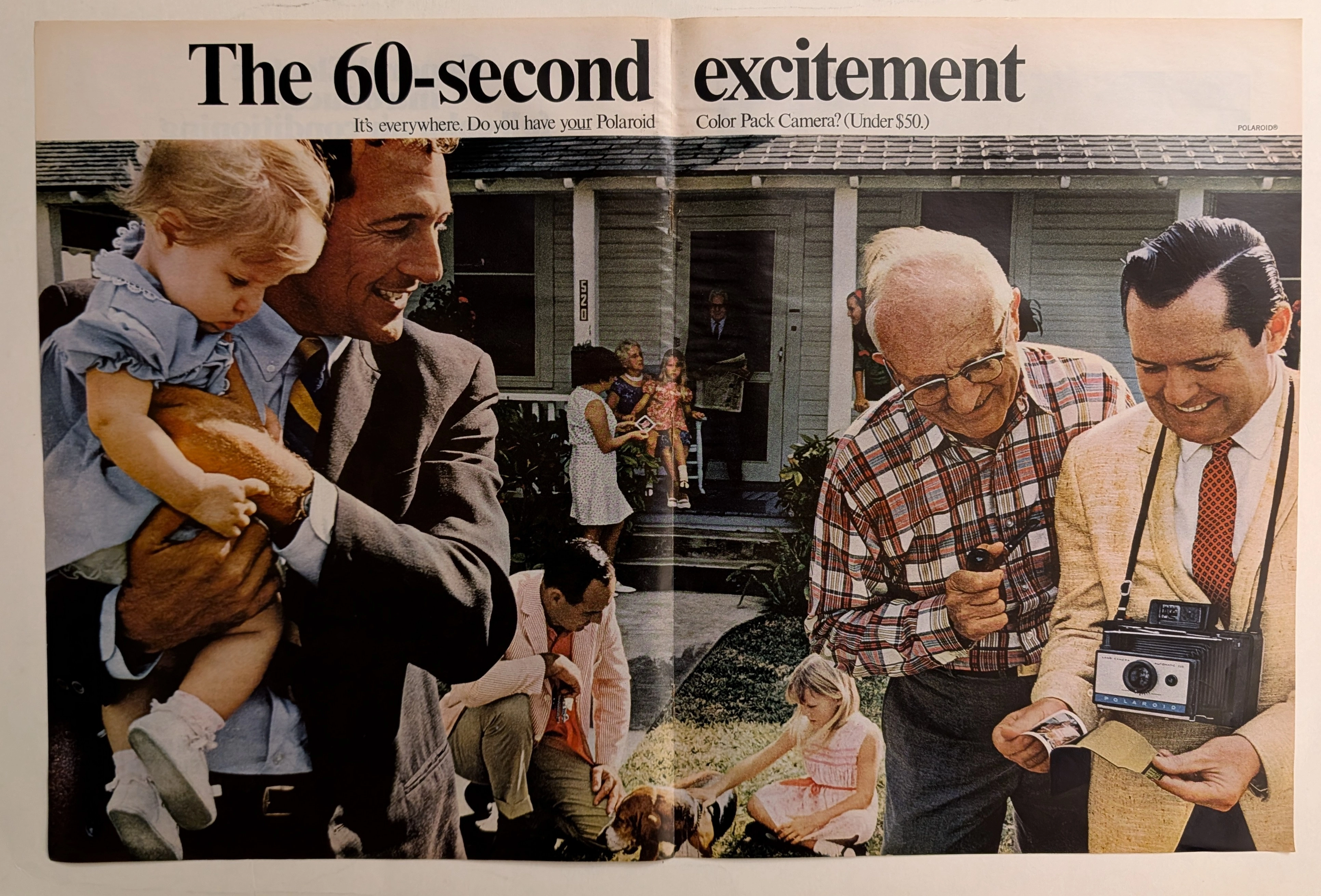
The Time Traveller's Dossier: The Instant Gratification Protocol – The Polaroid Color Pack Camera Exhibitio
The evolution of photography from a delayed, solitary, and highly technical chemical process into an instantaneous, shared, and interactive social event stands as one of the most profound technological and sociological shifts of the twentieth century. The historical artifact securely and elegantly positioned upon the analytical table of The Record Institute today is a majestic, large-format, two-page print advertisement for the Polaroid Color Pack Camera (Automatic 210), originating from the cultural zenith of the late 1960s. This document completely transcends the traditional boundaries of camera marketing and consumer electronics promotion. It operates as a sophisticated, multi-layered declaration of how optical innovation fundamentally altered human interaction, transforming the act of taking a photograph from a mere recording of memory into an active, thrilling focal point of social gatherings and familial bonding. This world-class, comprehensive dossier conducts a meticulous, unyielding, and exceptionally deep examination of the artifact, operating under the absolute most rigorous parameters of historical, sociopolitical, and material science evaluation. We will decode the vibrant, multi-generational suburban scene that perfectly encapsulates the "60-second excitement" phenomenon, analyzing the complex historical lineage of the Polaroid Corporation and the specific cultural impact of the Automatic 210 model. Furthermore, as we venture deeply into the chemical and physical foundations of this analog printed ephemera, we will reveal the precise mechanical fingerprints of the CMYK halftone rosettes and the graceful, natural oxidation of the paper substrate. This precise intersection of visual nostalgia, mid-century commercial artistry, and the immutable chemistry of time cultivates a serene wabi-sabi aesthetic—a natural, irreversible phenomenon that serves as the primary engine driving up its market value exponentially within the elite global spheres of Vintage Photography Ephemera and Americana collecting.
PAN AMERICAN WORLD AIRWAYS · Travel
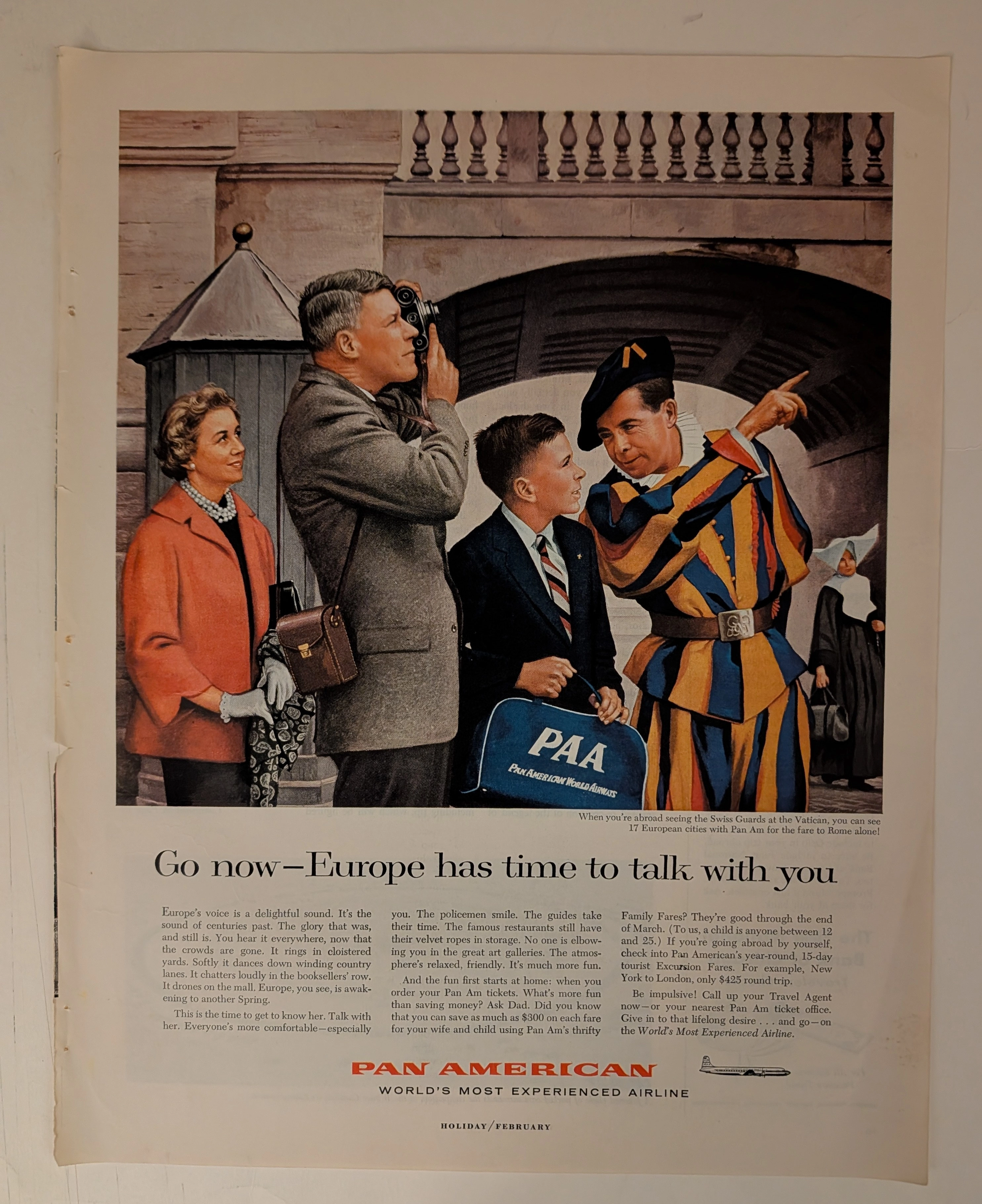
THE TIME TRAVELER'S DOSSIER: PAN AM - THE ARCHITECTURE OF THE AMERICAN TOURIST
The artifact currently subjected to our uncompromising, museum-grade analysis is a profoundly preserved Historical Relic excavated from the zenith of mid-century American aviation prosperity. This Primary Art Document is a full-page magazine advertisement for Pan American World Airways. Functioning as a "Forensic Blueprint of the American Leisure Class Abroad," the document masterfully weaponizes European heritage and history to validate the affluent, off-season travel of post-war American consumers. Its historical context is irrefutably anchored by the microscopic silhouette of a Douglas DC-7B aircraft, placing this artifact squarely in the twilight of the propeller age, just before the dawn of the Boeing 707 jet era. Grounded by extreme macro details of the iconic PAA flight bag, the bold corporate typography, and the breathtaking wabi-sabi chemical degradation highlighted by its violently torn binding edge, this artifact commands an irreplaceable status, cementing its Rarity Class S designation as a masterpiece of corporate sociological engineering.