The Time Traveller’s Dossier: 1985 Visa Premier Vintage Advertisement — The Passport to Borderless Wealth
The History
1. The Golden Age of Capitalism and the Yuppie Zeitgeist
To fully comprehend the profound cultural weight of this advertisement, one must examine it through the socioeconomic lens of the mid-1980s. Under the economic policies of the Reagan administration, the United States experienced a period of aggressive financial expansion. Wall Street boomed, giving rise to a new demographic archetype: the "Yuppie" (Young Urban Professional). This affluent, upwardly mobile class possessed high disposable income and viewed luxury not just as a comfort, but as a mandatory expression of success. This Visa advertisement does not target the working class or the suburban homemaker; it aims directly at high-earning executives and jet-setters who spend their winters skiing—a pastime historically entrenched as a status-heavy sport.
2. The Premium Credit Card Wars: Visa's Strategic Awakening
Prior to the 1980s, the premium Travel and Entertainment (T&E) credit card market was practically monopolized by American Express (Amex) and Diners Club. Visa and MasterCard were largely perceived as utilitarian, "everyday" cards meant for local retail purchases. Recognizing the critical need to penetrate the affluent market, Visa conceptualized the "Visa Premier" tier (the precursor to the modern Visa Gold and Platinum tiers). The gleaming, textured gold card featured in this ad—issued by the fictitious "The International Bank" to evoke a sense of universal financial sovereignty—was Visa’s strategic weapon against the Amex Gold card. The aggressive subtext of the campaign was clear: Visa’s premium offering possessed the prestige of Amex but offered vastly superior, real-world utility.
3. Decoding Geographic Semiotics: "From Squaw Valley to St. Moritz"
The headline of this advertisement is a masterpiece of geographic positioning.
Squaw Valley: (Now known as Palisades Tahoe) was a premier California ski resort and host of the 1960 Winter Olympics. It represented the "New Money" wealth of the American West Coast—a vibrant playground for tech pioneers, Hollywood elites, and young corporate executives.
St. Moritz: Nestled in the Swiss Alps, this resort is the legendary zenith of "Old Money" European luxury, a historical winter retreat for royalty and legacy billionaires.
By linking these two specific, highly evocative locations, Visa communicates that a single piece of plastic can elevate the cardholder to a status accepted equally within the circles of American nouveau riche and the entrenched high society of Europe. It effectively erased geographic and class borders.
4. The Psychology of Borderless Travel and the Death of the Traveler's Cheque
The copywriting acts as a manifesto of financial globalization. The specific numbers—"nearly four million locations, in 156 countries, on six continents" and "over 151,000 bank offices worldwide"—are not merely informational; they are calculated strikes against competitors like Amex, which suffered from limited merchant acceptance despite its elite prestige. Furthermore, the ad highlights the card as an alternative to Travelers Cheques, an antiquated and cumbersome financial tool. In this context, the Visa card becomes a symbol of ultimate security. The traveler is freed from the anxiety of currency exchange rates or the fear of stolen cash. The campaign slogan, "ALL YOU NEED," was not hyperbole to the 1980s elite; it was a declaration of absolute financial independence.
5. The Aesthetics of Frost and Gold
In terms of visual storytelling, setting the scene amidst freezing temperatures—evident in the hyper-realistic frost clinging to the ski goggles and the heavy, padded white jacket—creates a psychological state of vulnerability. The model reaches a bare, elegantly manicured hand into the warmth of the jacket to withdraw the radiant, warm-toned gold card. This gesture is highly symbolic: pulling "light and warmth" out of the cold. The Visa card represents more than currency; it represents immediate access to the roaring fireplaces, fine dining, and premium services waiting just beyond the harsh, freezing slopes.
The Paper
Printing Technology and Substrate
Examined under archival conditions, the physical substrate of this piece unmistakably identifies it as a clipping from a premium American magazine of the mid-1980s. It is printed on a 60lb to 70lb coated gloss text stock, a standard for high-end periodicals requiring vibrant photographic reproduction.
The printing process utilized standard 4-color (CMYK) offset lithography. The primary technical challenge of this specific layout was rendering the "Gold Card." In the 1980s, printing true gold required expensive metallic spot inks, which were often cost-prohibitive for massive magazine runs. Therefore, the master printers relied on a precise CMYK halftone process, heavily utilizing magenta and yellow dot patterns to create the brilliant illusion of a textured, reflective metallic surface. The result is striking, allowing the card to visually pop against the cool, bluish-whites of the ski jacket.
Over the decades, the paper has developed a natural patina. There are slight micro-abrasions on the glossy black surfaces of the goggles—common in ephemera of this age due to friction with opposing pages—but the pigment of the typography and the iconic Visa logo remains remarkably sharp and entirely free of severe oxidative foxing (yellowing).
The Rarity
Rarity Class: B (Archival Quality / Financial & Lifestyle Ephemera)
The scarcity of this item does not stem from a limited print run, as Visa advertisements were published by the millions in dominant publications like TIME or Newsweek. Rather, its Class B rarity derives from its "contextual integrity." Financial ephemera was rarely saved by the general public, unlike classic car advertisements or movie posters.
This specific advertisement occupies a highly sought-after nexus for three distinct collector groups: fintech historians tracking the evolution of premium credit tiers, winter sports enthusiasts captivated by the cultural time capsule of the Squaw Valley reference (a name now historically retired due to social shifts), and collectors of 1980s pop culture seeking the ultimate embodiment of Yuppie consumerism. Finding a pristine specimen from this financial era—free from severe spine-edge tears, moisture damage, or UV fading on the crucial gold tones—makes it a valuable asset ready for a financial history archive.
Visual Impact
The visual architecture of this advertisement relies on calculated contrast and psychological projection. By cropping the image tightly to obscure the model's face, the art director invites the viewer to seamlessly project themselves into the scenario. The focal point is not the human figure, but the striking juxtaposition of the bare hand emerging from the heavy winter gear, holding the Visa Premier card. The iconic blue, white, and gold Visa logo stands out sharply against the frosty, pale backdrop. The typography, utilizing a mix of authoritative Roman serif and elegant italics, reinforces the premium, elite nature of the service, culminating in a visual statement of unquestionable status.
Exhibition Halls
The Archive Continues
Continue the Exploration
THE TIME TRAVELER'S DOSSIER: THE GOLDEN LIE AND THE PROPAGANDA OF 1936
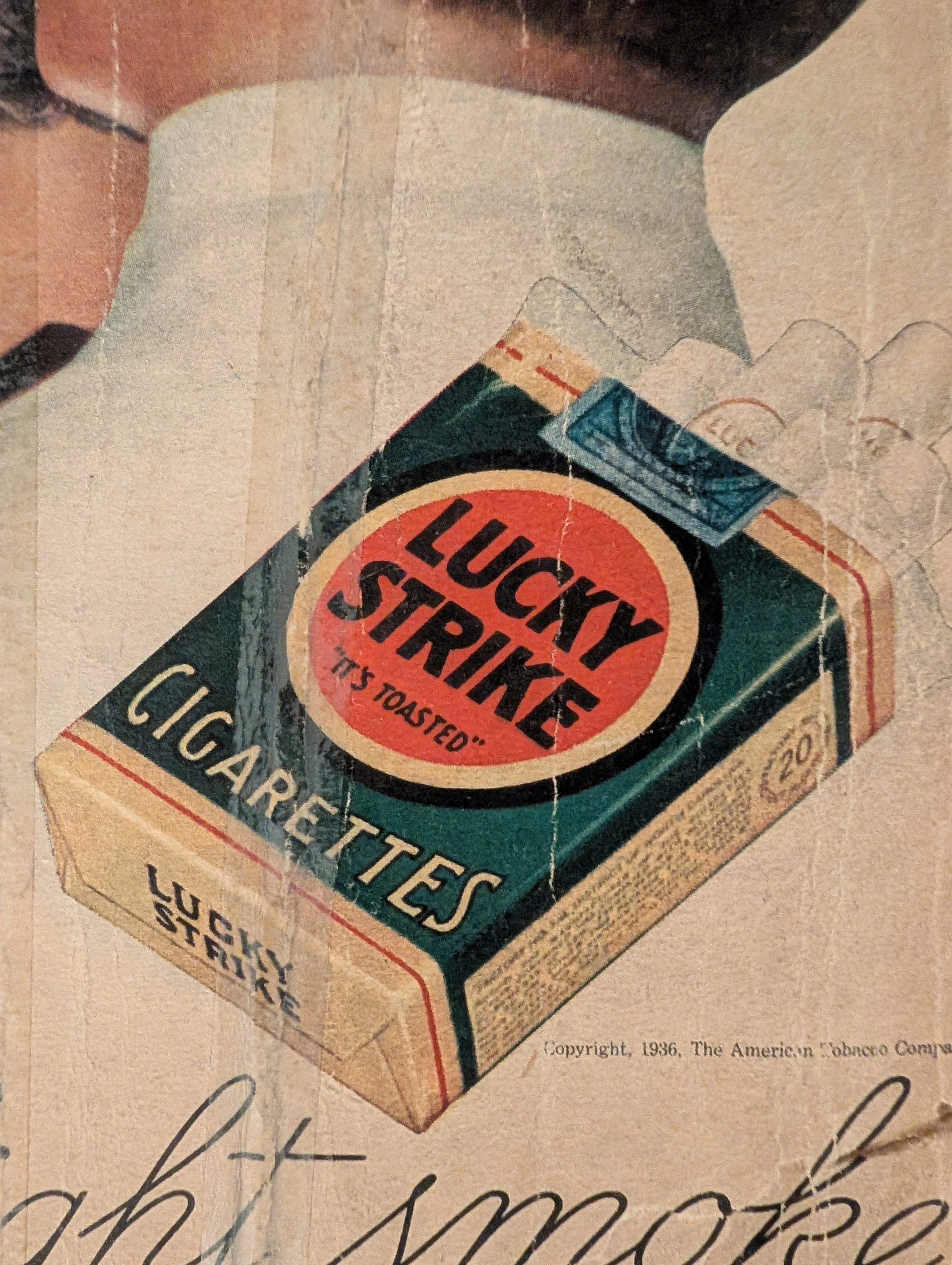
The artifact under exhaustive, uncompromising, and unprecedented museum-grade analysis is an exceptionally rare, battle-scarred Historical Relic originating from the absolute zenith of the American tobacco empire. This Primary Art Document is a monumental, full-page advertisement for Lucky Strike Cigarettes, forensically and definitively dated to 1936 by the explicit copyright text: "Copyright, 1936, The American Tobacco Company". This is not merely a vintage tobacco ad; it is a profound "Sociological Blueprint of Corporate Propaganda" from the interwar period. Emerging in the heart of the Great Depression, this artifact captures the audacious peak of 1930s psychological marketing. The commanding headline, "Smoke to Your Throat's Content", represents the era's surreal, medically ironic strategy where tobacco conglomerates aggressively marketed deadly carcinogens as "smooth" and "non-irritating" to the throat. Furthermore, the legendary slogan "It's Toasted" serves as a masterclass in advertising spin, transforming a standard manufacturing process into an exclusive health benefit. Visually, the ad brilliantly normalizes and glamorizes female smoking—a direct continuation of the industry's sociological engineering to double their consumer base. Rescued from the inevitable oblivion of disposable mass media, this pre-2000s analog artifact is a breathtaking embodiment of the Japanese aesthetic of wabi-sabi. Printed on highly acidic wood-pulp paper, it exhibits severe, violent edge trauma, deep structural creasing, ancient tape residue, and a profound, burning amber oxidation across its entire surface. This unstoppable molecular death transforms a piece of mass-produced corporate propaganda into an irreplaceable, ready-to-frame Primary Art Document of American marketing history.
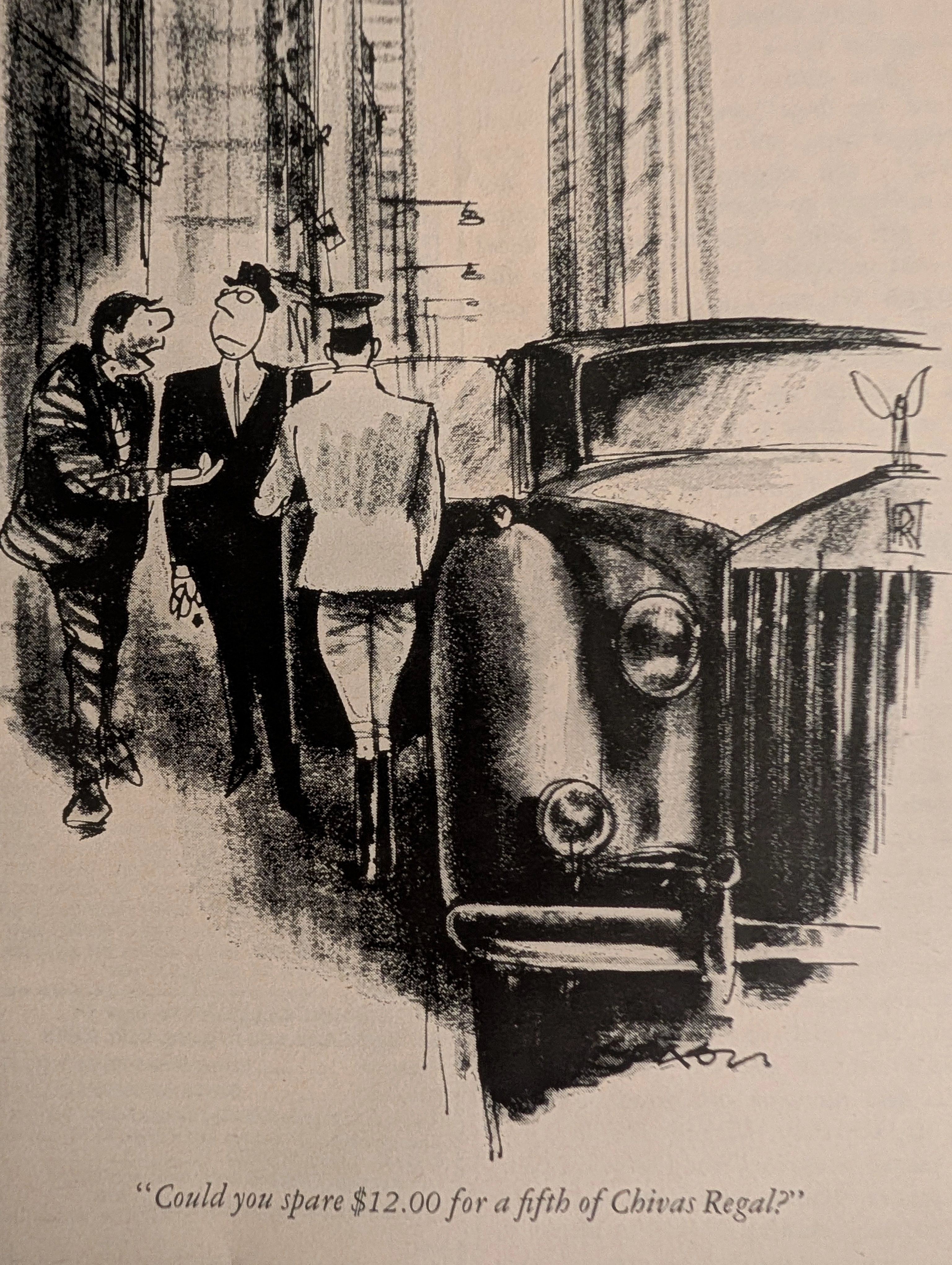
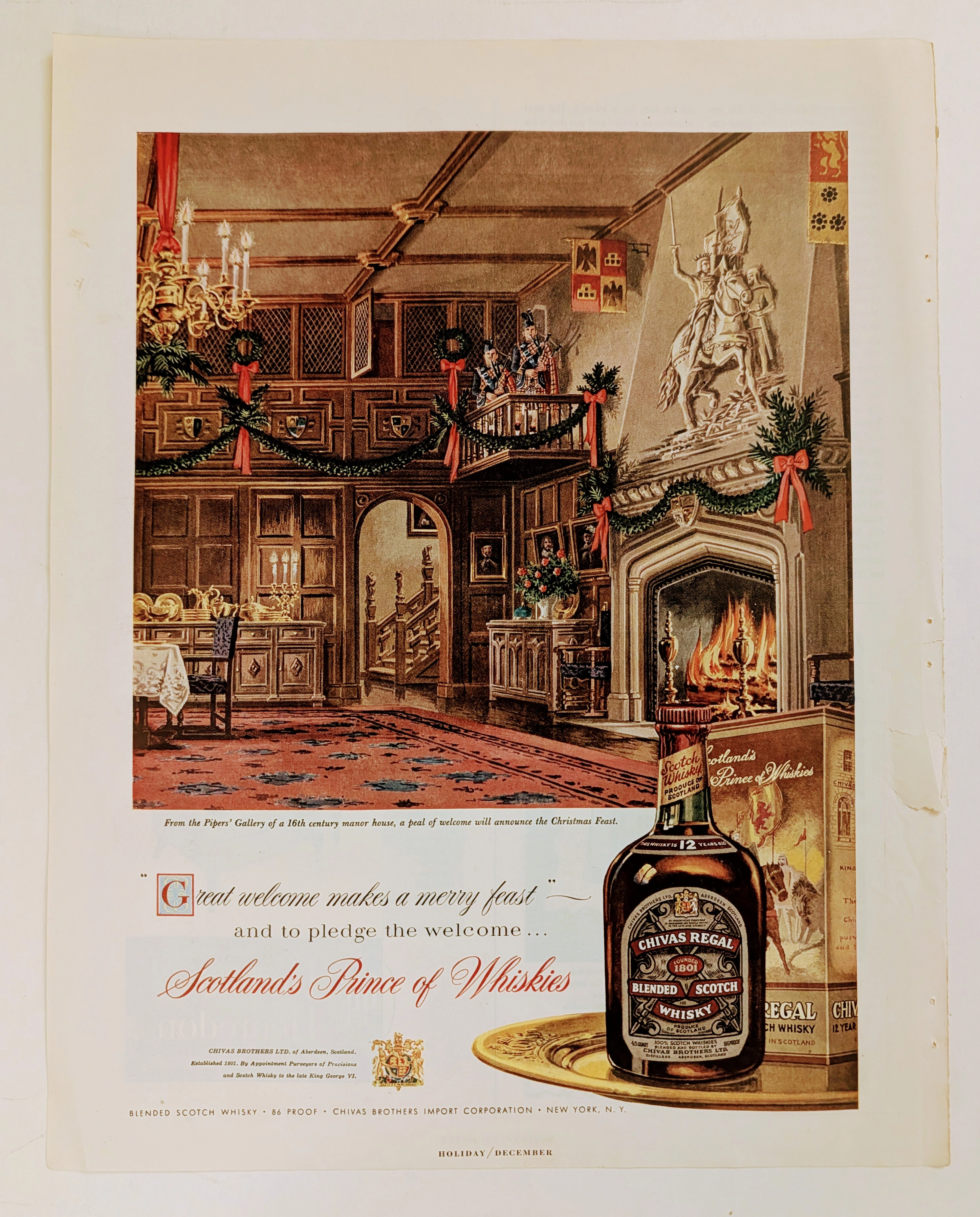
Vintage Chivas Regal x Charles Saxon Ad: The Vanishing Playboy Art | The Record
An in-depth look at the Chivas Regal ad from Playboy magazine, illustrated by legendary artist Charles Saxon. A magazine-sized piece of authentic analog art on degrading vintage paper, driving up its value as an alternative asset.
Ballantine · Beverage
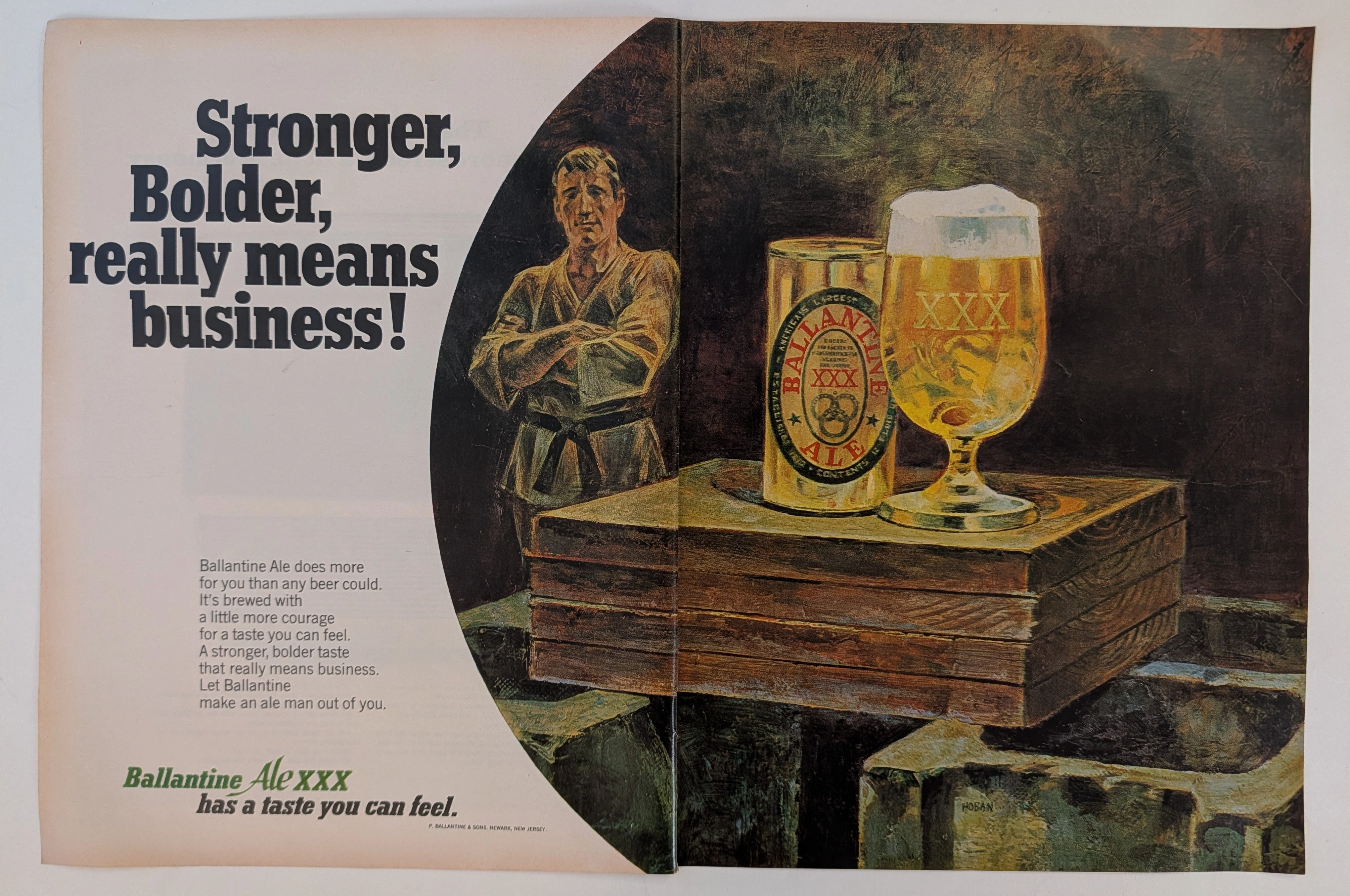
The Time Traveller's Dossier: The Martial Authority of the Brew – An Academic Archival Analysis of the 1968 Ballantine Ale Advertisement
The cultivation of brand identity through visual symbolism is a profound psychological discipline, acting as a mirror to the cultural aspirations of its era. The historical artifact elegantly positioned upon the analytical table of The Record Institute today is a majestic two-page print advertisement for Ballantine Ale, originating from approximately 1968. This document completely transcends the boundaries of conventional beverage promotion; it stands as a masterclass in the semiotics of mid-twentieth-century American masculinity. By seamlessly aligning the consumption of a traditional ale with the disciplined, formidable imagery of a martial arts master, the advertisement constructs a compelling narrative of strength, boldness, and unyielding character. This world-class, comprehensive academic archival dossier will conduct a meticulous and deep examination of the artifact, operating under the most rigorous parameters of historical and material science evaluation. We will decode the strategic copywriting that challenges the consumer to embrace a "stronger, bolder taste," and illuminate the profound historical lineage of the P. Ballantine & Sons brewing empire. Furthermore, as we venture into the chemical and physical foundations of this analog offset lithography, we will reveal the mechanical fingerprints of the halftone rosettes and the graceful, natural oxidation of the paper substrate. This precise intersection of visual nostalgia, mid-century commercial artistry, and the chemistry of time cultivates a serene wabi-sabi aesthetic—a natural phenomenon that serves as the primary engine driving up its market value exponentially within the elite global spheres of Vintage Breweriana collecting.