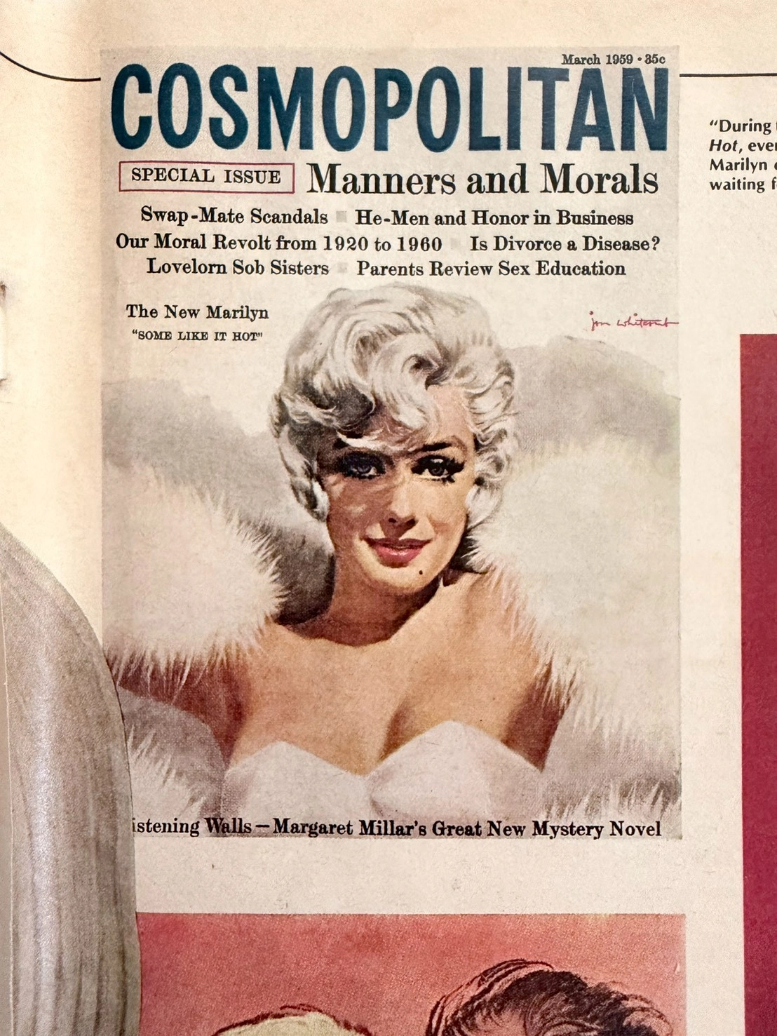
Vintage 70s Crown Royal Ad: Vanishing Analog Art | The Record
The History
THE SHATTERED CROWN
When a Grown Man's Tears Become a Fading Legend on Paper
As the Chief Curator of The Record, traversing through the timeline of analog history, I invite you to dive deep into one of the most viscerally powerful advertising campaigns of the 1970s. This is not merely an ink-stained page; it is a "Museum Grade Artifact." It speaks of pride, unrepeatable analog craftsmanship, and the ruthless economics of decay.The image before you is the iconic "Have you ever seen a grown man cry?" campaign by Seagram's Crown Royal. One short sentence that sent a shockwave through the souls of drinkers worldwide. The sight of a shattered crown-shaped crystal bottle, its premium amber liquid bleeding across the floor, plays on a dark humor that triggers a profound sense of masculine loss—weeping for a whiskey too precious to spill. To comprehend the immense value of this single page, we must dissect its history, art, and the chemistry of time.
🏛️ CHAPTER I: THE GENESIS OF THE CROWN
The prestige of this advertisement is meaningless without understanding how "Crown Royal" was born, and the titan behind it.
Samuel Bronfman (1889–1971): A Canadian billionaire and the visionary architect of the Seagram Company, the largest distiller in the world during the 20th century. Bronfman didn't just sell liquor; he sold class.
The Royal Connection: In 1939, for the historic visit of King George VI and Queen Elizabeth to Canada, Bronfman sought to create a whiskey fit for a monarch. He masterfully blended 50 distinct whiskies, housing them in a cut-glass crown bottle wrapped in a royal purple velvet bag. Crown Royal was strictly a tribute to the King before it was released to the masses. Therefore, when this 70s ad depicts the shattering of that exact bottle, it is a deliberate psychological masterstroke—the destruction of a symbol of upper-class perfection.
📷 CHAPTER II: THE GOLDEN AGE OF ANALOG CRAFTSMANSHIP
If a modern agency wanted a broken bottle, they would render it perfectly via 3D CGI in hours. But this page is from the 1970s—the era of authentic, unforgiving analog art.
The Lighting Setup: Capturing shattered glass and liquid required immense skill. Photographers used large-format cameras and reversal film. They orchestrated complex lighting with strobes, tungsten lights, reflectors, and gobos to catch the facets of the broken crystal without flattening the image with lens flare.
The Timing: The spilled amber liquid had to look dynamic and visceral. The art directors physically smashed dozens of real, expensive crystal bottles to find the perfect shards and meticulously styled every droplet. You are looking at days of sweat, madness, and Madison Avenue perfectionism that simply does not exist in the digital age.
⏳ CHAPTER III: THE FRAGILITY OF HISTORY & PAPER DEGRADATION
As a collector and investor, the fundamental rule is: "Vintage print is a constantly degrading asset."
Lignin & Acidic Autocatalysis: Pre-2000 magazines were printed on wood pulp paper containing Lignin. When exposed to UV light and oxygen, lignin oxidizes, turning the paper yellow, brittle, and frail. Alum used in the paper reacts with moisture to create sulfuric acid, literally eating the page from the inside out.
The Ink of the Past: Look closely, and you'll see the vintage CMYK halftone printing—a beautiful, imperfect pattern of ink dots that no modern laser printer can replicate. This specific page survived fire, moisture, and the trash bin for half a century. Its patina is a signature of survival.
📈 CHAPTER IV: THE ECONOMICS OF SCARCITY
The investment strategy at The Record is absolute: Value peaks when irreversible destruction of supply meets the rising demand of nostalgia.
Zero Production: 1970s printing presses cannot be fired up to recreate this exact paper and ink smell.
Exponential Attrition: Every day, original magazines are destroyed by acid, pests, or humidity. The source material is violently shrinking.
The Rise of "Home Art Gallery": In an era of screen fatigue, the elite crave tangible art. Framing an original, magazine-sized piece of advertising history elevates any bar or study. This page is no longer just paper; it is an "Alternative Asset" whose rarity will only compound as time erodes the rest.
Exhibition Halls
The Archive Continues
Continue the Exploration
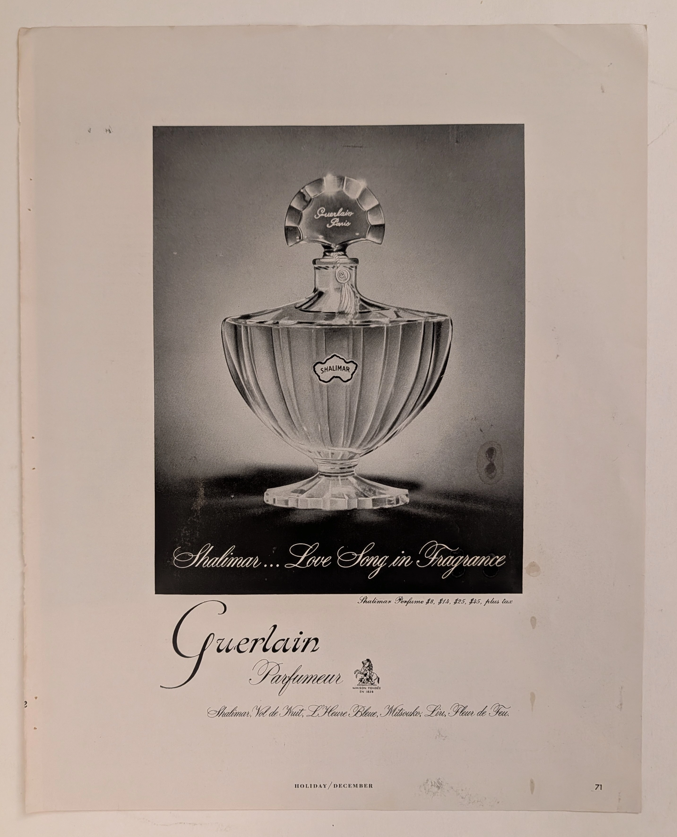
Guerlain · Fashion
The Time Traveller's Dossier: The Architecture of Desire – Guerlain "Shalimar" Advertisement (Circa Mid-20th Century)
History is not an accidental sequence of events; it is a meticulously engineered illusion crafted by those who command the aesthetic and cultural narratives of their time. Long before digital algorithms could sterilely dictate consumer preferences, the ultimate manifestation of psychological manipulation and corporate alchemy was executed through the calculated precision of the halftone printing press and the absolute mastery of analog darkroom photography. The historical artifact before us is not merely a disposable page torn from a vintage magazine. It is a perfectly weaponized blueprint of exoticism, a visual declaration of extreme luxury, and an unwavering testament to an era where fragrance was sold not as a cosmetic, but as an immortal "Love Song." This museum-grade, academic archival dossier presents an exhaustive, microscopic deconstruction of a mid-20th-century print advertisement for the legendary Guerlain "Shalimar" perfume. Operating on a profound and ruthless binary structure, this document records a calculated paradigm shift within the global luxury industry. It captures the precise historical fracture where a concoction of botanical extracts and synthetic molecules was conceptually transmuted into a literal, physical embodiment of a mythical Eastern romance. Through the highly specialized lens of late-analog commercial artistry and stringent visual forensics, this document serves as a masterclass in psychological marketing. It established the foundational archetype for selling intangible emotions at astronomical markups—an archetype that unconditionally dictates the visual and strategic totems of the modern haute parfumerie industry today.
THE TIME TRAVELER'S DOSSIER: THE STRATOSPHERIC MANSION AND THE AESTHETICS OF DECAY
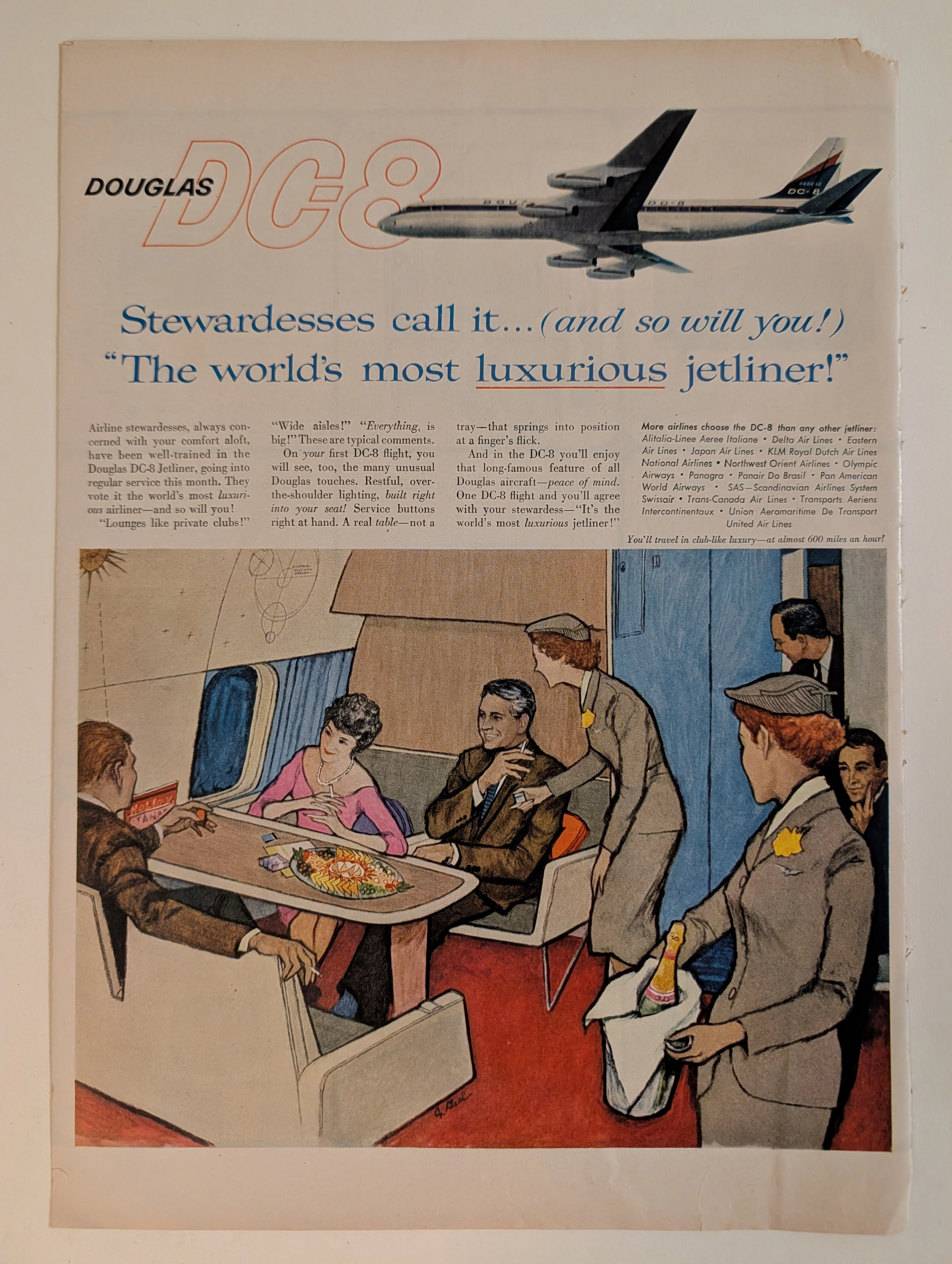
The artifact under exhaustive, museum-grade analysis is a flawlessly preserved Historical Relic originating from the absolute dawn of the commercial Jet Age (circa late 1950s to early 1960s). This Primary Art Document is a magnificent full-page advertisement for the Douglas DC-8, the aerospace leviathan engineered to rival the Boeing 707 and conquer the global skies. Visually anchored by an elegant, sweeping illustration of the aircraft's exterior and a highly detailed, evocative rendering of its opulent passenger lounge, the piece represents the zenith of mid-century aspirational marketing. Signed by an elusive mid-century commercial artist, the illustration captures the "Palomar Lounge"—a private club in the stratosphere where the elite played cards, smoked, and drank champagne beneath a Space-Age celestial diagram. By utilizing the ultimate authority of the era—the airline stewardess—to validate its luxury ("Stewardesses call it... The world's most luxurious jetliner!"), Douglas masterfully sold the illusion of exclusive, aristocratic segregation at 600 miles per hour. Rescued from the binding of a forgotten periodical, this pre-2000s analog artifact is an unforgeable testament to the aesthetic of wabi-sabi. Printed on inherently acidic wood-pulp paper, it exhibits a beautifully frayed right margin and a deep, warm ivory oxidation. This majestic chemical degradation transforms a mass-produced corporate propaganda piece into an irreplaceable, ready-to-frame Primary Art Document of aerospace history.
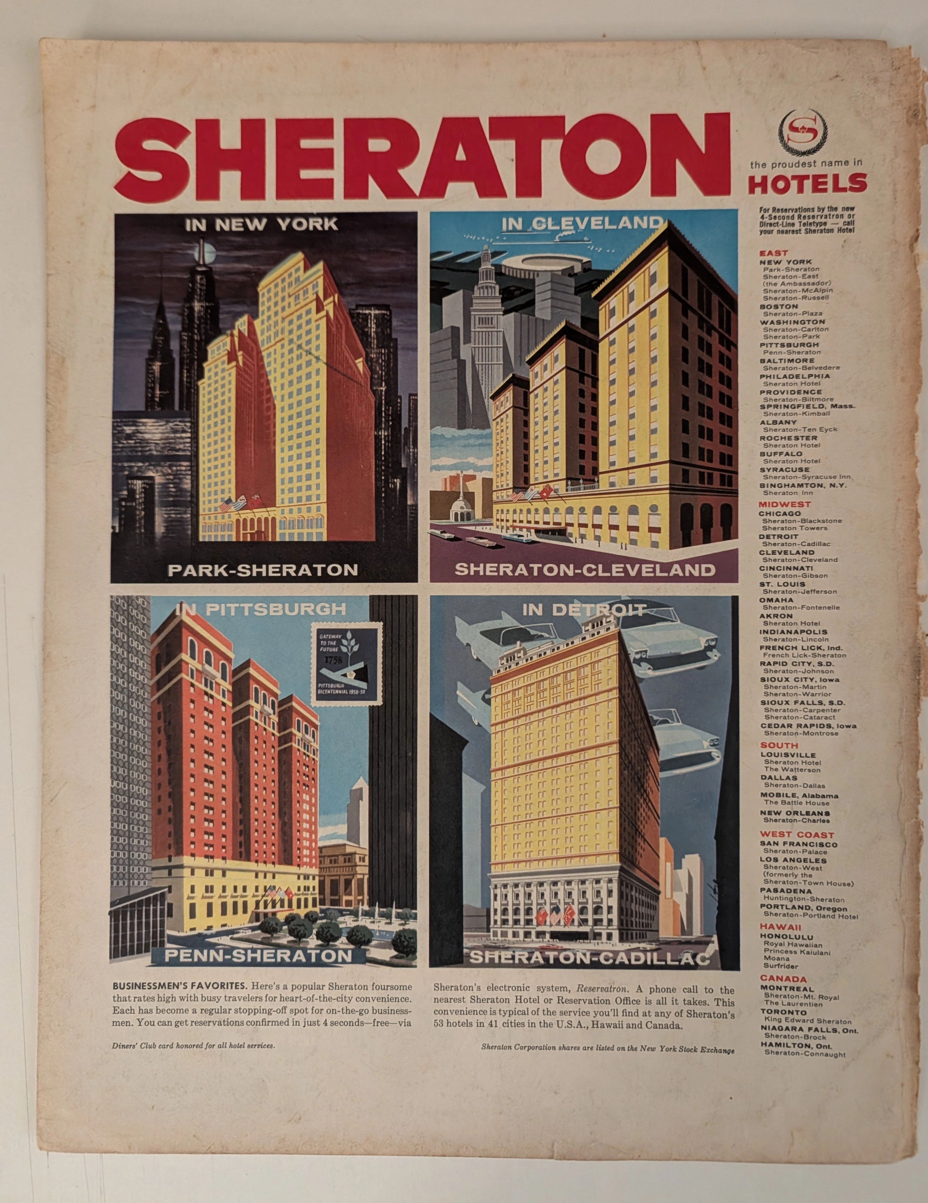
THE TIME TRAVELER'S DOSSIER: THE ARCHITECTURE OF POWER AND THE BIRTH OF THE DIGITAL WORLD IN THE 50S
The artifact under exhaustive, uncompromising museum-grade analysis is a remarkably preserved Historical Relic originating from the absolute zenith of the post-war American economic boom. This Primary Art Document is a sweeping, monumental full-page advertisement for the Sheraton Hotels empire, forensically dated to circa 1958–1959 via the explicitly illustrated Pittsburgh Bicentennial (1758-1958) stamp embedded within the artwork. This document is not merely a travel advertisement; it is a profound "Sociological Blueprint of the American Corporate Ascendancy." Visually anchored by four hyper-stylized, architectural illustrations of Sheraton's flagship properties—New York, Cleveland, Pittsburgh, and Detroit—the piece captures the era's unbridled optimism. Each panel is a masterpiece of mid-century commercial illustration, particularly the Detroit panel featuring ethereal, floating tail-fin automobiles symbolizing the Motor City's dominance. Furthermore, this artifact documents critical milestones in global business history. It proudly advertises the acceptance of the Diners' Club card, marking the revolutionary dawn of the modern credit card era. It also boasts of Sheraton's "Reservatron" electronic system—one of the earliest commercial applications of computing in the hospitality industry—and proudly declares its listing on the New York Stock Exchange. Rescued from the binding of a forgotten, heavy-stock periodical, this pre-2000s analog artifact is an unforgeable testament to the Japanese aesthetic of wabi-sabi. Printed on inherently acidic wood-pulp paper, it exhibits a beautifully violent, jagged right margin and a deep, warm amber oxidation across its surface. This majestic, unstoppable chemical degradation transforms a mass-produced corporate propaganda piece into an irreplaceable, ready-to-frame Primary Art Document of mid-century architectural and economic history.