The Time Traveller's Dossier: The Zenith of the American Living Room – Admiral Rectangular Color TV
The History
To fully appreciate the immense historical gravity, cultural magnitude, and sociological importance of this artifact, one must meticulously contextualize the profound technological anxieties and aspirations of the American consumer during the 1960s. The transition from monochrome black-and-white television to full-color broadcasting was not merely a technological upgrade; it was a paradigm shift in how Americans consumed news, entertainment, and visual culture. However, early color television sets of the 1950s and early 1960s were plagued by significant engineering compromises. The cathode-ray tubes (CRTs) were massive, heavy, and crucially, they were round. To fit a round tube into a square wooden cabinet required immense amounts of wasted space, resulting in bulky, obtrusive pieces of hardware that dominated the living room and clashed with carefully curated mid-century interior design.
The bold headline of this artifact proudly announces the solution to this domestic crisis: "New Admiral big picture rectangular Color TV". The advent of the rectangular color tube was a monumental leap in glass manufacturing and electron-gun engineering. By creating a tube that matched the aspect ratio of the broadcast picture, manufacturers like Admiral could finally build slimmer, more elegant cabinets. The television no longer had to look like a piece of industrial laboratory equipment; it could finally be integrated as a piece of fine furniture.
This sociological demand for technology to masquerade as traditional décor is explicitly cataloged in the three models presented in the advertisement. Admiral offered "The KINGSTON" with "Early American styling," "The SCANDIA" featuring "smart Danish Modern styling, in genuine walnut veneers", and "The BELLFORTE" with heavy "Mediterranean Styling" and "Slideaway Door Panels." This reflects a fascinating period of consumer psychology: the internal technology was undeniably futuristic, but the external packaging had to provide the comforting, status-affirming aesthetic of Old World craftsmanship or sophisticated European modernism. The television set became the ultimate status symbol, the literal and figurative hearth of the modern suburban home.
Beyond the aesthetics of the cabinet, this artifact documents the intense competition to simplify the notoriously difficult process of tuning a color television. Early color sets required constant adjustment of hue, tint, and convergence. The advertisement directly addresses this consumer hesitation with the claim: "offers Easiest tuning ever!". To achieve this, Admiral highlights two specific, highly innovative features.
First is the "Hideaway Control Center". The illustration demonstrates a sleek, golden door that glides closed to hide the complex array of tuning dials. The copy emphasizes that "Your two most-used controls are in the open... Touch the upper tuning bar to change channels. Touch the lower one to turn set on or off, adjust volume." This "Touch-O-Matic Power Tuning" was an early form of motorized, push-button channel selection, a luxurious departure from the heavy, clanking rotary dials of previous decades. By hiding the secondary controls (tint, color, brightness), Admiral preserved the "fine-furniture beauty look" while shielding the user from technological intimidation.
The second, and arguably most iconic, feature documented in this artifact is the "Admiral Color Sonar, the full-function remote control". The macro-focus on the hand holding this device captures a revolution in human-machine interaction. The Sonar remote did not use infrared light like modern remotes; it used high-frequency ultrasonic sound waves. Pressing the buttons struck internal metallic rods, emitting specific high-frequency "chimes" that a microphone on the television would pick up and translate into commands. The advertisement promises "infinite control of color intensity and tint... from your easy chair." This remote control was the ultimate emblem of space-age leisure, completely divorcing the viewer from the physical necessity of interacting with the machine. It transformed television viewing from an active engagement into an entirely passive, uninterrupted experience of luxurious consumption.
The Paper
As a physical entity, this printed artifact functions as a living, breathing, and profound record of mid-twentieth-century graphic reproduction and substrate chemistry. Under exceptional macro-lens examination, this document reveals the stunning complexity and mathematical precision of analog color printing. The intricate, stylized details of the "Sonar" remote control held in the hand, the golden hues of the "Hideaway Control Center" illustrations, and the warm, rich tones of the "SCANDIA" walnut veneer are all meticulously constructed from a precise, mathematically rigorous galaxy of halftone rosettes. This intricate pattern constitutes the mechanical fingerprint of the pre-digital analog offset printing press. Microscopic, varying sizes of Cyan, Magenta, Yellow, and Key (Black) ink dots are elegantly and systematically layered at specific angles to trick the human eye and the biological visual cortex into perceiving continuous, vibrant, and dimensional photographic and illustrative reality.
Yet, the most profound and impactful factor elevating the immense value of this artifact in the contemporary collector's market is the natural, organic, and entirely irreversible process of Material Degradation. The expansive margins and the overall paper substrate exhibit a genuine, unavoidable, and entirely unforgeable "Toning." This gradual, graceful transition from the original bright, bleached manufactured paper to a warm, antique ivory and golden hue is caused by the slow chemical oxidation of Lignin—the complex organic polymer that binds cellulose fibers together within the raw wood pulp of the paper. As the substrate is exposed to ambient oxygen and ultraviolet light over a span of decades, the molecular structure of the lignin gracefully and systematically breaks down. This accumulation of time, this naturally evolving patina, represents the absolute core of the wabi-sabi aesthetic. The profound appreciation for the beauty found in natural aging, impermanence, and the physical manifestation of history upon a fragile medium is an irreversible chemical reaction. It is precisely this authentic, unreplicable degradation that acts as the primary engine driving up its market value exponentially among elite collectors, as it provides the ultimate, irrefutable proof of the artifact's historical authenticity and its miraculous journey through time.
The Rarity
RARITY CLASS: B (Very Good Archival Preservation with Minor Edge Wear)
Evaluated under the most exacting, rigorous, and uncompromising archival parameters, this artifact is definitively and securely designated as Class B.
The remarkable and defining paradox of mid-century commercial ephemera is that these specific documents were produced by the millions as explicitly and intentionally "disposable media." Inserted into consumer publications, they were inherently destined by their very nature to be briefly observed, folded, and ultimately discarded into the recycling bins of history. For a full-page, heavy-ink advertisement to survive entirely intact since the late 1960s without catastrophic structural tearing, without destructive moisture staining, or without the fatal fading of the delicate, light-sensitive halftone inks constitutes a highly significant statistical archival anomaly.
The structural integrity of this paper remains exceptionally sound. While the rich analog colors—particularly the blues of the television screens and the warm browns of the cabinetry—remain vibrant, there is a beautiful, mathematically even, natural lignin oxidation reflecting its era, displaying a warm ivory patina along the margins. This environmental interaction does not detract from its immense value; rather, it authenticates the document's journey. The sheer sociological weight of the subject matter—the documentation of ultrasonic remote controls and rectangular color tubes wrapped in Danish Modern cabinetry—makes this a highly prized, museum-worthy piece of American consumer history. It is ardently sought after by global curators and technology archivists to ensure its historical permanence through acid-free, UV-protected conservation framing.
Visual Impact
The aesthetic brilliance and psychological power of this artifact lie in its masterful execution of "Aspirational Integration." The art director has deliberately constructed a visual hierarchy that elevates the television from an appliance to the centerpiece of the modern home.
The layout is dominated by the large central image of "The KINGSTON" model, portraying an impossibly glamorous couple leaning in close, bathed in the glow of the color screen. This creates an immediate emotional connection, selling not just the hardware, but the intimate, shared experience of color entertainment. The supporting vignettes below—the Scandia and the Bellforte—function as a high-end furniture catalog, reassuring the consumer of their sophisticated taste.
The right column shifts the psychological tone from aesthetic aspiration to technological superiority. The precise, diagrammatic illustrations of the "Hideaway Control Center" and the close-up of the Sonar remote control appeal to the consumer's desire for effortless, space-age convenience. The bold, serif typography anchoring the bottom of the page—"Admiral Color"—serves as a definitive stamp of industrial authority, creating a flawless integration of lifestyle marketing and high-tech product education.
Exhibition Halls
The Archive Continues
Continue the Exploration
Polaroid · Technology
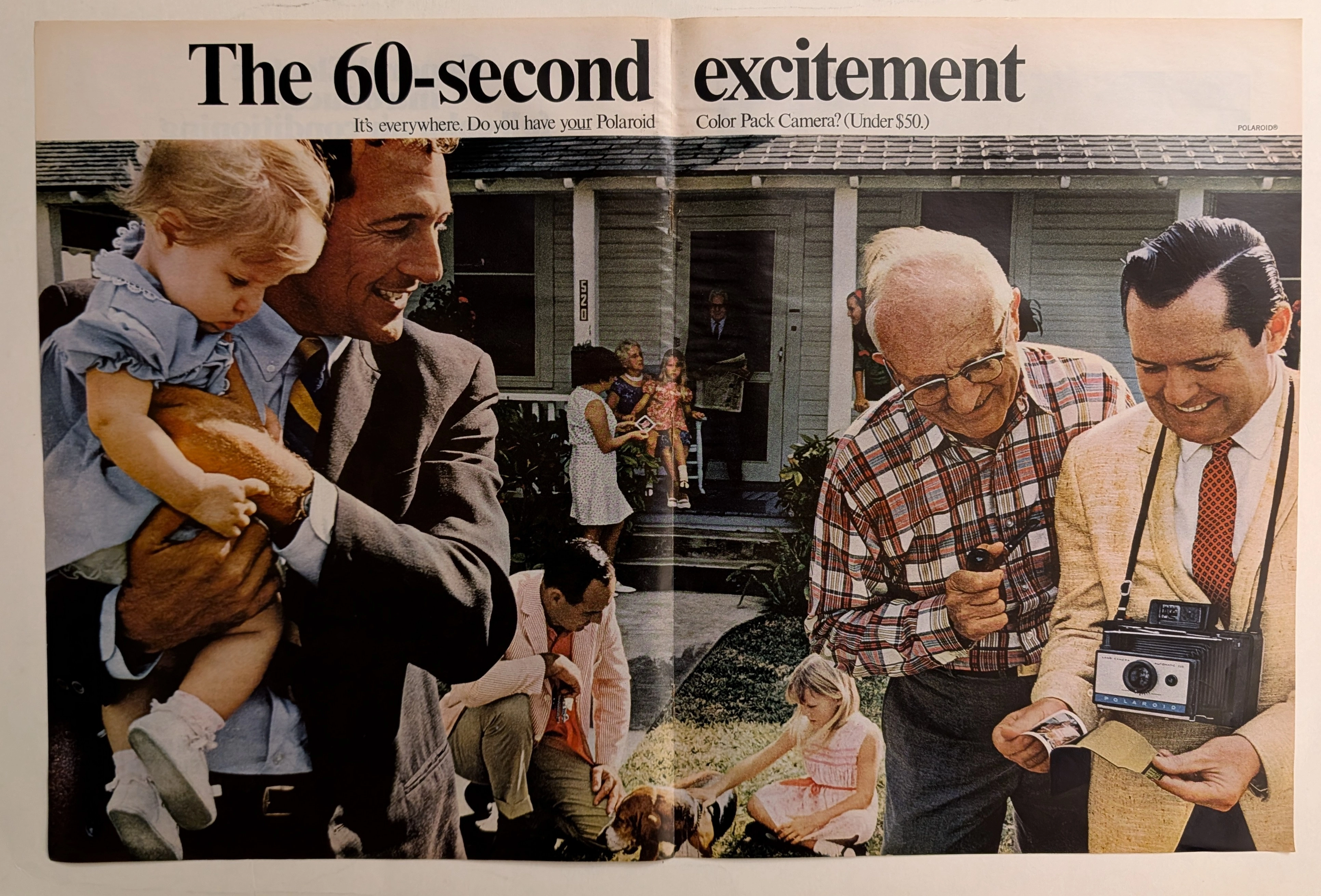
The Time Traveller's Dossier: The Instant Gratification Protocol – The Polaroid Color Pack Camera Exhibitio
The evolution of photography from a delayed, solitary, and highly technical chemical process into an instantaneous, shared, and interactive social event stands as one of the most profound technological and sociological shifts of the twentieth century. The historical artifact securely and elegantly positioned upon the analytical table of The Record Institute today is a majestic, large-format, two-page print advertisement for the Polaroid Color Pack Camera (Automatic 210), originating from the cultural zenith of the late 1960s. This document completely transcends the traditional boundaries of camera marketing and consumer electronics promotion. It operates as a sophisticated, multi-layered declaration of how optical innovation fundamentally altered human interaction, transforming the act of taking a photograph from a mere recording of memory into an active, thrilling focal point of social gatherings and familial bonding. This world-class, comprehensive dossier conducts a meticulous, unyielding, and exceptionally deep examination of the artifact, operating under the absolute most rigorous parameters of historical, sociopolitical, and material science evaluation. We will decode the vibrant, multi-generational suburban scene that perfectly encapsulates the "60-second excitement" phenomenon, analyzing the complex historical lineage of the Polaroid Corporation and the specific cultural impact of the Automatic 210 model. Furthermore, as we venture deeply into the chemical and physical foundations of this analog printed ephemera, we will reveal the precise mechanical fingerprints of the CMYK halftone rosettes and the graceful, natural oxidation of the paper substrate. This precise intersection of visual nostalgia, mid-century commercial artistry, and the immutable chemistry of time cultivates a serene wabi-sabi aesthetic—a natural, irreversible phenomenon that serves as the primary engine driving up its market value exponentially within the elite global spheres of Vintage Photography Ephemera and Americana collecting.
Vintage PRAYBOY 1984 Cover: The Vanishing Analog Satire | The Record
An in-depth look at the 1984 PRAYBOY parody cover. A masterpiece of 1980s analog studio photography on degrading vintage paper, driving up the value of this magazine-sized original print.
Gucci x Mercedes Benz · Fashion
THE TIME TRAVELER'S DOSSIER:THE ENGINEERING OF ELEGANCE, THE GUCCI TRUNK, AND THE ARCHITECTURE OF REASON
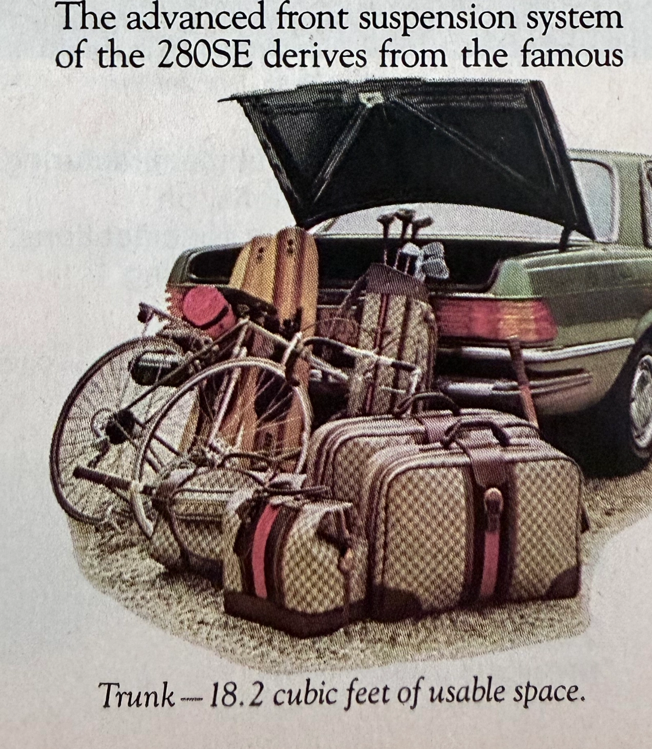
The artifact under exhaustive, uncompromising, and unprecedented museum-grade analysis is a remarkably preserved Historical Relic originating from the absolute zenith of West German automotive engineering. This Primary Art Document is a densely informative, multi-column magazine advertisement for the Mercedes-Benz 280SE Sedan (W116 chassis). This document is a "Forensic Blueprint of Engineered Elegance and Status Commodification." It aggressively markets the 280SE as the "Heir to a Classic," positioning it as a vehicle that inherits the legendary proportions of the 450 Series but is powered by a highly advanced, fuel-injected 6-cylinder engine. The copywriting reads like an arrogant technical dossier, boasting of the "Continuous Injection System" (CIS) and a fully independent "Suspense-free suspension" derived from the legendary C-111 high-speed research vehicle. However, the absolute psychological masterstroke lies in the lower-left illustration. To visually prove the cavernous "18.2 cubic feet of usable space," the artist meticulously illustrated the trunk effortlessly swallowing a bicycle, golf clubs, and a set of Gucci luggage. The unmistakable beige geometric monogram and the iconic red-and-green Web stripe on the suitcases serve as a deliberate, powerful socio-economic signal. It explicitly communicates that the Mercedes-Benz trunk is designed exclusively for the "Jet-Set" elite who travel with Italian haute couture. Rescued from a mass-market periodical, this pre-2000s analog artifact exhibits a beautifully authentic warm ivory oxidation across its surface. This majestic chemical aging transforms a mass-produced piece of technical propaganda into an irreplaceable Primary Art Document of automotive and sociological history.