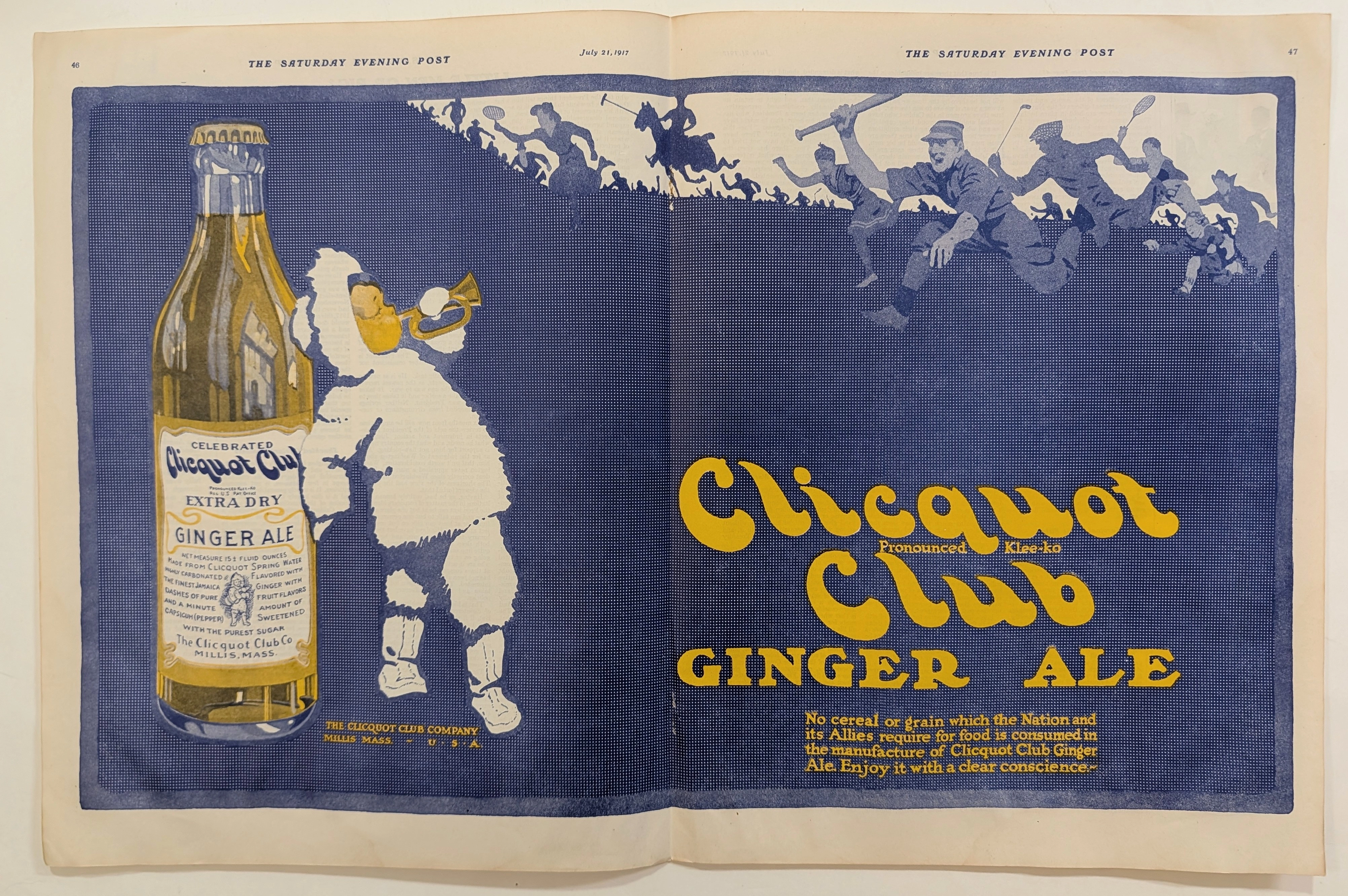
1917 Clicquot Club Extra Dry Ginger Ale Vintage Advertisement
Founded in Millis, Massachusetts, The Clicquot Club Company became a dominant force in the American beverage market during the early 20th century. This July 21, 1917, advertisement is exceptionally notable for its grand two-page scale and its brilliant use of a duotone color palette. The deep, textured blue background serves as a striking canvas for the golden-yellow typography and the detailed illustration of the iconic Clicquot Club Eskimo boy. The mascot, clutching the oversized bottle of Extra Dry Ginger Ale and blowing a brass horn, commands the left page, immediately drawing the viewer's eye across the expansive spread. The right page features energetic, flat-silhouette illustrations of figures engaged in various popular sports—baseball, tennis, polo, and track. This visual strategy
Category: Food & Beverage
Year: 1917
Rarity Class: A
Paper & Print Condition
Paper & Print Condition: The two-page spread exhibits a beautiful, natural oxidative aging, presenting a warm aged paper texture characteristic of early 20th-century newsprint. The original flat illustration style and meticulous hand-drawn stroke quality are impeccably preserved across the expansive layout. The deep, textured blue ink remains highly vibrant, while the golden-yellow accents show no significant fading, maintaining the striking period color palette. The central fold line, inherent
Provenance & Rarity
Provenance & Rarity: Authentic print media originally published as a grand two-page centerfold in The Saturday Evening Post on July 21, 1917. Surviving intact two-page advertisements from the World War I era are exceedingly scarce due to the fragile nature of early 20th-century newsprint and the typical disposal of wartime periodicals. This specific artifact is remarkably significant as it explicitly documents the intersection of consumer marketing and domestic wartime conservation, directly ref
Rarity & Condition Summary
Rarity & Condition Summary: Classified as a Class A historical artifact, this 1917 Clicquot Club print advertisement represents an exceptionally well-preserved specimen of early 20th-century consumer marketing. Its physical condition—distinguished by a flawless duotone color palette, a structurally sound centerfold, and pristine, flat illustrative elements—far surpasses the typical survival rate for World War I-era newsprint. Because the original hand-drawn stroke quality and warm paper texture